This guide covers fun facts, real examples, and tips to help you understand complex features easily, like databases and search bars. It highlights the purpose behind each site. Mainly how eCommerce has changed how people buy and sell things. This change makes it a helpful tool for anyone wanting an online business. Likewise, “Why Websites Matter” explains the crucial role of websites in today’s digital world.
Three years after the digital boom, websites — from blogs to business hubs — have become essential for communication, commerce, and entertainment. With insights from SEO expert Jamie, this guide explores many site types, like eCommerce giants (e.g., Amazon), personal blogs, and news portals. It includes social media and professional portfolios, which points out the importance of each.
This guide is full of helpful tips, facts, and advice. It is a must-read for anyone curious about how websites impact the internet and our daily lives. Read about it!
The world is always changing. Websites have also changed along with it. Many kinds of websites are now available for people to easily use and understand. Each is for different uses. For example, the uses of a corporate website or a news website are not the same. This part will show the purposes and various uses of the selected top 11 different types of websites. This way, we can get a clear idea about those websites. The detailed discussion is described below.
Only six months after the big boom in online personal branding, personal websites have become the hottest thing on the internet. Mixing the stylish with the super unique. These websites offer real and honest views of people's lives. They include stories from a musician creating a place to share their music, an artist setting up a digital gallery for their artwork, and a traveler's blog sharing exciting adventures from distant places.
Whether you’re a job-seeker showing off skills, a photographer wanting a portfolio to call your own, or just someone needing a place to journal, a personal website is all about your world. These websites are built to be attractive, personal, and designed to impress visitors. And maybe even inspire a few visitors to start their own. Personal websites are simple but very meaningful. They help us share our lives online. Having a space just for ourselves on the internet is always useful.
Key Features of Personal Website
Websites. Cool. Useful! Although the excitement for creating a personal website might not have been huge at first. Digital spaces have quickly become a big deal for everyone looking to show who they are. In today's world of personal branding, these online spaces help people showcase important information. Job seekers, artists, and storytellers can highlight their biographies, achievements, and personal projects. Personal website elements like photo galleries, a neat “About Me” page, and a list of hobbies and skills, these websites are simple yet powerful ways to say, “Hey, this is me!”
A personal website has become a great tool for standing out. It has smooth designs and easy navigation. You can customize it to show your personality. It’s all about building connections and sharing what makes us unique, and with a personal website, there’s no limit to what you can share with the world.
Structure of a Personal Website
Personal websites are like little digital homes on the internet, where we get to share who we are with the world. Whether you’re a writer, an artist, a developer, or just someone who wants to make a mark, these sites let us design pages that match our style.
Some people create blogs to share their thoughts and stories. Others use portfolios to showcase their skills, photos, and past work in cool galleries. Others? They’re all about the resume, perfect for showing job experiences, achievements, and skills at a single look. And then we have a mix of personal websites that are a bit of everything! With simple menus, clean layouts, and easy-to-follow sections, anyone can make a truly personal site. Do you want inspiration? Just think about what makes you you. It's a fun way to let people peek into your world, all in one unique, memorable space.
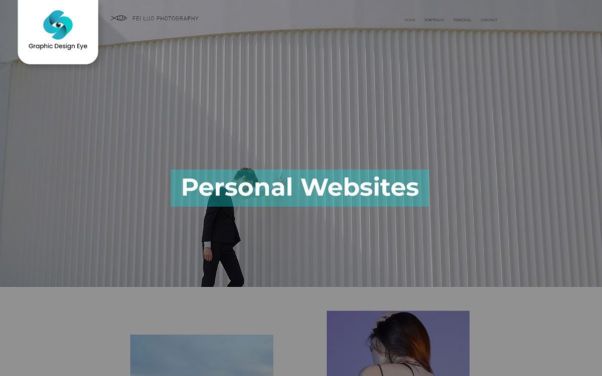
Fei Luo's website is all about letting the photos do the talking. It's clean, crisp, and visually driven—just like the best photography portfolios should be! Think fashion, film, and architecture, all laid out in a sleek, easy-to-navigate way. This is the perfect example of how to showcase creative work online. Using visuals instead of text keeps the presentation minimal and professional. It's simple, stylish, and a total win for personal branding.
Are you ready for this? For some years, e-commerce websites truly impressed shoppers and sellers. Now, online shopping has become a new habit just like everyday essentials. Popular websites like Amazon, eBay, and Shopify serve millions of customers every day. These sites are user-friendly and innovative.
Online-only discounts make shopping at home a great experience. With e-commerce, you can enjoy a wide range of products right from your living room. So, whether you’re a discount chaser, you’ve had a bad experience with physical stores, or you simply find yourself comfortable with online options as if by some kind of retail magic, don’t miss out.
Key Features of E-commerce Website
E-commerce websites offer a top-notch shopping experience with easy menus, attractive product displays, and essential features like one-click checkout. Thanks to their ever-changing technology and customer-friendly design. These websites, which started in the 90s, always seem to be ahead of their time.
The arrival of new e-commerce platforms now has even more advanced features. These websites offer more than just a store or a website; they provide a complete shopping experience. They use real-time analytics, high-speed loading, and flexible designs from talented developers. They are more than just handy sites; they enhance how you shop online. They’re even better. Come for exclusive deals and easy browsing. Enjoy fast delivery and a shopping experience that meets today’s needs while shaping the future of retail.
Structure of an E-commerce Website
Top platforms feature a homepage with clear images, easy category filters, and a simple navigation bar. These features create a pleasant shopping experience. With its fast-loading pages, secure payment options, and a smooth journey from product discovery to checkout, today’s e-commerce websites truly make the online shopping experience easy. And even then, you might wonder if getting all your essentials delivered in a few clicks is too good to be true. Dive into it now because with online retail advancing quickly, who knows what shopping will look like next year!
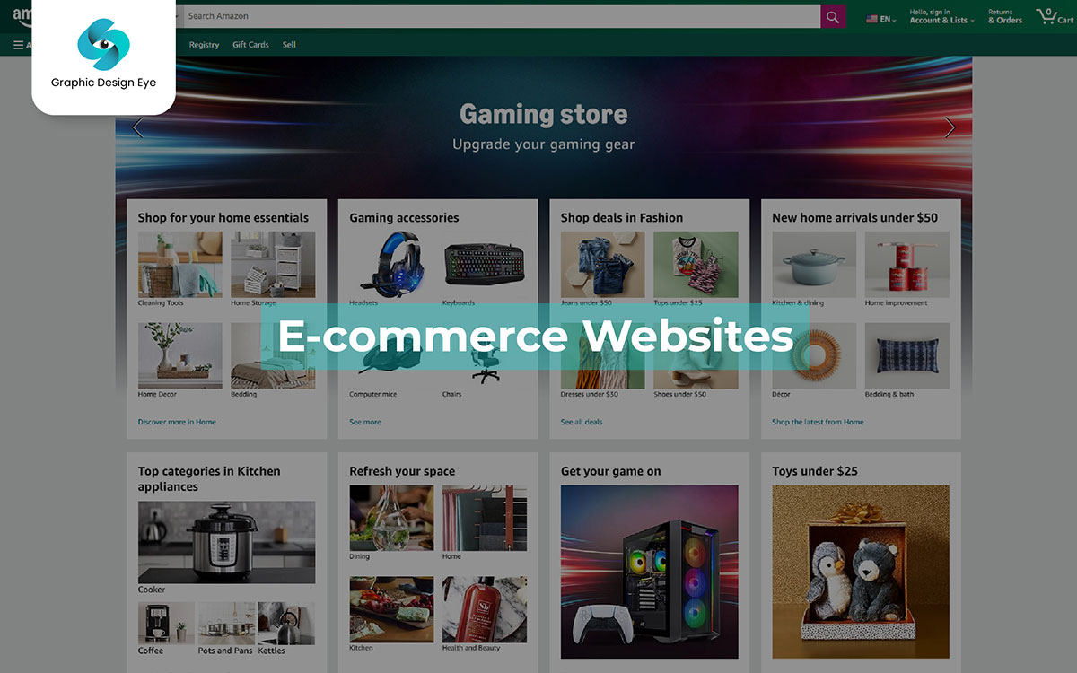
Amazon.com is a big, active marketplace where you can find almost anything you want. It’s a high-speed shopping website that lets you buy stuff from all around the world without leaving your couch. Jeff Bezos, who started Amazon, has turned it into this super-huge online store that sells everything from books to high-tech gadgets. Meanwhile, it also makes sure it delivers at lightning speed. And the products – with cool brands like Apple, Nike, and Samsung, plus thousands of small businesses.
Amazon is a real game-changer. It is full of choices and deals, all wrapped up with a super-easy one-click shopping system (seriously, it should have won a prize for easiest shopping ever). All together now! Should we buy it now, or should we wait a bit? Kind of like we should. But maybe we should just buy it.
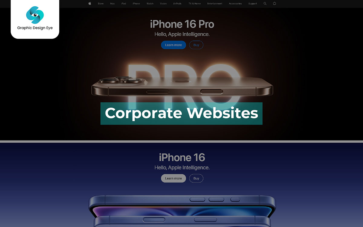
Apple's site is an example of a corporate website that sets the standard for the whole internet. This sleek, all-about-business platform puts everything in the right place to make sure every visitor explores the world of iPhones, MacBooks, and those famous white earbuds. Apple’s website looks clean and modern, making you feel like you are looking into the future. All while you shop. It features every latest Apple product, customer service help, and many high-res images. It’s no wonder this corporate site has become iconic. It lets you explore products, check features, and sometimes even sneak peek into what’s next. A true innovator, If you'll excuse the tech joke, it’s a big step into the future.
Key Features of Corporate Website
An example of Apple’s website is back again. It impresses visitors with clean pages, smart animations, and plenty of product information in a user-friendly layout. Every corporate website should have a feature like this. Apple’s website has a simple, modern design with large images and easy navigation. It isn’t exactly your average website. Then what is it? It’s also not the most complex corporate site out there either. The high-quality product images, easy “Buy Now” buttons for each gadget, and helpful support tools make this worth every click. But it’s Apple’s signature look — clean, clear, and full of white space that really keeps you coming back. Proof, then, that it’s always not just about the products; it’s the presentation.
Structure of a Corporate Website
Steve Jobs is the founder of Apple’s online journey. In a modern digital world where tech companies compete and innovate, Jobs dreamed of a site where customers could easily explore Apple’s products. This design features clear, high-resolution images and a simple layout.
However, a corporate website gives a quick view of the company, with an About Us section and details on Products and Services, just like Apple. It includes News updates and Contact Us for reaching out. A support section should be available for FAQs, live chat, and repair information. Legal pages cover privacy and terms. The layout must be clean and easy to use with a Search Bar.
Apple.com is changing how corporate websites look and feel. The site provides a great digital experience. It features attractive images and simple navigation, allowing visitors to easily explore products like iPhones and MacBooks with just one smooth scroll. The website has a simple design that looks similar to classic Apple styles. Each product page includes necessary details that make online shopping enjoyable and easy. Apple's ability to create an engaging website offers customers a great experience with the brand. It is packed with high-quality imagery, smooth animations, and a clean design that stays classy yet cool. Apple.com is more than just a site. It’s a masterclass on how digital presence can bring a brand to life.
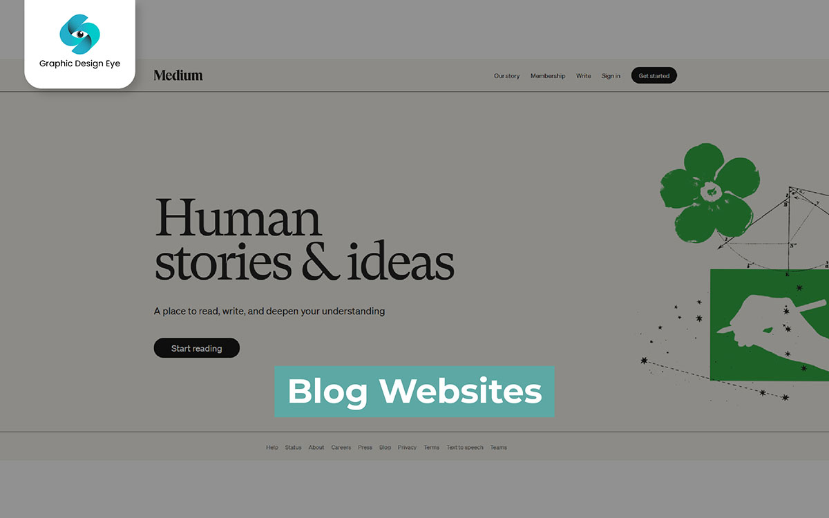
A blog website is where people write stuff online. It’s like a public diary that anyone can read and where people talk about things they like or know. Some blogs are about food, some about travel, and others talk about hobbies or news. It’s a place on the internet that feels more like a real person talking. Not like a book or a magazine. Blog websites let people share their thoughts whenever they want, and people can leave comments too. Many blogs are simple, and you just scroll down to read more. You might see pictures, words, or videos on a blog, too.
Key Features of Blog Website
Blog websites help share ideas with the world. They let people write about topics they love, from food and travel to tech and lifestyle. Blogs make it easy to tell a story, show photos, and give advice to others. In some blogs, readers can even leave comments, ask questions, or share their thoughts. Most blogs have simple designs so readers can find stuff fast. Some of them even show related articles so people can learn more. Also, many blogs help people make money through ads or partnerships with other brands. A good blog has regular posts and easy-to-read layouts. So, readers always come back. Blogs really let everyone be part of the big online community.
Structure of a Blog Website
Creating a blog website isn’t just about writing. It’s about setting up a place where people can read, learn, and get inspired. A good blog website has a clear structure. It starts with a simple homepage that tells visitors what the site is about. Every blog needs easy-to-find sections for articles, like categories for different topics. This way, readers won't get lost. Most blogs also have an 'About' page that tells the story behind the writer or the website. The design often includes sidebars for popular posts or links to other pages. This helps make the site feel more connected and interactive. Adding a comment section lets readers join the conversation, creating a more lively space. With a good layout and simple navigation, a blog becomes not just a site but a proper place for ideas to come alive.
Medium is a popular platform for writers and readers. It is a place where stories, ideas, and advice come together. Medium covers a variety of topics, including technology, lifestyle, and personal essays, instead of just one genre. Writers of all levels can join and share their voices, while readers benefit from them in one place. The simple design of the site helps readers focus on the content. You can find expert professionals, hobby writers, and creative thinkers all in one place. This all makes it a truly broad community. The platform encourages people to share ideas and information. A single post can inspire or inform someone, creating a ripple effect. Medium is a digital stage where every piece of writing whether it is big or small, is appreciated.
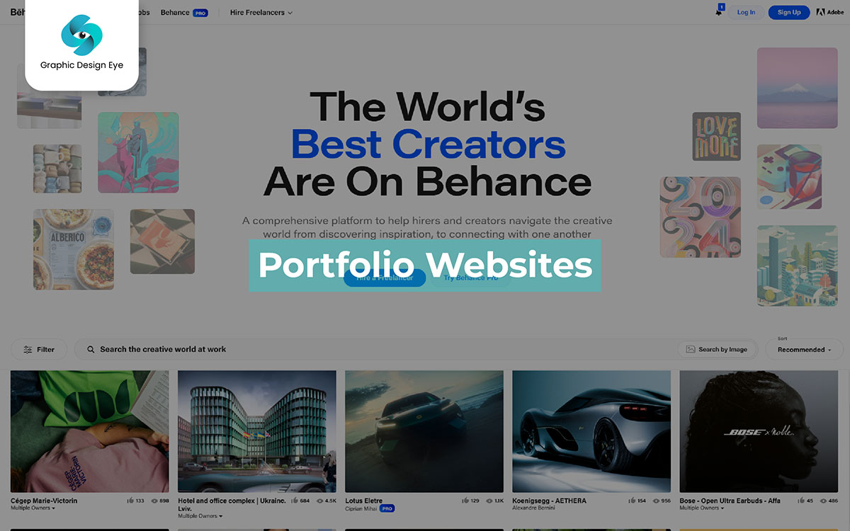
A portfolio website is a digital space that allows people to show their work and skills to potential clients or employers. If you are a photographer, designer, or writer, these websites help you organize your projects and achievements in a cool and easy way. Portfolio websites have a clean and simple design. They focus on showing the work itself. Easy navigation helps visitors move through different parts or specific areas. A nice portfolio website should have a biography or an ‘About’ section. So that viewers have a broad idea of the creator’s story, style, and passions.
Key Features of Portfolio Website
Portfolio websites show the best works of designers, artists, or anyone in an easy to navigate and creative way. They show creativity and skill virtually. These websites feature eye cathing galleries and smooth navigation, giving viewers a look into the creator’s world. Standout features often have an ‘About’ section that gives insight into the person behind the work. There are also organized sections that show many projects.
Attractive layouts and easy designs help visitors explore without getting lost. Many portfolio sites also feature client testimonials, which build trust and credibility. These websites offer interactive features that help creators show their unique styles and skills. They are more than just pages. They serve as personal paths that invite everyone to explore, enjoy, and find inspiration.
Structure of a Portfolio Website
A stunning showcase of the top talents in web design. It gives a clear picture of what today's creatives can achieve. Bright animations, clean layouts, and stylish transitions are some highlights of these personal showcases. Both clients and designers love them. Artists in all fields - from graphic designers to 3D modelers - use these portfolios to highlight their unique flair and skill sets, and, as a result, they are more in demand than ever. Noteworthy examples of engaging portfolio websites include Jon Kohn's simple yet striking site, which shows how much can be revealed with just a few clicks. Another example is Sarah Blake's lively portfolio, which brings digital art to life with every scroll and hover. Each designer shows their unique style: "Look at me now!"
Before joining Behance.net, a professional might wonder if they can use the platform for something like “really freaking wild.” And really freaking wild they can do indeed. On the site, a magnetic Behance welcomes creators of all types - from bold graphic designers to subtle, soft-touch illustrators - as they show their unique, vibrant work to a global audience. There’s the joy of posting something new, the excitement of seeing those ‘likes’ roll in. The shock of getting a comment from a complete stranger across the world - and sometimes, even from a major brand is a fantastic feeling.
Well, whaddayaknow? It turns out that this isn’t just a site to look at pretty pictures. Behance is actually a hub where creatives can connect with potential clients. Build an audience, and even get job offers. It’s a network where they can find feedback and connect with other creators. Sometimes, you may even slip into some trends or collaborations. Join creative challenges, explore popular portfolios, and enjoy the excitement that comes with it. You have an active art gallery and a professional networking site, offering great chances to get noticed! What’s not to love?
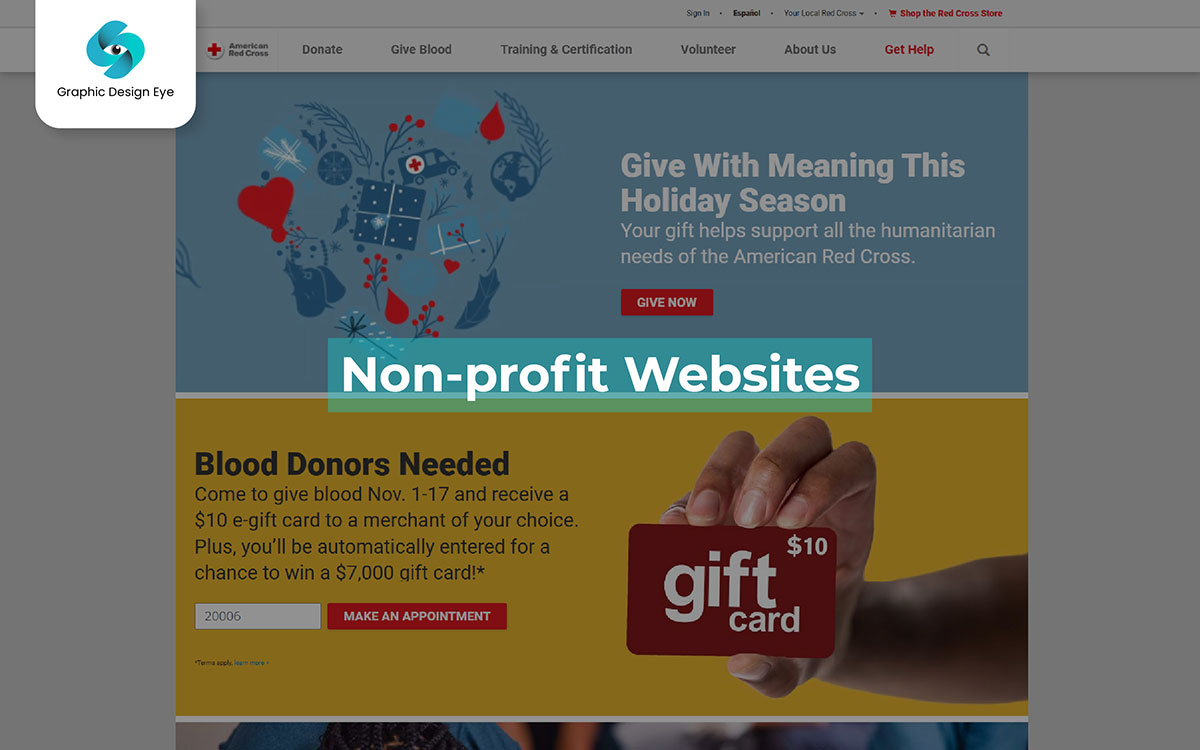
Interest in online charity platforms is growing quickly. Now it is a great time to learn about one of the most impactful sites: non-profit websites. Water is a great example of a non-profit organization that works to provide clean water to people around the world. Although we may not all be able to provide water ourselves, this organization makes it easy for us to support an important cause. Water and similar non-profits are great options for newcomers who want to make a difference. They offer a simple and impactful way to support global causes, making them more open than larger commercial sites.
The "Get Involved" section clearly tackles the big challenge of providing clean water to everyone. It is a prime example of how a website can motivate people to take action and make a change.
Key Features of Non-profit Website
As more people donate online, non-profit websites are becoming very useful. These sites are designed to be user-friendly and easy to navigate. They help visitors find causes they care about, such as animal welfare and clean water access. For example, water involves people with a clear mission. It inspires them to help by donating or volunteering. These sites offer an easy way to connect people with various charitable missions as users explore pages of life changing steps and engaging content.
It is important to have the chance to make a positive change in the world. When visitors use these platforms, they have a satisfying experience that makes them feel part of something larger. Although there are a few minor usability problems, this is a great example of digital altruism.
Structure of a Non-profit Website
How exactly do you create a website that supports a mission to change the world? Just ask non-profit web developers. They’ll give you a detailed answer. Silencing the skeptics’ claims that checks note digital charity platforms don’t drive real impact. The structure of these sites guides visitors from mission statements to donation buttons with ease. This setup encourages support for important causes like clean water access and wildlife protection. These platforms are meant to inspire visitors to get involved, support missions, and spread awareness by points out layouts, engaging visuals, and impactful storytelling.
Non-profit websites are designed to be easy to use and understand. They provide clear financial information and have attractive sections to inspire the community to get involved. These sites use visuals that reflect their mission and offer a chance to help the world. We can’t wait to see the next generation of digital platforms. These platforms will promote greater outreach, making it easier for people to support global causes.
The Red Cross website is a place where people can learn about health, safety, and ways to help others. It’s like an online guide that shows people how to stay safe and make a difference in emergencies. Some parts of the site teach about preparing for disasters, while others share real stories from people who received help. It feels more like a friend sharing advice, not like a formal report. The website also has a space for those who want to volunteer, making it easy for anyone to get involved. The Red Cross website isn’t just about asking for donations; it’s about connecting people to its mission and showing them how they can help, learn, and make a positive impact.
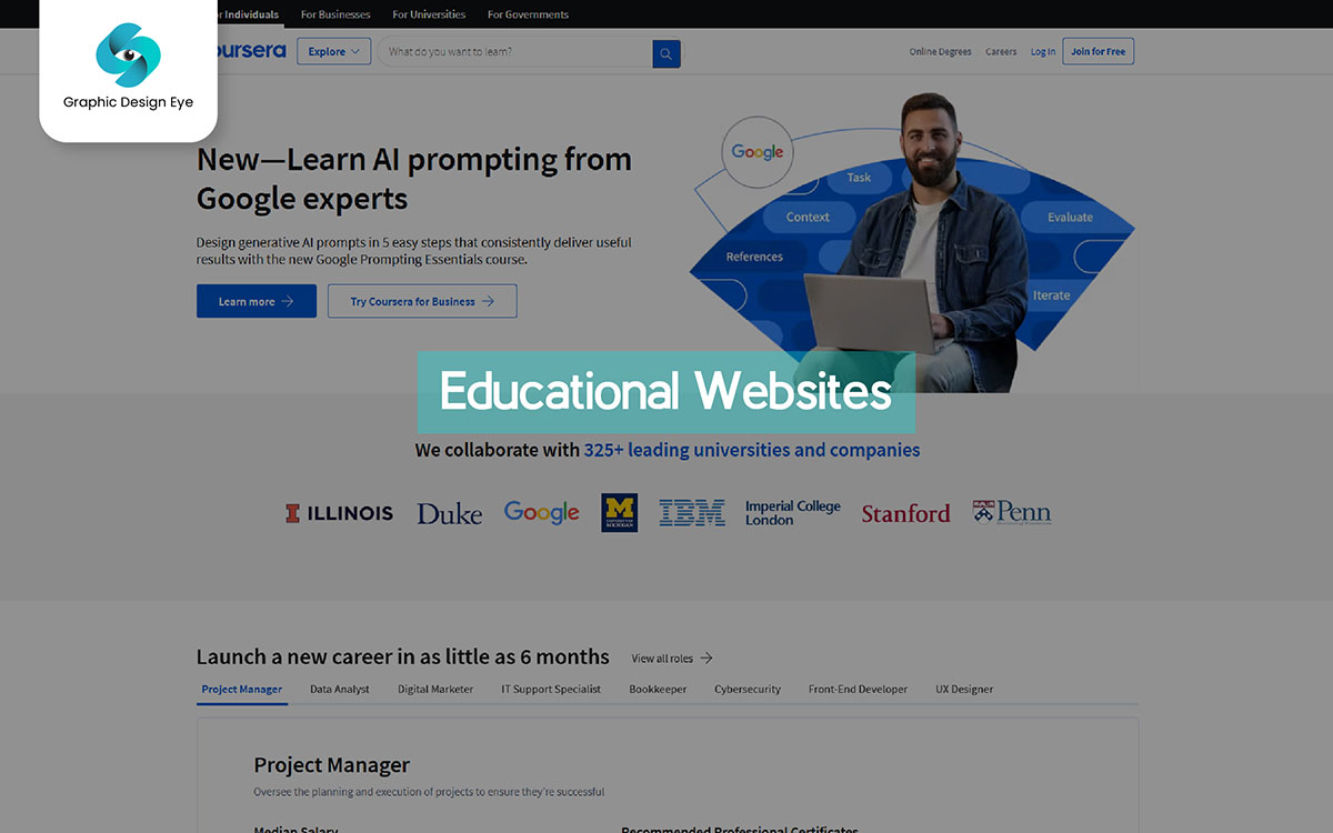
An educational website is a place to learn cool stuff! These websites have lots of info on things like math, science, history, and more. Sometimes, they even have games or quizzes, so learning feels like playing. Many people, like students, teachers, and curious minds, use educational websites to understand things better and help with schoolwork. Just like a library, but online and always open, they make it easy for anyone to learn whenever they want.
Key Features of Educational Website
Educational websites are like secret keys to knowledge. A whole world of learning opens up just with a click! These websites make math, history, and science feel like magic and way more fun than regular class stuff. Videos that explain with real colors and sounds, quizzes that give you stars, and games that make you wanna learn even more? Yep, that’s what I’m talkin' about. It’s like each website is saying, ‘Come on, let’s go on an adventure!’ And guess what? You can return anytime, find new stuff to learn, or try where you left off again. These places online ensure you don’t get bored, and they really make you smarter.
Structure of an Educational Website
Have you ever imagined what a learning website would be like if it looked like a playground? What if it was created by the person who made SpongeBob and featured fun cartoons instead of dull textbooks? Well, think no more! In KidzLearn, funny characters are always there to help — just like teachers with big personalities. The site's main guide is Super Smarty, who loves to teach all subjects in fun ways and jumps in whenever you get stuck. The lessons cover everything from math games to science experiments to silly history stories. But it’s the site’s lively pages (animations! Fun facts! Colorful graphics!) and goofy activities, paired with a perfect mix of learning and playtime, that make it worth every kid’s visit.
Coursera is a website where people can learn all sorts of things online. It’s like a big library of courses that anyone can join to study topics they’re interested in or want to know more about. Some courses focus on tech, others on business, while some cover art or even fun hobbies. It’s a space on the internet that feels like a teacher guiding you rather than a textbook. Coursera lets people learn whenever they want, and some courses even give certificates. Many courses are easy to browse, and you can watch videos, read materials, and complete projects. With a premium option, Coursera offers even more classes and degrees, so there’s always something new to explore.
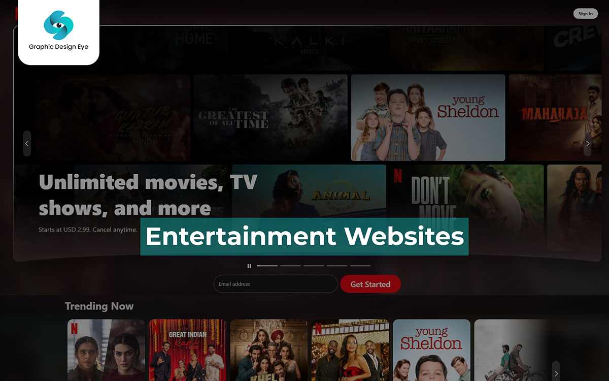
An entertainment website is where people go to enjoy movies, games, and celebrity news. It’s like an online spot where fans can keep up with the latest trends in pop culture. Some sites focus on streaming shows, some on the latest movies, while others dive into video games or gossip about celebrities. It feels more like hanging out with friends who share the same interests, not like reading a formal magazine. Entertainment websites let people watch videos, read updates, and stay connected with what’s popular. Many of these sites are easy to navigate, with bright visuals and fun content. You might see pictures, articles, or even short clips that make following entertainment exciting and interactive.
Key Features of Entertainment Website
Entertainment websites are built around exciting visuals and engaging content. The homepage is a key feature, showcasing trailers, trending shows, and celebrity news. It draws you in and makes you think, “I could spend a long time here,” even if you planned just a quick visit. The main features include video streaming, interactive polls, and user profiles, all designed to keep you engaged. An entertainment website can draw in visitors with exciting graphics and cool animations. It offers a mix of pop culture content, including movie previews, music hits, teasers, and fan forums. But explore further, and you’ll be hit with unique recommendations and surprises that elevate it to a place that feels just like home for every entertainment lover.
Structure of an Entertainment Website
The homepage serves as the main hub. Filled with trending shows, news, and games designed to draw users in right from the start. Entertainment websites are places where everyone can find their own space. Visitors can customize their experience based on interests in movies, music, and games. It’s an impressive take on the entertainment portal idea, with options for watching trailers, engaging in live chats, and exploring exclusive interviews, all from one platform. Great site offers a clean design and a constant supply of new content. It is easy to navigate and has many exciting options, although it sometimes tries to do too much with its many features.
Netflix is a popular streaming platform where you can watch movies and series. It aims to keep you entertained and is a go-to spot for binge-watching. It makes perfect sense that its design is a little wild and crazy, letting you dive right in and get lost in endless options. Split into two main categories — Movies and TV Shows. Netflix takes viewers from trending titles and classics to new originals, covering every genre and age range. The first half of the homepage scrolls by quickly and is packed with top picks. However, it’s the “Recommended For You” section where Netflix's algorithm gets personal, which is really surprising. It’s a masterclass in curating, and nothing less than a streaming giant like Netflix deserves.
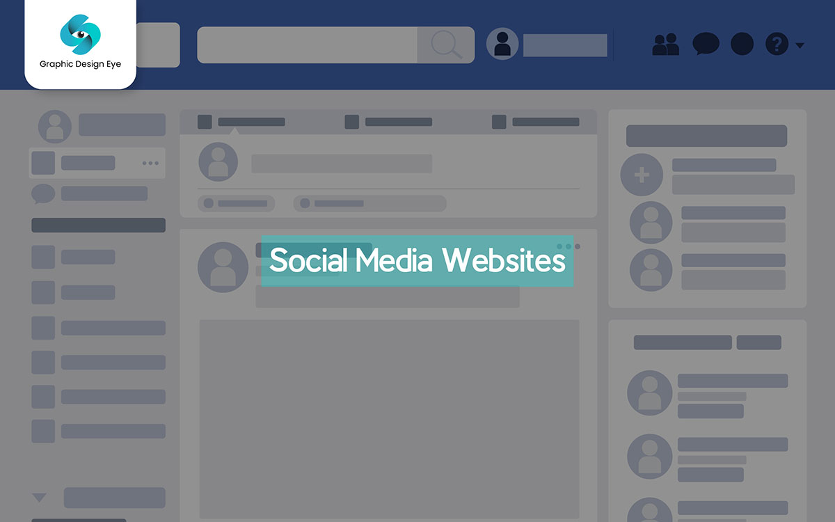
Social Connect is a platform where people from all over the world come together online. It’s like a digital space where anyone can connect, share updates, and discuss their lives or interests in real-time. Some people use it to chat with friends, others to share media, and some explore different communities. It feels more like having a conversation with friends than reading a formal article. Social Connect allows people to express themselves instantly, and users can interact by liking, sharing, or following each other’s posts. Many parts of the platform are straightforward, and you just scroll to see new updates. You might come across photos, messages, or even videos, making it a lively place to engage with others.
Key Features of Social Media Website
Easy-to-use, engaging, and oh so interactive. The social media platform will surely have you scrolling for hours. The site is built for modern users and offers a friendly mix of posts and real-time chat. It allows people to share, like, and comment in a special digital space tailored just for them, with easy customization options. The platform is anchored by a smart feed system that finds popular posts and shows what matters most to each user. It’s supported by many fun features, like profile badges for active users, cool photo filters, and live streaming for creators. The easy layout and design alone would have kept us here. Honestly, the active community and smooth navigation make it all so satisfying.
Structure of a Social Media Website
A social media website typically has a main feed where users see updates from friends and followed accounts. Each user has a profile showing their posts, bio, and followers. Users can create posts with text, photos, or videos and decide who sees them. Notifications alert users to likes, comments, and messages, and direct messaging allows private chats.
Users can explore trending content, join groups, and connect with others who share their interests. Privacy settings help control who sees a user’s information. Some platforms also offer ads and tools for creators to earn money. Moderators ensure the platform stays safe and friendly for all users.
Facebook.com is a place where people from all over the world connect online. It’s like a social hub where anyone can chat, share updates, and post things they find interesting or important. Some people use it to stay in touch with friends, some to share pictures, and others to keep up with news or hobbies. It feels more like an ongoing conversation than reading a formal website. Facebook lets users share their thoughts, photos, and videos whenever they want, and others can leave comments or reactions. The platform is easy to navigate, and you can keep scrolling to see new posts, making it an active space where people connect and interact.
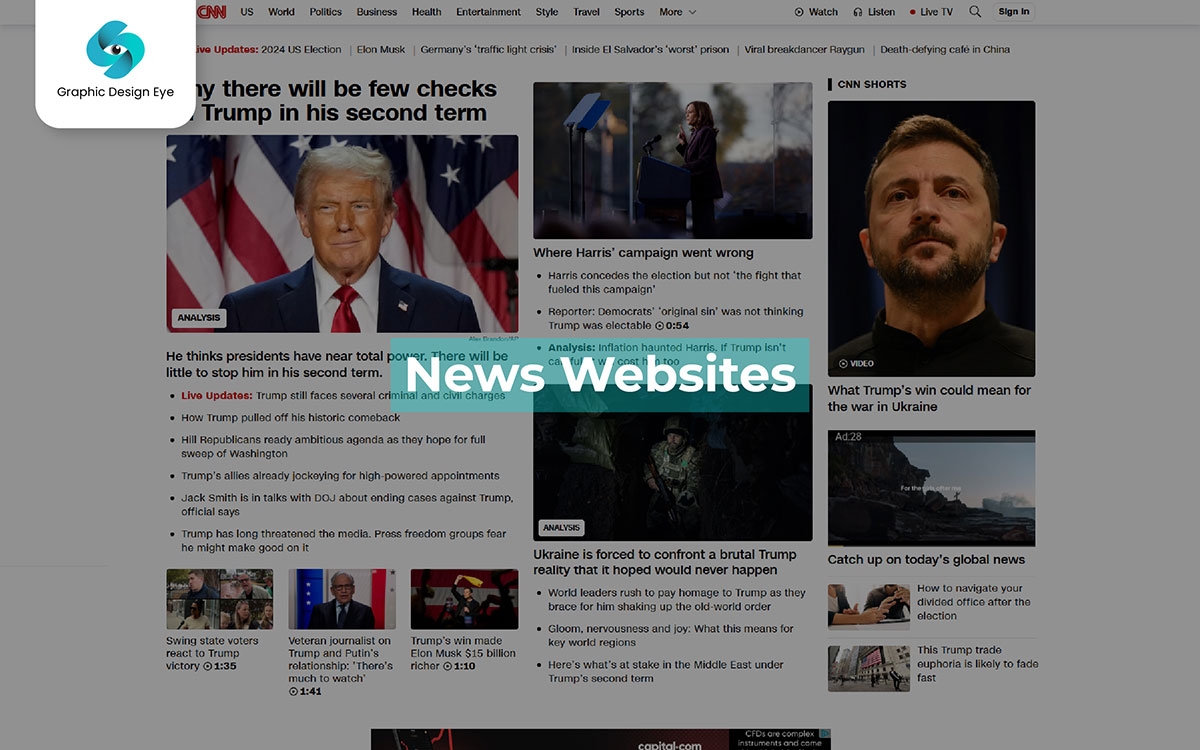
It is a platform where people get updates on everything from world events to local happenings. This guide breaks down what makes these sites essential for staying informed. The website delivers headlines, in-depth reports, and quick updates, all organized to keep users aware of what’s happening around them. It covers stories on politics, sports, culture, and more. It makes it easy to find the news that matters. The interface is simple but designed with purpose. The pages load quickly, and headlines are updated frequently, giving a sense of urgency that captures the pace of real events. Yes, the content is vast, but every article is designed to be worth the read.
Key Features of News Website
News websites are often described as an alternative to traditional news. This platform, structured to engage online readers, combines quick updates with more detailed features. The website quickly loads news articles in a clear format. It provides coverage of all news categories, including politics and sports, all in one place. Main sections like “Breaking News” offer instant updates, while deeper dives exist for those wanting more in-depth coverage. And yet, these sections get the job done, quickly summarizing even the most complex topics. A creative landing page design (complete with trending tabs, notifications, and live updates) keeps readers engaged and informed. After rolling out updates on both national and global news, it's no surprise that more features and faster loading times are planned. Who doesn’t love the thrill of seeing the latest stories pop up in real time?
Structure of a News Website
A news website is organized to help you find information fast. At the top, you’ll see the site’s name, a menu with topics like Sports and World News, and a search bar. The biggest story is shown first, with other stories grouped by topic below. There’s usually a sidebar with popular stories and maybe the weather. At the bottom, you’ll find links like About Us and social media buttons. Articles may have comments, related stories, and multimedia. The site is mobile-friendly and optimized for quick loading, making it easy to navigate and read.
CNN.com has reported on global elections, tracked updates on the pandemic, and provided live news from conflict zones. Now, it faces a new challenge in the fast-moving digital world. It is based on the well-known newsroom format but modernized for an online audience. The platform centers around delivering breaking news as it happens, with a focus on immediacy and reliability. CNN.com helps you stay informed with live updates and detailed reports from a team of skilled journalists. It brings viewers closer to unfolding events, covering everything from political turbulence to environmental crises. This online news platform is easy to use and has a clear layout. Users receive helpful notifications that keep them engaged. It provides a comforting experience for those looking for news.
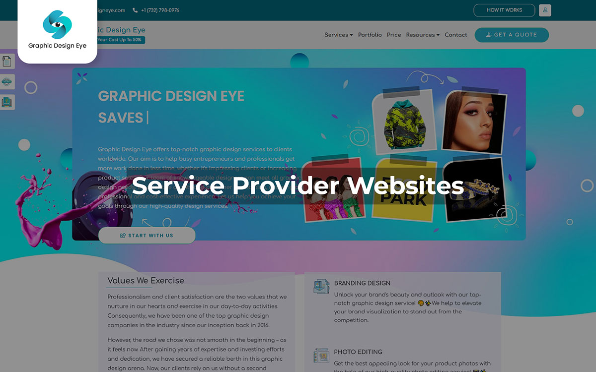
Service provider websites are like digital storefronts for providers that offer services like graphic design, web design, consulting, IT solutions, digital marketing, recruitment—you name it. They’re set up to be the provider’s primary online presence, showing off their expertise, a rundown of services, real client testimonials, case studies, and easy contact info. The goal? Bring in new clients, clarify the provider’s value, and build trust right from the first click.
Key Features of a Service Provider Website
A service provider website is designed to attract clients and showcase the provider’s skills. It lists each service clearly, like “Graphic Design” “Web Design” or “Digital Marketing,” so visitors know exactly what’s offered. There’s usually a portfolio section showing successful projects to build trust, along with Client Testimonials that prove the agency’s experience.
Structure of a Service Provider Website
The webpage layout of a service provider website is straightforward. The Homepage offers a quick overview of the provider’s strengths, showing off key services and some client reviews. The services page then dives deeper into each offering.
A portfolio page gives examples of past work, often with visuals and feedback to make it more engaging. The About Us page shares the agency’s story and introduces the team. Many sites include a blog for added value, where insights and industry updates are posted.
Graphic Design Eye is a full-service graphic design provider offering a wide range of creative and marketing design services. They cover everything from creative logo design and branding design to website design, social media graphics, and even specialized photo editing services like background removal, clipping path, photo retouching, and more.
Graphic Design Eye also has a blog section to keep clients up-to-date with graphic design trends. Here, they post articles on topics like color importance, typography basics, and design principles, helping clients stay informed on the latest in the graphic design world while showcasing their expertise.
Choosing the right website structure depends on what your website aims to do, who your audience is, and the features that work best for you. Here’s how you can decide which website structure would be suitable for you:
Personal Website: If you aim to showcase personal branding, projects, or a resume, opt for a simple, portfolio-style structure. This normally has an "About Me" page, galleries, and clear sections for projects and achievements.
The website structure should match user expectations. For example, e-commerce users expect fast, secure checkout, while blog readers want clear article categorization.
Customize your website based on its type. For example, include search bars for blogs, secure payment options for e-commerce sites, or donation buttons for non-profits.
Your website should be able to edit easily. This means you can add new sections, pages, or features without affecting users' experience.
Popular site builders like WordPress and Squarespace are well-known in the tech world for creating all kinds of websites. They are interesting options for creating a website. These platforms are designed for easy use and personalization. They offer different templates and easy plugins, allowing beginners and experienced users to create their ideal websites.
Much like choosing between different paintbrushes. Picking the right platform can feel like a game of trial and error as designers judge the options. This breakdown of website builders helps us understand what each platform offers. It is useful for both website fans and those who may not know much about websites, even if the term “plugin” sounds unfamiliar.
Structure matters, from menus and links to the overall organization. It affects how easy or hard it is for someone to reach their goal. A clear and simple structure feels natural, while a messy or confusing layout can distract users.
As each page unfolds, the website structure either helps users navigate easily or leaves them unsure about what to do next. And the effect? It has one of the most direct impacts on visitors to engage deeply or leave quickly in search of a better option.
Forget plain old websites; it's all about the different types of websites. This breakdown explains website structures clearly, showing exactly what we need to know. From e-commerce sites to personal blogs, every type has its own unique structure and purpose. Imagine a clean and organized business website versus a buzzing social media site with user profiles and live updates. Each has its own rules for what works best. As users click around, the different structures start to stand out, each one built for a specific purpose and feel. Despite some odd design choices that might leave you scratching your head. The well-structured sites make for smooth and engaging navigation. And the result? You can find a wide range of online experiences, from simple and efficient to rich and exploratory.
The magic happens when the site's design and features match its purpose. This helps visitors find what they need easily without getting lost or confused. The beauty of the process is twofold: first, it’s all about keeping it simple and easy to navigate. And second, finding the perfect fit for the audience makes the whole online experience way more engaging and enjoyable.
This is goodbye for now, but our team is always here for you. If you need any more suggestions or advice, we’re happy to help. Also, if you require any kind of creative design service, the Graphic Design Eye design team is ready to assist you. Just drop us a message. Good luck!