How many times have you judged a business by its business card? We bet so many times! Likewise, people will have initial opinions about your brand based on their business cards. A good card design can inspire trust. It shows the recipient that you pay attention to detail.

If a business card is well designed, it increases the likelihood that the receiver would want to interact with you and your company more often. This small piece of paper may go a long way in influencing how people perceive your business.
Having high-quality business cards can help establish real relationships with others much easier. So, we have got you covered with the best business card design tips and tricks for maximum impact on your design. Let's know in brief!
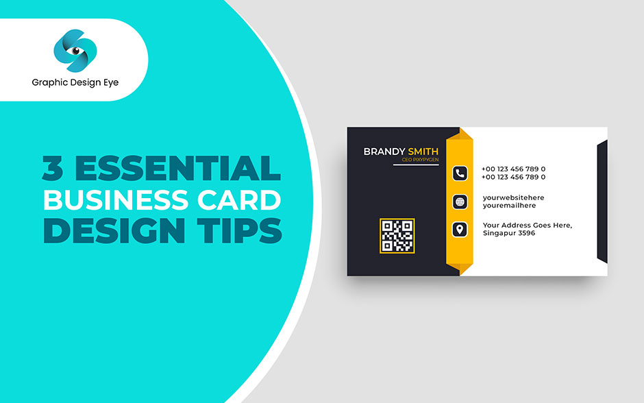
Now, the real shot comes. We have gathered some awesome business card design tips and tricks that will help you get an amazing outcome. The following are the expert design tips that you should follow:
Keep it simple. Use Arial or Times New Roman, two simple and legible fonts. Specifically for those having a lot of data on their cards, ensure the font size is large enough to be easily read by everyone. If the layout is plain and easy to understand, then individuals won't strain their eyes trying to figure out name, business organization, position as well as contact details.
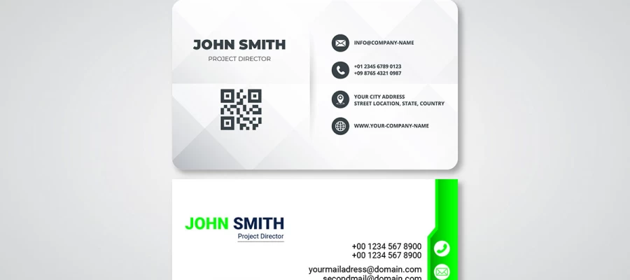
Your professional image can be represented in so many ways by just a small piece of paper; ensure that all the important stuff like your name, company's name, the title of the job held, and contacts (email address, website link and telephone number) are included. Having these basic building blocks in place will make contacting potential clients/contacts effortless.
Design basics should guide layout and visual hierarchy. When planning how information will flow through the card, make sure it is user-friendly design and easy to read and understand.
Make sure you stick to design principles even as you inject some personality into your card. Check out some inspirational business card designs to make something unique that represents your brand.
It can take a creative touch for a business card to become more meaningful than just an informative piece of paper. But when presenting your contacts, give value to its attractiveness and singularity among others which will assist you in catching attention.
For a sophisticated look, always stick to design principles while making your business card. To get a good printout use CMYK color model with readable font size and high resolution photos (300dpi).
To give an impression of high-quality finishing, keep 5mm away from any important text on the front side of the card, including some white space between texts.
Showcase inventiveness pertinent to the industry. Take into account brand traits or offers when selecting colors or textures. In terms of the identity of your brand, whether you opt for traditional media such as paper or more contemporary materials such as metal or wood, could have lasting impacts.
Place the logo strategically for brand promotion purposes. It should be subtle yet powerful such that it enhances rather than detracts from your card's design. You must get a logo if you wish people to recognize your brand later on.
Your business card's font is one of the most important aspects for creating a credible look while ensuring it can be easily read. Classic styles like Arial, Helvetica, and Times New Roman are popular choices.
They are very clear and readable which is essential when sharing contacts. Nonetheless, these fonts are also quite commonly used thus failing to differentiate your card from others.
You might need to bring in some elements of distinctiveness by using subtle variations or contemporary alternatives that still maintain readability.
Stick to a font size between 10-16 pt for such vital details as name on a business card. By doing this you will stand out without overshadowing other graphic designs on the card. The name could be bigger within this range so that people would be able to find you among the rest at once.
When dealing with less critical pieces of information like phone numbers or email addresses, it would be better if they were printed in slightly smaller letters without losing balance and readability features.
Always think about how much space is available on your business card and how all text should remain legible as some other members of its design layout together with its general appearance should also let customers see that text clearly enough to read it again later.
Choose branding-compatible designs for your business cards. Choose a minimalist card design or use colors sparingly based on how your company feels like doing things.
In addition, it should be noted that vibrant hues add life to a room, but too much color could have an overwhelming effect; for this reason, whether or not going with a plain, colorless design would be effective in creating an impression of professionalism and clarity.
Despite other formats, PDF is the undisputed leader. Being compliant with this standard will guarantee that your digital card design will look good on any device or operating system. Working with designers and printers makes it easier to use PDFs because they are easy to update and share.
PDFs have the added advantage of providing more safety to your documents than other formats. They maintain good print quality and resolution which is essential for professional business cards.
The use of vector graphics possible in PDF format ensures its scalability without loss of quality. The reason why people go for PDF as their choice is due to its stability and versatility.
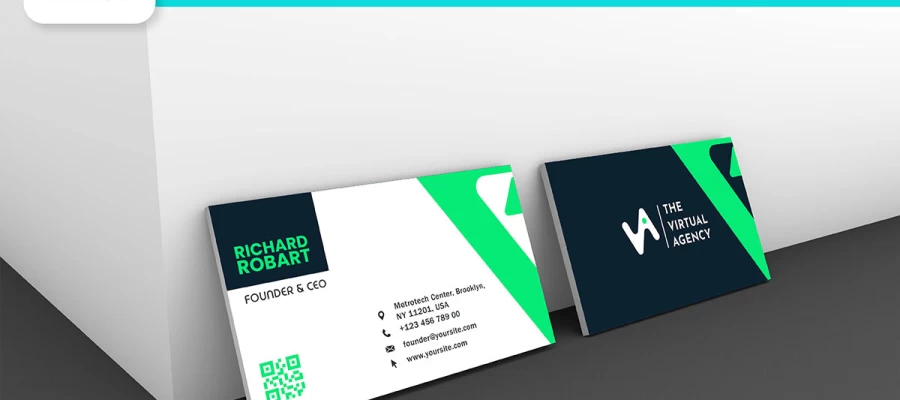
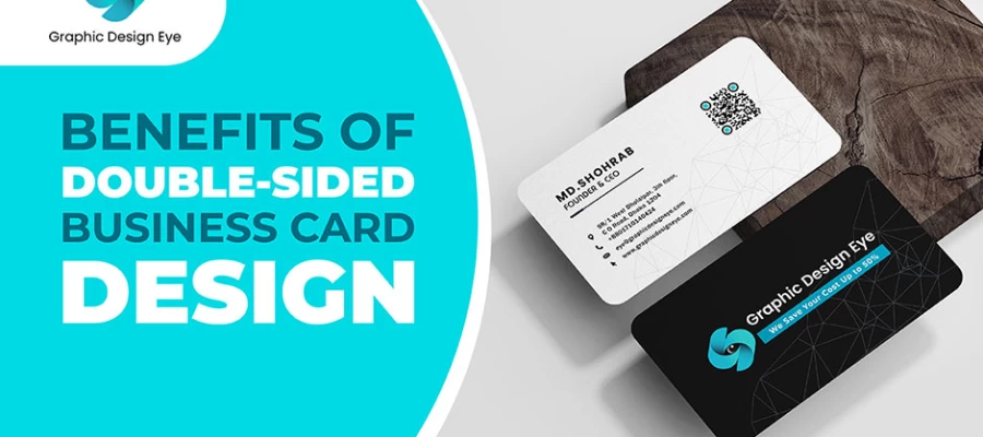
Utilize the back of your business cards to display head-turning images that enhance what you have indicated on them. Silently include graphics or a logo to improve a company's brand image.
By incorporating attractive images which create a good impression in people's minds about your company, this side supplements the informative side.
Avoid employing traditional paper for business cards. Make an impression that would last through utilizing non-standard materials. Think about something like plastic; it is durable as well as stylish.
The authenticity of wood cards cannot be questioned at all; they are rustic by nature. Metal, being able to demonstrate polished professionalism speaks for itself indeed! While slate has an earthy touch and sophisticated appeal, when used in designing business cards, it can attract the attention of everyone around, hence becoming the talk of town materials.
These should be selected in keeping with the contemporary image of one enterprise highlighting creativity and innovation but also lasting longer than paper possibly does. In addition, select a medium that resonates with your company's core qualities, not only style separating from substance.
Furthermore, don't be afraid to consider out-of-the-box options. Sometimes, adding one special material to a plain business card can make it a keepsake forever.
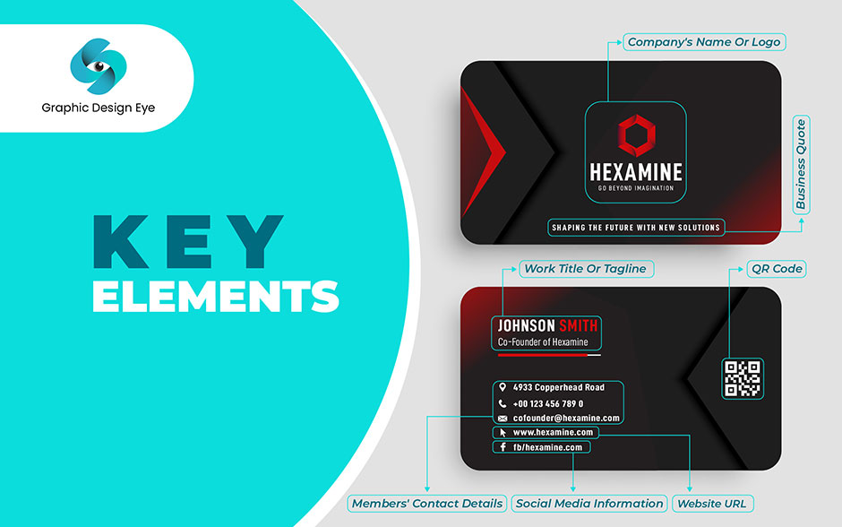
Many people get confused about what to include in your business card. If you are one of them, this is the first thing you should know. Together, these elements create a well-rounded business card that not only introduces you but also leaves a lasting impression. From your contact details to your business elements, everything together can create a memorable business card. Here are some elements that you must have on your business card:
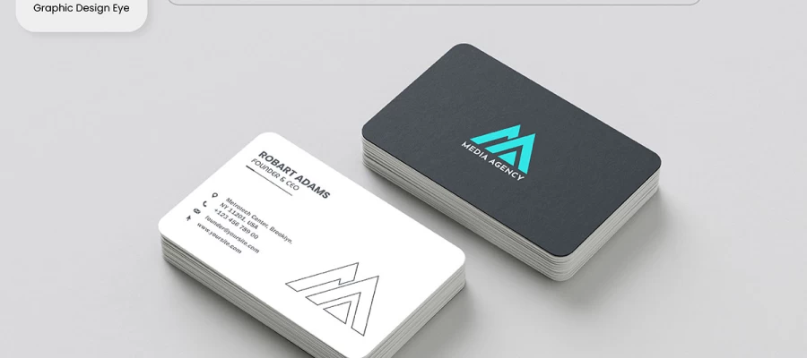
Ensure that the most striking thing on your card is your unique logo and company name. As a result, people will remember your name and link it with your brand. Whether you own the blog or business title or not, you must maintain uniformity and professionalism in branding.
Give a quick summary of what you do. Your tagline or job title should give people an idea of how good you are at what they do without boring them with details. It's like a mini-introduction that ignites interest for your services as well as expertise; hence brief but catchy.
Make reaching out to you easy for others. In today's age, one must have an email address, and if they take phone calls, their number should also appear here. Be aware that privacy rights are sacred but the address could give credibility to your organization.
How someone appears online matters much. Remember that this virtual shop front showcases more about yourself and the products therefore don't miss including it in your card. Be plain in emails which include links to websites making them look professional too.
Go beyond simply providing just the card and engage with those who follow it. Putting up these handles for social media allows others to find yours within no time. Building community and spreading the brand across platforms are greater than just friends. Brands looking forward to interacting with customers online will find it suitable as well.
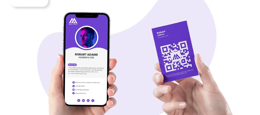
It enables individuals with smartphones to scan their mobile devices over your business card code. Thus making QR codes more interestingly interactive—they will take users directly where they want to go; for example, to your website, a specific landing page, or even a video that provides more information about what you do.
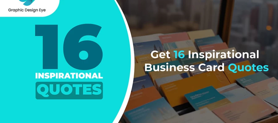
A motivational quote for a business card is a brief, powerful statement that motivates positivity and confidence. These inspirational business card quotes are ideal for professionals looking to leave a lasting impression, as they reflect the values of determination, success, and resilience. Perfect for networking, they resonate with clients alike.
It is important for your business card to be of high quality in terms of printing and production. If you use different materials and finishes like embossing or foil, you can have a feel of the card. Don’t forget that the latter is not only an amazing way out but also reflects your professionalism along with attention to detail.
Using a range of material and finish options can significantly enhance the impact of your business card. To add some texture to it, various options like embossed surfaces, foiled accents or lamination with silk could be considered.
By using materials that are consistent with your brand such as shiny metal for example, high-end labeling will help your business cards stand out more and last longer.
Embossing is among the unique materials or textural finishes that will enhance interaction in any project undertaken. They boost the impact of the cards by inviting touch thereby being distinctively tactile.
Therefore, think outside the box and experiment using embossing as well as raised designs so as to make your project more interesting. Also, this will help a lot in making people note at once that it is a 3D card which means close attention was paid when designing it.
3D effects add dimension and visual appeal to corporate card designs. Raised accents give it a tactile feel and make yours distinct from others. Consequently, this technique aims at building up the brand's image and making it easy for potential customers to recall it through sophistication.
The effectiveness of business cards can be maximized by properly distributing them as well as using them purposefully. Understanding your target market will help you ensure that it speaks directly to the right people. Adding a clear call to action will prompt immediate response while making good use of white space increases readability and usability. This approach makes sure that your card stands out in a person’s mind.
Ensure your business card is aimed at your target market and area. For example, if you are a digital genius showing off your skills or an expert carpenter displaying your trade, make sure that the images and information provided are consistent with what you do. This direct correlation makes people remember it later when they need to find something.
Use an obvious call to action (CTA) so that people can act upon such requests easily. Henceforward, send an appealing offer or incentive for them to come closer or look around through their screen device. Direct interaction leading directly into sales can be achieved by strategically placing the CTAs.
Make it user-friendly. All vital information should be present on this small piece but at the same time leave enough space for recipients to jot down notes or write down something else when need be.
Utilize white spaces wisely – this makes focus sharper among other things improving readability making it easier for users to read through all provided information on a given card to make sense of it all.
Make sure your business card is outstanding by not making common design mistakes. Here are a few things that you should never do on your business card:
Before deciding on a final design for one's business card, re-evaluate all of the work twice over. Poor alignment, wrong phone numbers, or a simple typo can undermine the professional appearance of your cards.
Look for typos and double-check if the text is right. It's time to double-check calls, emails, and URLs as well. All elements' spacing and alignment should be checked very carefully. Confirm that your identity is visible enough and in the right position on this particular design.
Mistakes are easier to notice before printing than after that. Look at colors to ensure that they will turn out well when printed. Carefully check whether it accurately portrays your brand before sending out your business card for printing.
When designing your business cards, think about the thickness of paper you will use. How people perceive your business is affected by this factor. Thicker cards are usually seen as more professional or sophisticated in most cases.
They imply that your company can give good value for money. Avoid card stock that is too thin or unprofessional because it will make your card appear cheap. Opt for heavier weight stocks typically around 400 gsm and above.
The outcome is always a high-quality-looking card that feels solid inside out. It remains in wallets and card holders longer due to that quality of the material used to make it heavier than others' cards which are thin and light as feather while still keeping their strength intact.
One of the most important things to consider when designing a business card is what information goes into it. It should be attractive, legible, and straightforward. Do not choose fonts that cannot be seen clearly in small sizes.
Decorative styles look nice but use them only once in a while. Arise them where your company logo or name needs such. Choose clean readable fonts where contact details are concerned. Sans serif fonts usually work better if you want legibility. Balance between two fonts can add visual interest without going overboard. You do not want to present a messy, unprofessional-looking card with bad typography so limit yourself to just several fonts. Also, consider if there will be any color applied to the text.
For ease of reading, ensure that it contrasts against its background; proper typography should display the nature of your brand, and it doesn't matter whether you use modern, classic, or quirky font style, but its identity must match that of your brand.
An ideal business card is one that is neither too busy nor too simple. However, do not go overboard with weird designs. You don't want a lot of clutter on your card that could distract from important details when designing it.
Keep things easy and short; include just your name, contacts, and logo on it. Minimize illustrations, icons, and colors on the cards as much as possible. The less you put on your card, the more powerful and apparent simplicity can become. It also makes space for notes where customers can write them down. Additionally, creative elements should not overshadow but rather highlight any message on it. Therefore, use them wisely to bring focus on key areas in our design.
There is a lot of difference between business cards printed professionally and cheap ones. However, printing at home is also very tempting to save money, but the results are usually poor in comparison to what you would get from a professional printer. They have everything from types of paper to finishes. They guarantee bright colors and sharp images. This brings out an elegant look that looks highly professional which will be good for your company's image.
Homemade cards might make your brand look unprofessional and inexpensive for crisp, clear lines and vivid colors, go for expert printing. These include foil stamping, embossing, and matte treatments among others. That will make your cards more sophisticated and classy.
As far as company cards are concerned, standard paper particularly at 14pt cardstock is perfect. It meets the requirements of both quality and functionality associated with such paper types.
It has an appearance suitable for everyday use since it is strong enough but also flexible enough not to seem too formal or stuffy when being handed out during networking events or conferences. Owing to this choice then if you want them thicker say between 16 pt., up through either eighteen points; but still end up coming off really well done looking quite sophisticated and rich as well as luxurious.
The logo is an important feature on any type of calling card because it represents one's brand identity. Have the logo on the front of the card. This might be seen at a glance, therefore. Proofread your logo design to ensure it is clear and of good quality.
Try as much as possible not to have anything around this logo. However, an excess of images may overshadow it. It should be the most prominent thing on the business card. Clear and noticeable logos lead to improved customer recognition and retention, while allowing them to take a neat and professional look.
Grammatical errors and typos in your business cards may however not excite the customers as it may suggest to them that you do not care about perfectionism. It is important therefore to check and recheck before you print. Findings show that there are many who will go without buying if they find spelling errors.
Your business card design should include high-resolution images (300dpi) which will make them appear sharp and crisp when printed out. On the other hand, low-resolution images (such as 72 dpi) can be pixelated or fuzzy thereby spoiling your card’s professional look.
Card stock selection matters a lot. Try avoiding cheap-looking materials that can reflect poorly on your card. Consider quality alternatives such as Silk Laminated or Velvet Laminated cards for better durability and perception of your brand.
Make use of your business card to reinforce what you stand for as a brand. This means incorporating colors and visuals that match those on your logo, or website so that they can be easily recognized by an individual who has seen them before.
Do not overload your card with too much print information, graphics, or pictures; keep sufficient white space for easy appreciation of the data being displayed without drowning our eyes with too much stuff at once.
Do not ignore the reverse side of your business card. This is an opportunity for you to put in more details such as slogans, social media links, or special offers thereby making it more useful and effective.
Ensure that you understand and use bleed, cut lines, and safe areas before finalizing your design. These will ensure proper printing and avoid situations where some parts of your artwork get cut off by mistake during production.
From our given business card design tips and tricks, you can see that properly designed business cards come with more power and are of higher quality. This makes cardstock suitable for a variety of finishes, including matte, glossy, or even textured, that will give your business card originality, matching its brand.
If you think we have missed anything from our end, let us know! Also, for additional tips and pieces of advice, contact this graphic design company without any hesitation!