A look at the best university logos to carry ideas about learning, legacy, and identity - they can bring design insight of an iconic academic logo. Some university logos honor centuries of tradition. Others celebrate modern ideas and forward-thinking innovation. Together, they show how design and purpose can work hand in hand.
When you think of what makes a university stand out, the logo often comes first. You see it on buildings, books, websites, and even graduation gowns. It’s more than decoration. It sends a clear message about what the university values. The logo reminds students, teachers, and visitors of the guiding principles there. It shows the spirit of the place.
Every part of a logo matters. The shape, typography, and color all play a role. Bold colors can show confidence. A simple crest can express trust and stability. Even small design choices affect how people feel about the university. That feeling often lasts longer than words.
This is why branding in higher education matters. It’s not just about looks. It’s about the emotions and pride it creates. Strong branding builds connection and a sense of belonging.
In this blog post, we'll explore the top 20 best university logo design ideas, their stories, meanings, and design secrets. Let’s dive in!
When students wear a university emblem on jackets, letterheads, or merchandise, they carry a piece of history. This is the power of a modern university logo design.
Some university logos draw you in with tradition, while others impress with a clean, modern look. We’ve listed 20 of the best university logos with their behind-the-scenes stories.
Let’s explore!
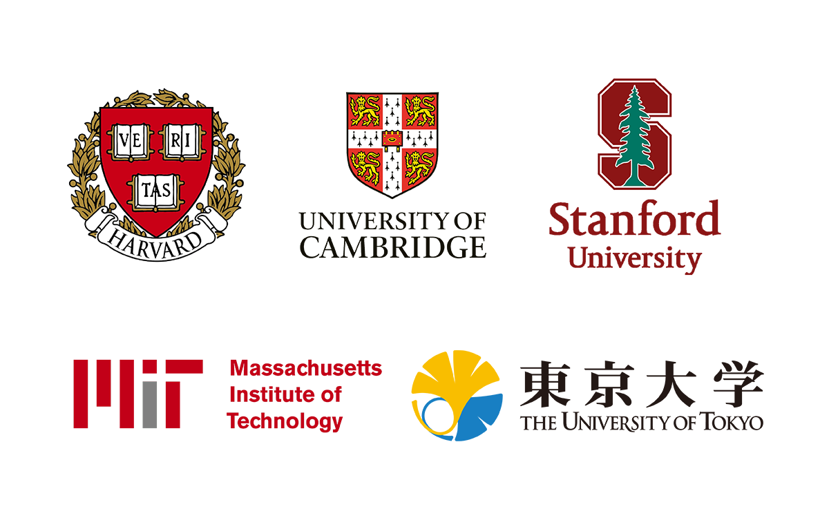
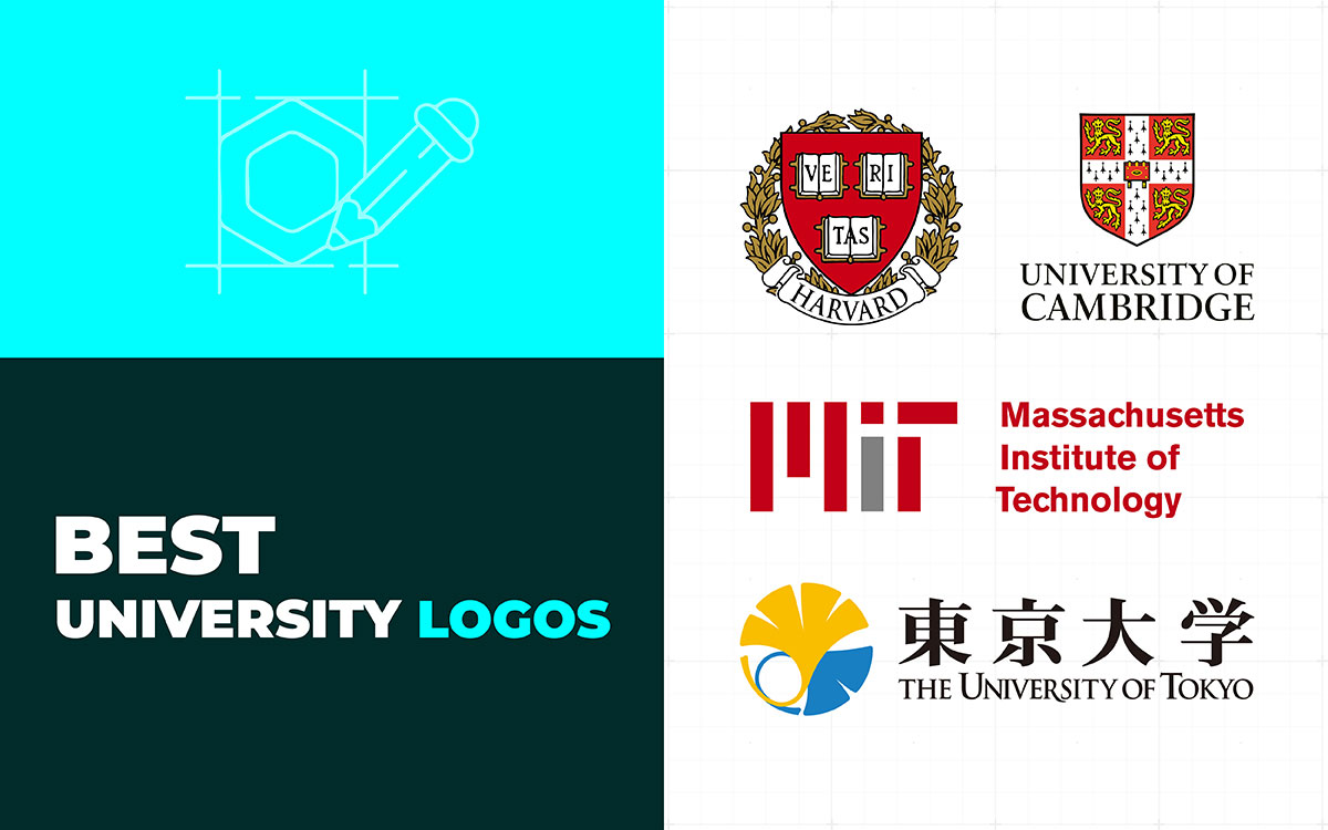
The Harvard University logo feels powerful and authoritative. At its center are three open books. They carry the word “Veritas,” which means truth. That single word captures Harvard’s identity. The books point to learning, while the word adds sharp meaning.
The shield around the books feels strong and protective. A laurel wreath circles it, linking the logo to history and long traditions of honor. The red background stands out. Red is bold, serious, and impossible to miss. It reflects thoughtful color choices for a university.
All these parts come together to create a mark that is simple but weighty. It needs no decoration because its meaning carries the power. The Harvard logo has stayed the same for centuries. That consistency tells its own story. People see it and think of prestige, authority, and deep knowledge.
The logo does exactly what a great emblem should. It communicates clearly without trying too hard. Every shape, color, and word serves the same purpose. It feels proud but never loud, old yet never outdated. That is its real success. The design remains one of the best examples of Ivy League logos and still inspires today.
The Oxford logo feels like an emblem passed down through centuries. It is one of those famous university logos that speak of legacy and wisdom.
At its center is an open book. On it is the motto, “Dominus illuminatio mea,” which means “The Lord is my light.” These words show faith, guidance, and clarity all at once.
Above the book, small golden stars shine. They seem to spread wisdom into the world. The background is deep blue—calm yet strong. The gold details add a sense of nobility.
A circular border frames the whole design. It adds balance and a touch of tradition. Together, the book, stars, and motto paint a full picture of Oxford University’s identity. The logo is decorative but never overwhelming. It feels old, yet timeless.
Perhaps this is Oxford’s emblem’s true strength: it carries history but still looks fresh today.
What stands out is how the logo blends faith and intellect. Nothing feels forced. The book, stars, and deep blue work together like quiet voices in a choir. The design doesn’t just represent knowledge—it shows the light that guides it.
Even after centuries, the logo still feels alive. It continues to inspire as a symbol of true academic excellence.
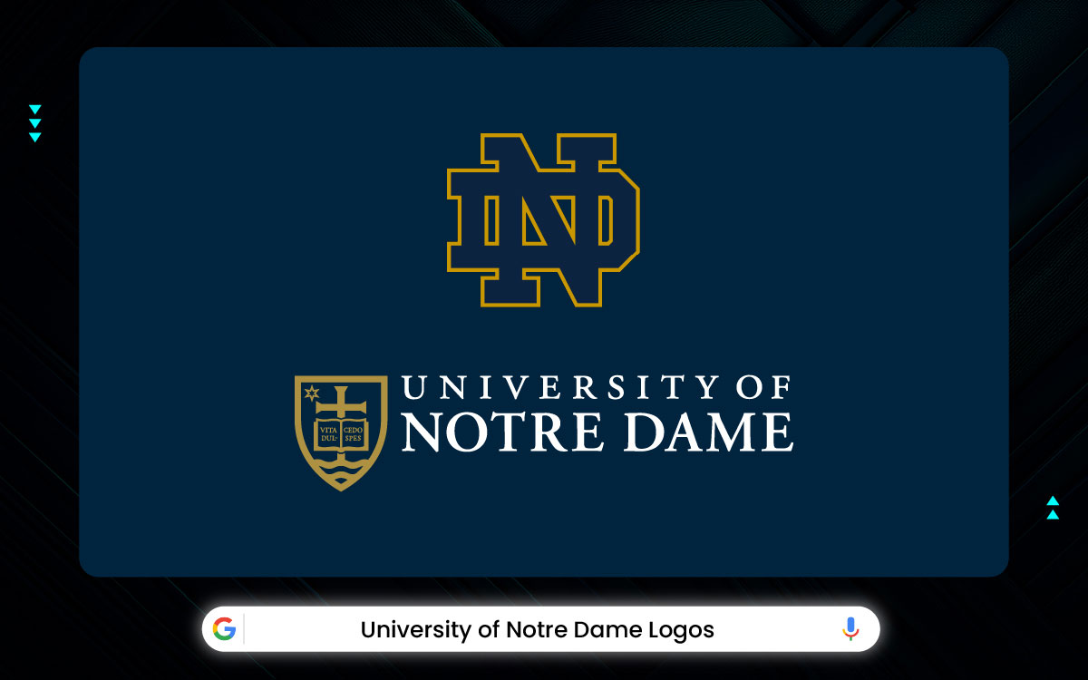
The University of Notre Dame has two main logos: the academic seal and the ND monogram. Both reflect the same spirit: a bond between faith, learning, and tradition. The university began in 1842 with Rev. Edward Sorin. It grew from a small mission into a name known around the world. Through it all, the logos carried the same meaning.
The academic seal feels calm and complete. Every part fits carefully. At the center, a cross and an open book show faith and knowledge together. The book bears the Latin words Vita, Dulcedo, Spes, meaning “Life, Sweetness, Hope.” They show that learning is guided by belief.
A six-pointed star honors the Virgin Mary, Notre Dame’s namesake. Sailors once called her the “Star of the Sea” for guidance. Here, she guides students through the wide sea of learning. Wavy lines below represent the twin lakes near campus, keeping the design grounded.
Blue and gold were chosen with care. Blue stands for wisdom and trust. Gold represents light and the Golden Dome. The Garamond-style letters feel both graceful and strong. The seal is formal, yet warm.
The ND monogram is bold and connected. It shows unity, strength, and tradition. It drives the spirit of Notre Dame athletics. One logo feels sacred, the other strong, but both share the same heart.
These best university logos do more than mark a school. They show that true greatness comes when values, knowledge, and faith work together.
The American University logo looks simple, but it’s smartly designed. The square is split into red and blue halves, giving it order and pride. A white “A” and “U” overlap in the center, joining the parts into one strong image. It feels confident, modern, and clearly American.
The university began in 1893 through an Act of Congress. Over time, it became known for service and policy. Its modern logo reflects that legacy. It’s simple, yet meaningful. The typography looks scholarly but stays clean for digital use.
Red shows energy and drive. Blue adds calm and logic. White links them, like the university connects ideas and people. The logo feels formal, yet friendly. It fits perfectly for a school in Washington, D.C., where intellect meets national vision.
What makes it stand out is how little it tries to show. No crests, no buildings. Just shape, color, and meaning. The square feels steady, the letters confident, the colors patriotic yet calm. It blends history with progress, intellect with service. The result feels timeless. It proves that simplicity, done right, can be powerful.
The Cambridge logo carries layers of history. The shield is split into four sections, each with its own symbol. Three sections show golden lions. They are bold and royal, tied to England’s heraldry. The fourth section has a cross with small ermine marks. These reflect faith and the university’s roots in learning.
The colors stand out. Red dominates, strong and striking. Gold details shine with elegance. Black adds depth and keeps the design grounded. Together, they create balance and contrast.
This richness shows that the university values heritage and continuity. Every corner tells a story. Looking at it is more than seeing a school mark. It is seeing tradition, resilience, and academic pride.
The Cambridge logo doesn’t whisper. It speaks with confidence. Every lion, line, and color is intentional. It doesn’t aim for simplicity, yet nothing feels heavy. That balance gives it charm. It shows that tradition isn’t about staying still. It’s about standing strong while time moves forward.
The Yale logo has a layered design that blends tradition with clarity. At its center is a shield, giving it a classic academic look. Inside the shield is an open book, an old symbol of learning. What makes Yale’s logo unique is the Hebrew phrase, “Urim v’Thummim.” This lettering adds meaning, showing that the book represents light and truth, not just knowledge.
The surrounding border shapes keep the mark symmetrical and readable even at a glance. Color is also a big part of Yale’s design. The blue shade, now known as “Yale Blue,” became almost an identity by itself, instantly recognized without extra detail. Designers often note how the typeface works with the shield: it’s not overly decorative, but sharp enough to convey authority.
Yes, Yale’s logo feels calm but sure of itself. The Hebrew text adds spirit, the blue adds memory. It’s faith and intellect sharing space, quietly. You can tell it’s not chasing logo design trends. It’s built to last- simple, steady, and full of meaning.
Yale’s logo is special not just because of how it looks, but because of what it stands for. The shield and open book make you think of learning and school. The Hebrew words add a deeper meaning, linking smart thinking with the spirit. The calm Yale Blue color ties everything together. It feels strong and trustworthy. The logo doesn’t need bright colors or fancy designs to stand out.
The Stanford logo feels fresh because it doesn’t have a crowded seal or heavy crest. The main part is the redwood tree, which works as a natural symbol. The tree’s shape is simple, tall, and easy to recognize. This makes it stand out on things like shirts, websites, and signs.
The color, called “Cardinal Red,” stays the same everywhere. When it’s paired with white space, the logo looks bold and modern. Designers also like how the tree mixes natural detail with clear lines. This means it still looks good even when it’s small.
Some versions of the logo add an “S” around the tree. This makes it flexible. The university can use it for sports, classes, or online platforms while keeping the same look.
Overall, the Stanford logo feels strong. It uses one symbol—the tree—to create a lasting design. The tree represents growth, strength, and belonging. It feels real, like it earned its spot. No shields or extra decorations, just simple confidence. It stands tall without showing off. This logo is a great example of a clean, thoughtful university design.
MIT shows its identity through several design layers. The full seal carries many symbolic details. On one side, a scholar is holding a book. On the other side, a worker with a hammer. Together, they represent “Mind and Hand,” the institute’s core motto.
The MIT seal looks old and fancy. It is symmetrical and full of tiny details, kind of like an old coin. It looks great on diplomas or big prints. But on computers or phones, it’s hard to see clearly.
That’s why MIT also has a simpler logo. The bold “MIT” letters with vertical color bars are modern and creative. The bars kind of look like circuits or building blocks, which is perfect for an engineering school.
MIT uses both logos in a smart way. One shows its history, the other works well in today’s digital world. This shows that MIT cares about design and knows how to use it for different purposes.
The two university logos feel like two sides of MIT. The seal honors the past. The block letters look toward the future. Together, they are serious but curious, classic but full of energy. You can almost see the ideas and inventions happening inside the logo. It’s a clear example of how a university logo can evolve from old-fashioned to modern.
Look at Berkeley’s seal, and you’ll notice balance and precision. A circular frame holds a torch and an open book. The torch stands for knowledge and guidance. The book hints at learning that never ends. The blue and gold show prestige without feeling distant.
Notice the symmetry. It gives a sense of stability and trust. The typeface is formal but easy to read, fitting with other professional university logos. The spacing and proportions feel intentional. A logo like this asserts identity quietly, without shouting.
Even the small details matter. The flame placement, the letter spacing, they all create a gentle rhythm. The seal blends tradition with approachability. It shows how a classic design can tell a story that lasts decades. It is deliberate but welcoming, serious but human.
What stands out most is how every detail has a purpose. The torch guides, the book represents knowledge. Blue and gold feel steady, not loud, giving clarity and warmth. The spacing works with the shapes, keeping everything balanced and readable. This design builds order through meaning, not decoration. It reflects strong branding for the university.
The phoenix grabs attention right away. Flames wrap around the bird, showing rebirth and renewal. Every line is deliberate, detailed, yet easy to see. Red and black bring energy and authority while keeping it formal. The circular border focuses the movement and gives structure to the bird.
Notice the typeface. It matches the university crests. Flames usually feel wild, but here they guide your eye naturally. A logo should tell a story without words. This rising bird shows resilience and transformation instantly.
The flames and circle together create movement, but in a controlled way. Every part adds meaning. That’s why the logo feels alive, yet balanced. It’s elegant, expressive, and fits the values it represents.
Chicago’s logo shows how structure can manage motion. The phoenix seems active, but the circle keeps it contained. The flames draw your eye to the center. Red brings intensity, black adds stability, and together they hold the design. It’s a clear example of visual control supporting emotion.
Princeton’s shield feels bold and structured. The orange and black colors balance energy with authority. Inside, the heraldic symbols nod to history and tradition. They give the logo a sense of legacy.
The typeface pairs well with the formal shield. It stays readable and clear. The contrast between orange and black grabs attention while keeping the tone serious.
The layout guides your eye from top to bottom. It creates a natural hierarchy. A logo should be structured and memorable. The medieval references suggest intellect and credibility.
Spacing, proportion, and symbol placement make the shield feel complete. Every choice, from color to spacing, has a purpose. The medieval influence shows legacy, intellect, and credibility. This makes the logo timeless and effective for higher education.
Princeton’s logo is a study in organized tradition. Orange and black balance each other. The shield keeps its historical roots. The simple layout keeps it clean. The serif type unites the design and gives it an academic tone. Everything feels measured, clear, and consistent.
The ginkgo leaf in the University of Tokyo logo is more than just a shape. Its design shows growth, strength, and knowledge at the same time. The veins are arranged with care, giving the logo balance and structure.
The leaf’s symmetry makes it feel stable and orderly, yet still natural. The golden-green color stands for wisdom and longevity. Clean lines and good spacing keep it readable and elegant without clutter. Every part, from the proportions to the stroke weight, feels deliberate.
In short, the logo subtly captures growth and the lasting reputation of the University of Tokyo.
The stars in this logo really set the tone. The Southern Cross immediately shows location, identity, and guidance. The shield and book suggest protection and knowledge.
The blue and gold colors feel prestigious and professional without being too strong. The star arrangement guides the eye across the emblem naturally. The logo balances symbolism and readability very well.
Shields in the best university logos often show trust and durability, and this one does it perfectly. Careful spacing and alignment make it feel organized while still interesting. It blends tradition and modernity, showing that scholarly excellence can be approachable.
Melbourne’s logo, for example, uses the Southern Cross for location and guidance. The shield and book show protection and learning. Blue and gold feel professional but not stiff. The stars guide your eye, and the spacing keeps it readable and balanced. It combines tradition with clarity, making scholarly values feel welcoming.
The University of Cape Town logo is smart. It hints at the city and its culture. The curves suggest mountains and ocean waves at the same time. It shows the landscape without being too literal. The flowing shapes also feel inclusive and calm.
The colors are simple, mostly black and gold. They add elegance without being loud. The bold letters balance the curves. This keeps the logo clear and easy to read. The shapes and text work together to create rhythm and flow.
The logo feels alive and balanced. It represents the city’s coastal heritage, cultural unity, and academic strength. Every part fits naturally. In the end, it is simple, modern, and meaningful.
The Sorbonne University logo is classic and formal. The round emblem with clear lines shows it is a structured, traditional institution. The main icon reflects the university’s heritage and French academic prestige. Look closely at the details in the emblem. They feel ceremonial and suggest knowledge passed down through centuries.
The typography is chosen to match this historic identity. The typeface and emblem work together, making the logo formal but still approachable. The simple color palette keeps it modern and easy to read. You can sense academic elegance without it feeling crowded.
The circular shape hints at inclusivity and continuity. Overall, the logo communicates respect, learning, and intellectual authority. People instantly see it as a serious, reputable university. At the same time, the design remains timeless. The Sorbonne logo is a neat mix of legacy and clarity.
It shows how to balance heritage with clarity. The circular emblem and typography feel ceremonial, yet the clean lines make it readable. Every choice, from spacing to symmetry, carries meaning. You feel the history, but the design never feels heavy. It proves a logo can honor tradition while still feeling fresh.
The University of Toronto logo is full of meaning. Notice the beaver. It is Canada’s national animal and stands for hard work. The shield and book show learning and academics. The shield is symmetrical, giving a sense of balance and stability. The typography adds a feeling of tradition and seriousness.
At the same time, the mix of animals, books, and the heraldic shape keeps the logo interesting. The deep blue color shows trust, wisdom, and authority. It also reflects Canadian pride while staying professional. The design is simple but detailed, making it feel symbolic. You can see how national identity and education come together naturally.
The logo communicates credibility and heritage without feeling overwhelming. It is recognizable and meaningful. It stays in the memory and makes the university look established and confident. The University of Toronto logo combines culture, knowledge, and design smoothly.
Toronto’s logo is all about harmony in symbols. The beaver, the shield, and the book work together in a steady, purposeful rhythm. The deep blue inspires trust, while the heraldic accents tell a story. Every element supports the identity, making the emblem feel grounded, meaningful, and visually striking.
The National University of Singapore Logo mixes tradition with modern style. First, notice the lion. It stands for Singapore, courage, and strength. Next, see the shield and geometric shapes. They give a clean, modern feel. The typography is professional but easy to read.
The colors are simple yet bold. They show confidence and stability. Symmetry and balance reflect Asian design values. The logo feels formal but is easy to recognize. Heritage and innovation come together here. The emblem works well in both small and large sizes.
It feels iconic without being complicated. The NUS logo conveys authority, pride, and forward-looking education. It is simple but meaningful. Anyone can recognize it and link it to Singapore’s top university.
NUS nails simplicity without losing personality. The lion shows strength. The geometric shield organizes the space. The sans-serif type keeps it readable. Everything aligns to create a design that is modern and respectful. It is clear, versatile, and memorable. This logo proves that minimalism can carry depth and purpose.
The University of Edinburgh logo feels very traditional. Start with the crest. It immediately hints at history and heritage. The central shield shows an open book. This clearly stands for learning and knowledge. Around it, you’ll see other symbols, like the castle and saltire. They show Scottish identity and pride.
The typography adds a formal touch. It also makes the logo feel more academic. Overall, the logo balances detail with clarity. The emblem is rich, yet still easy to read. Over time, it has become instantly recognizable. The crest suggests authority and longevity.
Even so, it doesn’t feel old-fashioned. The layout is careful and structured. Symmetry and hierarchy guide the eye naturally. The blue colors add elegance without being too much.
The Edinburgh logo blends tradition, identity, and scholarship in a simple visual story. The shield, book, and Scottish symbols together tell a story of heritage and learning. The deep blue and gold add elegance, while the layout keeps everything clear. It feels grounded and strong, timeless but never heavy or outdated.
The ETH Zurich logo stands out for its clarity and simplicity. The bold letters “ETH” use modern typography. The geometric layout adds a sense of stability and order, reflecting Swiss design principles. The spacing makes the logo easy to read at any size, from a website to a building sign.
The black color gives authority and professionalism without being distracting. The design avoids extra symbols or decorations. Step by step, it communicates efficiency, technical skill, and reliability. Its simplicity also makes it versatile across different media.
The logo feels strong and memorable. Clean lines and balanced proportions create trust. In short, ETH Zurich’s logo shows that a simple design can convey precision, innovation, and global recognition.
Minimalism speaks loudly here. Bold letters, geometric structure, and black tones convey reliability and clarity. Every detail is intentional, with nothing to distract. The logo proves that simplicity can communicate professionalism, innovation, and worldwide appeal.
The University of Sydney logo catches the eye with its lion at the center. The lion shows courage, strength, and leadership. Behind it, a shield holds the Southern Cross, a symbol of Australia and national pride.
An open book sits within the design, showing learning and scholarship. The typography fits the heraldic style and adds a formal, academic touch. Yet the elements are well arranged. The symmetry and spacing make the logo clear and easy to read.
Over time, the lion, shield, and typography have formed a recognizable emblem. Gold and blue colors add elegance and contrast. The logo communicates history, authority, and knowledge. It is striking and meaningful without being complicated.
Sydney’s logo tells a story through design. The lion, shield, Southern Cross, and book form a balanced, purposeful composition. The gold and blue palette adds sophistication. The typography reinforces the academic tone. Together, the elements show strength, knowledge, and identity, making the emblem memorable and visually appealing.
Educational institution branding requires a logo that does more than just look good. It’s about capturing a story in a single mark. The logo should feel honest. It should feel right to students, staff, and alumni. You need a logo that has meaning, the right colors, strong technical design, and a look that lasts.
Here’s how to create a university emblem design that works:
To begin, dig into the school’s past. What stories sit behind the name? Who founded it and why? What local or cultural motifs matter here? You look at a logo that means nothing will fade. A logo with roots will stick.
On that note, archival research also gives you unexpected options. A minor campus motif can become a fresh visual hook. In short, research gives the design a reason to exist, not just a pretty face.
All right, color sets the mood before words arrive. Blue often suggests trust and scholarship. Red can signal energy and boldness. Gold hints at prestige and ceremony. Then again, muted tones can feel modern and calm.
In practice, color tells personality. Is the school forward-looking or tradition-rooted? The answer guides palette choice. More than that, color builds emotional memory. Over time, people connect a shade with the institution.
Here we go, the best university logos must live everywhere. From signage on a façade to a favicon in a browser tab. So clarity is non-negotiable.
Yes, Mockup designs are your friend. Try the mark on email headers, student cards, merch, and courses pages. Check both dark and light backgrounds. Look how it prints on textured cloth or embossed paper.
Also consider single color or reversed versions. A good logo should work in full color, mono, and one-color outline. In short, scale and flexibility make a logo useful day to day. When a logo holds its ground everywhere, it builds trust.
To wrap up, aim for minimalist university logos that bridge eras. Younger audiences lean toward minimal forms. Alumni often prefer familiar cues. So, why not keep the essence but shift the language?
Ask yourself: will this still feel right in ten years? If the answer is shaky, simplify. Timeless design often equals restraint. At the same time, don’t freeze the logo. Plan for subtle refreshes in future brand reviews.
Finally, remember identity is lived. The mark will gain prestigious university symbols meaning through events, ceremonies, and alumni stories. Design for that growth, and the logo will grow with pride.
Now, we’ve reached the end of our review with the best university logos. As we’ve seen, a logo is more than just an image on a page or screen. Great university logos feel timeless. They hold tradition while still looking modern. That balance is tricky, but when it works, it quietly earns respect.
Details matter more than you might think. A single curve, the space between letters, or the shade of a color can change everything. Each small choice builds perception, pride, and connection.
Top university emblems reveal how a school presents itself to the world. They are deliberate, subtle, and lasting. The main lesson is that a good logo tells a story without saying a word.
If you want a custom university logo, consider Graphic Design Eye’s custom logo design service. Our logo designers know how to capture your story, values, and vision in a single logo.
A strong logo does more than represent a brand. It becomes its silent, powerful voice for years to come.
We wish you the best in your journey with us!