Yup, fonts are powerful. They say so much without words. For example, a bold font feels strong and confident. A softer font feels warm and welcoming. It’s amazing how the right font can make your brand feel real.
When designing a logo for your brand, you need to take a lot of things into consideration. For instance,
Among them, typography is an important element of logo design that depicts the brand name along with a right typeface. Well, it’s not just about design – it’s about connecting with people.
When you pick the wrong font, you’ll feel it. It’s like wearing shoes that don’t fit – uncomfortable.
I’ve been there, staring at a design, knowing something’s wrong but not sure what it is.
But when I found the right font, everything made sense. When you find the right one, it feels perfect.
Now, let’s dive into some of the best logo fonts that could be the perfect fit for your brand!
The best logo fonts aren’t just pretty. They work like magic. With kerning (space between letters) and tracking (space between words), they keep things smooth and balanced.
They have vector scalability, so they stay sharp on tiny screens and giant billboards.
What’s more, variable weights give flexibility, while glyph alternates add a touch of charm.
These top 34 best logo fonts for 2025? They’ve got it all. Whether you need precision, flow, or timeless style, these fonts will tell your brand’s story beautifully. Let’s explore them, one by one!
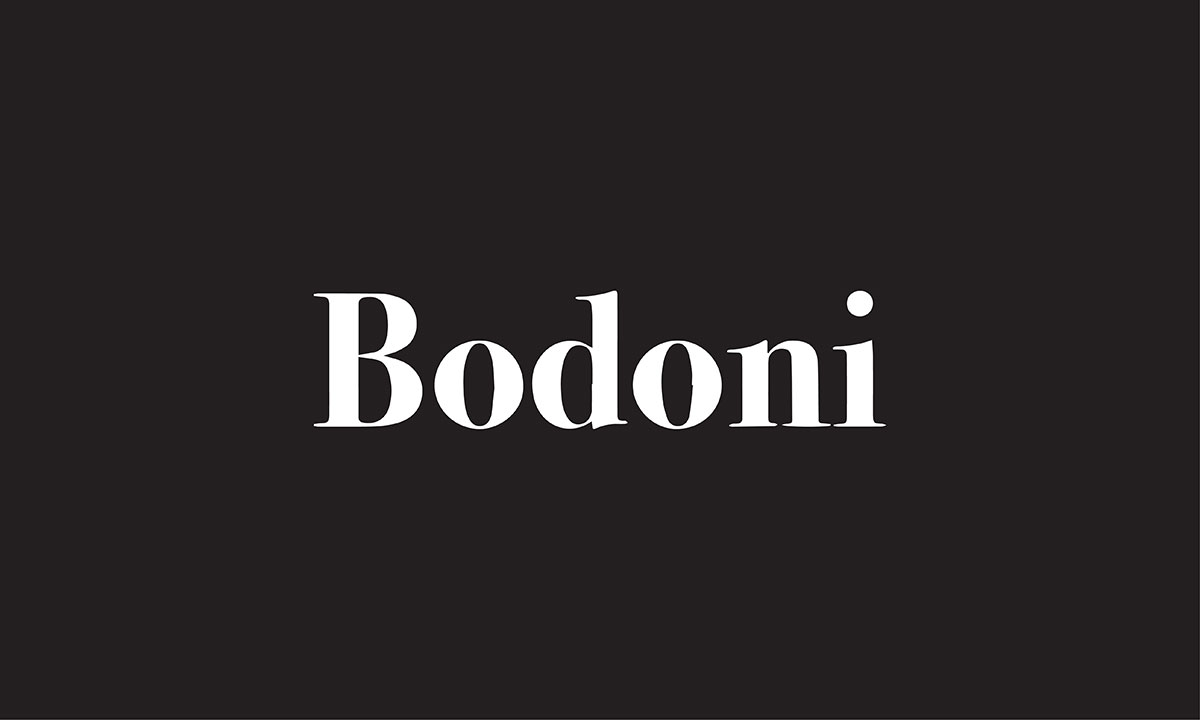
Bodoni is a beautiful serif font. It’s well-known for its classy and elegant look.
This font was made by Giambattista Bodoni. It has thick and thin strokes that make it stand out. The letters are sharp and stylish.
If you want your logo to feel luxurious, Bodoni is a great choice. It’s perfect for high-end brands.
It adds a sense of elegance and strength. If you love serif fonts, Bodoni might be just what you need for your logo.
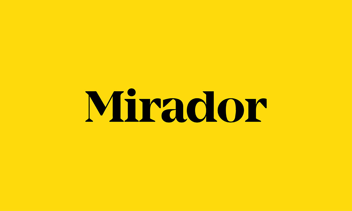
The Mirador font is designed by Rene Bieder, one of the most powerful and versatile neoclassical fonts that you can use for any corporate and editorial purposes. If you are looking for a reliable typeface for your logo which has a traditional look yet is timeless.
Mirador font has 10 weights with matching italics. You can choose from its 20 different styles including heavy, bold, extra bold, light, regular, book, semi bold, etc.
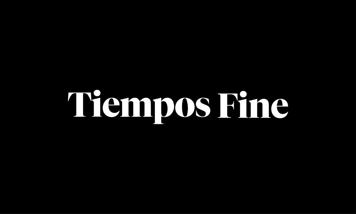
Large modern serif of Klim Type Foundry's popular Tiempos family.
The typefaces are large, sharp, and have 12 different styles including semi-bold italic, black, black italic, light italic, bold, etc.
If you want to keep your logo font in serif italic style, this can be a good option.
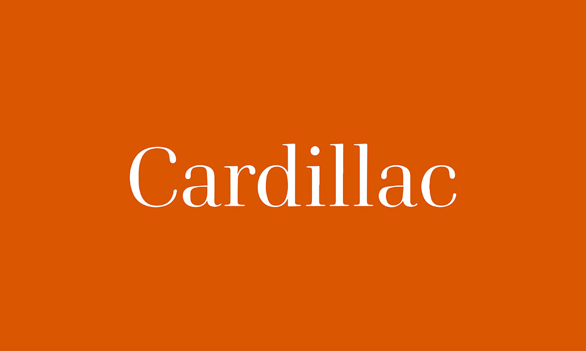
Cardillac is a unique font made for logo design. It’s a modern serif font with 14 different styles to choose from.
The bold styles work well for logos that need to stand out. They give a strong, professional look.
Cardillac’s clean, modern design makes it perfect for any brand that wants a fresh, stylish feel.
For logos with a lighter, more elegant touch, you can choose the light styles. These are great for logos that need to be sleek and subtle.
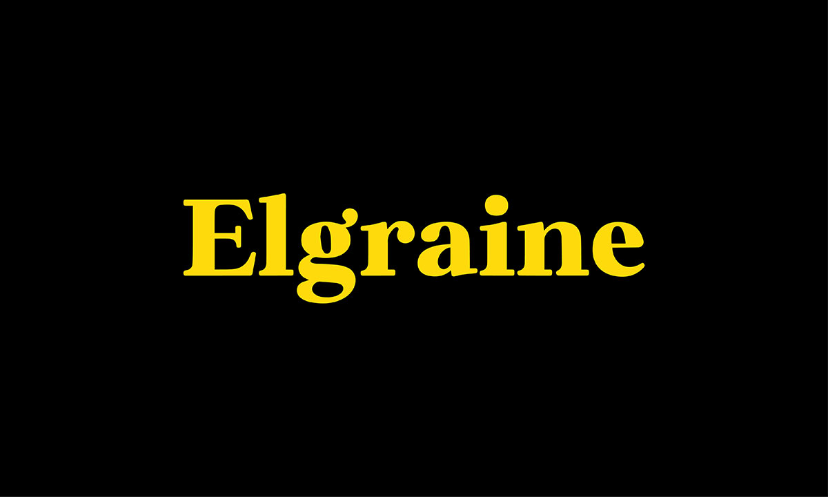
Elgraine is the best font for logos. It comes in 18 styles, from thin to bold, with italics. This makes it flexible for any logo.
It mixes classic serifs with a calligraphic touch. This gives it a unique, elegant feel. Elgraine will make your logo stand out.
For a bold logo, choose the heavy strokes. It’s perfect for logos that need to be remembered.
If you want something strong and stylish, Elgraine is a great choice.
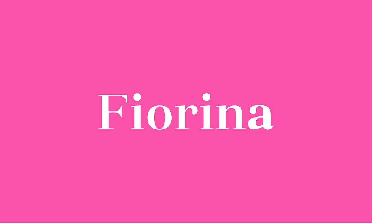
Fiorina is inspired by the classic Didone style, which gives it an elegant and clean look.
The font offers many styles, ranging from moderate contrast to bold, high-contrast designs. This makes it flexible for different types of logos.
If you want your logo to stand out with sophistication, Fiorina is a great choice.
Its sharp, sleek lines give a strong, professional feel. Whether your brand is luxurious or modern, Fiorina brings a touch of class.
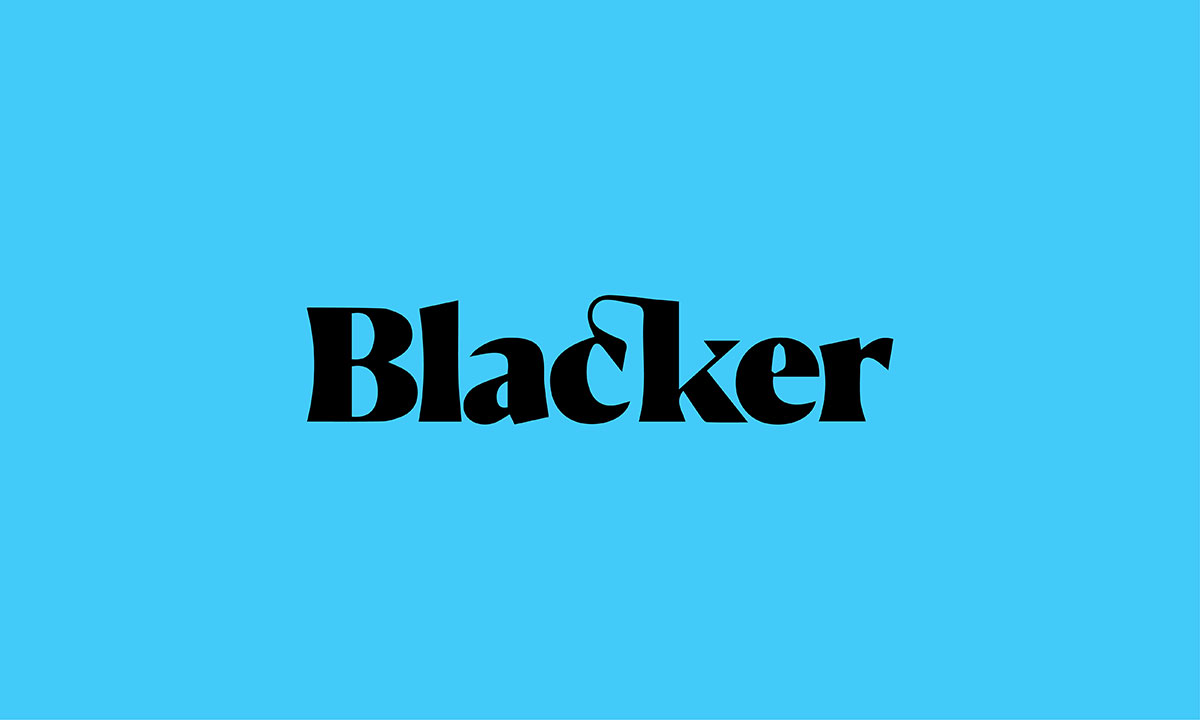
Blacker and Blacker pro comes with traditional serif strokes in six styles with 69 weights and was developed by zetafonts.
It has two different categories which are the display version and the text version.
The typeface includes high contrast, condensed, display, text, and titling strokes so you can easily choose the best option for your needs.
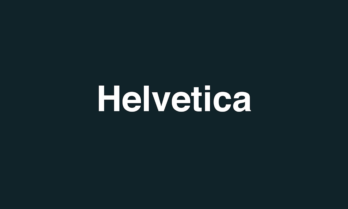
Here is Helvetica, one of the best logo fonts, developed in 1957. This is the most used sans serif font in modern days designed and presented by Max Miedinger, and Eduard Hoffmann.
It comes with an oblique rather than italic style, a common feature of almost all grotesque and neo-grotesque typefaces.
Whether you have the full brand name logo or a few letters, Helvetica is always a good option for brand logos and names.

Another common sans serif font is free and has a strong typeface appearance in modern typography.
Futura is a geometric sans serif which means the letters on this typeface are based on geometric shapes, especially the circle.
Although it is lighter, it derives a clean, catchy result no matter where it is used.
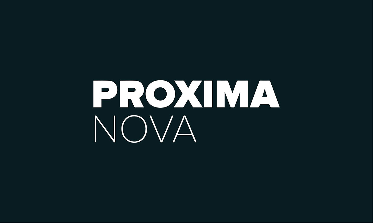
A huge font family that includes 16 fonts and 7 weights designed by Mark Simonson.
It is considered the best font for logo, web and print media designs.
However, you can use its bold and heavy strokes for logo design if you want to use modern typefaces.
Also, you can combine it with other fonts to make a better visual attraction with your design.
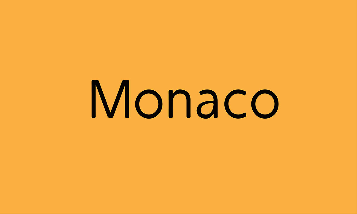
Based on the monospace theory, this distinguished typeface was designed by Susan Kare and Kris Holmes.
It was originally released by Apple with its Mac operating system and was designed to be used with the Macintosh Programmer's Workshop IDE.
However, it is now used in logo design, and banner design to make them distinctive and make a modern appearance.
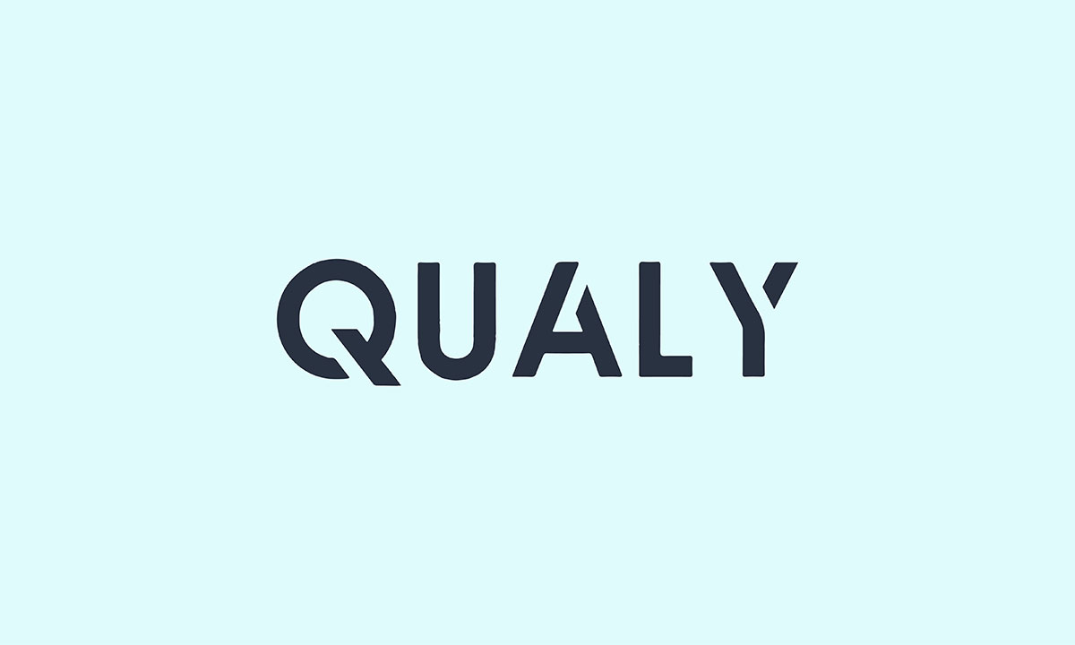
Qualy is a clean, simple, unique form of the typeface which is perfect for making an outstanding logo for your brand.
If the brand theme matches the font style, it can make a great logo for the brand.
The best font for single-letter logos because each letter of this typeface has a unique appearance that can easily make sense of the brand logo.
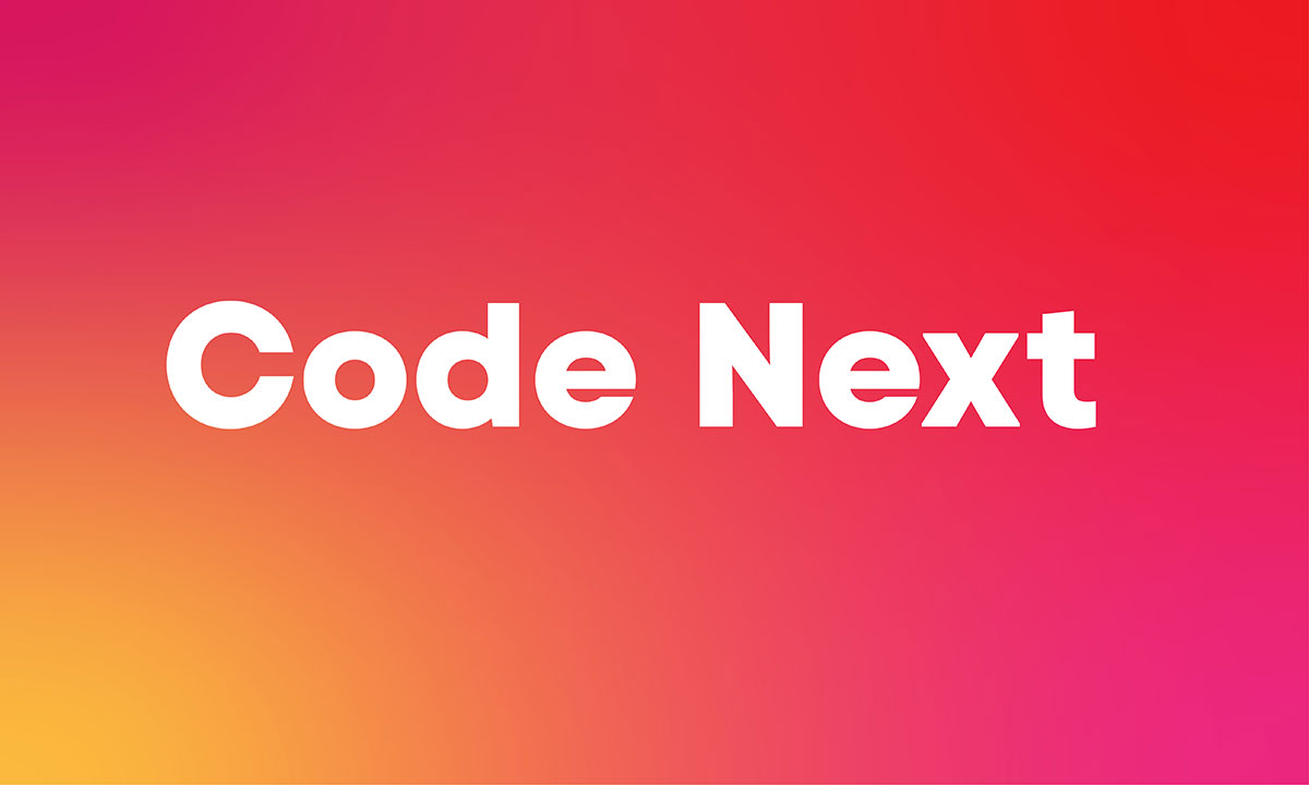
Designed by front fabric, code next is a geometric typeface that includes 22 weights, 11 uprights, and 11 italics.
Also, the versatile font family has 2+ variable fonts, more than 12870 glyphs, and extensive open-type features.
Code next’s heavy strokes are best to use for logo design and all other display materials.
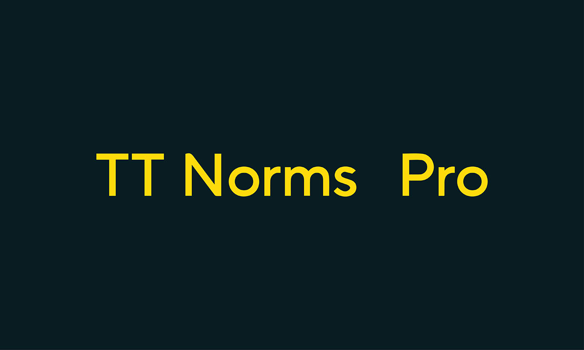
TT Norms is a modern, geometric sans serif font. Its clean shapes make it great for logos. It was created in 2017, so it feels fresh and professional.
The font has 18 styles. There are nine weights like Regular, Bold, Thin, and ExtraBlack. Each weight also has italics, which gives you more options.
This variety is perfect for logos. Use lighter weights for simple and clean logos. Pick heavier weights for bold and eye-catching designs. TT Norms gives logos a modern, stylish look. It makes them stand out with confidence.
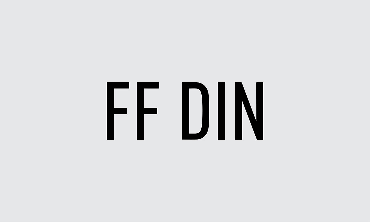
FF DIN is a geometric sans serif font. It was made in 1995. Its clean design is great for logos. It has 20 styles and weights, from Light to Black. You can choose lighter weights for soft logos or bold ones for strong looks.
This FF DIN font is perfect for clean, simple designs. It keeps your logo clear and easy to read.
FF DIN is a great alternative to fonts like Github. It’s available in Adobe and Google Fonts, so it’s easy to use.
With its many weights and clean style, FF DIN is a top choice for logos. It makes your logo look sleek and professional.

When thinking about modern typefaces, sans serif fonts are a top choice. They give logos a clean, simple, and fresh look.
This particular font was designed by Adrian Frutiger. It was created as an alternative to Futura, offering a unique but equally stylish option for logo design.
It comes in three weights, giving you flexibility. Whether you need a light, bold, or medium style, this font can fit your logo's needs. It's modern design and simple lines make it perfect for logos that want to look both professional and approachable.
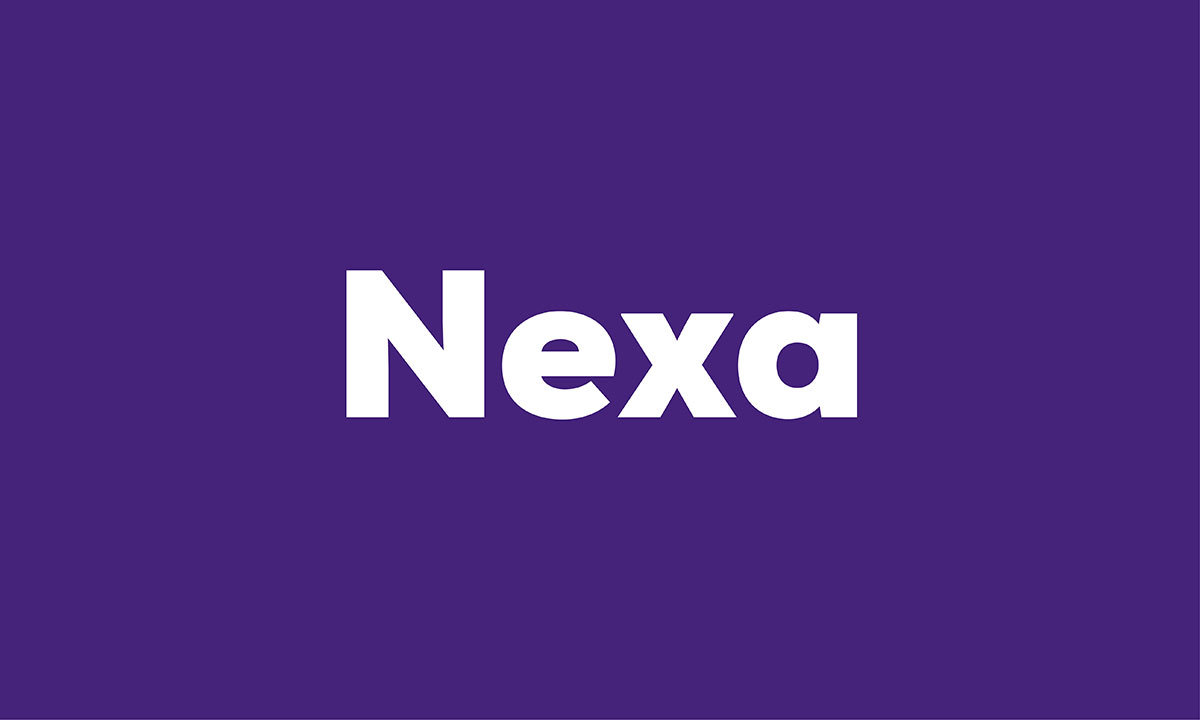
Nexa is a bold geometric sans serif font. It’s great for logos that need to stand out. Its clean, strong lines work well for headlines and print.
The Nexa font family has 9 weights and 36 styles. You can pick the perfect one for your logo, from thin to bold and heavy.
Nexa is easy to read, no matter the size of your logo. This makes it a top choice for clear, professional logos.
With its modern style and strong readability, Nexa is perfect for brands that want a bold, clean, and versatile logo font.
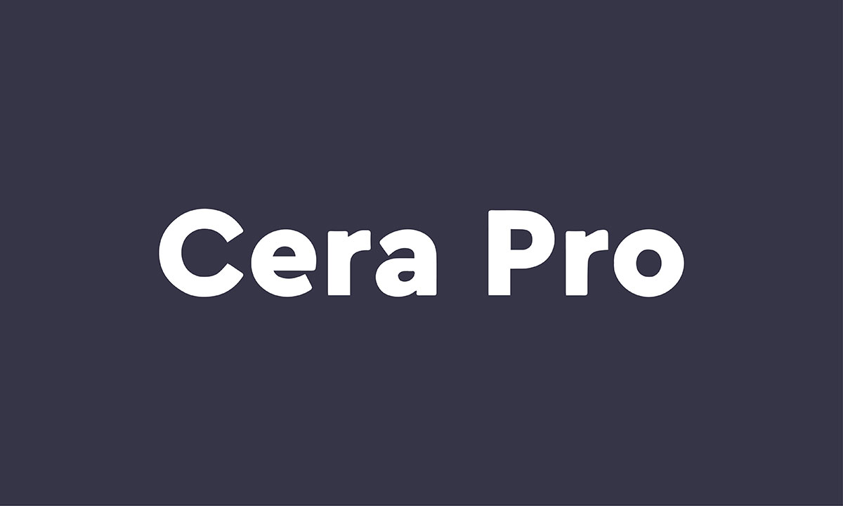
Cera Pro is a strong sans serif font. It’s perfect for logos, especially for titles and headlines.
Designed by Jakob Runge and published by TypeMates, it has a modern and stylish look.
Cera Pro works well both in print and on-screen. It’s made to be versatile and stand out.
It comes in six weights: thin, light, regular, medium, bold, and black. Each weight has a clean, geometric design, making it accurate and simple.
With its sleek design and range of options, Cera Pro is a great choice for logos that need to be bold and clear.
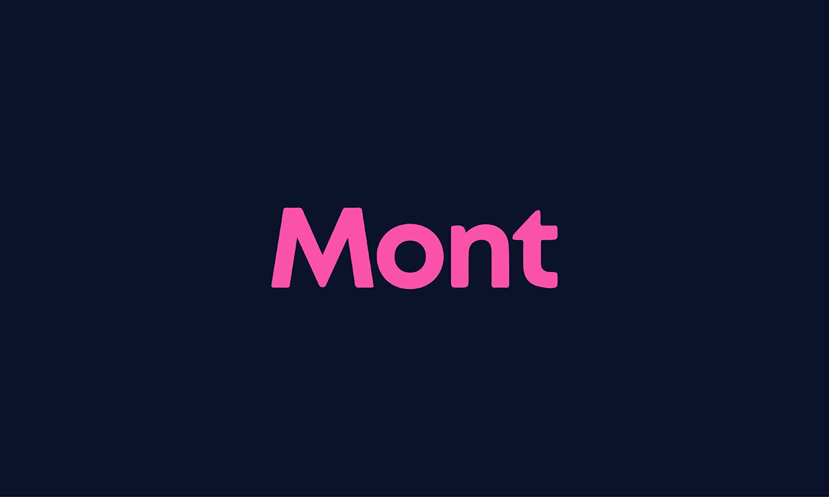
Mont is a family of 20 fonts and is a geometric sans serif with pure elegance.
The font can be used to make things easy to capture, and get a first impression with its bold strokes and the light strokes are best for long text.
Mont includes 10 weights ranging from Hairline to Black with matching italics.
It supports extended Latin (English), Cyrillic, and Greek - more than 130 languages together.

Intro is a bold sans serif font. It is built on geometric shapes. Its structure uses clean lines and consistent angles. This makes it precise and modern.
The geometric base makes it feel sharp and reliable. It offers 8 weights, which is amazing. You can pick lighter weights for soft logos. Or choose heavier ones for bold designs.
This variety gives so much flexibility. Intro fits different styles easily. But its bold strokes are where it shines. These stand out in large formats like covers or signs.
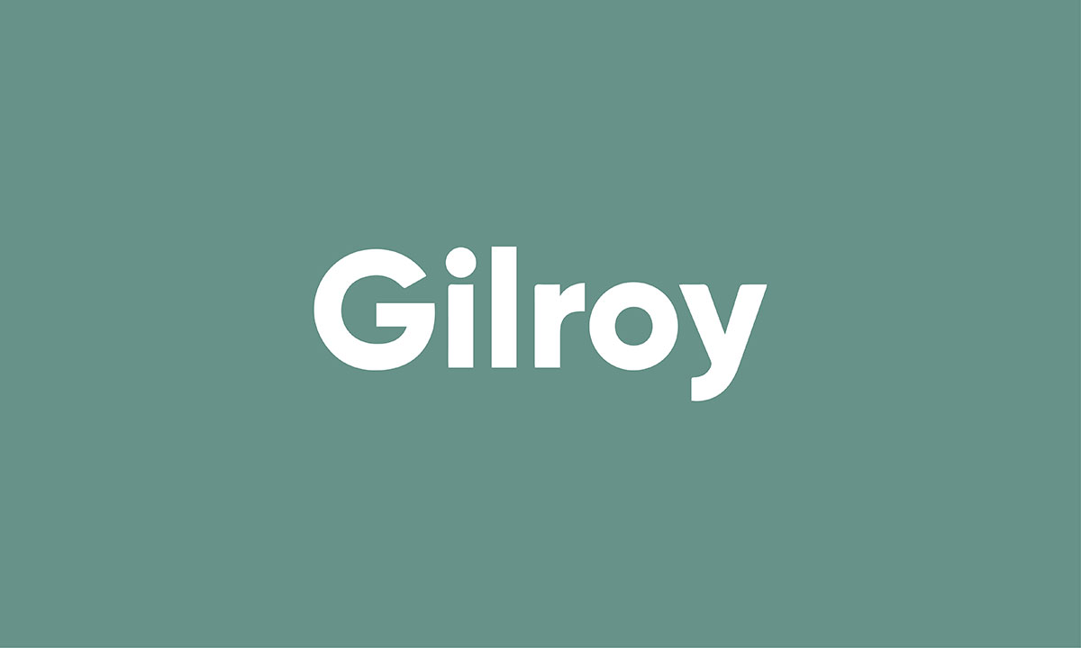
Gilroy is a font that feels both strong and graceful. With 20 weights, including 10 uprights and matching italics, it lets your logo shift between bold and light, like a quiet breeze or a powerful storm.
It speaks many languages, even Cyrillic, making it perfect for reaching across the globe. With fractions, tabular figures, and arrows, it adds magic to logos with numbers and symbols.
Gilroy’s ligatures, like “fi” or “fl,” dance together, smoothing the edges of your design. Its clean, geometric shapes keep your logo clear, no matter how big or small.
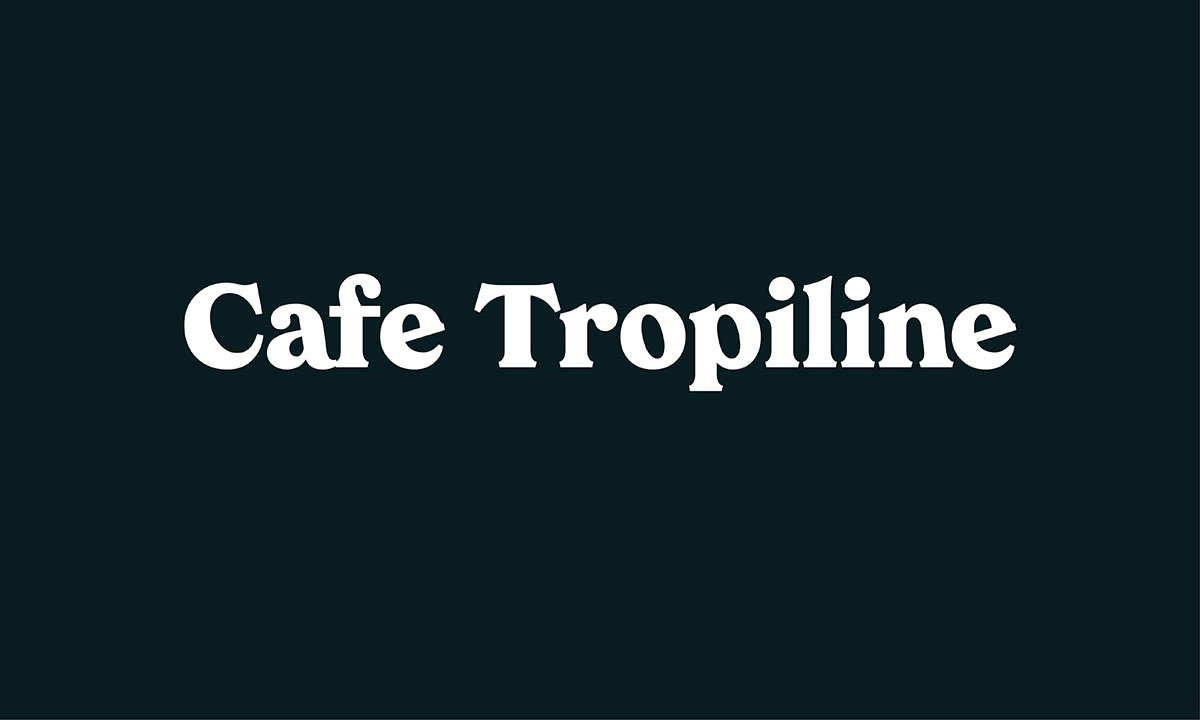
Formal script font created by Cahya Sofyan and published by Studio Sun & Co.
Cafe Trop-line is one of the coolest Hawaiian fonts that seem ideal for specific brand logos and other branding materials.
It can be used in magazines, book covers, and advertisements if you want to make a good first impression.
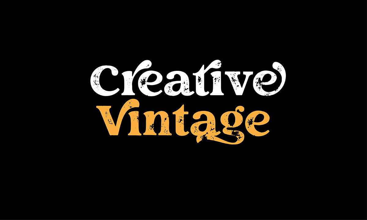
If you are a vintage lover and want to make your brand logo look vintage and retro yet modern, then this would be the best font for logo.
The alphabets of this modern serif typeface look extremely unique and interesting.
It has two different types which are creative vintage regular and creative vintage draft.
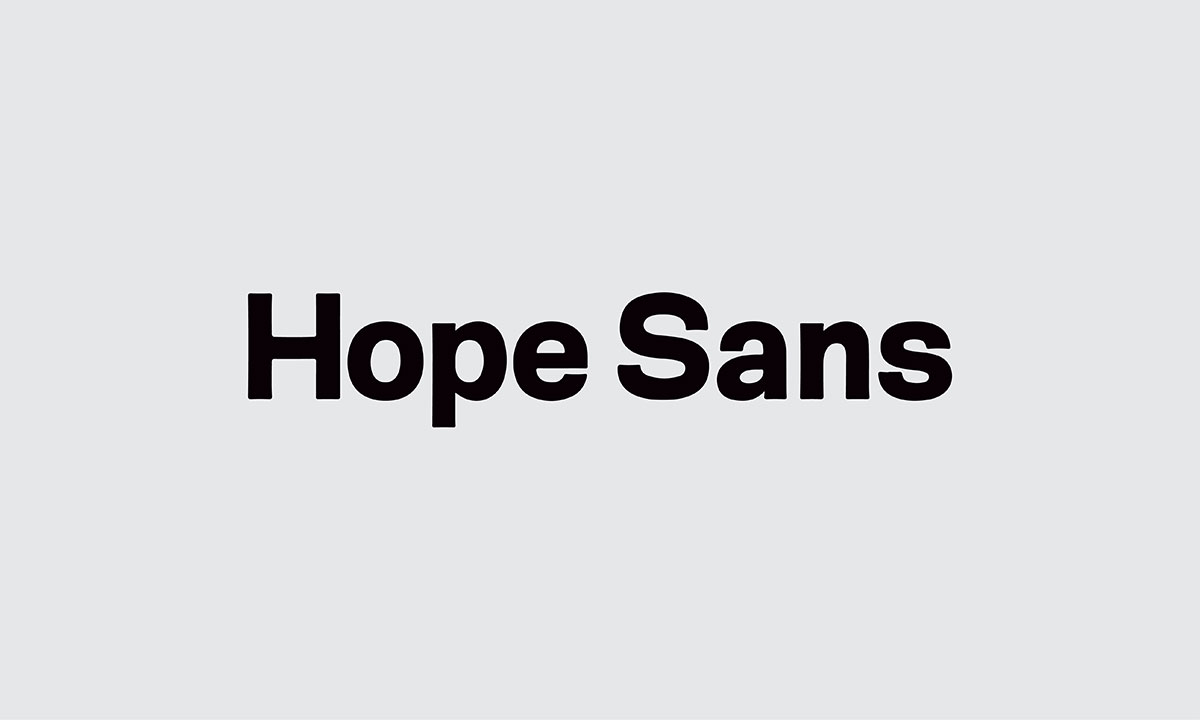
Modern sans serif typeface which is mainly a combination of sans serif and hope sans.
The Hope Sans typeface is a throwback to the type styles of the 1970s which makes a vintage outlook while its sans serif form delivers a clean, minimalist visual typography for any platform.
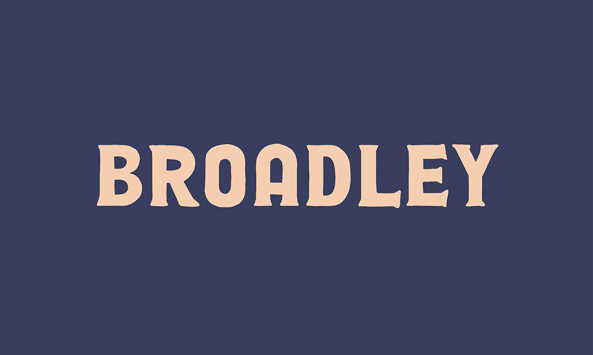
Want to make your brand logo something bold, and attractive while having a retro feeling, you may look for this typeface.
The font Broadley can take your branding to another level.
You can make a strong brand identity by designing your brand name with this typeface.
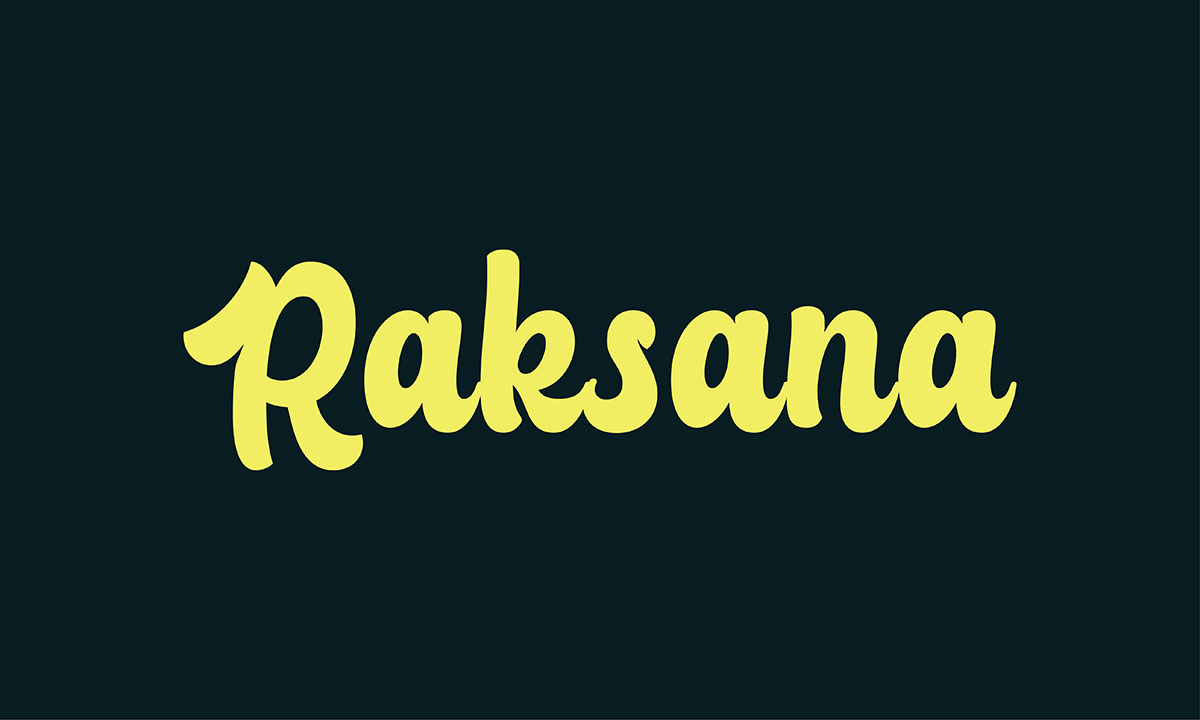
Raksana is a bold script typeface because it represents elegant handwritten alphabets in fine retro style.
Ideal font for vintage brands which need a traditional or classic approach to their audience.
Apart from logo design, the font provides great results when used for product packaging.
If you are going to launch a new product but can't help yourself to find the best logo font for the product name, you can consider Raksana.
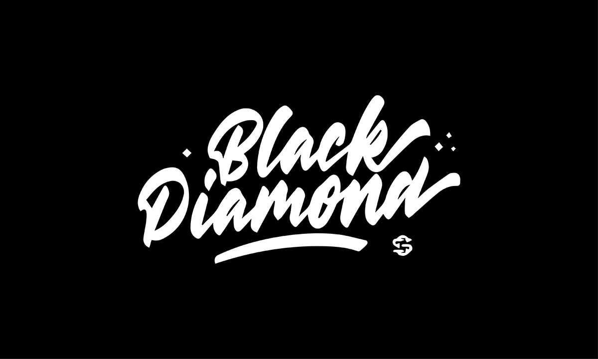
Black diamond font can be used for both formal and informal use.
This handwritten font looks like it is not written but rather painted with a brush and so has a unique feel.
This typeface is so bold, stylish, elegant and of course an exquisite modern look.
You can use it for logo, print design, advertisements, and branding as well.
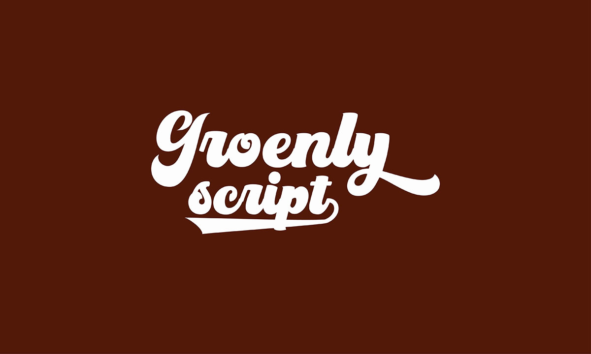
Groenly Script delivers a classic calligraphic style with a retro edge.
You can also call it a cartoon font because the font style is perfect to represent cartoons and animations. It includes 2 styles that you can use to create fun designs.
If you are looking for a calligraphic font style to design your logo, groenly script makes the best sense regarding this.
Chunk Five is bold and strong. It makes logos stand tall and be remembered. Its thick strokes feel solid, like tree roots, bringing trust.
Moreover, sharp edges make it stand out in a crowd. It mixes modern style with a touch of the past. The slab serifs add history and make it easy to read.
Furthermore, Chunk Five stays clear at any size. On a business card or billboard, it never fades. It holds its place with pride. To achieve balance, pair it with lighter fonts. Without that, it might overpower the design.
In conclusion, Chunk Five is perfect for logos that need to be clear, striking, and lasting.
Intro Rust is a bold choice for logos. Its industrial look gives brands a modern, daring vibe.
Plus, the font is flexible, with many weights and styles, fitting all design needs. Next, it shines with clarity. Geometric shapes and organic curves come together perfectly.
It looks great at any size, always clear and strong. The high x-height and wide letter spacing keep it neat and professional.
Moreover, Intro Rust blends straight lines with smooth curves. This mix gives it a timeless, fresh feel. It fits well with other design elements, making it perfect for any platform.
Overall, Intro Rust is both practical and artistic. It’s a great choice for logos that want to stand out and be remembered.
Dubbo – Retro Serif’s tiny strokes at the ends of letters give it a timeless feel. The retro design feels old, yet it has a fresh twist that draws attention.
Next, the letters are balanced. Bold serifs pull you in, while the shape stays neat. It works on everything, from tiny cards to big signs.
Also, Dubbo is versatile. It looks great in print and on screens, staying sharp at all sizes. The spacing keeps your logo clear, even in busy designs.
What's more, Dubbo comes in regular, bold, and extra bold weights. Whether you want a bold statement or a soft touch, it fits your brand perfectly.
Palmour is a font that speaks softly, yet boldly. Its strokes catch the eye, moving with grace. They draw you in, steady but playful. Even in tiny sizes, it stays sharp and clear, never fading.
Next, the crafted serifs whisper elegance. They add warmth to the design, making it feel alive. The tall x-height helps it shine, especially on screens, where every word must stand out.
Each letter fits perfectly, flowing smoothly, like a river through calm lands. The curves in "S" and "R" glide like waves, adding a modern touch, soft but strong.
In the end, Palmour’s charm never fades. It keeps your logo fresh, shining brightly, no matter where it is. Its beauty stays, timeless and true.
FF Blur is a great choice for a logo font. Bold, but soft. Its curves are sharp yet smooth. This mix makes it stand out.
What makes it even better? It's versatile. Whether large or small, it stays clear. The letterforms are condensed, making it perfect for tight spaces.
The spacing between letters is just right. This ensures legibility, no matter where it appears, from a business card to a billboard.
Its geometric structure feels modern, but the soft curves make it warm. It's a perfect blend for a logo that lasts.
"Extra Light Serif Font" is a quiet beauty. It speaks softly, yet it’s elegant. It feels timeless, like a classic story with a fresh twist. The delicate serifs add tradition.
However, the light weight keeps it airy, like a breeze on a warm day. This balance makes it special. It’s both old and new. It’s refined, like an antique with a modern touch.
The space between letters, called kerning, is key. It lets each letter breathe. This keeps the font clear, even when small.
It still shines, sharp and easy to read.
Next, the slant of the strokes adds more depth. It changes the feel, like a breeze shifting the mood.
At times, it feels calm and steady. Other times, it stands bold and ready. The key is to make sure it’s always clear, no matter the size.
Yes, there are many fonts out there. It can feel like walking through a forest, each tree offering something different.
The wrong font can make your brand feel off or forgettable. It just won't fit.
It’s not just about choosing something that looks good. The font must match your brand’s tone and story.
For example, a casual font might not work for a serious brand. A stiff font can make a creative brand feel too cold.
This can leave you second-guessing.
One wrong choice, and your brand may lose its voice.
But don’t worry. The perfect font is out there. Take the right steps, and you’ll find it.
Let’s now look at how to choose the right font for your logo.
If you are on the verge of selecting a typeface for your logo, invitation, or any other print design but can't help yourself to decide which one to choose.
You can learn some basics of typography regarding this. It will help you get the differences between four main types of typefaces which are,
You can find so many subcategories in the study, different weights and textures of fonts, and so many popular fonts since the internet is the home of all free and paid fonts.
Do your research, the more you will go the better you can understand the font theory.
Taking inspiration from similar brands, big fishes and competitors can help you a lot in this regard.
For instance, if you are a tech brand, you can see what font other brands are using.
You can follow them or choose slightly similar but other family fonts for yours.
Consider where you are going to use the typeface.
Is it for a logo or social media advert, business brochure, whatever, you should decide on a font based on the use.
It is because you need to choose bold heavy strokes for social media. For invitations and formal letters, you can choose script font for headlines and light sans serif for the body.
In addition, you should pay extra attention when choosing a logo typeface.
To get the best result, you can discuss with designers to find the right typeface for your needs.
The font style should go with your brand niche and the entire design.
If you are making a product banner for social media or a website, the font should be relevant to the product type.
For example, think it is gaming equipment you are selling, then you should implement a font that could give a gaming vibe to persuade audiences.
If you maintain relevance, the success rate will be higher for the design.
It’s not that you only go for style when selecting font but you should also take care of your legibility.
No one will look at your design if it is not readable. Especially when using script fonts, you need to make sure that brand names and other texts can be easily read from a minimum distance.
Font legibility is no-nonsense as it can make or break success.
Finally, choose a font that includes a versatile font family so that you can take advantage of utilizing various font styles in that family.
Also, make sure that the font is timeless meaning that its acceptance will not deteriorate over time.
Here we are, at the end of our journey on choosing the best logo fonts!
But before you go, remember one thing. Fonts are more than just letters. They are the heart of your brand.
The right font says a lot, but it’s only one part of the story. It must fit with everything else: colors, space, and design. All these pieces should come together to feel just right.
Your logo’s font is not just a choice. It’s the voice of your brand. It speaks to the world.
So, take your time. Try different options, trust your instincts, and don’t be afraid to make changes.
If something feels off, change it. That’s how you make it perfect.
If you want to learn more, you’re in luck! Explore our blog posts: “The Role of Typography in Logo Design,” “What Kind of Logo is Most Suitable for Your Business,” and “How to Choose Brand Colors?”
These articles will help you learn more about logo design.
Enjoy reading, and may your brand’s journey be as special as your logo!