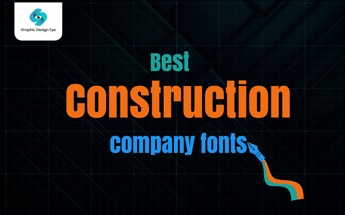
The best construction fonts maintain your construction company's brand identity across a variety of marketing materials, including logos, business cards, brochures, signage, billboards, and websites. These fonts look like steel beams, read like clear road signs, and scream strength at first look. Think about structure, precision, and clean lines.

Wait! Imagine yourself as the client of your own brand. What do you want to feel the first time you see that logo? Stability, safety, and skill. Now, think about the font you are using and ask yourself if it carries that weight. In construction, the typeface you choose can make or break the design.
The truth is, the construction industry is structural to the core. Solid, straight fonts win. Strong weights that perfectly balance with icons like helmets and cranes. Keep it simple and functional. One font family is often enough with smart negative space for hierarchy.
Now, we have created a list of the top 20 best construction fonts for all your needs. Can’t wait to find the one that feels like poured concrete for your identity?
Great! Scroll on, pick your workhorse, and start designing a logo that stands tall, on paper, on screen, and on-site.
Keep reading.
Fonts are the backbone of construction design; bold, straight and built to last. Also, strong fonts hold up your visual identity, just as steel beams hold up a building.
When selecting a font, it's important to choose those that convey a sense of professionalism, simplicity, and legibility. Avoid ornate or fancy script typefaces. Opt for fonts that convey dependability and reliability.
Below, we’ve handpicked the top 20 best construction fonts that can bring toughness, professionalism, and a modern industrial feel to your next project.
Let’s explore now!
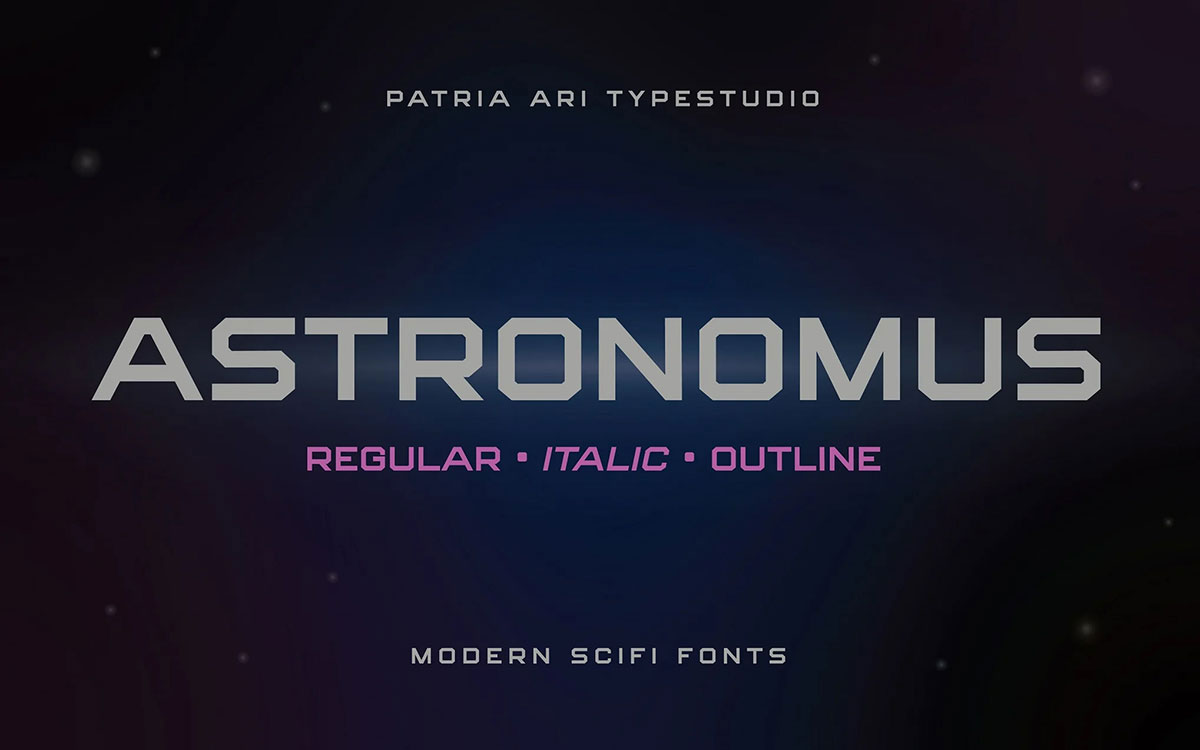
This font has a futuristic design and has elements of science fiction. It's bold and makes a powerful statement. It's ideal for brands in the construction, automotive, and technology sectors that are looking for a modern feel.
Offered in regular, italic, outline, and outline italic styles, Astronomus is flexible in design. The strong and sleek balance in industrial and technology-focused projects is fascinating. It's a modern font that demands attention and is perfect for those seeking a dynamic and clean appearance.
Key Features
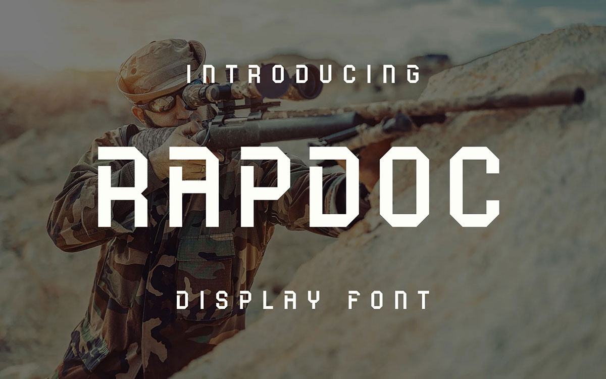
Rapdoc Font is bold, compact, and attention-grabbing. This sans-serif display font brings a solid industrial vibe that works great for construction logos, posters, and banners. Its thick letterforms create an instant feeling of power and stability, exactly what a construction business needs.
With OTF and TTF formats, it’s easy to use across platforms. Rapdoc’s clean alignment and balanced strokes make it stand strong in both digital and print projects. Ideal for anyone who wants boldness without losing readability.
Key Features
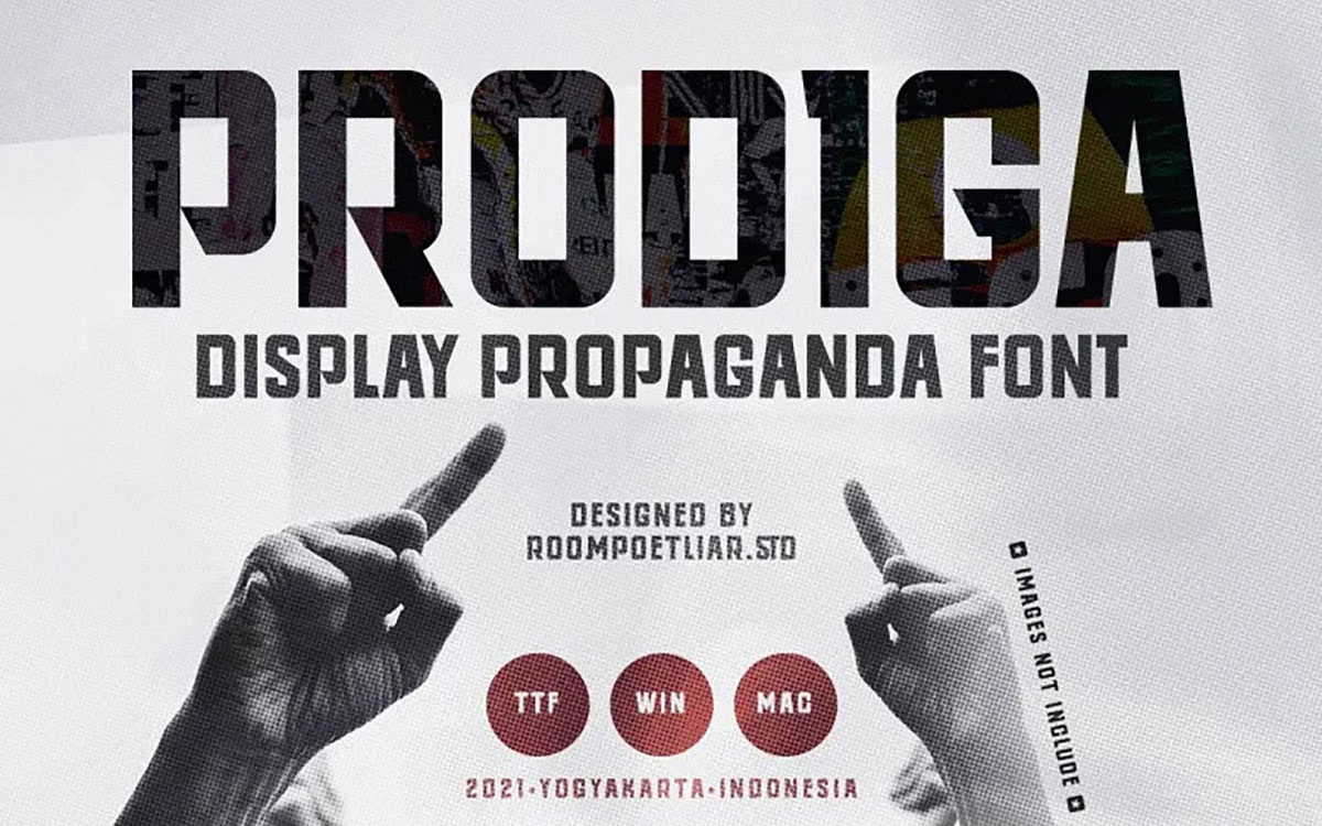
Clocking in at the top of our list, Prodiga is an elegant yet powerful display font which consists of TTF and WOFF formats. Created for headlines, logos, and sport-inspired construction designs, it holds a unique place in construction typography.
With personalizing flexibility through ligatures and stylistic alternates, it achieves a polished and lively look that inspires projects to merge boldness and style.
Key Features
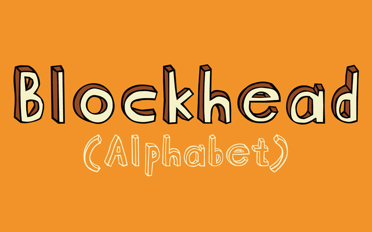
This bold slab serif typefaces, with a block and bold style, like its name, is also inspired by industrial signs. Blockhead has a geometric style with bold and strong character presentation. It comes in different types of best construction fonts and includes uppercase and small caps, with 252 glyphs.
Blockhead font has a friendly tone design that works for construction logos, posters, and signage. This slab serif font is timeless in style, easy to read and bold even at a long distance, and will not disappoint.
Key Features
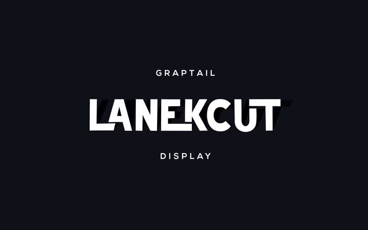
Lanekcut is a modern, construction-inspired, minimalist font. Its clean design, along with width differences, gives unique prominence to each letter. It is a great fit for builders, architecture firms, or construction startups looking to build a modern yet grounded identity.
Its balanced design offers a polished, professional appearance that is great for headlines, logos, and slogans.
Key Features
Steel Construction offers a striking, bold style that resembles actual metal material. Its characters shine with a 3D steel texture, adding to the impression of reality. This typeface is compatible with Adobe Photoshop, Adobe Illustrator, and Mac apps that support SVG fonts.
It can be used on logos, taglines, and other digital mockups that require a dominant steel accent. The font even feels like iron and visually seems as tough as a steel beam!
Key Features
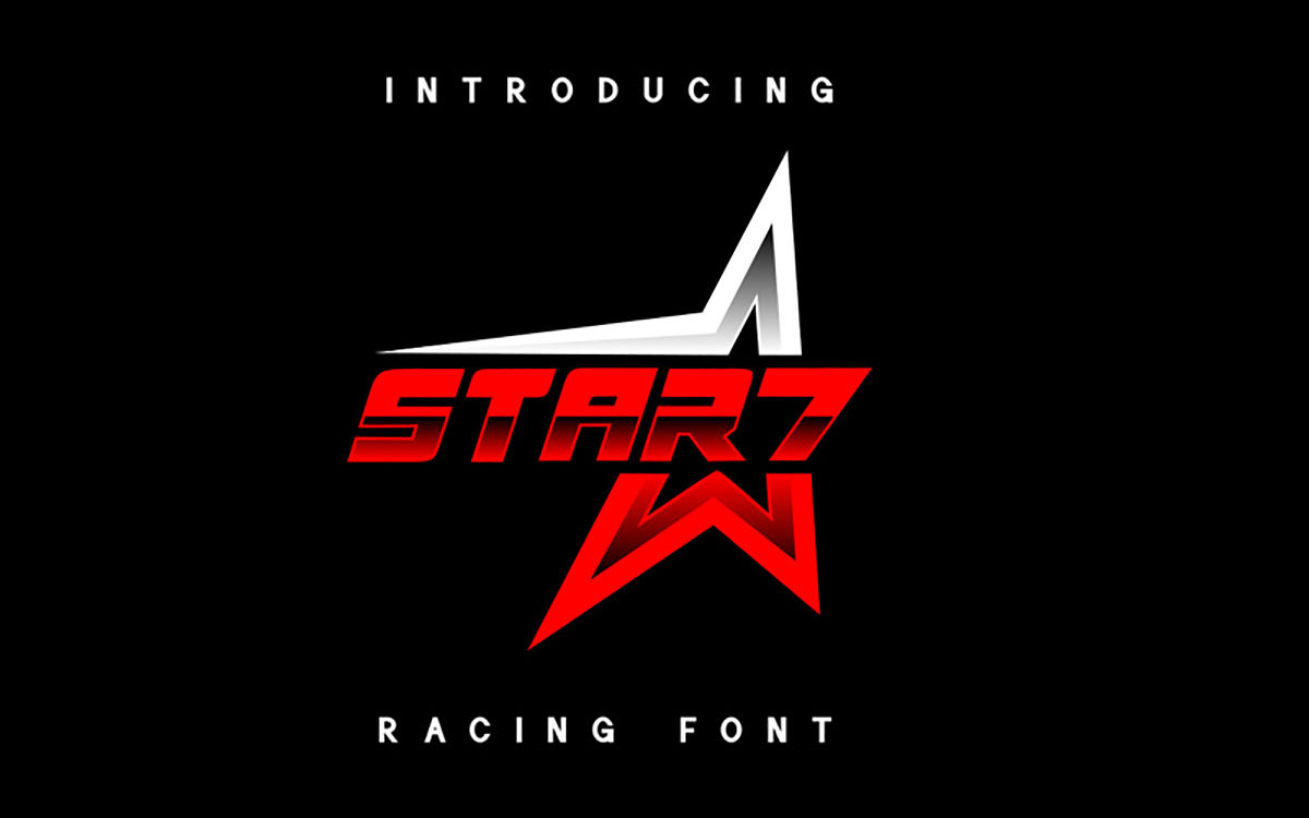
Star7 is a racing font that exudes energy and speed. Its bold, wide characters and angular cuts make it suitable for strong and contemporary branding. The sharp, edged features offer a mechanical vibe, which is appropriate for construction logos, sport brands, and graphics related to machinery.
Star7’s design makes every word appear active and assertive. It is an ideal font for brands that require precision, motion, and a confident spirit.
Key Features
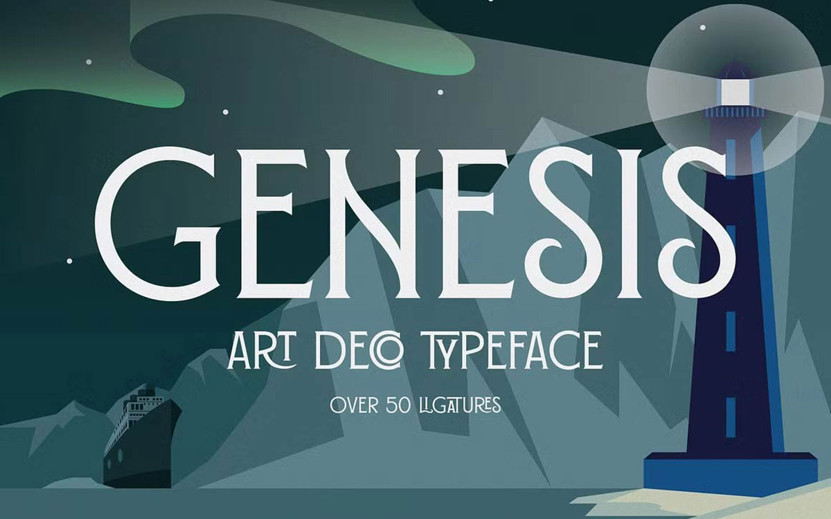
With Genesis, you will enjoy the Art Deco fonts. It will help you in modernizing and making your designs geometrically balanced. It will provide class and structure to your designs, especially those in the construction industry or architecture.
It includes 50 ligatures to help you customize your text. Use it in your posters, printed materials, and logos to portray structure, elegance, and professionalism.
Key Features
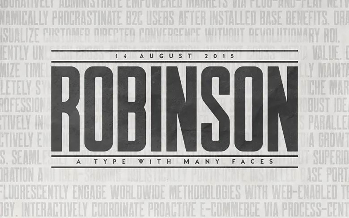
Robinson is pristine, adaptable, and works impeccably for construction and corporate design. Balanced spacing makes it legible in any size. It contains uppercase, lowercase, punctuation, and numbers, thus all the elements required for any professional design.
This straightforward typeface establishes a modern and confident appearance, ideal for promotional materials, magazines, and business cards. And best of all, Robinson is a free font, making it a perfect choice for projects that have a tight budget.
Key Features
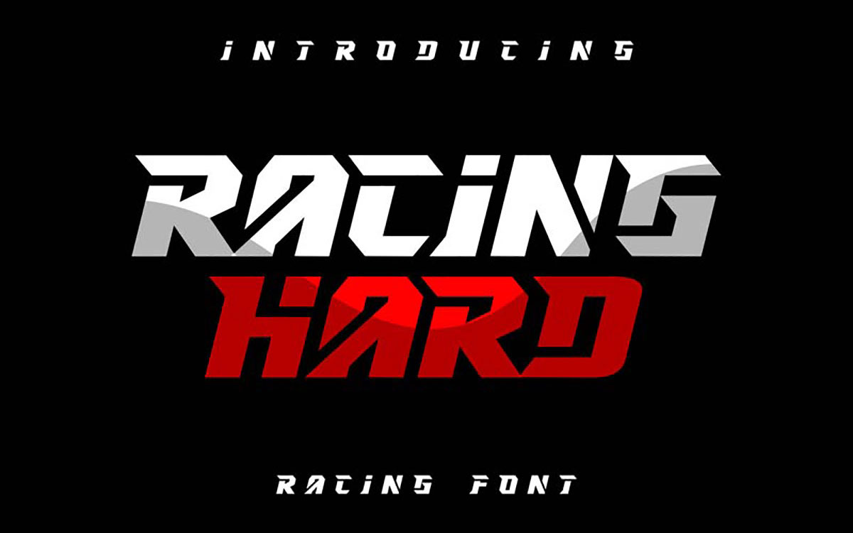
Racing Hard is characterized by rapidity, boldness, and high energy. Its construction is inspired by racing and is fully appropriate for the construction and automobile sectors. Characters in the typeface possess a stylish forward slant, providing an impression of speed and strength.
Racing Hard is available in OTF and TTF file formats and is great for branding and attention-seeking logos in the sportswear industry.
Key Features
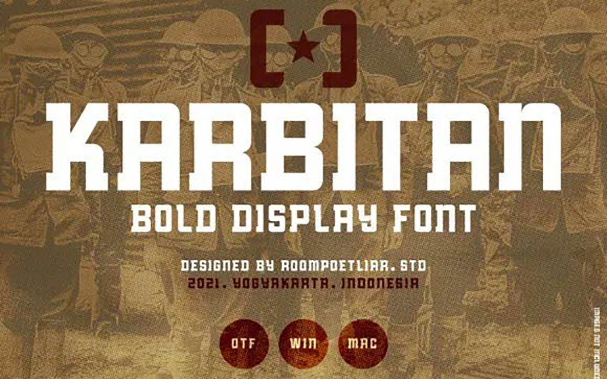
The Karbitan Bold Display Font is sharp, solid, and ready for impact. Designed with industrial, clean, and confident bold rhythms, it is a perfect fit for headlines, construction posters, or sports branding.
It is easy to use across design applications because it supports OTF and WOFF formats. The trimmed corners create a balanced, minimalist style with a powerful personality.
Key Features
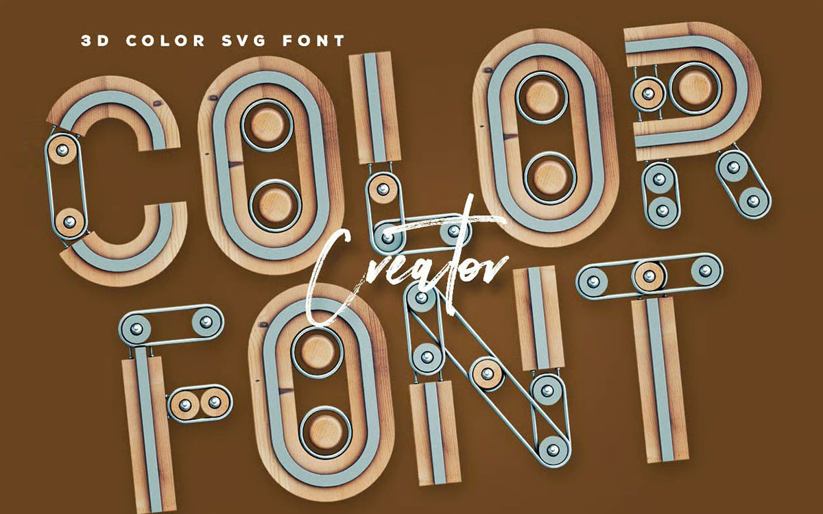
Creator is a bold 3D color SVG font that pops off the screen. It is designed for modern design projects that wish to integrate 3D realism and texture. The smooth and glossy edges give a lively character to the letter forms. It is great for posters, digital banners, and brand visuals.
Compatible with Photoshop, Illustrator, and Mac apps. The Creator font uses layered looks and gives a whimsical touch while maintaining professionalism.
Key Features
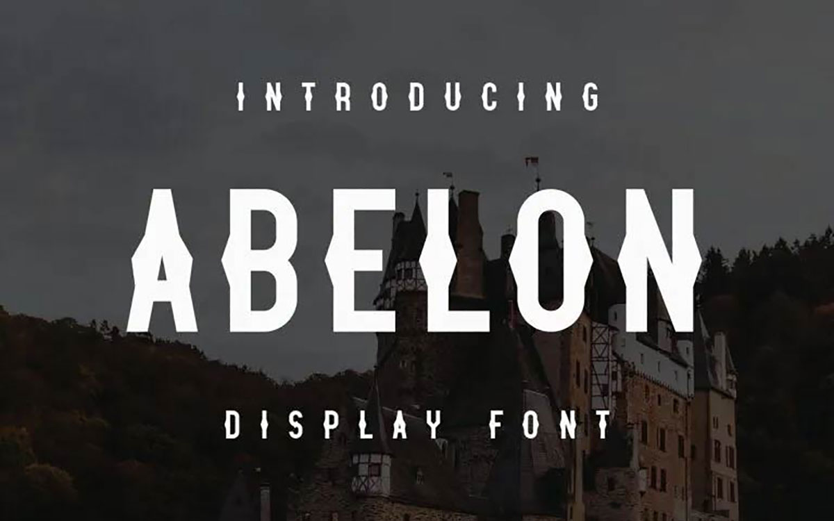
Abelon is a powerful sans-serif display font that merges a contemporary aesthetic with an industrial look. Its bold strokes and organized design in alignment work best for large posters or logos as fonts for construction companies.
Bold designs lack clarity, but the letter spacing guarantees readability. Abelon is available in both OTF and TTF formats and comes with a full set of uppercase and lowercase letters, numbers, and punctuation marks, making it a dependable option for powerful visual identities.
Key Features
Florent is a vintage serif font that takes inspiration from the 15th-century printing era. With a contemporary twist, it integrates classic branding fonts.
With a classic and geometric construction, Florent can be used for labels, posters, and industrial design fonts. Florent comes in two versions, Display Text and Display Face, each maintaining the classic vintage charm and construction.
Key Features
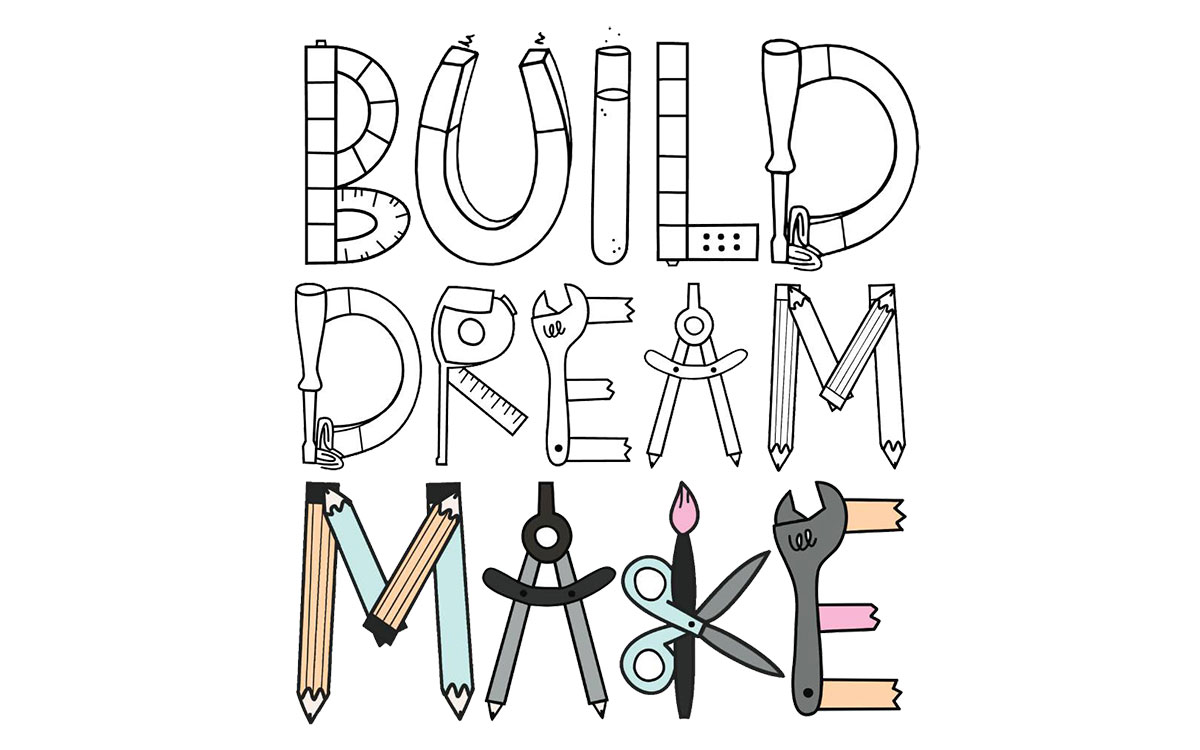
Builder font is a lighthearted doodle font meant for STEAM or construction projects. It is great for educational or branded materials because it contains letter fonts and construction doodles. Every character is uniquely hand-drawn yet well-balanced.
The unusual shapes make it suitable for educational materials for kids, playful logos for businesses, and themed greeting cards.
Key Features
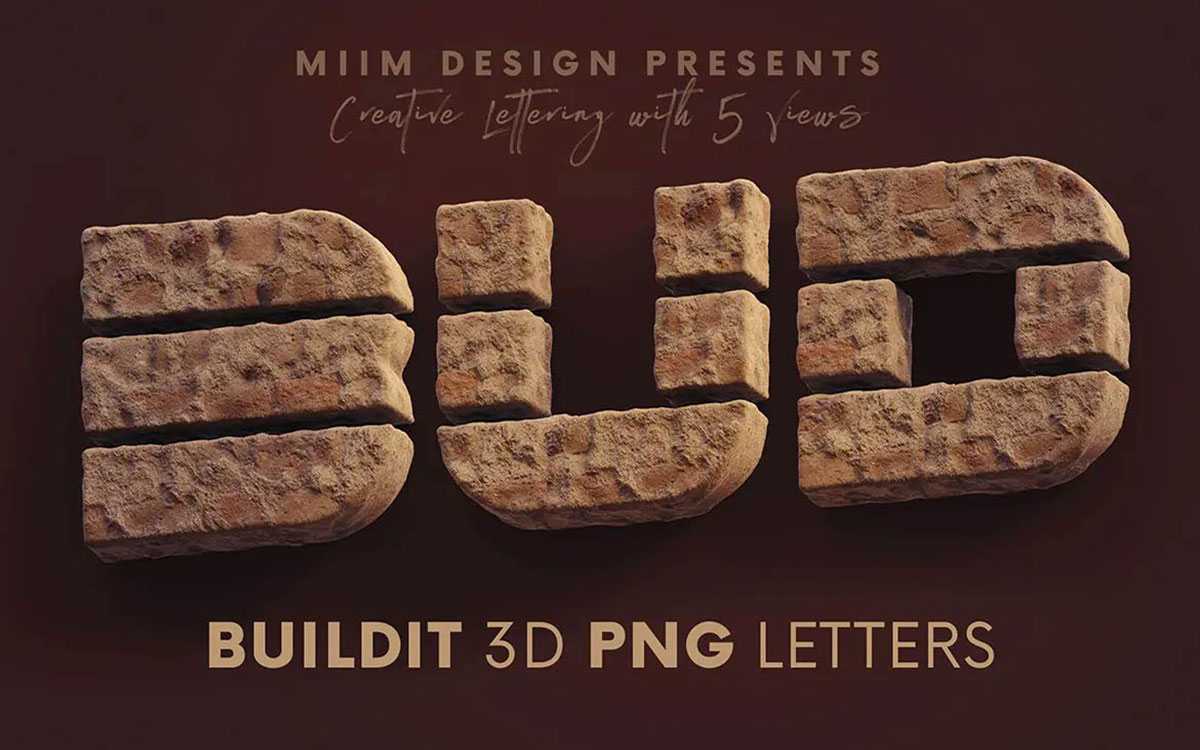
This font gives off the impression that it was created using building blocks. 3D PNG Font Build It Brick is enhanced with a realistic brick texture, which gives a heavy font for branding and an industrial feel, making it appropriate for posters, headlines, or promotional projects focused on advertising.
Versatile shadow layers and varying angles allow you to change the perspective according to your needs.
Key Features
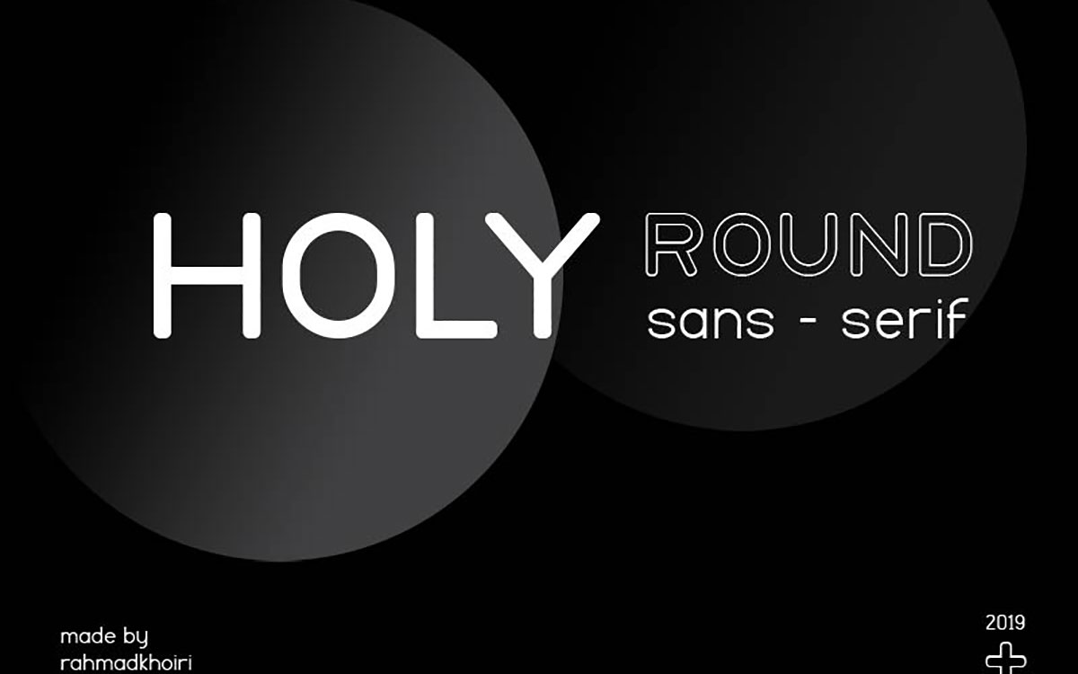
Holy Font is a geometric, symmetrical, and modern sans serif family with seven weights and additional flexibility to include obliques in design.
Its minimalist and monoline style with beautiful curves offers readability and makes it a suitable choice for architecture firms, builders, and modern minimalist corporate branding.
Key Features
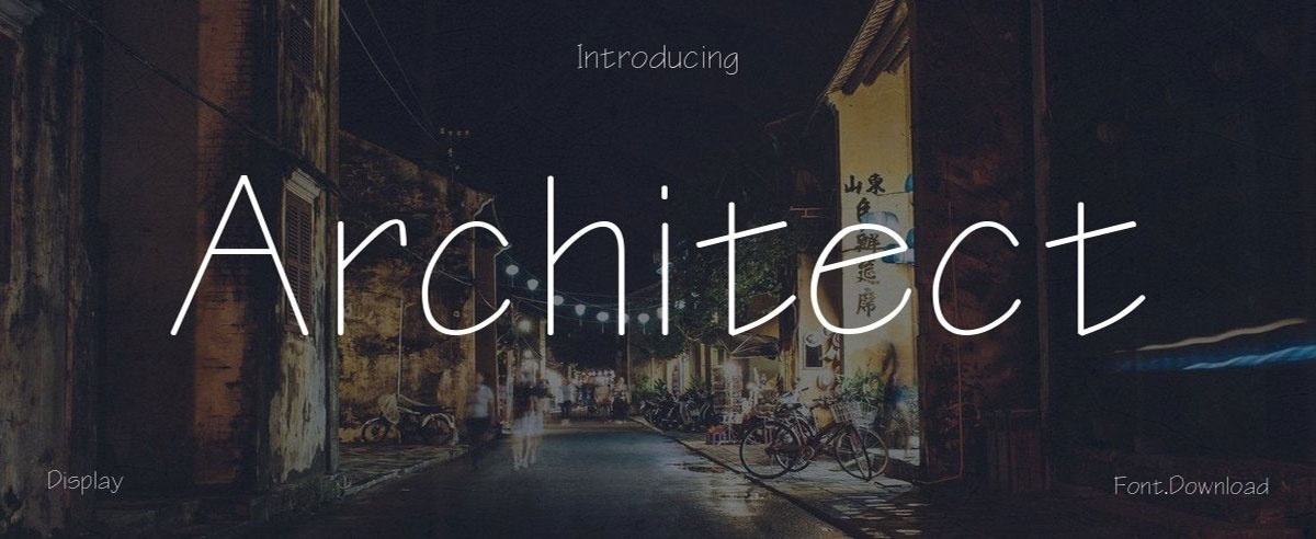
Inspired by technical drawings and blueprints, it has a precise and governed structure with uppercase letter forms.
This makes it ideal for bold and clear documents that require focus. Use on signage for construction firms, websites, and highly branded infrastructure snow’s architecture.
Key Features
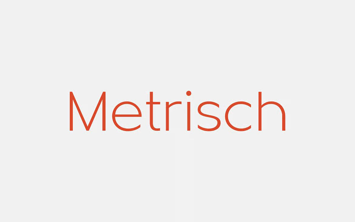
Metrisch is a modern geometric sans serif font with a sleek and well-balanced burnish. Its sharp corners and vertical cuts project a clean industrial feel. Metrisch is offered in 7 weights, making it versatile for most design projects.
It is free and offered for personal use. Metrisch is a great fit for structural and minimalist designs like logos, posters, and web designs.
Key Features
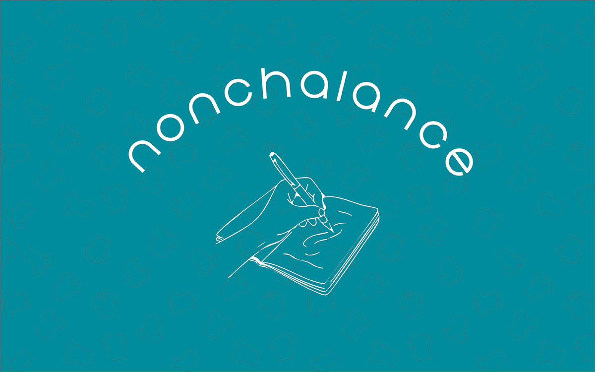
Nonchalance is a clean, minimal sans-serif font popular among architectural and design companies. It stands out for its modern, confident feel. If you need a professional, organized look, this should be your pick.
This font gives you a polished structure while keeping things simple and easy to read. Nonchalance is appropriate for logos, brochures, and any design that requires the architectural field.
Key Features:
Your job doesn’t end with having the font names; you need to know how to choose the right construction font for your construction company. Let’s see how you can do it:
The brand's font communicates whether the business is modern and sleek or traditional and trustworthy. The best construction fonts possess the ability to express the corporate personality to potential clients before any text is read.
For instance, a business that uses bold, block letters is confident and assertive, while a business that uses clean, sans-serif fonts is contemporary and proficient. Your font must convey to your customers a feeling that you want them to have.
A bold, assertive font is trustworthy, while a sleek font displays artistic flair. Ensure that the typeface communicates the appropriate tone, whether the business is serious, confident, or friendly.
Fonts are more than letters; they are silent messengers of your company’s values. A construction firm that focuses on safety and reliability should use bold, steady fonts with clean lines. Design-oriented companies, on the other hand, tend to gravitate toward more modern, geometric fonts. Each curve and edge tells a story.
When your logo’s font matches your business values, it creates an instant connection with your audience. Before you make a selection, write down three of your company's core values, such as strength, honesty, and precision.
Then choose a font that evokes the same feeling. This is similar to construction, just as you wouldn’t use glass where steel is needed, a poorly chosen font will fit your message design.
Different fonts convey different feelings. Some fonts might look powerful and professional, while others look open and welcoming. For heavier, bold fonts like Impact or Anton, a construction company that works with big projects might want to convey authority.
But if you deal with home repairs or small residential builds, a rounded or softer font like Lato gives a friendly touch. Balance is the trick here - too strong a font can feel harsh, while too weak a font can look soft and feeble.
Always keep your audience in mind. Who is it? Families? Businesses? Contractors? The font you choose should help them feel understood. Fonts that convey authority and respect, while friendly fonts help approachability.
Your font needs to be legible at all scales, whether it's a business card or a billboard. Construction companies tend to put logos on jackets, helmets, and all sorts of vehicles. So, logos would be shielded from quite a distance.
To be legible, a font needs to be simple and clean. Fonts with complicated embellishments or thin strokes should be avoided as they may fade or become unclear in smaller scales. Most sturdy sans-serif fonts would be a great choice as they are likely to remain legible in both print and digital formats.
Before finalizing, test the font at different scales. Does it remain bold at a smaller size? Is it readable on a mobile screen? A font that holds its clarity and shape on different scales is the mark of a smart design choice.
Think about how a typeface on a business card looks compared to a font on a roadside banner. The same typeface has to look good in both places. That’s how we define and use scalability.
You can find construction branding everywhere: on machinery and helmets, on vehicles, and on big construction boards. When a font loses detail, your logo can look really unprofessional, depending on the size rendered.
Always check how the font looks at different sizes. Some fonts look good on printed paper and get fuzzy on digital screens. Choose a font with stable thickness and spacing. A scalable font keeps your brand easily recognized, regardless of the size. Using cement is a good analogy: a strong cement will hold up under any condition.
Multi-language supported construction typography. If your company operates in different areas, you'll need the best construction fonts with support for different languages.
A construction font should cover accents, symbols, and different alphabets in its extended character sets. This helps your business keep building company branding consistently in all areas.
Think about your company working all over the world, the logo text should appear the same, whether in English, French or Spanish. Industrial typefaces, such as Roboto and Montserrat, offer extensive coverage of different languages. This helps keep everything consistent and professional.
Building modern structures goes well beyond brick and mortar. There is design, engineering, and tech. Your font choice must signify that. Sans-serif ones like Metrisch or Genesis sound simple, sleek, and progressive.
Fonts with sharp points and bold geometric shapes give off the impression that a firm is creative. These fonts say, ‘We employ modern construction techniques, smart materials, and innovative construction logic.’
A logo font should say, ‘We are not just constructing buildings; we are constructing the future.’ Modern, bright, progressive. A font says a thousand words about the future of a firm, and this is why it is construction branding fonts.
Finally, we’ve reached the end of our construction font journey! Fonts are the building blocks of every strong design, just like bricks in a solid structure. Hope you've enjoyed this journey with us as we explored different types of best construction fonts.
Demonstrating trust, competence, and professionalism is easy with the right font. Construction branding fonts must communicate stability and strength in a simple, clear design.
Think of it this way: before clients even read your name, your font already tells them who you are. It shows your precision, your skill, and your dedication to quality. So, take what you’ve learned from these fonts and start crafting your own brand story. Pick a font that feels strong, clean, and built with purpose.
Good luck designing your next project, one that stands tall, speaks strength, and feels built to last! If you need any help with choosing your font, don’t forget to reach out to Graphic Design Eye!