TL;DR:
This guide explains the difference between RGB and CMYK color modes and why colors often look different on screen than in print. You’ll learn when to use RGB vs CMYK, how to avoid common printing mistakes, and practical tips to ensure your printed designs look vibrant, accurate, and professional.
The colors you see on your screen don’t always match the final printed result. This is completely normal. Most designers face this issue at least once.
Screens show color using RGB (Red, Green, Blue) light. It creates bright, vibrant visuals that work well on digital platforms.
Printers work differently. They use CMYK (Cyan, Magenta, Yellow, Black) ink on paper. Because ink and light behave differently, printed colors can look darker, less bright, or slightly different from what you see on screen.
This isn’t just a small technical detail; it affects your everyday design work. Knowing what is the difference between RGB and CMYK in printing helps you avoid unexpected color changes. It can also reduce reprints and save time and money.
This is especially important when designing posters, brochures, t-shirts, packaging, magazines, and other printed materials.
So, let’s break it down!

RGB and CMYK control how your design looks in the end. Pick the wrong one, and colors change quickly. Pick the right one, and your prints feel deliberate.
This section slowly explains that moment. It shows how digital colors and printed colors follow different rules. It doesn’t rush through the technical details. Instead, it helps the ideas start to make sense.
You’ll see why some designs look great on screens but dull on paper. You’ll notice that screens create light, while ink relies on surfaces. Small choices at the start quietly shape the final result.
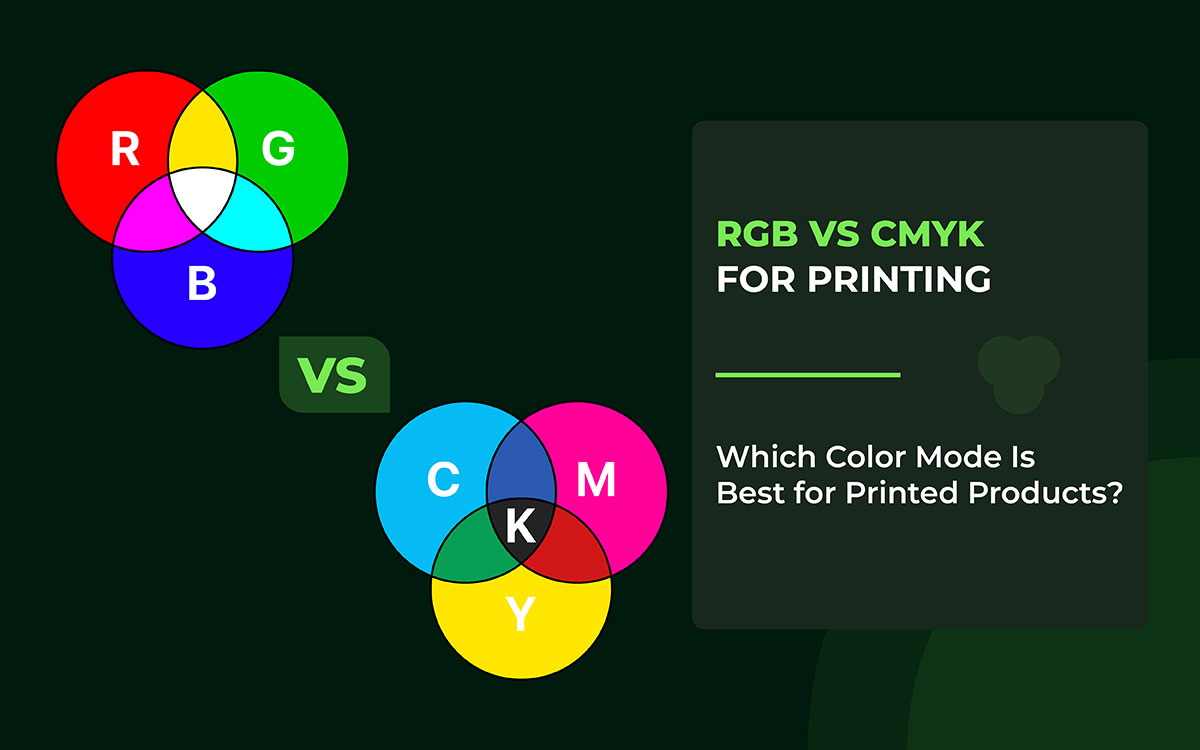
RGB stands for Red, Green, and Blue. These are the three primary lights. Your phone, computer, and TV all use them to create the images you see. Unlike printing, RGB doesn’t use inks or pigments. It mixes light with light to make different colors.
When red, green, and blue are all at full strength, you get white. No light at all gives black. That’s why RGB is called an additive system. It’s what makes digital colors bright, vibrant, and glowing.
Quick Summary Table: RGB Insights
RGB uses the additive color model, which is based on light. Unlike mixing paint, it mixes red, green, and blue light to create colors.
If all three are mixed together at maximum brightness, the result will be white light.
It’s like painting, but with light instead of ink. By changing the brightness of each light, you can make millions of colors. The more light you add, the brighter the color becomes.
RGB makes vivid, jewel-like colors, perfect for screens and digital displays.
RGB is the best choice when the color comes from light. Screens like your phone, computer, or TV use red, green, and blue light to make all the colors you see.
A few of the places where you can commonly see RGB are:
If your design is meant for digital screens, use RGB. It makes colors bright and glowing. These colors work best on light-reflecting surfaces, making your design stand out.
RGB colors are so bright because they come from light, not ink. That’s why colors on your phone or computer screen look like they’re glowing.
Designers love using RGB because it makes their work pop. You can get crazy bright blues, electric pinks, shiny greens; basically any color you can think of. RGB also makes it easy to create smooth color fades and soft glows, which is why digital pictures look clean and full of life.
One tricky thing for beginners is that these colors don’t always look the same when printed. Printers use ink, not light, so some bright colors might look duller or a little different on paper. That’s why designs on screens often feel more colorful and lively than anything you can hold in your hands.
CMYK stands for Cyan, Magenta, Yellow, and Black. These are the main inks printers use to make colors on paper. When you mix them, they create all the colors you see in magazines, posters, and books. Unlike RGB, which uses light to show color on screens, CMYK uses actual ink.
CMYK uses a subtractive color system. That just means the more inks you mix, the darker the color gets. So, mixing cyan, magenta, and yellow doesn’t make colors brighter. It makes them deeper and richer. This is how printed images get their color depth.
The “K” in CMYK stands for black. Black ink adds strong contrast and sharp shadows. It makes dark areas look clear and crisp. Using black also helps save other inks, so the colors stay clean and don’t get muddy.
Quick Summary Table: CMYK Insights
CMYK creates color in a simple but different way. It does not add light. Instead, it removes light. Everything begins with white paper. White paper reflects light back to your eyes.
When ink is added, it blocks some of that light. As more ink goes on the paper, less light can reflect. This makes the color look darker.
Here are a few easy examples of basic color mixing:
When cyan, magenta, and yellow mix together, the result looks muddy. It does not create a true black. That is why printers use a separate black ink, called K. This ink makes text clear and shadows sharp. It also saves colored ink and improves contrast.
Think of CMYK like painting on paper. Each layer of ink removes more light. The way these inks mix decides the final color. CMYK is perfect for printing magazines, posters, flyers, and packaging.
CMYK is the main color model for anything that gets printed. It works on paper and other physical materials. It uses four inks: cyan, magenta, yellow, and black. These inks mix to create different colors.
CMYK is used in many printed items, such as:
Unlike RGB, CMYK is a subtractive color model. The inks absorb light. More ink means less reflected light. This creates darker colors.
If your design will be printed and physically seen, CMYK is the right choice. It helps your colors stay true, consistent, and professional in the final print.
CMYK is made for print. It focuses on accuracy and reliability. It keeps colors consistent on paper and other physical materials. That is why it is the standard choice for professional printing.
However, CMYK also has some limits when compared to RGB.
Even with these limits, CMYK is highly dependable. It ensures your printed work looks the way you expect. This reliability is vital for magazines, packaging, and professional documents.
Choosing between RGB and CMYK can be confusing. Many designers and marketers face this problem. You might ask, “Should I design in RGB or CMYK?” Or, “Will my colors look the same?” These are common concerns.
The wrong choice can cause trouble. Colors may look dull. They may appear muted. Sometimes, they look completely wrong.
Don’t worry. Here, you’ll know when to use RGB. You’ll also know when to switch to CMYK. This chart will save time, cut costs, and prevent costly reprints.
RGB and CMYK can be mixed. But you must do it carefully.
Mixing does not mean using both at random. It means designing for one medium and then preparing the design for another.
Think of it this way. RGB works with light. CMYK works with ink.
You cannot print true RGB colors on paper. But you can design in RGB first. Then, you convert the colors to CMYK for printing.
If you'd like, I can simplify other sections in the same style to keep the tone consistent across your content.
Key Rules When Mixing
Have you ever designed something on your computer, only to be surprised by the printed result? It happens a lot. What looks bright on screen can look dull on paper.
Bright blues often turn flat. Greens can lose their life. Pinks may look faded. Designers and clients complain about this all the time.
The reason is simple. Screens and printers do not work the same way. They use different methods to show and produce color. Because of this, the final printed colors often look different from what you see on your screen.
Monitors use RGB. They create colors by mixing light. This lets them show bright, vivid shades. Many of these colors are impossible to print.
Printers use CMYK. They work with ink. Ink absorbs light instead of creating it. As a result, printers can display a narrower color range.
Some RGB colors do not exist in CMYK. When this happens, the printer picks the closest match it can produce.
Think of a neon blue on your screen. It looks bright and glowing. Even the best printer cannot recreate that glow. It can only give a similar shade, not the exact color.
Colors can look very different on a screen and on paper. This happens because of light, brightness, and reflection. A screen makes its own light. Paper does not. It only reflects light back to your eyes. This simple difference changes how colors appear.
A monitor shines light straight into your eyes. Because of this, colors look bright, clear, and lively. They often seem rich and glowing. That is why images on screens usually look sharp and eye-catching.
Printed colors work differently. Ink sits on the surface of paper. Light hits the paper and then bounces back. During this process, some light is lost. As a result, colors look darker, softer, or less bold than they did on the screen.
The type of paper also matters a lot. Glossy paper reflects a large amount of light, much like a mirror. This makes colors stand out more. They look deeper, richer, and more vibrant. Matte or uncoated paper absorbs more light than it reflects. Because of this, colors appear calmer, softer, and less intense.
Paper thickness plays a role, too. Thicker paper can hold more ink. This can slightly change how dark a color looks or even shift its tone. Small details like this can make a visible difference in the final print.
Even if you use the same design file, colors can change when printed on different papers. This often surprises beginners. But once you understand how paper and light work together, it becomes easier. You can choose the right paper and better predict how your printed design will finally look.
One of the most important things that a printer should be correctly calibrated for is color printing. Calibration, in this sense, is basically a tuning operation for the printer so that it produces the exact color output in your design file.
It is quite easy to be misled when a printer is not calibrated properly. In fact, the printed colors can sometimes be slightly off. As a result, various examples of prints might be:
There are still plenty of things that can influence your final print, even though you may have converted your file to CMYK correctly:
Being mindful of one's actions, such as allowing your file conversion to CMYK to be accurate, applying color profiles, and evaluating proofs prior to printing, are all elements of a good workflow.
In cases where calibration and workflow are lacking, a paper piece will, without a doubt, showcase a totally different, vibrant brand from a well-designed CMYK file.
Colors can look very different on a screen and on paper. This happens because screens use light to make colors. Printers use ink. Light and ink mix in different ways, so the final color can change. Here are a few simple examples that show how this works.
These color changes are not mistakes. They are a natural part of printing. When designers understand this, they can plan better. It helps them choose colors that stay as close as possible to their original idea.
Designers have a few tricks to ensure the colors they see on a screen match those in print. Doing this right saves time and money.
By following these steps, designers avoid surprises and save money on reprints.
Converting RGB designs into CMYK for print isn’t as simple as hitting a button. Even seasoned designers often struggle to preserve vibrancy and color accuracy if they skip crucial steps. The key lies in understanding color spaces, using professional software tools correctly, leveraging ICC profiles, and applying careful manual adjustments.
Here’s how to ensure your RGB-to-CMYK conversion is precise, professional, and print-ready.
RGB (Red, Green, Blue) offers a wider color gamut than CMYK, resulting in richer gradients, glowing effects, and highly saturated hues. Converting to CMYK too early can result in dull, lifeless colors.
Pro Tip: Keep all creative adjustments, textures, overlays, and glows within the RGB workspace. Only convert to CMYK when the design is finalized.
Relying on automated methods or simple “Change Mode” options can lead to unpredictable shifts. Instead, use built-in conversion functions that respect your document’s profiles:
These tools apply professional color management algorithms, minimizing sudden color shifts.
An ICC profile is a color map that defines the exact range a printer and paper combination can produce. Without it, colors may appear off or muted in print.
Steps:
This ensures your RGB design translates faithfully into CMYK.
Soft proofing allows you to preview on-screen how colors will appear when printed. It highlights problematic shades and ensures you make informed adjustments.
In Photoshop or Illustrator: View → Proof Setup → Custom → Device to Simulate
Watch for bright blues, neon greens, and other highly saturated colors; they often require manual tweaks.
Even with soft proofing, some colors will lose vibrancy. Fine-tune using:
This step keeps your print colors as close as possible to the original RGB vision.
Never send RGB files directly to print. Use professional print-ready formats with the CMYK profile embedded:
Embedding the profile ensures consistent results across different printing setups.
CMYK conversion can flatten shadows and reduce depth. Adjust the K channel (black ink) to maintain rich, natural blacks without over-inking.
Pro Tip: A slight increase in black density can dramatically improve depth without affecting highlights.
Even after soft proofing, nothing beats a physical test print. Check under neutral lighting to spot subtle shifts in hue, saturation, and contrast.
This final verification step ensures the colors you envisioned match what’s printed.
After examining RGB vs. CMYK, you’ve seen why screen colors don’t always match print colors. Screens use red, green, and blue light. Printers mix cyan, magenta, yellow, and black inks. That’s why prints can look darker, less vibrant, or slightly different than what you expected.
Don’t worry if you still notice color shifts. Every designer faces this challenge. The key is to understand color modes, prepare files correctly, and proofread your work before printing. Whether it’s posters, brochures, T-shirts, packaging, or magazines, choosing the right mode and workflow keeps your colors consistent and high quality.
With the right approach, prints can look almost as bright and vibrant as your screen. Printing combines technical skill with creativity. Mastering this process is the way to get excellent results.
Use these tips in your projects to make sure your prints match your vision. Keep learning about color management and professional printing. With practice, your designs can come to life exactly as you imagined.
If you want professional-quality prints every time, design with your final output in mind. Convert files to CMYK before sending them to print. Let Graphic Design Eye handle it for you. Our print-ready design services ensure correct color modes, precise calibration, and top-quality output.
Contact us today for expert support on your next printing project and turn your designs into stunning, real-world results!