However, to be effective, such content needs to be designed properly and by following some of the best practices. In the absence of this, you will end up wasting time, effort, and money on ineffective content. In this article, we've outlined some of the best ways to stand out with effective booklets and flyer design in your industry. Let's dive right in.
Imagine people receiving your booklet and flyer and noticing that it is poorly printed, with blurred shapes and writing, etc. If this happens, you risk ruining your brand's image in the eyes of your customers, who might assume that also the products or services you offer are of low quality.
One of the first considerations to make when thinking of launching an effective content design is to print high-quality booklets or flyers. In such a case, a personal booklet design with a printing design service online could help you achieve the professional appearance you desire.
Consumers must immediately connect your brochure or flyer with your brand. For this reason, it's important to remain consistent with your brand throughout all your materials. You can achieve this by using colors, fonts, and styles that you already use on your website or social media profiles. This will create brand awareness and keep your brand in the minds of people, making it easier for them to remember it.
If you want to make your flyers and booklets more engaging, you can insert promotional codes and QR codes that consumers can scan to redeem special offers on your website or shop. You might insert these in the form of promotional codes, bar codes to scan, or even QR codes.

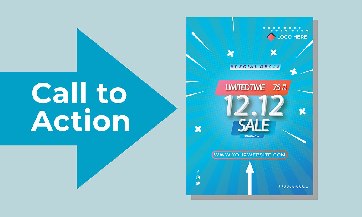
You are creating and distributing flyers or booklets because you want to reach some specific goals. For instance, you want consumers to attend your local event or buy your products. For consumers to understand your goal, you must clearly state it by adding a call to action. Your call-to-action must be concise, clear, and easy to understand.
Consumers shouldn't have any doubt about what they should do or struggle to understand it. For this to happen, there must be other elements following the call to action. As an example, if your call to action specifies "visit our website", you should place the URL of your website close to it or below.
Flyers and booklets that are too crowded with text, imaginary, and so forth, are not going to give you the results that you expect. Other consumers will be confused about them, which will probably result in your flyers and booklets ending up in the trash. To avoid this, keep the layout tidy with the essential information while using white space wisely.
To be successful with content marketing, you need to know to who you are addressing it. In other words, you must provide your target audience with something that they will appreciate and enjoy. To do so, it might be helpful to conduct an in-depth analysis of your clientele.
You can tailor your content to suit their needs by understanding their demographics, preferences, behaviors, and so on. Alternatives include sharing surveys, and polls, and allowing your target audience to decide which content they would like to access.

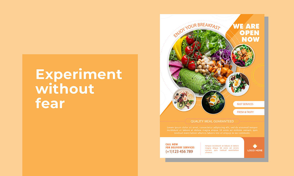
Consumers will not even take the time to look at designs they see over and over again. The same is true when using the same, repetitive copy. That's why you need to experiment with new styles, layouts, images, shapes, and copies.
Flyers and booklets are among the few content types that allow you to be as creative as you like. Therefore, don't be afraid to explore new ideas that you have never seen or tried before.
What is the benefit of keeping your flyer or booklet? Why shouldn't they throw it away? These are all questions you should ask yourself if you want to create something distinctive that you will want people to keep.
You might include a barcode that customers can scan at the store to receive a discount. This will encourage them to keep your flyers or booklets.
If you expect consumers to act, it will take a long time, and you won't always get the results you expect. To speed up the process, you need to give your audience a reason to act as soon as they receive your booklet or flyer design.
You might, for example, outline that the promotional offer only lasts a few days or hours, or that there are a limited number of seats available, etc.

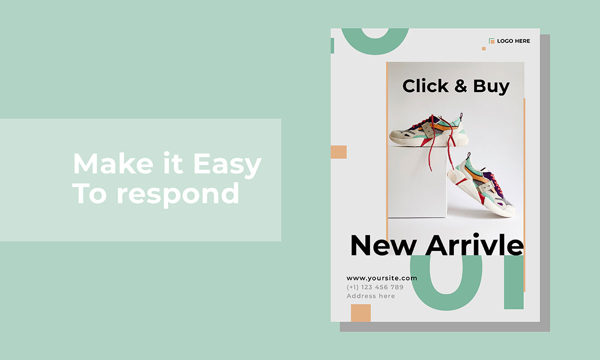
You may want to communicate an easy way for consumers to get in touch with you, either if they are interested in your products or services, or if they simply wish to stay in touch with you. For this reason, you must ensure that the content contains your contact information. Make sure your business name, phone number, and website URL are easily visible on the flyer or booklet.
Also, include your social media links, such as Facebook, LinkedIn, Twitter, Pinterest, and Instagram, if anyone follows those regularly. You can also consider adding a QR code that takes people to your product page or your newsletter page design with the sign-up page.
In designing booklets or flyers, you must also consider readability. In other words, you have to ensure that the content you create is fully understood by the consumer, even if viewed from a reasonable distance.
For this to happen, you must pay attention to the font and size you use, how much white space you leave, and the layout you create. It is important to make sure all paragraphs are well separated and visible, so the consumer will be able to follow the design and understand the content.
As most people scan content instead of reading it, you may want to use headlines to increase your chances of getting their attention. It's possible to use them to catch the attention of consumers, and to smartly section off the content that will be in the booklet or flyer.
By doing this, people will be able to comprehend the message without having to read too much text. This way, they will become curious about your content, leading them to explore it in greater depth.
If you are creating a flyer or a booklet, you must follow the AIDA model. AIDA is an acronym for Attention, Interest, Desire, and Action. To apply this, you should be able to:
Draw your audience's attention, for example with an intriguing headline;
Provide them with additional information, such as persuasive copy;
Make them want what you're offering;
Add a strong call to action at the end.
This is an old, but effective marketing tactic that has been proven to yield better results. Remember it any time you plan to create such content.
Whenever possible, use bullet points and numbering to create outstanding flyers and booklets. Consumers who are presented with a wall of text may find it unbearable, which will make them give up on reading. By numbering and breaking up the content into bullet points, you will make it more readable and visually appealing, which will encourage consumers to explore your content in greater depth and better understand it.
Images shouldn't just be placed for the sake of doing so. Images that have no relevance to the topic will have the opposite effect. The problem with them is that they not only don't add any value to your content, but they take away attention from the other important details, and their overwhelming use makes the layout look cluttered. Using flyers, booklets, and other promotional materials can have a lot of benefits in terms of exposure and sales.
For them to be effective, they should appeal to the audience, and as a consequence be designed according to some best practices, like the ones listed above. Following the tips presented in this article will help you achieve the results you desire. Thank you for reading this post.
Hopefully, you found it informative and helpful. If you want to read more, please contact the Graphic Design Eye support team.