Look at the best interior design logos that help you design an iconic logo for your interior design firm. These interior designer logos become a symbol of trust and style. They spark ideas, set a mood, and help your interior design firm's brand identity in a competitive design world.
In architecture and interior design, a logo isn’t just decoration. It’s a direction. The right mark shows taste without shouting. It hints at craft without clutter and leaves a calm, confident impression.
A line that feels intentional. A serif that feels classic. A spacious layout that lets the interior design firm breathe. Small choices like these shape how clients see you: thoughtful, consistent, dependable.
What matters most is the feeling. A modern interior design firm owner chooses clean shapes and quiet type. An interior design firm owner prefers polished monograms, warm tones, and a sense of balance.
Either way, the goal stays the same: a logo that’s easy to remember, easy to trust, and built to last. Not trendy for a season, but steady for a decade.
In the post, we’ll show you the top 25 best interior design logos that show how color, typography, and shape choices create a lasting impression, and learn practical logo design tips to design an interior design firm logo that feels fresh today and iconic tomorrow.
Let’s drive in and explore!
A logo makes you feel something before you even read the name. They suggest texture, balance, and light. Just like a well-designed room. A good logo in this field shows creativity in their lines and calmness in their spacing. They look intentional, not overworked.
Brand identity in architecture and interior design firms isn’t only about style. It’s about trust, tone, and story. A clean line can show precision. A soft serif can add elegance. A gentle color palette can make a name feel timeless. When these parts fit together, they create a design firm people remember.
Here, we’ve listed the top 25 best interior design logos to help you create your own architecture firm's visual identity. Each one shows how simple, thoughtful design can reflect an architecture firm's character and give it staying power.
Take a look below. You'll find perfect logo design ideas for your architecture firm's visual identity!
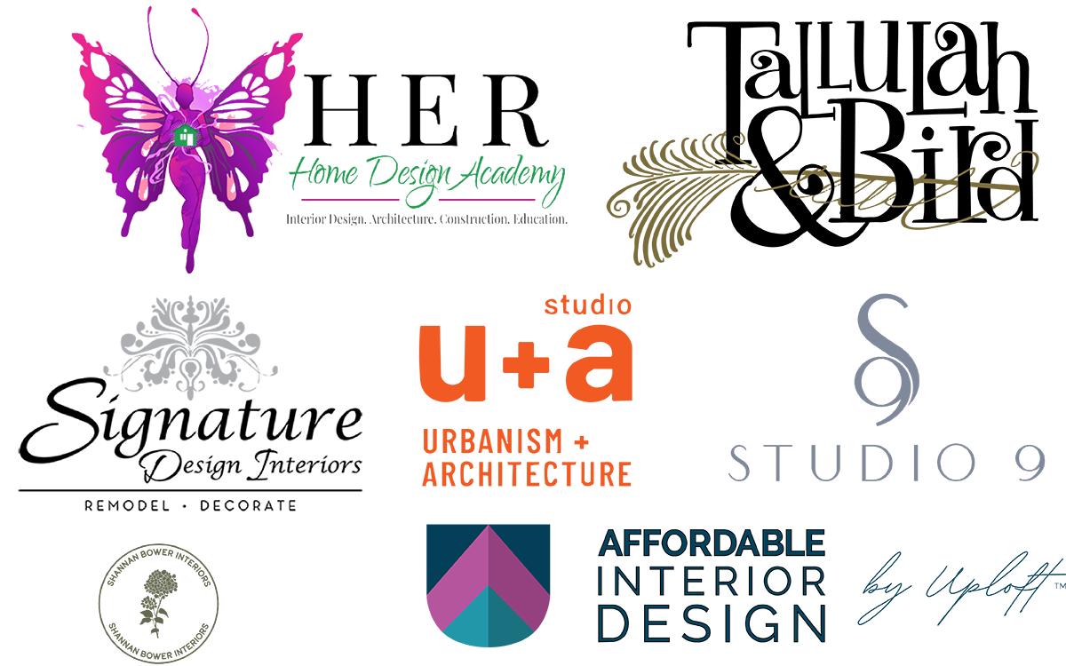
The HER Design Build logo mixes skill with warmth. The butterfly looks soft and full of life. Its colors shift from purple to pink, and its wings make you think of care and new beginnings. It gives a quiet message: spaces can change how we feel.
The text adds balance to that message. “HER” looks strong and confident. Under it, “Design Build” sits gently, like a calm echo. Together, they show both strength and thought.
It’s not trying too hard to be stylish. Instead, it hints at new ideas: a softer color palette, a simpler design, or a project that starts with emotion instead of trends. For architecture firms that want to last, that’s important: let the logo make a promise, then let the work prove it true.
This modern interior design firm logo is both a guide and an invitation. It shows skill and asks for care in return. If you want to build something that lasts, start with a design that speaks quietly and makes people imagine more.
The Shannan Bower Interiors logo feels calm as soon as you see it. The round shape keeps it balanced, and the flower inside makes it soft and gentle. The petals are drawn with tiny, careful lines. It looks natural, a little handmade, like someone put real care into it.
The design firm logo color is simple: black on a soft background. That choice makes it feel classic. The name curves around the edge, holding everything together without feeling tight. It looks finished but still relaxed.
There’s a meaning in this logo. It shows that design can be beautiful without trying too hard. The flower shows care; the circle keeps it steady. It feels real, personal, and lasting. Such interior designer logos belong anywhere, yet still feel made for one special place.
The Noz Design logo stands out from most in this field. It’s playful yet sharp, a small illustrated face that surprises you. The black lines are bold, but the shape stays friendly. It shows character without going overboard.
Using something so personal as a logo takes confidence. It makes the architecture firm feel alive. The light, simple text below gives the image space to breathe. That mix of personality and simplicity is what makes it shine.
It doesn’t chase elegance or polish in the usual way, and that’s what keeps it fresh. There’s a spark of creativity here. It reminds you that design can be serious and playful at once. A design firm logo can show skill and still feel human.
The minimalist interior design firm logo makes one thing clear: personality matters. Every space should carry a trace of the person who made it.
The Affordable Interior Design logo is simple but strong. A small house sits inside a blue square and does most of the work. It feels steady and trustworthy. The colors are soft, not bright, which gives the logo a calm and welcoming vibe.
The name is clear and straightforward. No tricks. No weird spacing. It’s easy to read and feels practical, just like the modern interior design firm's goal to make design feel possible for everyone. The mix of the picture and the text feels balanced. It’s simple but warm at the same time.
It doesn’t show off or try too hard. It proves that design can be smart without being expensive or complicated. That message is quietly inspiring: good design doesn’t need to be difficult. It can be simple, kind, and built to last.
The Dkor Interiors logo looks solid at first glance. The letters are big, dark, and clean. They sit close together. There’s a sharp diagonal line cutting through the “K.” It’s a small detail, but it catches your eye. That one line makes the word feel alive, like it’s moving forward.
Everything about the logo is simple. No colors, no extra decorations. Its power comes from looking confident. The black letters feel strong, serious, and built to last. The spacing is tight but not too heavy. You notice how balanced it is after looking twice.
It fits the design firm perfectly. Calm, confident, precise. Nothing feels rushed or trendy. It’s made like a good interior: clean lines, a strong base, and one smart detail that ties it together. That’s what makes this logo timeless. It doesn’t scream for attention. It earns respect quietly, just like the best interior design firms do.
The Delia Designs logo feels calm and soft. The word “delia” looks like it was written by hand. It moves gently across the top, light and loose. Underneath, “DESIGNS” is bold and solid. The two styles are different, but they balance each other. It feels human, like someone took care making it.
A thin curved line wraps around the text. It’s not a full circle, just a gentle hint of one. It gives the logo shape without trapping it. There’s space around everything, so it’s easy to look at. Nothing feels forced. It just fits.
The architecture firm logo shows what a well-designed logo can do. No tricks, no hurry, just attention to detail. It feels like it will stay good for a long time. That’s how you make something that lasts.
At first, the LuxDeco architecture firm logo looks simple. But the more you look, the more you notice. The letters are thick and strong. They sit close together. The word feels calm and balanced. Nothing is crowded or messy.
The black color suits it perfectly. It feels serious but not too heavy. It shows luxury without being loud. The style is classic but also modern. This luxury interior design company logo could go on a shop, a magazine, or a product label, and it would still look right. Every curve and space feels carefully planned.
There is something impressive in how simple it is. It shows that good design doesn’t need to be complicated. Its strength comes from leaving things out. That’s what smart brand identity always teaches: keep the important stuff, remove the rest.
The Charles & Co. logo looks formal but also appealing. The navy background feels heavy, and the gold ampersand draws your eye without being loud. It feels like a luxury interior design company that knows itself. The serif font adds a sense of tradition; tidy letters, a little space, nothing distracting.
The contrast stands out first. The blue holds everything steady. The gold gives it life. It mixes calm with confidence, and that’s why it works. There are no extra shapes or patterns, just carefully balanced text. It looks professional but not cold.
It feels dependable, a logo that doesn’t need to change to stay relevant. It is clearly made to last. Its simplicity is quietly inspiring. It shows strength doesn’t have to shout. A logo can feel timeless with one color, one symbol, and one line you can trust.
The LeBlanc Design logo feels soft and inviting. The script letters move like a pencil on paper. The grey color adds calmness. It feels refined but friendly. It doesn’t try to sell luxury; it already knows it.
The letters flow together. The uppercase “L” stretches wide, then settles into the name. It moves, but stays controlled. Below, the word “DESIGN” sits in small, simple type, holding the mark together. Art is above, structure below, a quiet balance.
This logo shows that elegance often comes from restraint. Nothing feels heavy. Every stroke is deliberate but light, able to breathe. It’s inspiring because it proves design doesn’t need to be bold to shine. Confidence can come through grace, the kind that lasts without needing to prove itself.
The thing that stands out most about the Elizabeth Erin Designs logo is how personal it feels. The minimalist interior design company name looks like it was written by hand, with smooth, flowing curves. This makes the logo feel creative, open, and relaxed. You can tell someone put thought into it, but it still looks natural, not like a computer made it. It shows that the design started with care, not just a plan.
On the left, there is a circular monogram that balances the signature. It’s simple: two “E” letters facing each other with a clean line in the middle. Even though it’s simple, it ties the whole logo together. Below, the tagline says, “Achieve Your Vision.” It grounds the design and sends a quiet message of confidence. It feels like everything will work out.
Everything about the logo feels in sync. The shapes, the curves, the spacing, they all fit together. It shows that a creative interior designer’s name can become a brand while still feeling personal. It captures what good design always does: it connects with people through simplicity and makes them feel something through its shape and style. This is the kind of logo that sticks with people and inspires them to create their own work.
The A & D Curated Studio logo is very thoughtful. The letters "A" and "D" are thick and bold, but their shapes are simple and clean. They sit very close together. The "&" in the middle is soft and curvy. It stops the design from feeling stiff. Right away, you notice the balance, things feel neat, but also relaxed. It looks like a brand that plans carefully but still leaves room for creativity.
The words below, “Curated Studio,” are smaller and simpler. The letters are thin and spaced out just right. They support the big letters above. The mix of bold and thin makes the logo feel strong but controlled. The black color keeps it grounded, and the layout is easy to remember.
The logo isn’t flashy, and that’s why it works. It feels like it will last a long time. The design looks natural, like it already fits wherever it goes. That’s what makes a brand feel timeless. It shows confidence, not noise, and it can stay relevant even if styles change.
The DeWitt Designs logo looks soft and friendly. The name is written in a loose, flowing style. It’s thin and quick, like someone wrote it carefully but without overthinking. There’s a small flower next to it. It fills the space, but doesn’t take over. It feels like it belongs there.
The black color works well. It keeps your eyes on the shapes, not on fancy home decorations. There’s a little text below that says what they do. It’s small and doesn’t grab too much attention. The logo feels balanced. It’s not perfect, and that’s what makes it feel nice.
You can tell it was made to feel personal, not like a big interior design company. It has the warmth of a small business, something made by hand to last. It doesn’t need bright colors or fancy effects to stand out. Just a name, a flower, and a bit of personality.
The A + E Design Lab logo looks simple, but that’s what makes it strong. It’s just two letters, A and E, with a small plus sign in between. It feels like two ideas coming together. Everything about it seems thought out. The letters are spaced well, the lines are thick, and there’s enough space so it doesn’t feel crowded.
The black color makes it feel professional and serious. The letters look strong, but not heavy. The interior design studio wanted to show it pays attention to details while still being friendly. It feels like a design firm that cares about logic and precision, but also about people.
The logo works because it’s not trying too hard. It’s calm, clear, and steady. You can imagine it on walls, books, or business cards for years without looking old. That’s what makes it feel important.
The Decorilla logo looks simple at first. Just two shapes, thin lines, a little space. But when you look closer, you see how it all fits together. The D and H connect like a frame, with sharp corners that meet gently. It’s simple, but not boring. It feels balanced, like it’s in the right place.
The white lines on the background make it feel light. You can imagine it anywhere, on a screen, a poster, or a wall. The name next to it is small and easy to read. It doesn’t try to grab attention. It just helps the logo. The whole design feels built, not just drawn.
That’s what makes it special. It feels calm, steady, and sure of itself. It shows structure, but still feels warm. A logo like this can inspire anyone who likes building things from simple ideas. It reminds you that if the base is strong, you don’t need extra decoration. The design speaks for itself.
The AERO Studios logo feels calm and steady. The letters are spread out, and each one has its own space. The soft grey color matches the name. It’s quiet, like stone or dust on a wall. It doesn’t try too hard. It just sits there, clear and simple.
Above the logo, the small word “Explore” fits perfectly. It makes you curious but doesn’t take over. Below, “Interiors & Design” brings things back down to earth. Everything lines up nicely. You can see the care put into spacing and size. Nothing shouts, but it still catches your eye.
It feels real, the kind of design that lasts because it’s honest. You can tell it belongs to a home decor studio that understands balance. Among other best interior design logos, this one stands out. It feels natural. No tricks, no noise, just calm. That calm trust grows quietly over time.
The home decor logo for Studio U+A looks strong. The letters are thick, like pieces of a frame. The plus sign is small but tough. It holds everything together, like a beam connecting two sides of a room.
There’s no color, just black on white. That works well. It makes you focus on the shapes and how they sit next to each other. The U curves a little. The A is sharp. The plus keeps them lined up. It feels planned, like someone really thought about the proportions.
The best part is how steady it feels. You could print it on glass, stamp it on paper, or carve it in metal. It would still look good. It’s more about discipline than style. That’s why it stands out. It doesn’t try to be trendy; it already feels modern. Good design like this lasts because it’s built right from the start. That’s what every design studio should aim for.
The Signature Design Interiors logo looks stylish but confident. The word “Signature” is written like a quick brushstroke, full of movement. Below it, the neat printed words “Design Interiors” make everything feel organized. One part is playful, the other controlled.
Above the name, a small floral symbol adds a touch of craft. It’s pretty but not too fancy. The grey-black colors make it simple and easy to use anywhere, from letters to store signs. It doesn’t need bright colors to stand out; its shape does all the work.
You can tell the logo was made carefully. Every line seems planned, nothing rushed. It shows the design firm knows how to make things look polished without losing personality.
This kind of design builds trust and feels fresh for a long time. It shows that creativity lasts longer when it’s done with care. That’s what makes a logo memorable.
The Studio 9 Interior Design logo feels calm and relaxed. The "S" and the "9" connect smoothly, like they were made to fit together. The design is simple but still feels alive. You can see that someone put a lot of thought into making it clean, useful, and soothing.
The soft grey color is perfect. It doesn’t shout for attention. It just feels right, like a room that looks good without needing an explanation. The name under the logo keeps everything steady. The straight lines and light spacing show that order can be beautiful when it’s done well.
This kind of design inspires creativity quietly. It proves that less can be more when every curve has a purpose. The logo doesn’t need flashy colors or tricks to look good. It reminds you that timeless firms are like timeless places: balanced, honest, and full of little details that make people notice and feel something real.
The Summer Thornton Design logo is all about letters, and it works. The letters are tall and fancy. There’s clean space around them. Nothing feels crowded. There’s no icon trying to explain the firm. Just the name, carefully arranged.
Look at the shapes. The lines are strong. The little edges on the letters are sharp. It feels like fancy clothing, classic, but also modern. The black letters on a white background keep your eyes on the shapes. As you read, the letters stand straight, then relax a little. It feels confident, but not showy.
This simple style says a lot. When the letters do all the work, every choice matters. You can tell someone worked on this until it felt just right. The result is steady and clear. It works on a door, a book spine, or a tag. It fits anywhere.
The logo also teaches a lesson: keep things simple. Let the shapes speak. If the firm is about good taste, show it in the letters. That’s how a logo stays strong over time: solid basics, clean edges, and room to breathe.
The Tallulah + Bird logo looks different from others. The letters look like they were drawn by hand. They are a little messy and uneven, and that’s what makes them interesting. It feels personal, like a note someone left behind. The little bird above the name adds a warm touch. It’s tiny, but it shows that the design cares about small details.
The black text keeps things simple. No colors are fighting for attention. You notice the shape of the letters, how thick they are, and how they fit together. It feels made by hand, not by a machine, and that gives it charm.
This logo shows creativity that doesn’t try too hard. It feels free, natural, and open to new ideas. That’s why people are drawn to it. It makes you think about designs that last because they come from feeling, not from rules. That’s where creative inspiration starts.
The Windsor Smith logo feels strong. The first thing you notice is the blue geometric shape above the name. Its lines are straight and fit together perfectly, like they were measured with a ruler. It gives a sense of precision, professionalism, and care. Once you see it, it sticks in your mind. The design looks thought-out and made to last.
The blue color fits perfectly. Blue naturally suggests trust and calm. It adds strength without feeling heavy. The text below is thin, even, and clear. It’s quiet but confident. Together, the mark and the type feel balanced.
There is a sense of careful design here. This logo doesn’t just look right, it feels right. Every shape has a reason. It inspires creativity and shows that great design doesn’t need to shout. It only needs a clear idea and the confidence to stay simple.
The Urbanology Designs logo feels light but intentional. The letters are thin and spaced wide, giving everything room to breathe. The “U” and “D” at the top curve softly. They are modern, simple, and restrained. On the surface, it looks clean. But you can tell every line was thought through.
The color is soft grey, almost neutral. It shows quiet confidence. It doesn’t try to fill space or feel heavy. The form itself carries the message. The text below matches this tone: clear, balanced, and steady. It feels professional yet approachable.
This logo inspires because it says a lot with very little. It feels modern but not fleeting. It’s a mark that will work for years, built on clarity, not trends. It reminds you that lasting design doesn’t need decoration. It needs purpose, and this logo has it in full.
The Jojo Wong Design Co. logo is very simple. It has two letters, “J” and “W,” drawn with thin lines. They sit close together. It looks clean. Nothing feels rushed. The space between the letters is just right. The lines are straight. Everything feels balanced.
Under the letters, the modern interior design company name is written in small letters. The words are calm and easy to read. There are no bright colors, just black and white. It looks like it could work anywhere, on paper, glass, or a wall.
You can tell someone to put care into it. The letters are placed just right and lined up neatly. It’s not flashy, but it works. It shows that good design doesn’t need to be over the top. One smart choice at a time, made clearly and carefully, is what makes a logo last.
The Allison Jaffe Interior Design logo feels soft and personal. The small “aj” at the top looks handwritten. It’s a bit loose, a bit natural. It’s not perfect, and that’s what makes it charming. The light blue color is calm and easy on the eyes. It doesn’t demand attention.
The name below is clean and simple. Straight lines, thin letters, everything balanced. It clearly complements the script above. Together, the two parts work well. One feels creative, the other professional.
This logo isn’t trying to impress. It’s made to feel right. There’s a small spark that shows care. It suggests design doesn’t need to be complex to be meaningful. Its simplicity inspires. One mark, one name, and a feeling of honesty.
The Semmelmann Interiors logo looks classy. The letters are tall and spaced out. They are dark purple on a white background. It feels solid and steady.
The first thing you notice is the small shape above the letters. It could be a flower, or maybe a compass. It has a gold center that catches your eye, but not too much. The colors work well together. They feel serious but still warm.
The word “Interiors” is below, smaller and also in gold. It pulls the whole logo together. Everything feels careful, like someone drew it slowly and checked it again and again. You can tell it was made for a modern interior design company that wants to look reliable.
It’s not a loud logo. It’s calm but confident. The kind of design that grows on you. The clean lines, the little gold detail, the perfect spacing. Just looking at it gives you a small boost of confidence. And that’s what good design does. It can make you feel steady, maybe even inspired, without saying a word.
Designing a logo for your interior design firm isn’t about fancy fonts or random colors. It’s about shaping an idea. Something that shows who you are and what you create.
The right logo captures a feeling of calm, balance, and purpose. It should look good, but more importantly, it should have meaning. A logo like that sticks in people’s minds. It helps them remember you.
Here’s a simple 3-step guide to creating an interior design firm logo that lasts:
Before you start designing, take a look around. See what other architecture firms are doing. Watch their best interior design logos. Notice what feels fresh and what feels old or overused. You’re not trying to copy them. You’re just trying to understand what’s already out there. Once you see it clearly, it’s easier to know where your design fits.
Think about who you want to reach. Is it homeowners, builders, or big companies? Each group wants something different. Try to figure out what grabs their attention. What colors or shapes do they trust? What kind of style or tone do they like? It will help you make a design that your audience likes but still shows your own style.
What helps here:
Once you see what’s out there, turn your focus inward. Think about what makes your work special. Do you like clean, simple lines, or do you enjoy lots of layers and textures? Do you prefer warm colors or cool ones? The same vibe that shows in your work should show in your design studio logo too.
Start sketching ideas freely. Don’t worry about whether they’re perfect. The best ideas often come from the messy, rough drafts.
Try different fonts, shapes, and spacing until something feels right. You’re not following logo design trends, you’re showing how your design firm talks. Trust your instincts. They usually know the answer before your brain does.
What helps here:
After you’ve sketched ideas and tried things on your own, it helps to get a fresh pair of eyes. A professional designer works on this every day. They can take your rough idea and turn it into something polished. They notice small details normal people miss.
You stay in control. They just help shape it. You tell the story, and they find the form for it. Together, you create something stronger than either could alone.
If you’re ready to design a logo for your interior design brand, contact Graphic Design Eye for a custom architecture logo design service that can help complete your interior design brand identity. Get a logo that truly captures the essence of your business.
For more information on interior brand logo design pricing, check out our custom logo design packages.
What helps here:
We’ve reached the end of our collection of 25 inspiring interior design logos. Each one shows how small choices can express so much. None of them overdoes it. They simply show balance, beauty, and confidence. Together, they reveal how creativity shapes identity and how design can quietly build trust over time.
Making a logo for a design firm is more than design. It’s an experience. It teaches patience, taste, and the art of restraint. You notice how one small detail leads to another. How a single line can become a designer’s signature.
We hope these interior brand logos give you a nudge to start designing your own. The best interior design logos come from curiosity and from trusting your instincts about what feels right. That’s how creativity becomes identity and why some architecture firms feel lasting from day one.
If you want more guidance on an interior firm's brand identity, you can check out our branding statistics.
Your logo isn’t just a design. It’s the story of your interior design firm, ready to inspire!