TL;DR:
Are you searching for the best Halloween fonts to make your designs genuinely stop people in their tracks? Inside, you'll find 20 detailed Halloween font reviews covering everything from classic horror poster aesthetics to playful kid-friendly styles, gothic blackletter elegance, and bone-chilling distressed textures.
The right font does more than decorate. It sets a mood, triggers an emotion, and tells your audience exactly what kind of Halloween experience you're inviting them into.
Maybe you're making a haunted event poster. Maybe it's a spooky brand, some trick-or-treat packaging, or a last-minute party invite. Whatever it is, your font is quietly doing a huge amount of work in the background. A lot of designers focus so hard on colors and artwork that they completely miss how much one typeface can change the whole vibe of a design.
Here's what makes this guide different. We didn't just round up fonts that look creepy. We dug into how each one actually performs, so you know exactly which font fits your specific project.
By the time you finish reading, you won't just have a list of the best Halloween fonts. You'll have a clear, confident direction for your next Halloween design, and the knowledge to make it look like a professional built it.
Let's get into it.

If you want to give your text a Halloween makeover, you're in the right place. These creepy fonts can totally transform your design in just a few seconds. Some are dark and spooky, others are fun and perfect for kids.
Check out these 20 Halloween fonts, scary typefaces, and creepy styles for the season.
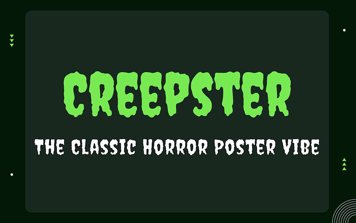
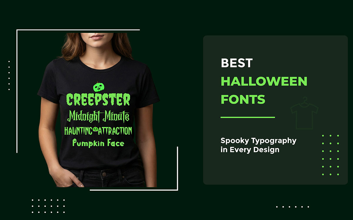
Creepster has a spooky, creepy, fun Halloween vibe. It's a free Google Font from Sideshow, and it stays clear and easy to read no matter how big or small you use it. Try it on creepy posters, trick-or-treat flyers, or scary logos. It also looks great on bold headlines for t-shirts, stickers, and banners when you need that instant Halloween punch.
Key Features
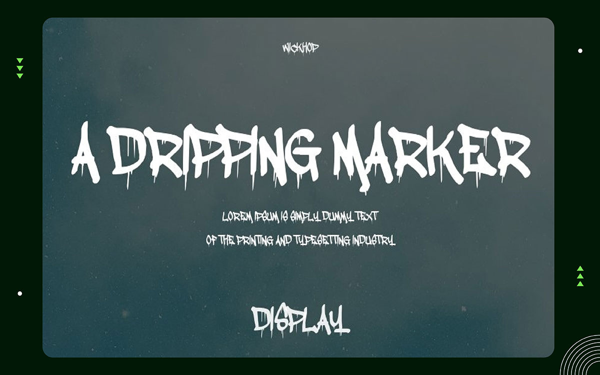
A Dripping Marker font looks like wet ink slowly sliding down a wall. It creates that classic drippy effect you see in spooky designs. The letters are bold, messy, and in-your-face. Use this font for haunted house flyers, spooky posters, and creepy signage. Make the font size large, so the drips remain clear when printed, and on screens for Halloween projects.
Key Features:
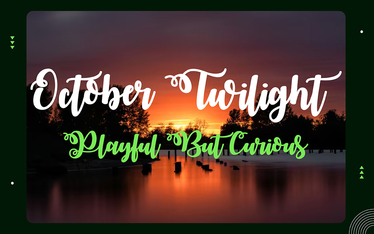
October Twilight is a unique font. It's soft and dreamy. The letters look playful and a little spooky. It works really well for fall labels, party invites, and cute Halloween posters. Just don't pair it with anything dark or gory. It's better for a calm, gentle mood. Try combining it with pumpkins, moons, and soft shadows to get that cozy, warm Halloween feel.
Key Features:
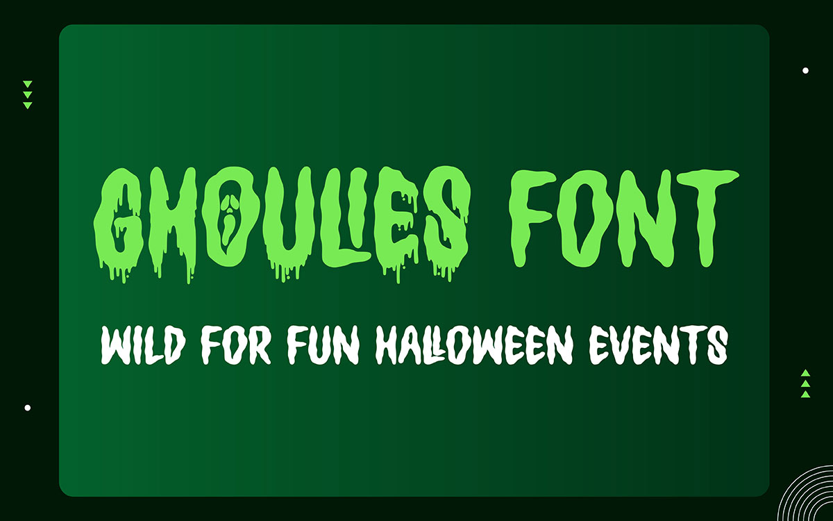
Ghoulies has a fun cartoon look with a creepy twist, but nothing too scary. The letters bounce around and look a little crooked, like a goofy monster grabbed a pen and started writing.
It works great for Halloween party signs and candy wrappers, as well as classroom posters and cute stickers. Stick to bright colors and give the letters some breathing room so everything stays easy to read.
Key Features:
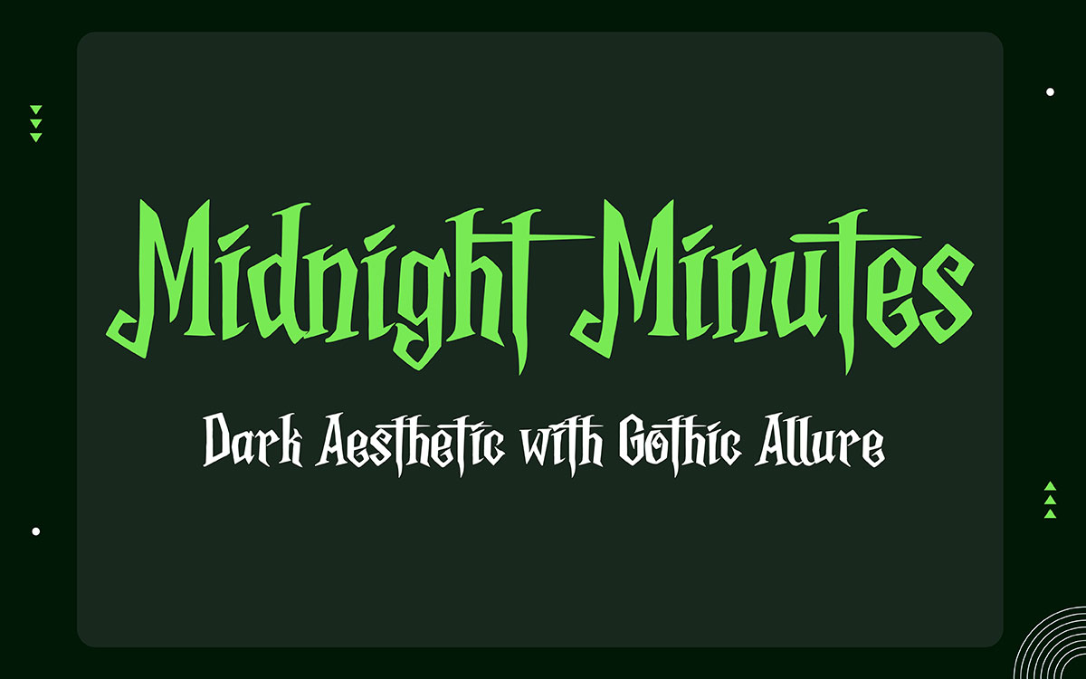
Midnight Minutes has a bold gothic look. It features sharp lines and dramatic endings, almost as if written in the Middle Ages.
It works great for invitations to dark or spooky branding, creepy branding, and moody poster titles. It's recommended to keep body text simple and let this font do all the drama at the front.
Key Features
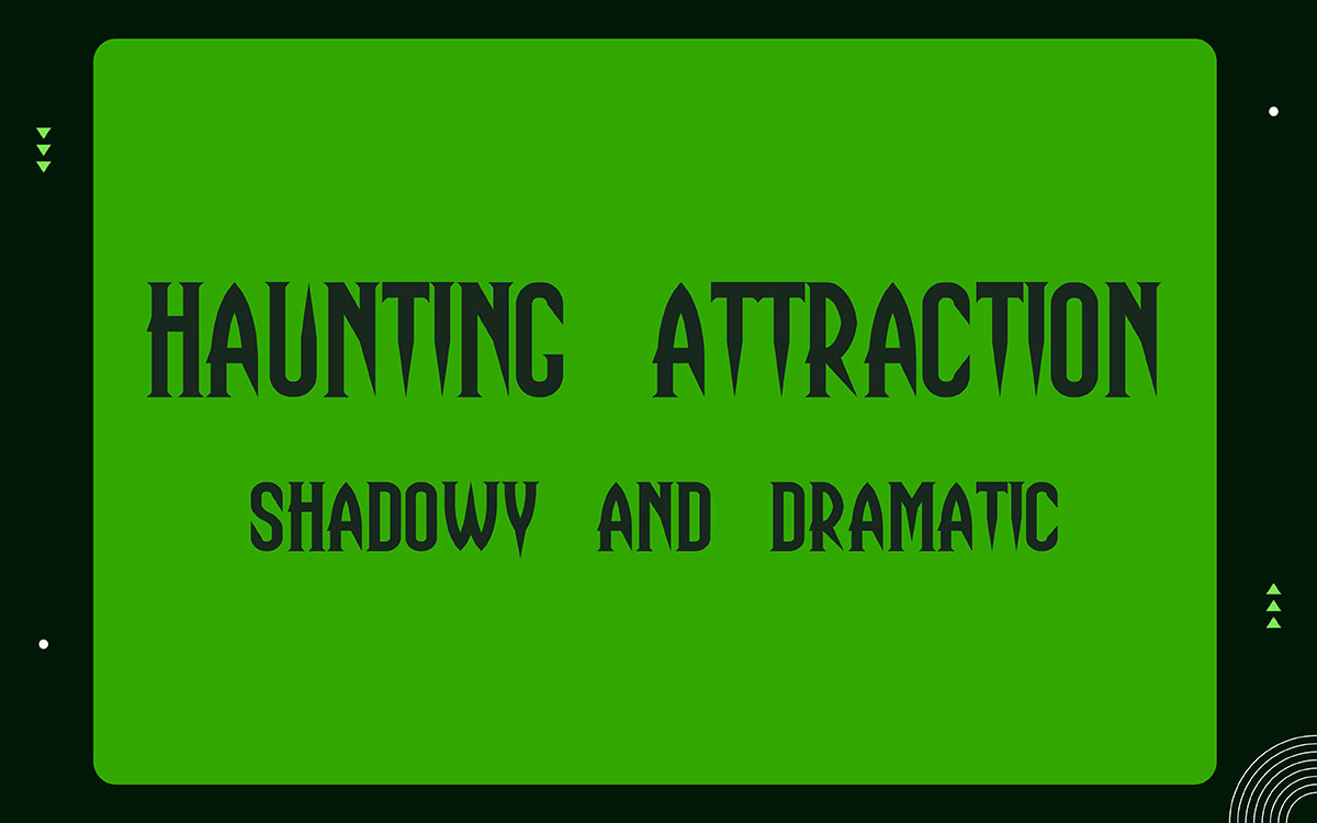
Haunting Attraction feels like an old carnival poster come to life. The letters are bold, a little creepy, and hard to ignore. Perfect for haunted-house flyers, horror-event banners, and scary posters.
Keep your text short with this font. Long lines don't work well here. For printed designs, go with dark textures. They boost the contrast and make everything feel way more eerie.
Key Features:
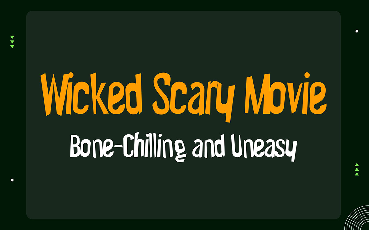
Wicked Scary is a font that feels raw, tense, and a little out of control. The strokes look jagged, like scratches, cracked paint, or broken bones. It works really well on Halloween posters, spooky thumbnails, and haunted event ads.
Don't pair it with anything cute or friendly. It's built for warning signs, spooky slogans, and big bold titles. Keep the background clean and simple so the letters are easy to read.
Key Features:
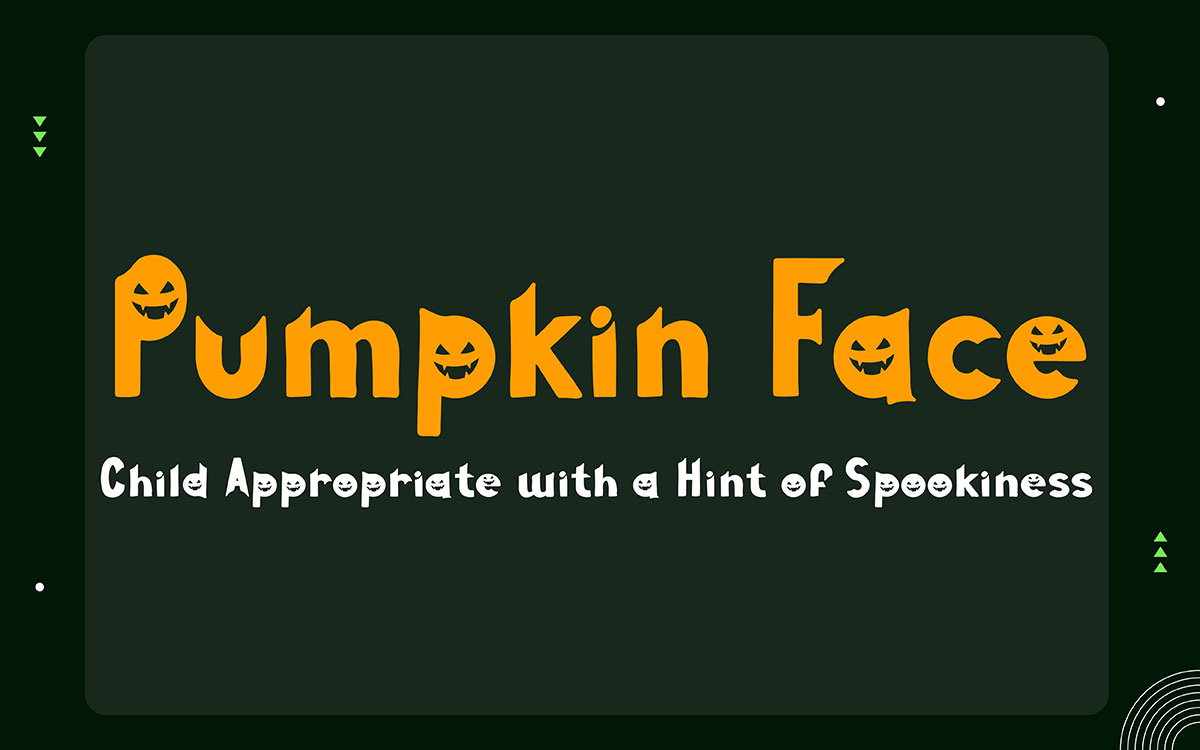
Round and smiley, Pumpkin Face gives off good vibes. It's one of the best Halloween fonts that feels fun, not spooky. Perfect for trick-or-treat bags, school crafts, pumpkin patch signs, and cute party invites. Stick to warm, orange tones when choosing colors. It works best with a few words, not long blocks of text.
Key Features:
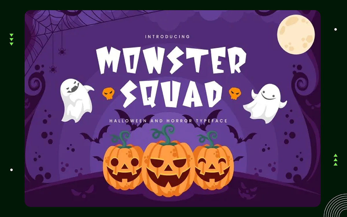
Monster Squad has a classic comic-book look with a creepy twist. The letters are thick and bold, perfect for wild Halloween stuff. It works great on teen party flyers, horror posters, and spooky merch.
Stick to big headlines; skip the long paragraphs. Pair it with bats, cobwebs, and bright colors to get that fun-but-eerie feel.
Key Features
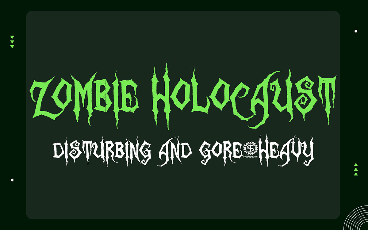
Zombie Holocaust is bold and in-your-face. The letters look damaged and cracked, like scratched metal or ripped skin. It fits perfectly on bloody movie posters, zombie events, and horror game graphics.
Don't use it for anything cute or kid-friendly. Stick to short lines and strong contrast. Throw in some grungy textures to nail that Halloween vibe, but make sure people can still actually read it.
Key features
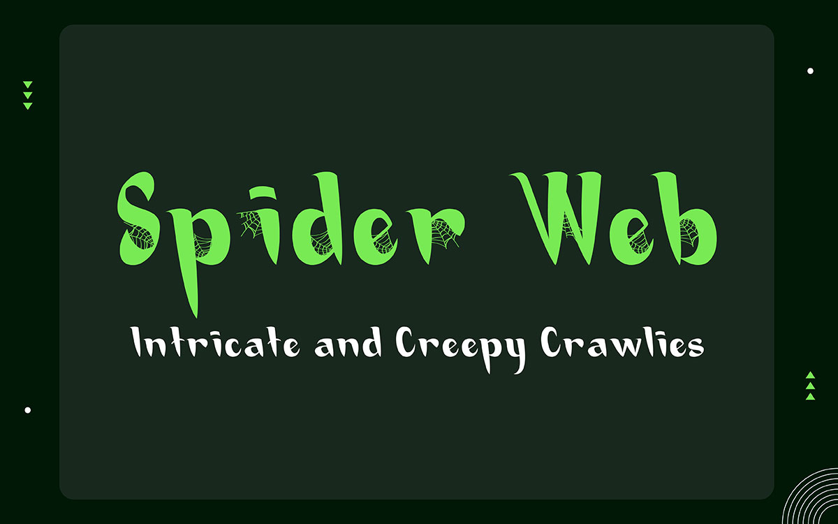
Spider Web fonts usually come with web details that give off Halloween vibes from the start. The style is creepy and decorative, making it perfect for haunted house flyers, party invites, and spooky banners. Use it for titles and headers. Keep the background simple so the thin web lines stay visible. Works best with black, purple, or orange color themes.
Key Features:
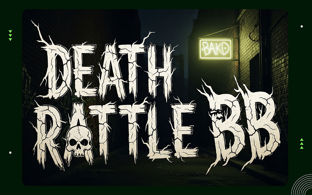
Death Rattle BB is among the best Halloween fonts for a horror comic. The bold letters look a little wild, like ink splashed across the page. It works perfectly for posters, sticker packs, and creepy designs that need a bit of edge. Best used for short headlines and punchy phrases. Throw in some comic textures, lightning bolts, or skulls to really crank up the spooky factor.
Key Features:
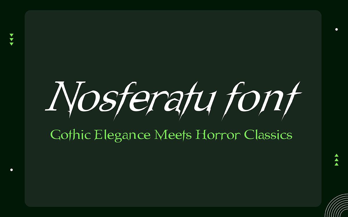
Fonts inspired by Nosferatu come from early vampire movies, gothic art, and old shop signs. The letters look sharp and serious. They feel bold and dramatic. They remind you of old film titles or words carved into a grave.
This style works well for dark invitations, scary posters, and spooky logos. It looks best in capital letters or short phrases. To create a classic horror feel, use thin borders, dark backgrounds, and soft shadows.
Key Features:
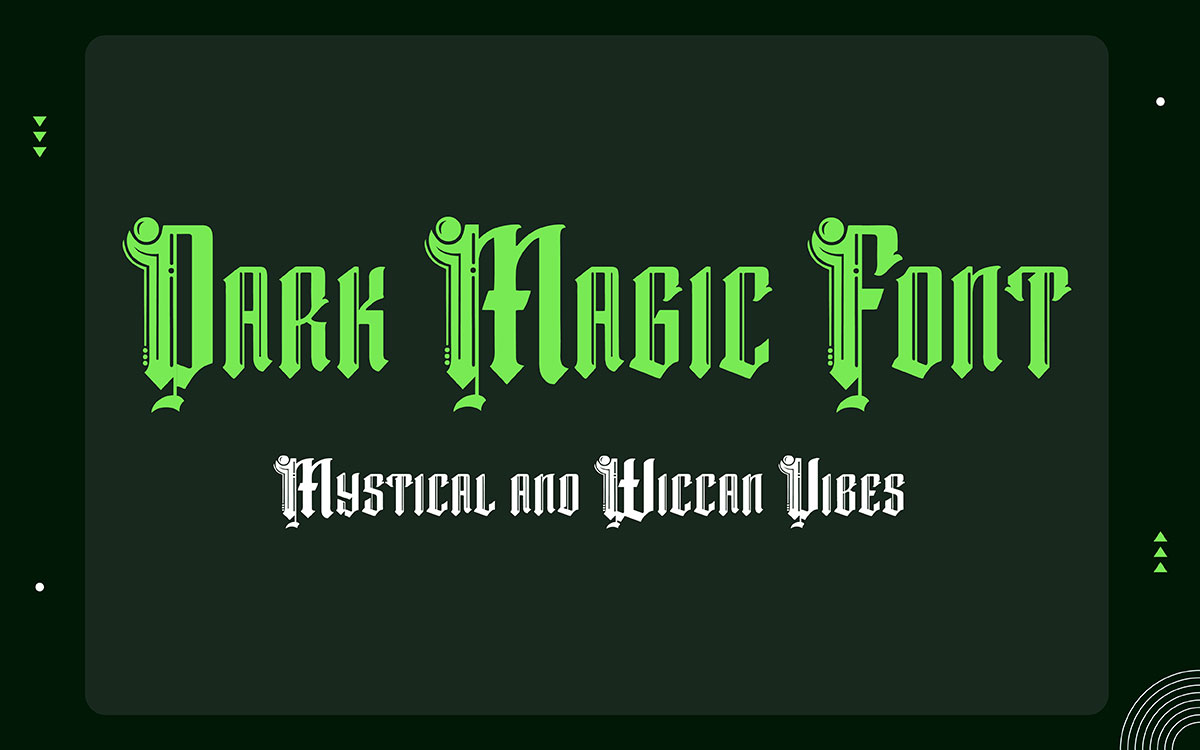
Dark Magic is a bold black-letter font with a strong Gothic look. The shapes are sharp and old-school, like something from the Middle Ages. It fits perfectly with witchy styles, creepy posters, and spooky logos.
Stick to using black-letter fonts for titles only, since long paragraphs get hard to read. Dark Magic works great for haunted brand designs and dramatic Halloween headers.
Key Features
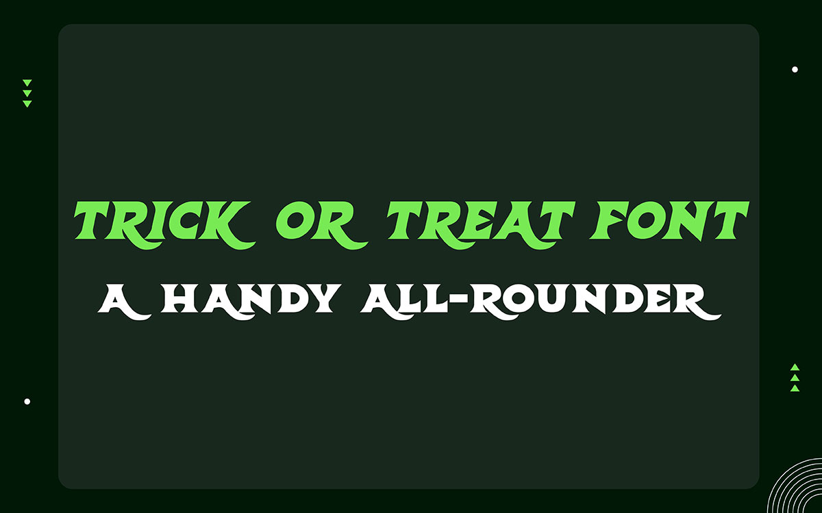
Trick or Treat is a Halloween font that does exactly what it promises. It's fun, a little creepy, and easy to read. Use it on party invites, candy jars, or classroom posters to create that spooky vibe.
It also looks great in short phrases and big bold headings. Add some pumpkins, bats, or cute icons alongside it, and you've got a festive October look that feels just right for the season.
Key Features:
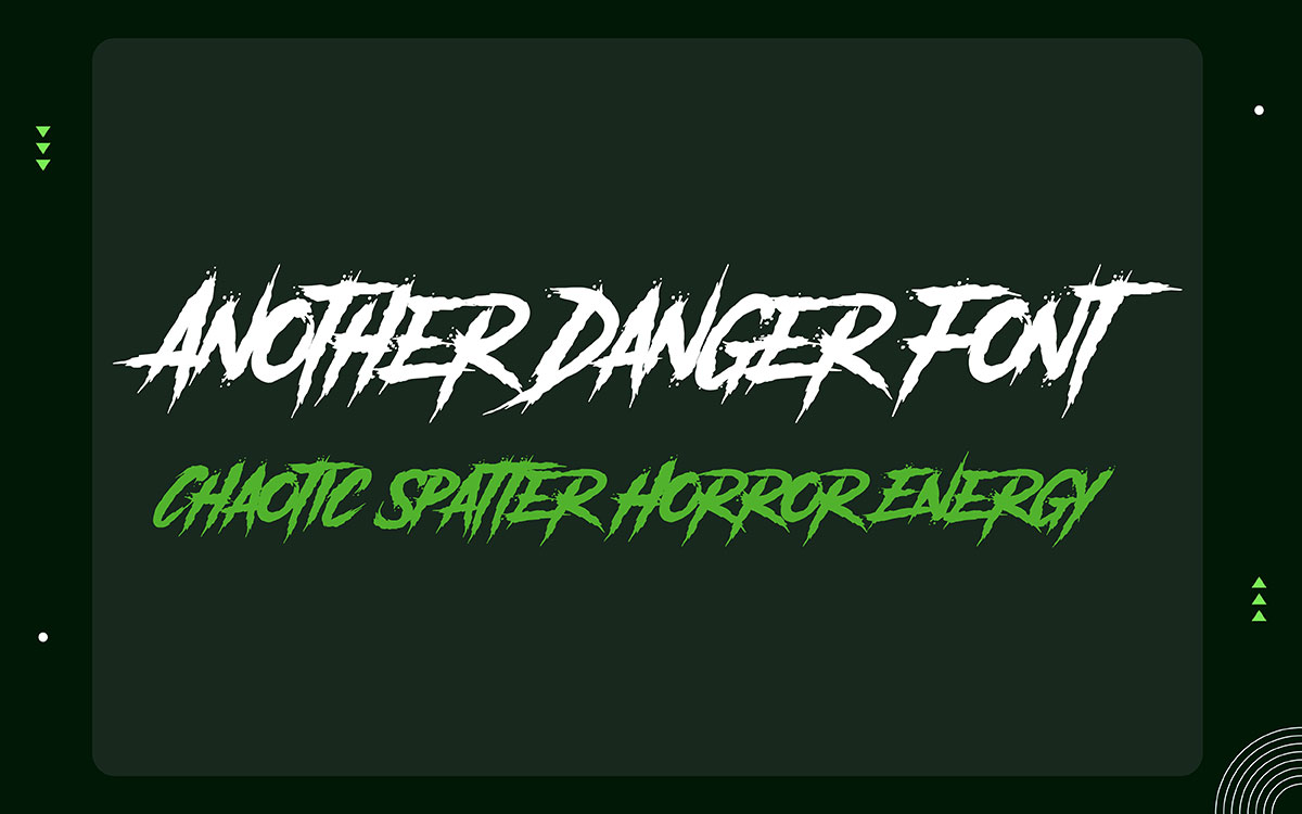
One font that really stands out for Halloween is Another Danger. Every letter looks like it was randomly splashed with ink or blood, giving it a bold, chaotic, and edgy feel. Perfect for horror posters and eye-catching spooky typography for Halloween projects!
Key Features:
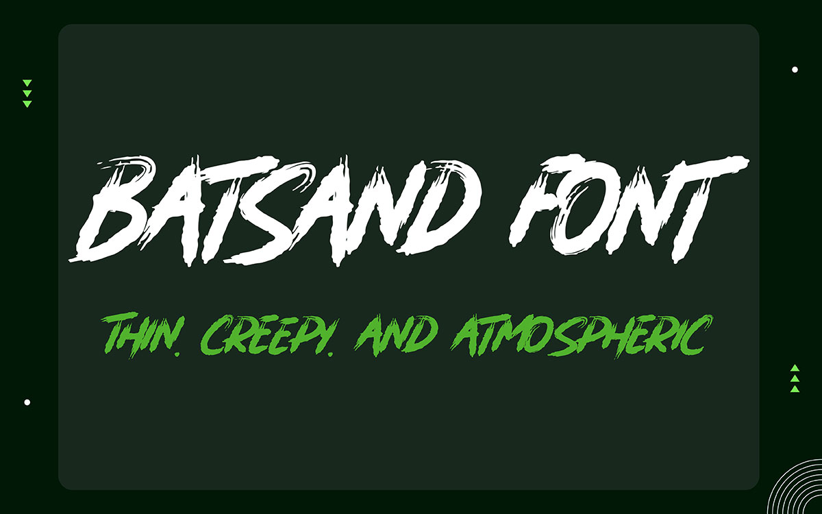
Batsand is a creepy font that gives off a strange, unsettling vibe. The letters look a little shaky and odd. It doesn't feel like a jump scare. It feels more like a chill down your spine. That's what makes it great, one of the best fonts for haunted-house flyers or mystery-party invites.
Key Features:
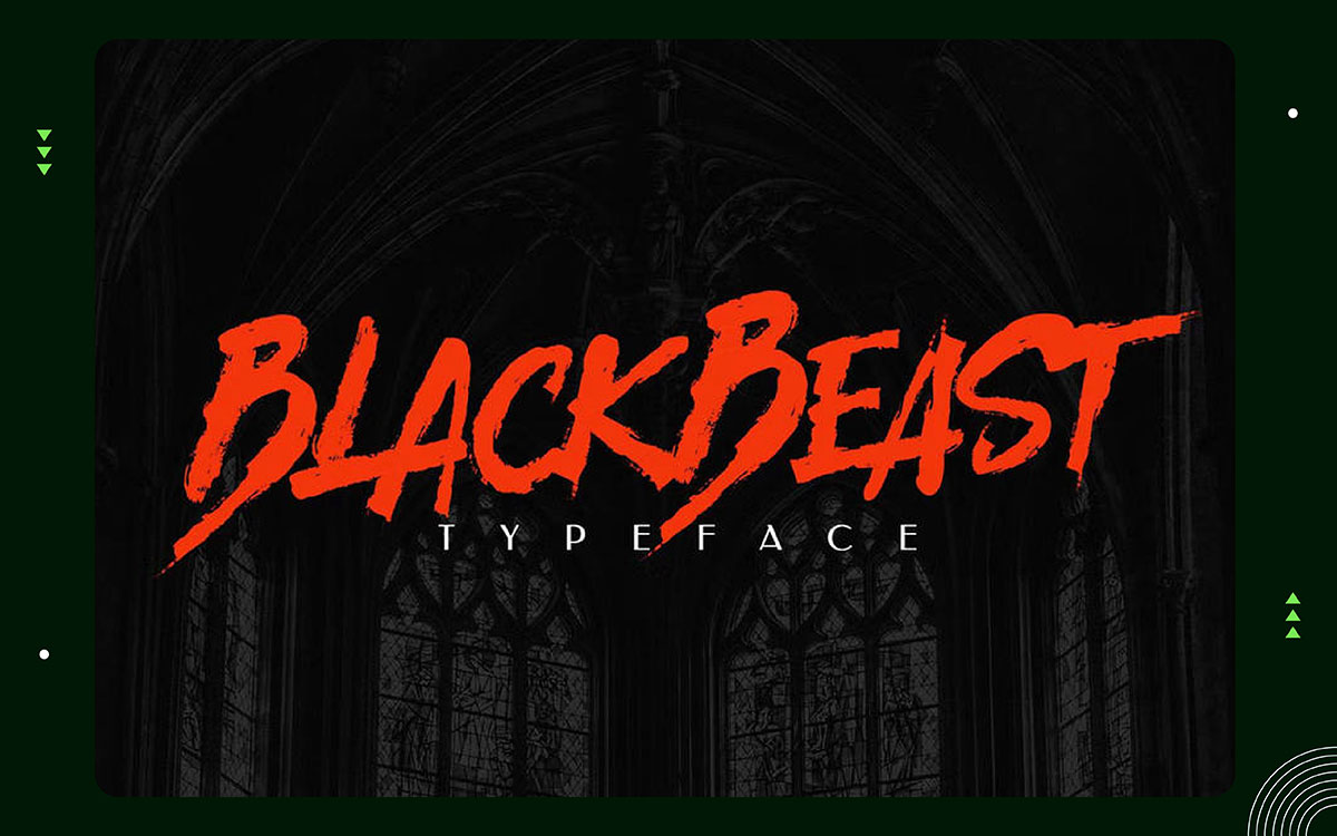
Black Beast is a paid horror font. It has sharp, bold strokes that feel dark and aggressive. It works great for Halloween branding, spooky graphics, album covers, and clothing prints. The style feels haunted and intense, yet remains clean and easy to read.
Key Features:
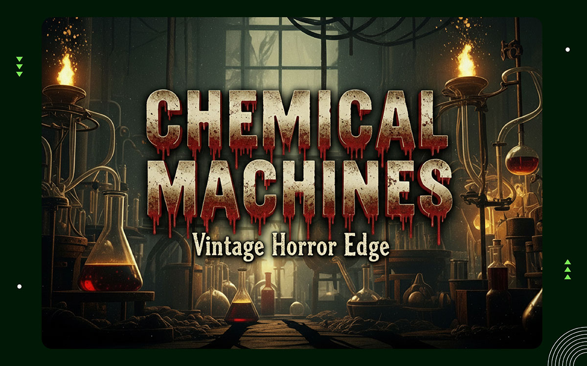
With a Halloween feel, Chemical Machines blends a vintage style with a touch of creepiness. It looks like an old lab that went terribly wrong. The worn-out lettering adds to that eerie vibe, making it a perfect fit for classic horror designs and grungy vintage posters.
Key Features:
With a look inspired by old horror comics, Dreadful uses scratch effects and layered details to give headings real depth. It adds personality to Halloween packaging and logos, making it one of the best font choices for that kind of work.
Key Features:
Picking the best Halloween fonts is just the beginning. The real fun is in how you use them. Spooky fonts, creepy Halloween typefaces, and gothic styles can look awesome or terrible. It all comes down to size, spacing, color, and where you use them.
Here’s how to use Halloween fonts effectively in the right way possible:
Posters and invitations need to grab attention fast. They should make you stop and actually read them. Save the spooky fonts for headlines only.
Keep the body text clean and easy to read. Titles like "Haunted House" or "Trick or Treat Party" are perfect for bold, creepy fonts. They set the mood right away.
High contrast colors work really well with Halloween fonts. Think black on orange, or white on dark purple. Also, don't crowd your design with too many decorative fonts at once.
Pick one spooky font for the title and one plain font for the details. That combo keeps things both dramatic and easy to follow.
On screens, simple beats fancy. Lots of creepy poster fonts look cool when printed, but get blurry on small phone screens. Always test your scary fonts at tiny sizes before you share anything.
Use bold, horror-style fonts only for short phrases. A glow effect, a shadow, or a small animation can make things pop. For spooky logos, keep the letters clean and easy to read. Piling on bats, webs, and blood drips everywhere just makes the design look messy. Simple layouts always look better online.
When it comes to printing shirts, simple is better. Fancy or decorative logos and fonts can crack or look blurry over time. For t-shirts, go with bold, thick fonts; they print the cleanest.
For witchy or pumpkin-style fonts, keep the details light and avoid really thin lines, as they don't print well. Try zooming out on your design to see how it looks from a distance. For spooky designs, stick to strong, high-contrast colors so they stay looking sharp even after a few washes.
Gothic letters and Halloween-themed fonts are great for making your comic or book title pop. For author names and subtitles, stick to a plain serif or sans serif font so it doesn't compete with the spooky main title.
When picking scary fonts for Halloween comics, textured horror styles can work really well. Just don't go overboard. Too much distortion makes things hard to read. Aim for dramatic, not messy. The font should support your story, not steal the show.
Designing messy Halloween fonts can make your work look amateur. Even small font mistakes can hurt your design.
These tips will show you common mistakes to avoid when using the best Halloween fonts and help you seriously level up your skills.
The first thing to check is whether people can actually read your design. If the font looks too wild and no one can make out the letters, the design has failed. For example, if the letter "C" looks like an "O," that's a problem. Go through each letter one by one.
Not every scary Halloween font has this issue, though. Some fonts use drips or cracks running up, down, or across the letters. These small touches make the font look really cool.
Step back and look at your design from far away. If it takes too long to read, tone it down a little. One small tweak can make it much clearer without losing that creepy feel.
Too many scary fonts in one Halloween design make it look messy. Pick just one spooky font. Place it next to a plain, simple one. That mix creates something cool and balanced.
Use the creepy font for your title only. Keep the rest of the text clean and normal. Play with thickness, too. Make one font bold and another thin and light.
Don't go crazy with colors either. Sticking to one color in different shades keeps things looking sharp. Also, give your creepy font some space. It looks way better when it's not crammed in.
Many Halloween fonts are linked to specific movies or franchises. When people see them, they instantly think of that film, not your design. It might seem like a smart choice, but you're basically borrowing someone else's idea.
Seasonal fonts should create a feeling, not copy another style. The goal is to make something that stands on its own. Fonts that remind people of a famous horror movie title are a bad pick.
Try to find ones that feel fresh and unique. Your work will come across as more creative and polished that way.
A well-planned layout makes things look great and fun to explore. But if you go overboard, it can get messy and confusing. So when you add Halloween-style fonts, keep the layout clean and simple. Make sure the text is straight and easy to read.
Good organization also helps creepy fonts and spooky writing stand out on posters and invitations, instead of looking like a jumbled mess. With scary designs, keeping things simple almost always works better.
Still not sure which creepy font fits your project? Here are quick answers to the most common questions about the best Halloween fonts FAQs.
Scary fonts usually have jagged edges, uneven strokes, or dripping details. They create tension and drama. Creepster is a great example. It has that classic monster-movie look.
A good Halloween font needs to look cool and still be easy to read. BlackBeast Typeface is a solid pick. It's bold, sharp, and grabs attention fast.
Killer horror fonts are big and intense. They usually have sharp edges and slightly twisted shapes. Killer Horror Font by Pian45 nails this style.
First, think about the vibe you want. Use bold, decorative fonts for titles and headings. Then pair them with clean, simple fonts for the rest of your text. The best Halloween fonts look creepy but should still be easy to read from across the room.
You now have a great set of the best Halloween fonts and enough design knowledge to use them with real confidence. But picking the right fonts is only half the battle. Creating something polished and eye-catching is where most people get stuck. That's where we step in.
At Graphic Design Eye, we've spent over ten years helping business owners, brands, and creatives with visual ideas. We handle everything from Halloween campaigns and event posters to full brand identities and social media graphics.
You've done your homework. You know what strong Halloween typography looks like. Now, let a team that eats, sleeps, and breathes design take it from there.
Contact Graphic Design Eye LLC today, and let's create something truly unforgettable!🎉✨