Remember, visuals are the key to success on social media.
Social media users are becoming more choosy and advanced with globalization. So, random designs or branding won’t help much in growing your business on these platforms. You need to understand social media design rules and your audience to find out which type of design appeals to which social media users.
Have you noticed how social media has become the center of online businesses? Ever wonder why?
More than 5 billion people use social media—that’s more than half of the world’s population. From this massive number, you can understand how crucial it is to create a social media presence for any brand.
This means that every business in this modern world must also have social media branding. Don’t worry. You don’t need to be googling again. This guide is like a handy guide you can use to improve your design. So, if you want to create designs that are social media-friendly and emotionally connect with your audience, you are in the right place.
Here, you will find all the social media graphic design tips that will help you to stand out on these platforms. Let’s discuss secret tips! Keep reading!

You’re desirable part has come. The important social media graphic design tips will surely help you to create attractive social media graphics and branding. Here are the social media design tips that might just skyrocket your business.
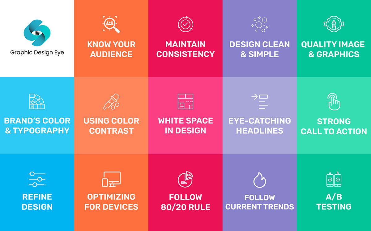
Before making your designs, think about the people you’re designing for. Are they teens? Business owners? Parents? Knowing this helps you make designs they’ll like and connect with. For example, bright colors and fun shapes might work for kids, but professionals might prefer clean and simple designs. When you understand your audience, your designs won’t just look good—they’ll actually mean something to the people seeing them.
Always use the same colors, fonts, and brand logo in every post. This will create a unique identity for your brand. Think of a famous brand, like Coca-Cola—they always use red and white. If your designs are consistent, people will recognize your posts right away, even before they see your name. It makes your brand look strong and organized.
Don’t try to put too much stuff in one post. If it looks too busy, people won’t know where to look at the first glance. And they might just scroll past. Keep it simple so they can focus on the main message. Less is more in graphic design for marketing.
Do you like like blurry pictures? Of course, not. Nobody does. Always use clear and sharp images. It makes your posts look professional and trustworthy. One simple rule, If something looks good, people are more likely to stop scrolling and check it out.
Stick to specific colors and typography for your brand. For example, If your brand uses blue and white with bold letters, use those all the time. It makes everything feel like it belongs together, like pieces of the same puzzle. This way people will consciously or subconsciously remember your style.
Contrast means using the colors opposites to make something pop. For example, think of a dark text on a light background. This helps important things, like your headline or a CTA button, stand out. If something stands out, people will naturally notice it first.
White space isn’t always white. Many will think it’s just wasting space or doing nothing. It’s not just empty space in your design. It gives the important parts room to breathe. Imagine a messy table vs. a clean one. Which one is easier to look at? That’s the magic of white space.
Write headlines that grab attention. A bit of copywriting can be useful here. Make the main message big and bold so they stand out. A good headline can make someone stop and want to know more.
A call to action CTA button tells people what to do next, like “Shop Now,” “Learn More,” or “Sign Up.” Add it somewhere obvious in your design. It’s like giving people a friendly nudge to take action.
Listen to comments from your audience. Also check out the analytics. Find out how each of your post performs. If something isn’t working, change it. Keep improving little by little. Your designs will get better and better over time.
Look at the numbers behind your posts: how many people liked it, shared it, or clicked on it. This shows what’s working and what isn’t. Use this info to make better designs in the future.
People use all kinds of devices—phones, tablets, laptops. Your design should look great on all of them. If any certain element or text is too small or blurry on a device, people won’t bother reading it. Make sure it’s clear and easy to read everywhere.
Make 80% of your design visual (like pictures or graphics) and only 20% text. Social media is fast-paced, and people won’t stop to read a lot of words. A quick, eye-catching visual does the trick better.
Keep an eye on what’s popular right now. Maybe it’s pastel colors or hand-drawn doodles. Adding trendy graphic touches makes your designs feel fresh and modern, which gets people excited.
Make two versions of your post—maybe one with a blue background and one with a yellow background. Share both and see which one gets more likes, comments, or clicks. This helps you figure out what your audience likes best. Point to be noted, do this testing before officially creating your brand. Once your brand is fully created, then stick to certain brand colors and typography.

Every social media platform has its own requirements for thumbnails. And you have to match that platform’s style when creating a design. Some social media likes are all about short, snappy posts, while others love videos or long stories. It’s important to know what each platform likes best so your design fits in. For example, Instagram uses a grid for pictures, and Twitter is set up as a timeline for quick updates. So, thumbnail images need to fit the style and size of each layout to look clear and keep people interested.
The way people interact on each platform is different. A good visual can hold people’s attention for a while. If you post the same thing everywhere, it will not work well.
Here are some crucial requirements for popular social media platforms:
You can create all your social media graphics using the guidelines above. However, you might be wondering which tool or software you need to use. There are many design tools available that you can use. They help you make thumbnail images, videos, or designs that look just right for Facebook, Instagram, or wherever you’re posting. I have picked the top 5 tools that you can use to create social media graphics.
Adobe Express is great if you want your posts to look really professional but don’t have a lot of time. It has ready-made designs that you can change up with your own words and pictures. You can even add cool effects to make your posts stand out, like moving text or images.
Canva is super easy to use, even if you’ve never designed anything before. It has lots of templates for things like Instagram stories or Twitter posts, so you don’t have to start from scratch. You just pick one, drag stuff around, and make it your own. Plus, if you’re working with friends, you can all edit the design together.
Visme is a bit more advanced, but it’s really good for making fancy posts or infographics. If you want to share numbers or facts in a cool way, this tool can help. It also has options for adding little motion graphics to your designs, which can make your posts more interesting.
Stencil is perfect if you need something fast. It’s simple, and you can make posts in just a few minutes. It also has lots of pictures and business quotes built right in, so you can quickly put something together that looks nice without hunting for extra stuff.
Fotor is more about editing pictures than making new designs. If you have a photo you want to post, you can use Fotor to make it brighter, add a filter, or put text on it. It’s like giving your images a quick makeover before sharing them online.
You need to regularly update your social media graphics to keep your audience engaged and maintain a fresh brand presence. Here’s a basic guide for updating your visuals on popular social media platforms:
Lastly, in our modern era, visuals speak louder than words. We’re becoming more comfortable every day watching visuals instead of reading.
Good social media graphics are the key to catching attention and building an emotional connection with your audience on social media. You’ll notice that every brand has its own style and voice.
Their branding is so strong that people recognize them just by seeing their design patterns or logos. You, too, must create unique, impactful designs to stand out. To create something truly effective, always follow the basic social media graphic design rules to achieve the best possible outcome.
Oh! Wait, did we miss anything? Or did you not find what you were looking for? If so, you can contact us anytime. Just send us an email, and we will do our best to assist you.
No more words today! Good luck!🤝