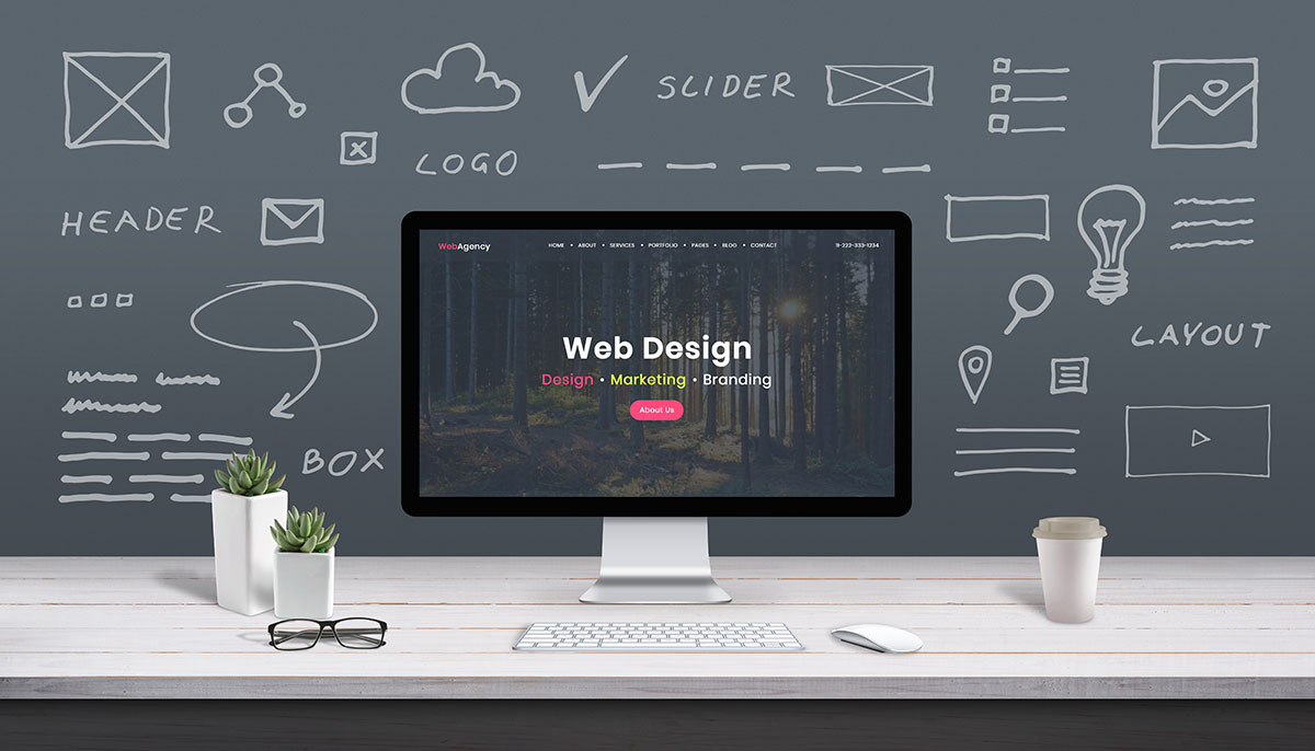
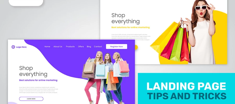
Open a website and within seconds your brain decides if it feels right. You don’t think about it too hard, it just happens. That first impression is exactly what modern web design aims to shape. Web designers know this well. To them, a page isn’t only a collection of text and pictures. It’s a stage where every color, font, and button plays its part.
 Web Design
 Oct 06,2025
 10 minutes
Picture this. You land on a page that loads quickly, the layout feels clean, and navigation makes sense without effort. You keep scrolling because it feels natural. Now imagine the opposite. Slow loading, cluttered sections, and buttons that look hidden. The difference is instant. One feels trustworthy, the other makes you click away.
That’s the heart of design. It isn’t just about looking modern. It’s about creating moments where visitors stay longer, read more, and maybe even buy something. Clean layouts, mobile-friendly setups, and clear calls-to-action quietly guide people, even if they don’t realize it.
And the truth is, most visitors can’t name why they like a site. They don’t say “oh, the typography has a good hierarchy.” They just know it feels easy. They know it feels professional. And that feeling makes them trust the business behind the page.
In this blog, I’ll share the essential elements of modern web page design that Graphic Design Eye experts focus on to build that trust. We’ll look at the choices that invite people in, keep them engaged, and turn a website into more than a digital placeholder.
Stay with me, the details might surprise you. Now, let’s dive into it!

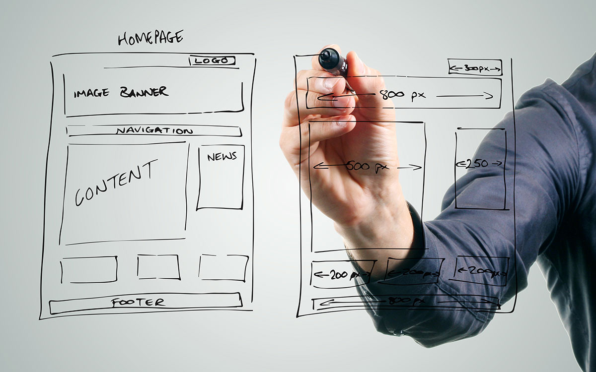
Sure, it’s no secret that a modern website has to do more than just look pretty. A good page feels smooth, clear, and built for the way people actually browse. Some elements make that happen quietly in the background, while others are right in front of you, shaping your first impression.
I’ve rounded up 8 essential elements of modern web page design. Each plays its own role, from keeping things simple to making the whole experience flow. And once you notice them, you’ll start spotting these details on every site you visit.
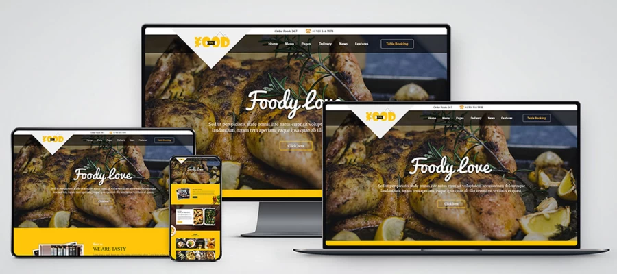
Your site needs to work perfectly whether someone visits on their phone, tablet, or desktop computer. Modern responsive design uses flexible layouts that automatically adjust to different screen sizes, including scalable text and images that load at the right size for each device.
Graphic Design Eye's top designers go beyond making sites look good on mobile. They make sure everything actually works. Payment forms, contact forms, and promotional pop-ups all get tested thoroughly on smaller screens using both testing tools and real devices to catch problems before customers encounter them.
With mobile devices driving most web traffic, smooth performance across all screens is essential for keeping visitors engaged and converting them into customers.
Speed is very important for credibility and conversion. That’s why the best web designers in Graphic Design Eye make it one of their top design concepts. That means images can’t be bigger than 250KB, and CSS and JavaScript files have to be minified. Also, browser caching has to be set up so that those who come back can see the website almost right away.
They use new formats like WebP instead of old JPEGs to make sure your site looks good. This way, it loads quickly, develops confidence, and keeps consumers interested from the start.
In any case, getting the right balance between speed and design takes experience and effort. USA-based companies seeking quality web development turn to Graphic Design Eye and other trusted local experts who prioritize speed-first development. These professionals use testing tools like Google Lighthouse to ensure sites load quickly and keep users engaged.
You know what it’s like to go to a website and feel lost right away. If your menus are too complicated or your links are hard to find, you could lose a consumer right away.
Your navigation should be so easy to understand that it feels like it’s not there at all. It should lead customers exactly where they want to go with obvious, familiar choices like “Services,” “Our Work,” and “Contact Us.” This kind of transparency indicates that you value their time and intelligence, which builds the kind of trust that turns browsers into believers.
To create this smooth experience, Graphic Design Eye's best designers follow three rules that can’t be changed:
When visitors can easily find what they’re looking for, they stay longer and explore more of your content. Clear navigation paths also make people more likely to contact you, make a purchase, or take actions you want them to take.
When everything on a page screams for attention, no one hears it. The art of visual hierarchy is making your most important statement stand out the most. It’s the difference between a messy noticeboard and a well-made poster with a headline that stands out. If you master this, users will know exactly what to do next and understand your offer right away, without any uncertainty.
To do this, skilled designers use a framework that is based on these basic methods:
When visual hierarchy is done well, visitors can understand your message and act on it.
People don’t just buy things; they also buy into stories and communities. And your website is the best place to tell your story. Instead of using cold, generic images, use photos that show what your business is all about right here in Graphic Design Eye.
For example, your van against a Joondalup sunset, your team helping at a local event, or your product being consumed at a favorite Northbridge area. Make sure that the tone of your website sounds like you, whether it’s nice and laid-back or formal and exact.
Another thing to keep in mind is that your brand identity is a promise, and you keep it by being consistent. Every touchpoint, from your site to your checkout process, needs to have the same look and feel. This means that you need to protect your brand assets. Use the same two typefaces and the precise HEX codes for your brand color on every page.
A completely uniform presence helps your business look competent, trustworthy, and easy to spot, cutting through the noise of a crowded market.
A modern website should work for everyone, including people with disabilities. Accessibility is both a responsibility and an opportunity to reach a wider audience. Key features include alt text for images, strong color contrast, and keyboard-friendly navigation.
Following Web Content Accessibility Guidelines (WCAG) helps ensure inclusivity. For example, clear headings make content easier for screen readers, and descriptive link text (“Download Annual Report”) is more useful than vague prompts like “Click Here.”
Inclusive design also benefits people with temporary or situational limitations. Someone with a broken arm using voice commands, a parent holding a child while browsing on a phone, or a color-blind user trying to filter products will all find your site easier to use. Addressing these details improves usability for everyone and builds loyalty by showing each visitor matters.
Clear calls-to-action (CTAs) guide visitors toward the next step, whether that’s booking a service, signing up for a newsletter, or completing a purchase. Without them, a site feels unfinished, and users leave without engaging.
Effective CTAs are short, bold, and easy to spot. Placing them above the fold, within content, and again at the bottom reinforces the message without clutter.
Design plays a role as well. A bright “Book Your Free Consultation” button on a neutral background draws attention. For e-commerce, urgency cues like “Limited Stock Available” can encourage faster action.
Always test variations. Sometimes changing “Learn More” to “Start Your Free Trial” is enough to lift conversions.
Trust online is fragile, and users will leave quickly if your site feels unsafe. Building strong security into your design protects visitors and builds confidence in your business.
Foundational security: SSL certificates, secure forms, encrypted databases, and regular updates safeguard data and keep your site trustworthy.
Advanced safeguards: For industries like healthcare or finance, features such as two-factor authentication provide an extra layer of protection.
Visible trust signals: Displaying secure payment badges and privacy assurances reassures customers before they share personal details.
Security keeps your site safe today, but scalability ensures it stays effective tomorrow. By using flexible frameworks, you can add features and expand content as your business grows without the expense of a full rebuild.
So here we are, wrapping things up. Funny how small details on a webpage can change the whole experience. Some parts guide your eyes without you noticing. Some make things look pretty, and some just quietly hold everything in place. And maybe that’s the point. Good design often works best when it feels natural.
Think about it. When you click a button and it just works, you barely notice, right? But that tiny interaction keeps you moving. Same with a headline that immediately tells you what’s important. Or when a layout makes reading easy, and suddenly your brain isn’t tired. That’s design doing its job without shouting.
If you’re making a site, don’t skip basics. White space, clean grids, clear labels, they all matter. These little tweaks add up. Absolutely, they change how people feel and how much they trust what they see.
In the end, design isn’t just visuals. It’s how people experience your page.


