Newspaper ads design service helps to get proper ads design according to purposes. You can incorporate a finely tuned strategy for your business because newspaper ads are timeless. They could also be used as future records for your business and branding, as well.
There are fewer alternatives of newspaper ads design. They are affordable and easily hold the attention of people. You can select the right and prominent spot on the newspaper. So, it is never missed by people. Moreover, you can have a positive response through the print media ads designs on newspapers.
In fact, understanding a newspaper ad is not rocket science. Instead, it is an effective way to let people know about your new business, product, or service. So, if the design is attractive, more people will see the advertisement. And through this way, you and your business will get popular.
Further, newspaper ads are able to get attention in offline arenas. At present, most of the people remain busy with online advertising campaigns. But following the traditional way of newspaper advertisement may bring you a grand success. It will expand your customer base as a wide number of people still read newspapers every day.
We are able to craft an outstanding newspaper ads design. And the pricing is relatively fair. You can contact us right now with newspaper advertisement campaigns. Your satisfaction is guaranteed.
Whatever type of ad you are going to publish in a newspaper, you will be trying to put the elements of the ad into a pleasing and useful arrangement. You can endlessly arrange your ad or article but there has some expert information about the format of the advertisement. If you are new to newspaper advertisement design then this category of advertisement format will help you a lot to build your one.
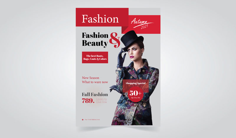
Big type layout focuses attention on the typography that it includes and it uses big type font to grab the attention of the readers. So, type overpowers art in a layout like this so that art may not even be needed. A big type of layout is very useful to create a headline and useful for those who don’t have so much content to adjust to the page or design. Big typography offers a sense of richness and creativity and adds a feeling of spaciousness. Above all this typography-related layout is very useful for artistic and minimalist designs.
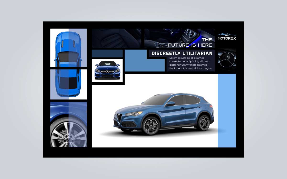
Mondrian layout is the most widely recognized layout in my opinion. It is named after the Dutch painter Piet Mondrian. Mondrian layout forms with black bars, lines, and solid areas of primary color that are divided by vertical and horizontal rectangles and squares. Among those shapes design, one or two of the rectangles may be filled with text or imagery, others may contain copy and others may be blank. Although Mondrian arrangement is an easy, logical, workable, and effective way to display type and art.
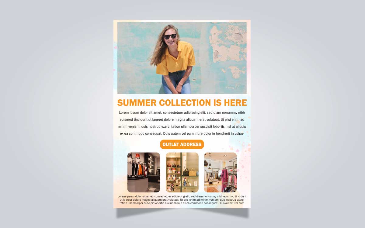
It is the best layout style for magazine design and is more popular than the Mondrian layout. This layout style comes in a vertical shape that doesn’t get in the way of the ad's message. With a large picture at the top and a headline, a body copy below this format will be going to make your article more readable to the reader.
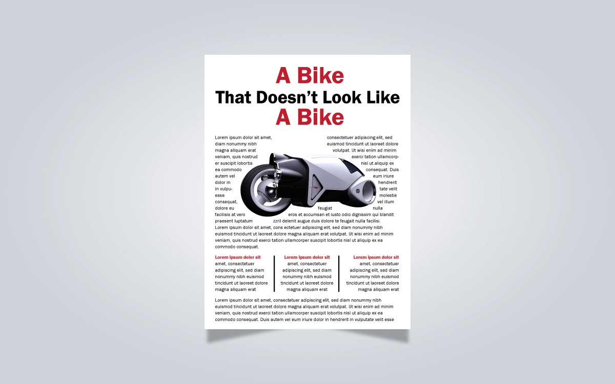
When you have an article that needs to be highlighted based on showing seriousness, then you should go with a copy-heavy layout. Copy-heavy advertising takes itself rather more seriously than other advertising. In this layout, headlines are centered, the first letter of the article is initially large and the entire article is broken into two or more columns. The theme of the article shows in a picture that is placed at the beginning of the article.
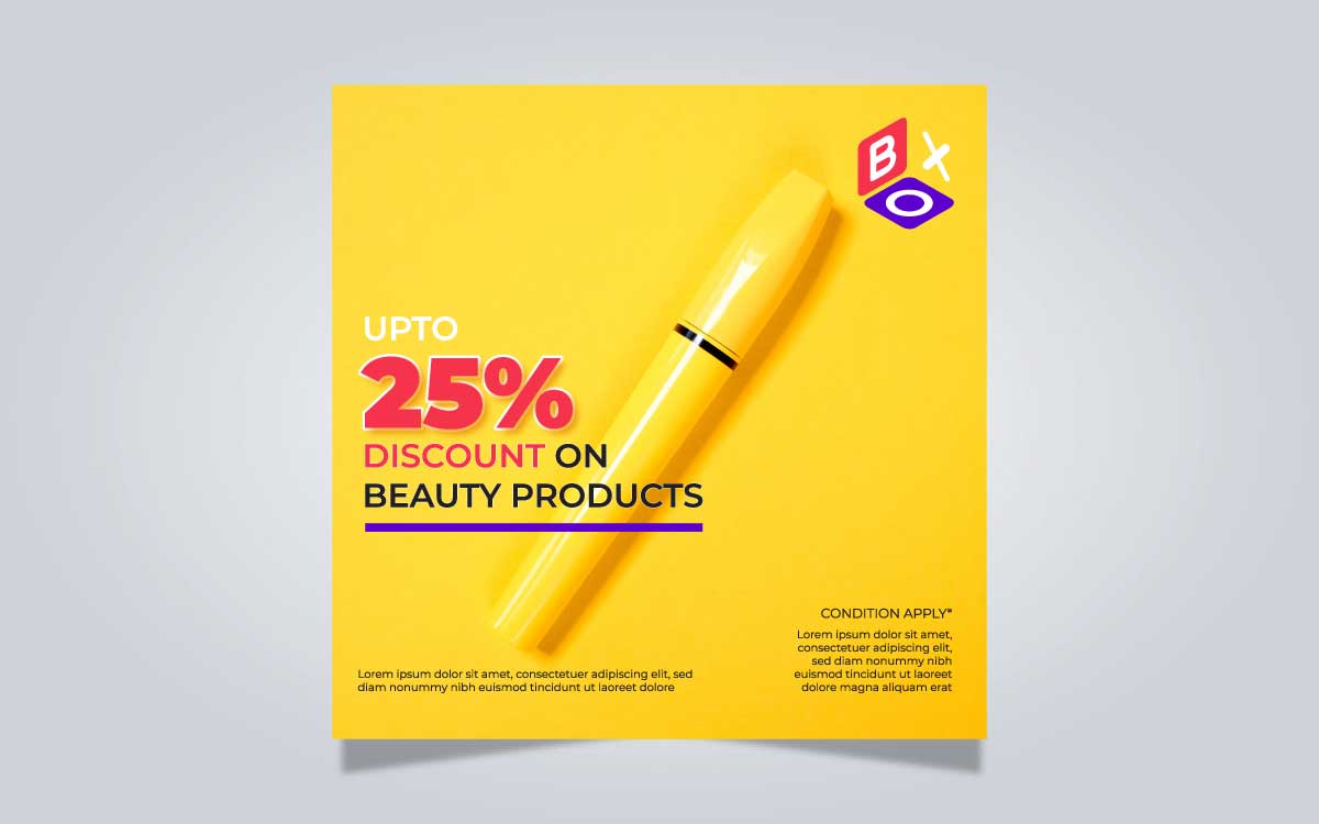
The frame layout has a border of solid black or another color, sometimes artwork in the middle for headline and copy. It is used more than newspaper advertising to magazine advertising design and highly chooses to decrease the optical size of the ad. Frame layout mostly covered the whole page of the copy and prevents associating another ad on the page.
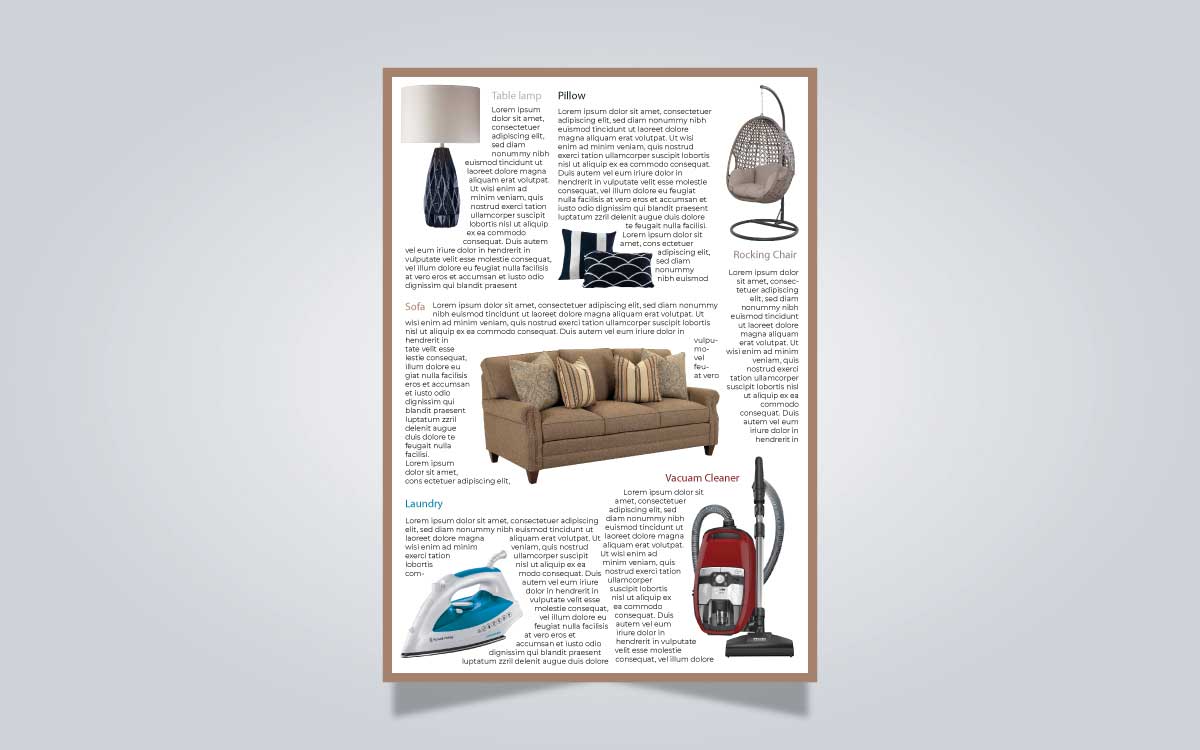
You know most of the readers of a magazine are interested in the editorial, not the advertisement. Because ads slow down the reader and it seems like a disorder to them. A circus layout doesn’t imply a standard layout and it refers to the irregular composition of elements. But this is powerful for merchandiser who wants to advertise products to a certain class of customers and also best to use in the school magazine, exhibition, entertainment, etc.
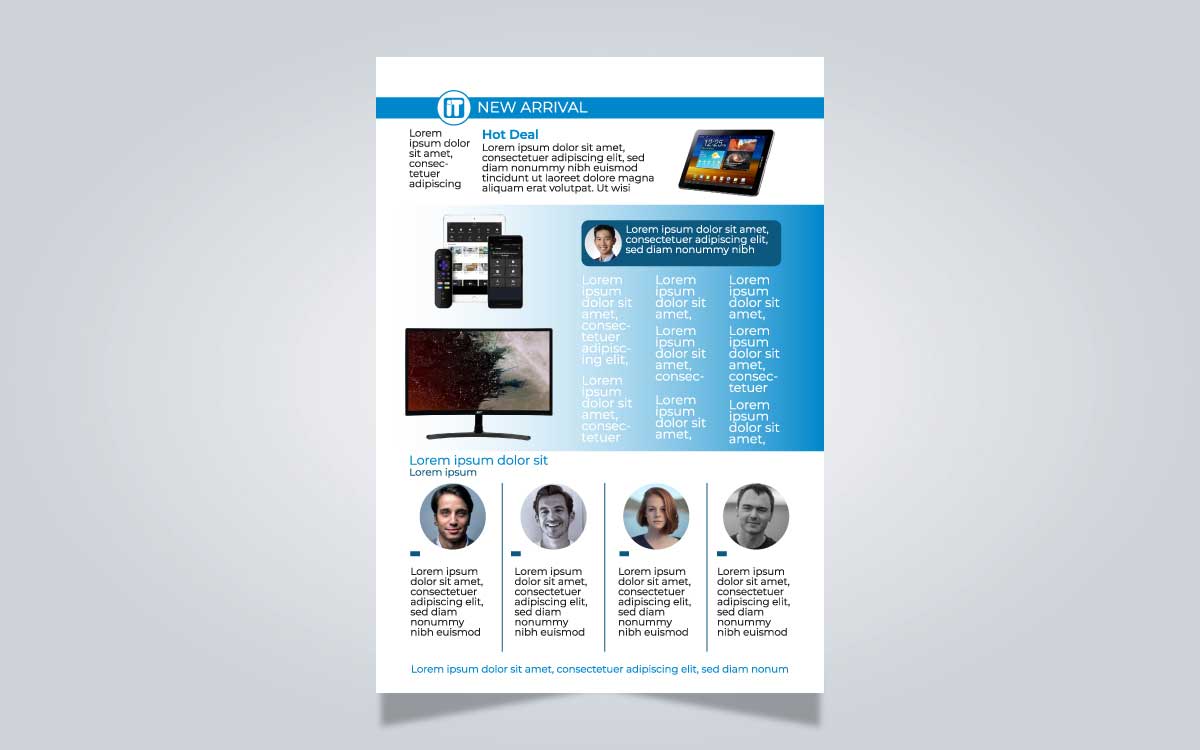
You can recognize the layout's structure in the name of it that it was multi-panel. So, it has some sections that divided it into the same shape as a rectangle, square, or cube. This iframe contains particular photos or drawings in every panel and also adds text or typography that is beneath pictures. It is also known as comic strip layout because all those panels of this layout tell a story or are used to simply display a product. This style is useful for education, sports, and youth-related design.
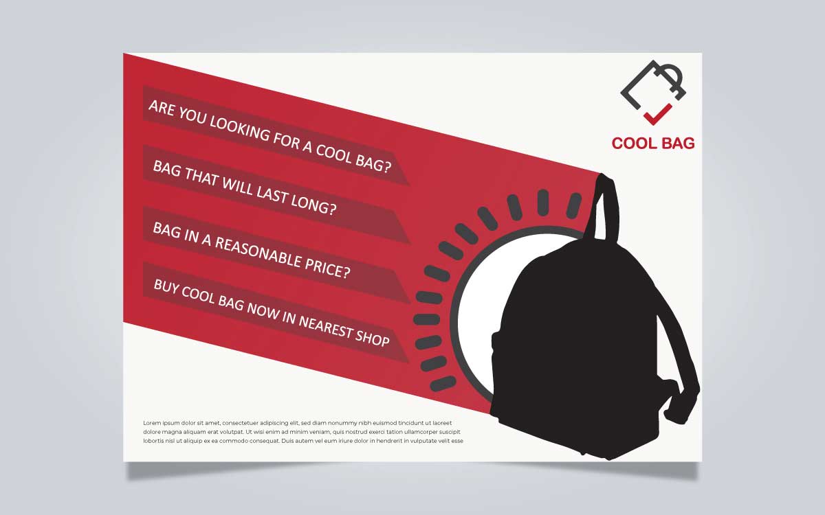
Professor Hallie J Hamilton said that “silhouette layout evolves from the unique shape created by the design of the ad, not by the shape of the elements used.” The silhouette layout comes with a classical feel with some irregular objects that are highlighted only through shadow. This layout always uses drop shadow techniques so that it visualizes the side view of the elements. It is a very useful layout to get attention over some important objects and because of the shadow that is used to it, get some extra suspense in your design as well.
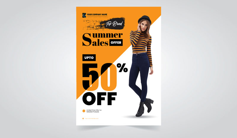
The alphabet-inspired layout is a letter-based advertisement design that works as another source of trust and inspiration for designers. This layout uses the basic shape of letters as elements both capital and small forms in a basic pattern to arrange the ad. This layout provides two strong design quality that is the shape of a letter of the alphabet or a number. This layout is used by most artists and creative people because it uses all of your creativity and knowledge of typography. This layout design can be used in print design as ads, web ads, posters design, etc. The goal of a newspaper advertisement design is to catch readers' attention and force them to take action. The success rate of your advertisement comes at zero levels when your prospect doesn’t notice it. Sometimes it becomes useless due to the lack of proper advertising knowledge. In newspaper advertising attention is everything. So, it is a matter of realizing how can you get attention from the readers through your advertisement. It is not so complicated if you know the way, to get the best result you need to use. The image that is related to your topic.
You should do the advertisement besides all that and try to make it peculiar so that reader can easily catch it in the crowd of another advertisement in the newspaper. Here I am mentioning some of the important tips that should need to know anyone who is trying to get rid of this field.
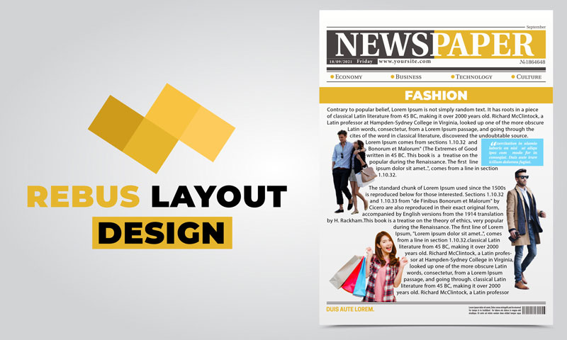
It is the type of advertising with copy broken up into small sections by illustrations. By replacing pictures this layout type is characterized by some of the words and used to form a story with that. this layout often comes symbolically and replaces texts with images to make sense. Sometimes, it adds surprise to the content and makes the design rich to improve readability. To enhance readers, focus, and attention and to add richness and surprise elements to your content you can use this layout for sure.
Graphic Design Eye has a three-step order placement process for newspaper ads design. First, our clients have to place the order. In the next step, we will process the order and send it for client review. Lastly, we will deliver the order and receive the payment.
Just send your project instructions
We send the designs to clients for feedback
Main file delivery and payment release
We do not have any concealed prices for this newspaper ads design service. Initial newspaper ads design price begins at $100. This is the basic pricing and offers some flexibility to our clients. This service in particular is flexible and designed to accommodate various budget levels while ensuring top-notch quality and attention to detail in every design we make. So, we have four pricing categories under this service. Each package ensures quality designs, adherence to brand guidelines, and a collaborative approach to achieve your advertising objectives effectively.

Basic
$100

Advanced
$150

Executive
$250

Leading
$400
Get a customized newspaper ads design price package for your specific needs!
BY QUOTATIONKnowing some information related to the newspaper ads design will help you find the best service. Also, it ensures to enrich your knowledge base over the design. Ultimately, the frequently asked questions will help you tailor your package perfectly.
When you go to the newspaper office to publish an advertisement for any of your purposes, you should have a clear idea of your advertisement. That means you need to confirm on which page your ad would be published if it is an article then how long it would be if you want to add a layout to attract people, How much does it cost, etc? In this article, I would describe all that topic and will clear all the hidden sides of newspaper advertisement design. We will be going to help those who are thinking about to create an advertisement in the newspaper.
When you take a newspaper in your hand, you can see so much news with texts and images that you might get confused to choose the right one to start. Then what did you do? You must search for the headline that is best suited to your mind. In this way, think you not as a reader but as an advertiser. You have something that you want to publish in the newspaper to inform people about that. if you don’t do that properly readers will miss that and you wouldn’t achieve your goal. Most of the readers usually bought newspapers to look through the current news and events, in the crowd of that news you should publish in a way so that it can easily get the reader's eye contact. To succeed in this issue, you can use image, exclusive font or typography, symbols, borders to get a quick meet to your reader's eye.
When you are making an advertisement in the newspaper, there are some common issues that you need to cover up. To make an effective ad layout, you must keep flow well together. For newspaper advertisement design, it is too hard to catch readers' attention because most of the readers skip it and search for news and views. You need to make a good combination of your ad’s whitespace, the size, and location of the ad, and also the placement of the copy. Here are some tips to follow in your newspaper advertisement,
Try to keep the ad short and simple, don’t make it so complicated. If you do that, your readers may lose interest to read the ad. Some fonts are difficult to read, so you should never choose them, also you should use one single font in all your text copy such as your main text, titles, subtitles, and headings.
Free spaces are going to make your ad look crisp and legible. Remember that, the whitespace you are using in your advertisement should be intentional and well-positioned. So, don’t use large holes and gaps between your picture or text if you want to make your ad stand out and look fresh.
It is an important matter for your newspaper advertisement design to where it would be placed. Poor placement can harm your ad and slightly get far away from your target. Try to place it on the bottom of the paper so that readers have eye contact with it.
Don’t use three dimensional, ups and downs or shadows in your ad, this type of style was popular ten years ago. but now, people get attracted to simple designs and that have a flat appearance. Besides, the alignment of your ad can call people to see it and separate itself from other advertisements. Alignment comes with all elements of your ad such as columns, pictures, titles, horizontal and vertical spacing, etc. you need to give a professional look beside all those elements.
Some elements must be included in your newspaper advertisement design. That’s are.
Headline: The headline is the most important element of your ad. It can get readers' attention easily. So, don’t forget to use it, try to keep it short, simple but strong.
Length: Your ad length should support your message. Long copy is good for technical and business products while short copy leaves room for graphics. Long text copy looks informative but there is a risk whether your readers choose it to read. But my advice is to keep a combination of both image and text and this is a must if you have fashion, home décor, and lifestyle products.
Comparison: In your advertisement, you should need to use such kind of comparative phrases like” why we are best from others”. This could bring trust over your product or service and keep you separate from your competitors in the market place.
Include benefits: Don’t forget to add benefits to your product or service so that readers can understand that they are getting what they need. Why the customers should buy your product or service now, draw the attention of your readers by using these types of words.
Call to action: Including CTA on an advertisement can invites, suggests, or directs the consumers to take quick action. You might include a free trial, discount, or an offer that adds value for consumers ready to buy. When you add a clear CTA on your ad, the readers would get a clear understand that what they should do after. Also, a clear call to action will ensure your ad reaches its objective.
Newspaper ad sizes is another point to be noted as it matters the most to advertisers. Ad design comes with different sizes based on classified ads. It measured in centimeters scale though few newspaper publishers still measure in width in terms of columns. One column is about 1.6 inches or 4 cm long. Usually, a newspaper ad has about 7-8 columns which means it is 28-32 centimeters wide and about 50 cm in length. Although it comes in some permanent sizes to display ads like.
A quarter-page newspaper ad has about 7-8 columns of standard size and has a length of about 50-52 cm. it is also considered as a postcard size ad. This type of ad grabs a complete corner of a newspaper page and can be placed in any of the four quadrants of the newspaper. This is the most common form of newspaper advertisement design also a cost-effective option yet.
According to its name, a half-page newspaper advertisement design can take half of a newspaper page. However, there have variations of half-page newspaper ad such as.
Vertical half-page newspaper ad design divides the newspaper area into two halves vertically. The vertical size comes with 16 cm in width and 46cm in length. Just like the quarter-page newspaper ad design, the popular choice of vertical newspaper ad placement is the right-hand side of the page.
This type of newspaper ad design divides the newspaper page into two halves horizontally. Horizontal half-page newspaper ad design measured 33cm in width and 25 cm in length. Just like the quarter-page newspaper ad design, the popular choice of vertical newspaper ad design placement is the bottom half of the page.
A full-page newspaper advertisement design covers the entire page of the newspaper and there are no other contents within the ad itself. This type of ads measured 33 cm in width and 52 cm in length. The dimensions are depending on the newspaper size and it includes a margin of 1-2 cm on the edges.
I would like to mention here some of the best newspaper ad sizes that’s are preferred by most of the newspaper advertisers. If you are one of them, you can choose from any of the following or you can go with your preferred size to display your ad. But remember that you should need to keep an eye of your design and layout when you are choosing the size for your ad,
The different advertisement design agency has different rate to design a newspaper ad. But it would start with a minimal rate of $100 and can end up to $400 based on the demand of the ad. As an advertiser, you should also know the cost of advertising ads in newspapers. The advertising rate is calculated on the base of the size of the ad, for example, width 2 columns: height 2 inches. So, the advertisement size will be 2 col×2inch = 4 inches per column. If per column inch rate is $500, then 4 inch/column price will be = 4 × 500 = $2000 USD.
That’s all about newspaper advertisement design I would learn from different sources. If you’re looking to advertising any of your business products or services or any other purpose, it will help you a lot from start to end. If you have any other issues to know in the same, then you can make direct contact with us by putting a single message, we are always ready to catch you with whatever you need.
The importance of a smart and attractive design could not be neglected. Because the design is able to get the right amount of exposure for a brand, service, goods or products. Usually, a catchy design brings more attention from the readers when you advertise for anything in a newspaper. So, it is highly important to get a smart design.
We are a pioneer in newspaper ads design service as we deliver the best design in all terms because Graphic Design Eye focuses on the detail while sketching the design. We are special in making unique newspaper ads designs as we know how to add more value in a simple design to make it look attractive, gorgeous and eye-catching. Also, we have the industry-best graphic designers who are highly skilled to deliver some flawless designs.
Moreover, we render each of the projects within the shortest possible time. So, our clients receive the projects as per their deadlines and are not required to wait for an uncertain period to have their projects completed.
What’s more, selecting a newspaper ads design service is like hiring a team of communicators to effectively communicate with the audiences. In this sense, we sharply customize the designs and agree for unlimited revisions for better and comprehensive communications. For all such grounds, you should choose us for your next newspaper ads design project.