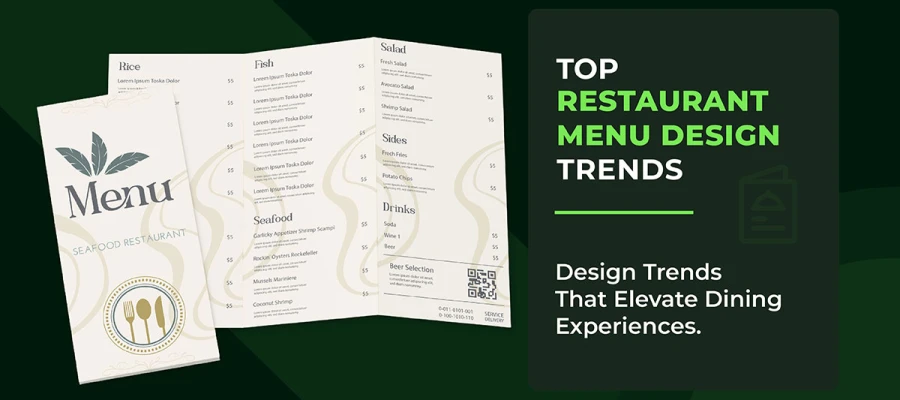
Are you looking for creative restaurant menu design ideas to give your restaurant menu a fresh twist? That would be one hell of an investment.
If your menu looks old, it’s a red flag. A dull menu can ruin the vibe before your guests even taste the appetizers!
Don’t worry, though. We've got something special cooked up for you.
This blog is your go-to guide for drool-worthy menu designs. Our menu will be a silent waiter, quietly boosting profits while serving.
So, grab a napkin and prepare to feast your eyes.
Here are 29 of the most creative restaurant menu ideas that’ll have your customers saying, “I'll have what they’re designing!” Let's drive in now!
When someone walks into a restaurant, the first thing they see is the menu. Right then, they get a sense of what the whole experience will be like. A great menu is a reflection of the restaurant's vibe.
In the next few sections, we’ll dive into 29 restaurant menu design ideas that make the dining experience better. So, let’s look in!
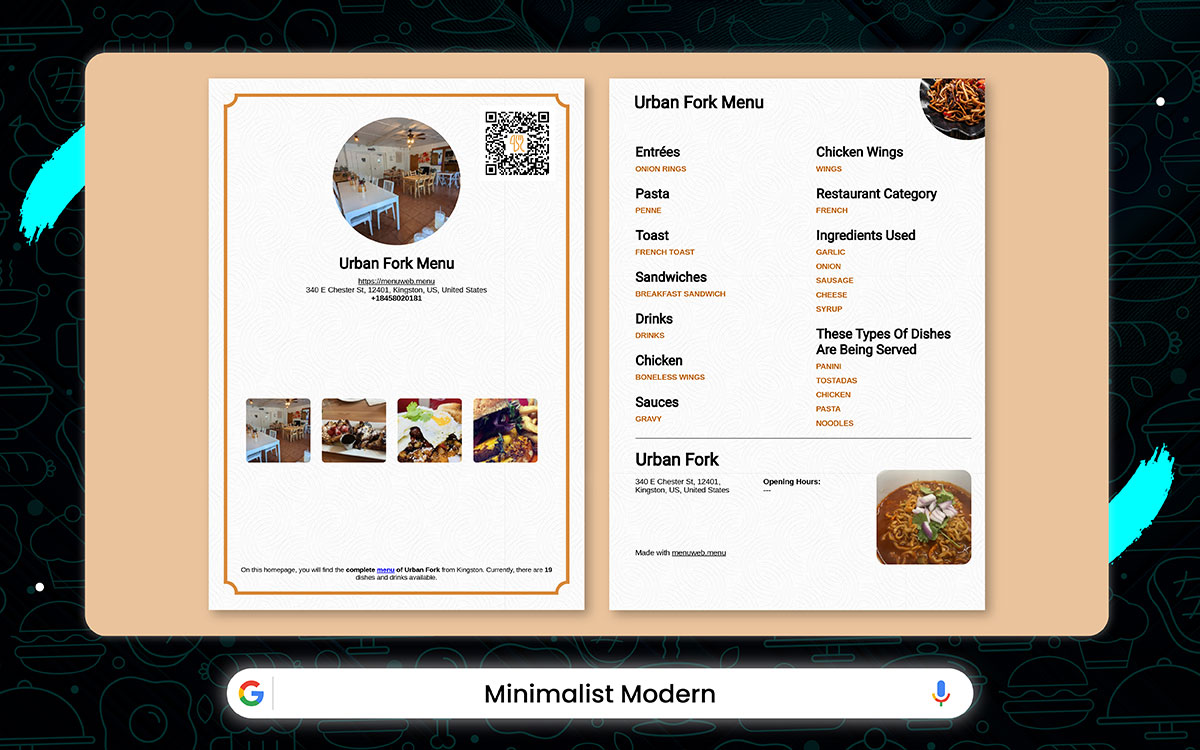
Restaurant: The Urban Fork – New York, USA
The Urban Fork keeps things crisp and clean. Their menu is sleek and modern, with plenty of white space that lets the food take center stage.
Bold headers and easy-to-read fonts guide you effortlessly from appetizers to dessert. The design is sharp and intuitive. It helps customers to make decisions faster. It also highlights the dishes suited for busy city folks.
Key Features:
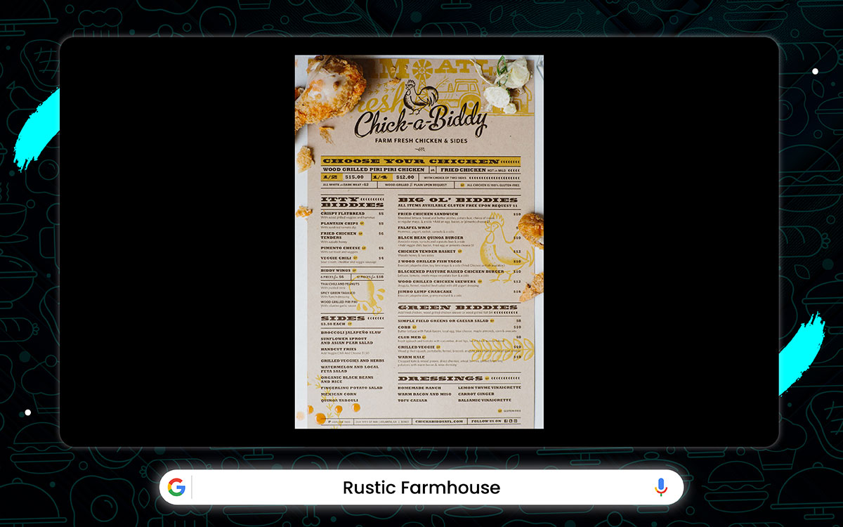
Restaurant: Chick‑a‑Biddy (Atlanta, GA)
Chick‑a‑Biddy serves up cozy food that matches the charming vibe of a cottage. Their menu features soft colors, set against a backdrop that feels like old parchment.
The handwritten-style font gives it an extra dose of a personal feel. It’s like the restaurant is inviting you to relax and enjoy every bite. The design wraps everything up in a warm hug while building trust around their farm-to-table promise.
Key Features:
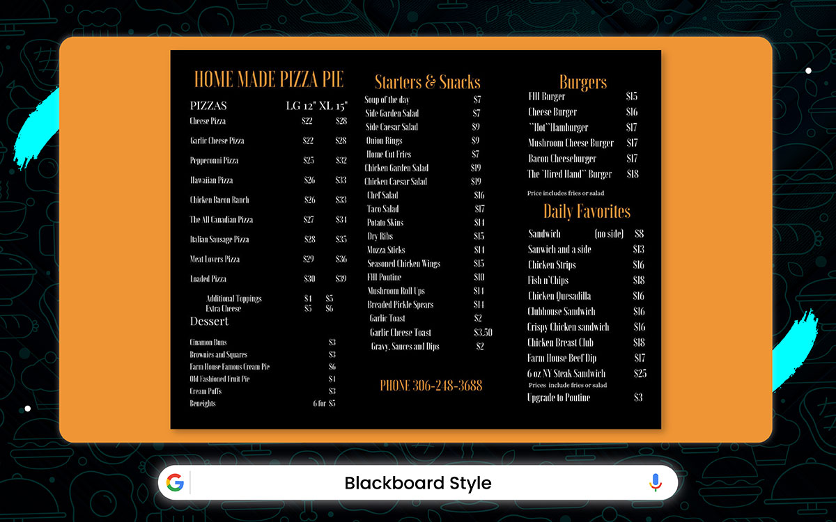
Restaurant: The Farm House Inn
The Farm House Inn menu brings comfort with a no-nonsense chalkboard design. Its deep charcoal background and high-contrast fonts grab consumers’ attention. Just a clean layout that feels as welcoming as a diner board should be.
Instead of drawings, this menu gets straight to the point. Pizzas, burgers, snacks, and daily specials are neatly divided into sections. “Weird Hand Burger” adds some character, while the “Daily Favorites” section keeps things fresh with a rotating selection. It’s simple, clear, and full of personalization.
Key Features:
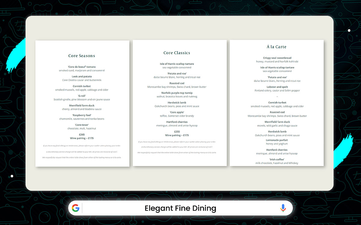
Restaurant: Core by Clare Smyth – London
The menu at Core by Clare Smyth in London is a luxury in itself. It’s printed on thick cream or ivory paper, the kind that whispers elegance. The serif fonts are classic, setting the tone for a dining experience that feels special from the very first glance.
The layout is simple, yet striking. Plenty of white space surrounds each dish to give room to shine. It’s as though every plate is a work of art, deserving of its moment.
This minimalism is a reflection of the refined experience that awaits diners. Everything about it feels graceful, almost as if you’re stepping into a world reserved for the privileged few.
Key Features:
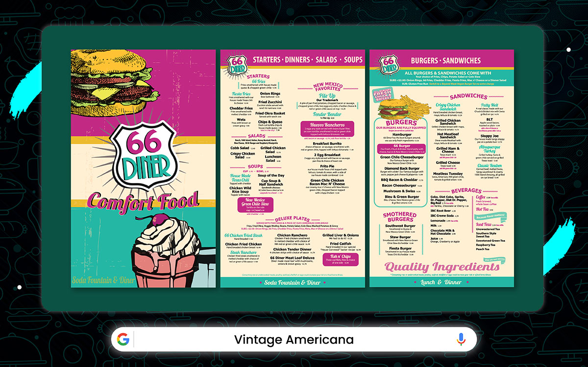
Restaurant: 66 Diner (New Mexico, USA, along historic Route 66)
The menu at 66 Diner takes you back to a 1950s roadside drive-in. It's like a half-forgotten memory. The vintage blackboard design, with its grainy texture, feels like something drawn with chalk.
Bold, uppercase letters shout out the headings and dish names, each with its own weight. The splash of yellow, white, and red accents pulls your eyes in just the right way. It’s got that casual vibe, with just a touch of nostalgia.
Key Features:
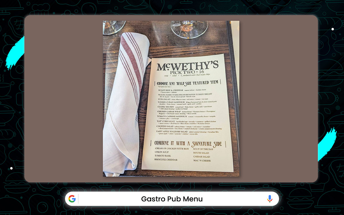
Restaurant: McWethy’s Tavern – St. Louis, MO
McWethy’s Tavern menu is a lively invitation to good times. Its large fonts and vintage textures create a vibe that feels classic and fresh. It’s an experience, carefully designed to catch your eye and spark your appetite.
The aged background paper adds that perfect, nostalgic feel. And with clever pairing suggestions sprinkled throughout, guests are nudged to try something new while enjoying themselves. It’s a menu that does more than list food. It leads the customers to a great time.
Key Features:
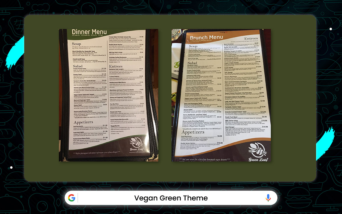
Restaurant: Green Leaf Vegetarian & Vegan Restaurant – Framingham, MA
The menu at Green Leaf feels as fresh and lively as their plant-based dishes. With soft colors, delicate typography, and subtle leaf illustrations, it exudes a peaceful vibe.
This thoughtful design builds trust, highlights the food's beauty, and reflects their eco-friendly values. It makes every guest feel good about their choices as they dine.
Key Features:
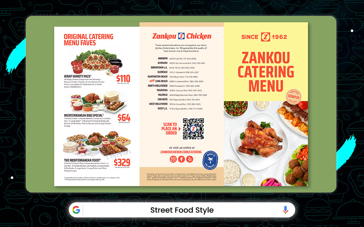
Restaurant: Zankou Chicken – Los Angeles, USA
The menu at Zankou Chicken feels like a lively festival flyer. It’s full of energy, with bright colors and playful sticker icons. The graffiti-style headings scream excitement.
Each dish has a bold name that grabs the attention. The design isn’t just about food, it’s a call to action, making you feel the rush of fast, flavorful fun. It’s the kind of menu you want to snap and share, sparking those spontaneous cravings.
Key Features:
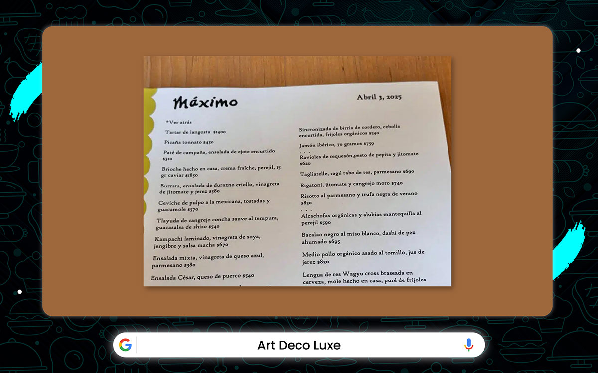
Restaurant: Máximo Bistrot again (Mexico City)
Máximo Bistrot’s menu exudes elegance. The creamy background sets the stage, with sleek black or grey text popping against it. Each section is framed by sharp, clean lines, adding a touch of modern sophistication.
The all-caps serif headings give off a sense of grandeur, while the delicate body font keeps things light and refined. Together, the design mirrors the glitzy vibe of the décor, enhancing the overall experience. It makes the place feel like a luxury.
Key Features:
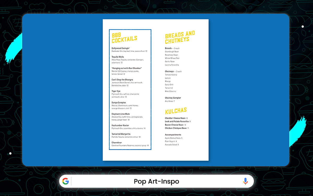
Restaurant: Bombay Bread Bar - New York, USA
Bombay Bread Bar is a feast for the eyes. The menu, splashed in bold reds and yellows with comic book-style fonts, practically jumps off the page. It’s the kind of place that begs to be shared on Instagram.
With its lively vibe and playful design, it’s made for the younger crowd. It’s bold, fun, and full of adventure, just like the brand itself.
Key Features:
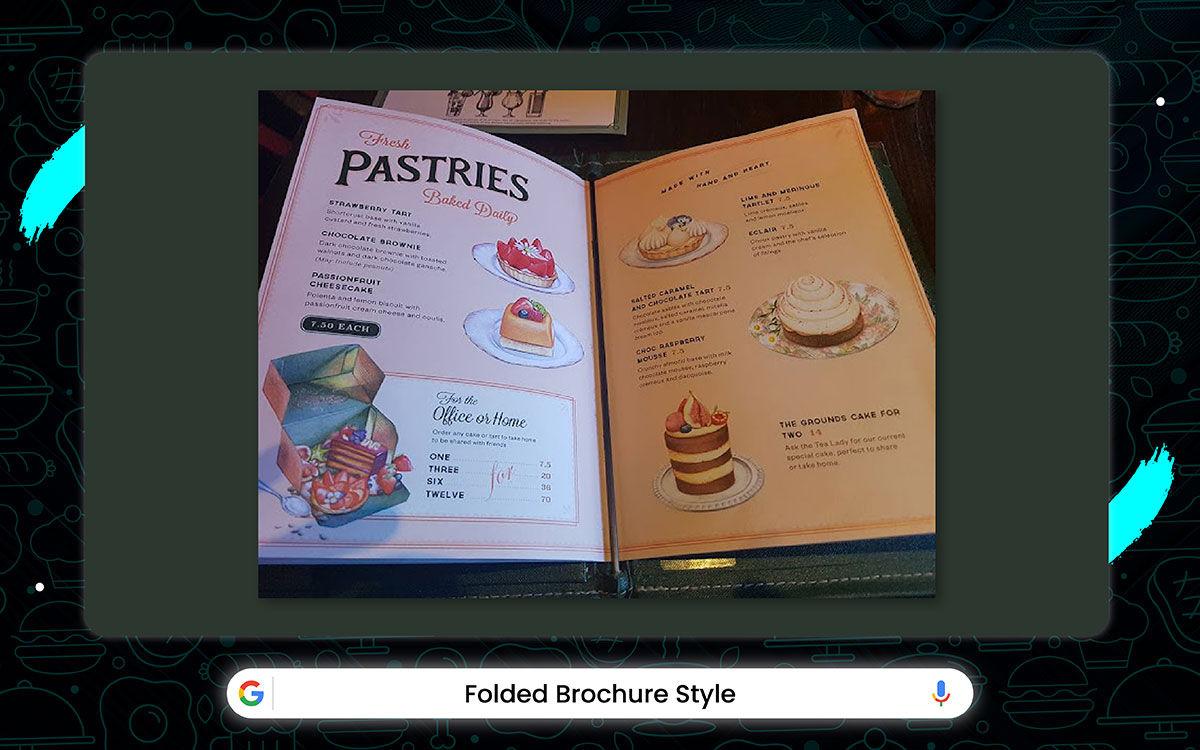
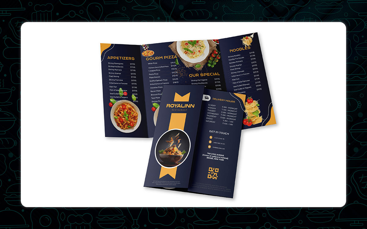
Restaurant: The Grounds of Alexandria - Sydney
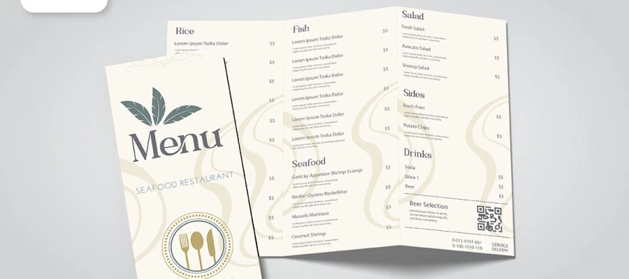
One of the best restaurant menu design ideas out there is The Grounds of Alexandria’s folded and trifold format. It’s simple, yet effective. Three panels- starters, mains, and drinks- guide you smoothly through the meal.
The brochure-style fold gives it a premium look. It’s also easy to flip through, making the menu simple to use. Folded menus are great. They’re pocket-sized for take-out and perfect for dine-in. It mixes timeless charm with a bit of modern flair.
Key Features:
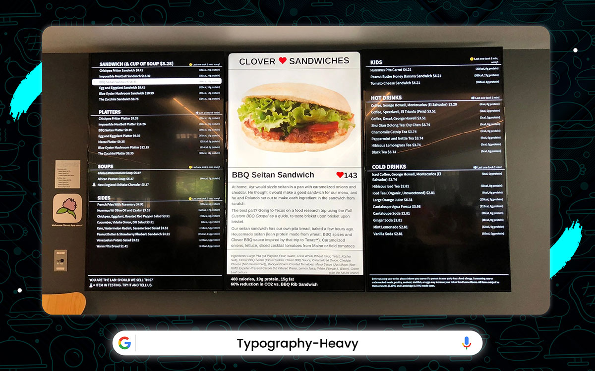
Restaurant: Clover Food Lab, Massachusetts, United States.
At Clover Food Lab, their menu is a design masterpiece. The typography stands out with bold titles, followed by smooth subheadings and easy-to-read text.
It’s simple, yet sophisticated. Perfect for a café where coffee lovers appreciate good design. If you're looking for fresh inspiration, this menu’s clear fonts and minimal style are just what you need.
Key Features:
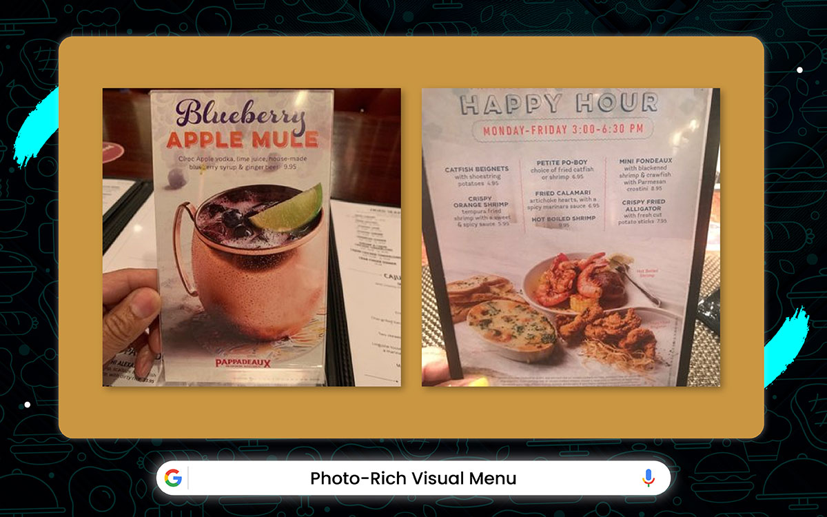
Restaurant: Pappadeaux Seafood Kitchen – Houston & US
At Pappadeaux Seafood Kitchen, the menu practically dances off the page. Each dish is brought to life with vibrant, mouthwatering photos that practically scream "eat me!" And just beneath each image, a one-liner teases what's to come, stirring up that irresistible hunger.
This eye-catching menu builds trust with its clean, thoughtful layout. It's informative without being overwhelming, guiding you effortlessly through the options. For travelers or anyone who loves a visual guide, it makes choosing fast and simple.
Key Features:
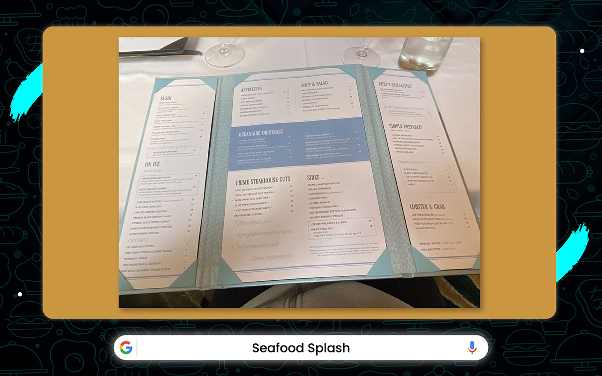
Restaurant: The Oceanaire Seafood Room – Boston, USA
The Oceanaire Seafood Room's menu is like a recap of a coastal breeze. This menu design features a clean, light beige or parchment-style background, giving it a warm, rustic, and approachable feel.
The layout is vertical and neatly organized, using bold serif fonts for headings and regular serif fonts for descriptions. Each section is well-spaced, with subtle lines separating items for easy reading.
The color palette is earthy and natural, matching well with organic or farm-to-table restaurant themes. It strikes a balance between traditional and modern, perfect for cozy cafés, bistros, or countryside-style restaurants.
Key Features:
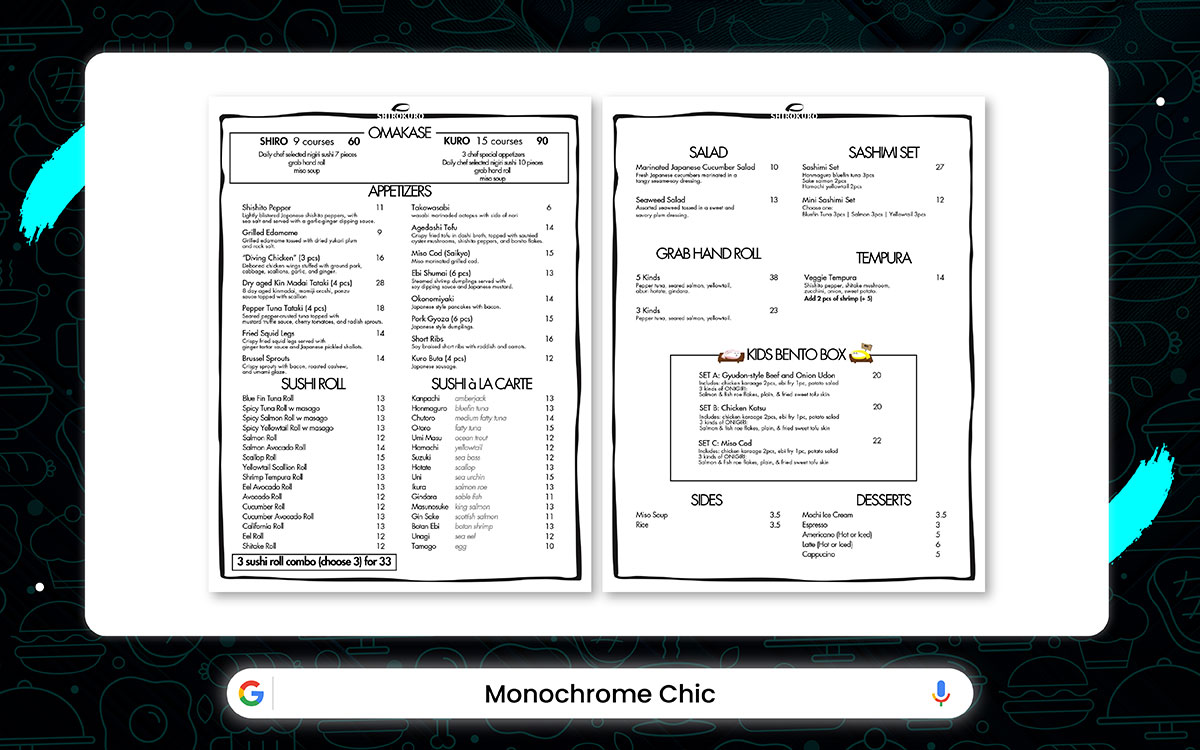
Restaurant: Shirokuro (New York City, USA)
Shirokuro is the essence of minimalistic sophistication. Its menu is a study in black-and-white, with stunning grayscale photos of each dish. The mix of serif and sans-serif fonts gives the text a modern vibe.
White space against dark backgrounds makes each menu item stand out. The monochrome look is refined, simple, and speaks volumes without shouting.
Taking away color brings attention to the textures and unique ingredients. The bold, modern design of the menu stands out. It perfectly mirrors the restaurant’s branding.
Key Features:
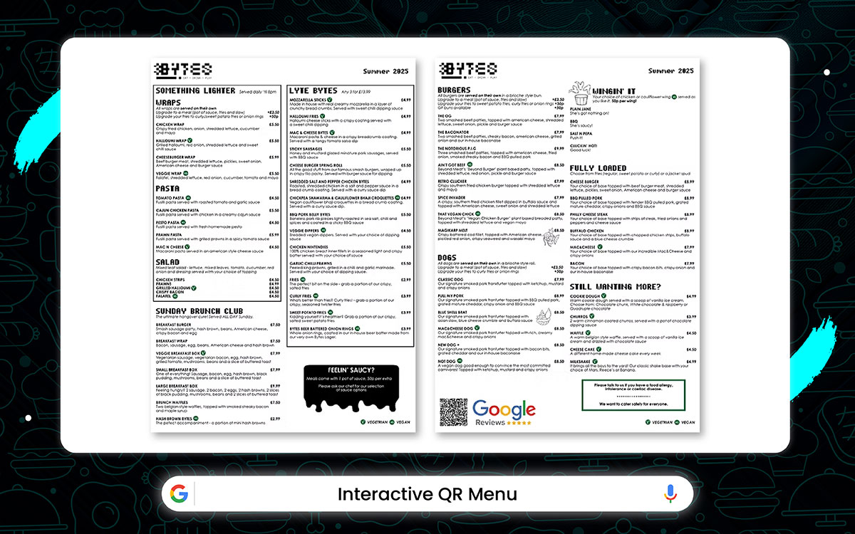
Restaurant: Bytes Restaurant (Atlanta, USA)
Bytes offers a new experience with swipeable menus that are easy to read. Each table has a QR code that takes you to a simple interface. The menu is divided into starters, bowls, and desserts. Icons indicate dietary options, such as vegan or gluten-free. And its touch-friendly buttons make browsing a breeze.
This design serves today’s tech-savvy diners. It makes ordering simple while reducing physical contact. The menu updates instantly, and visuals keep things engaging, so every visit feels new.
Key Features:
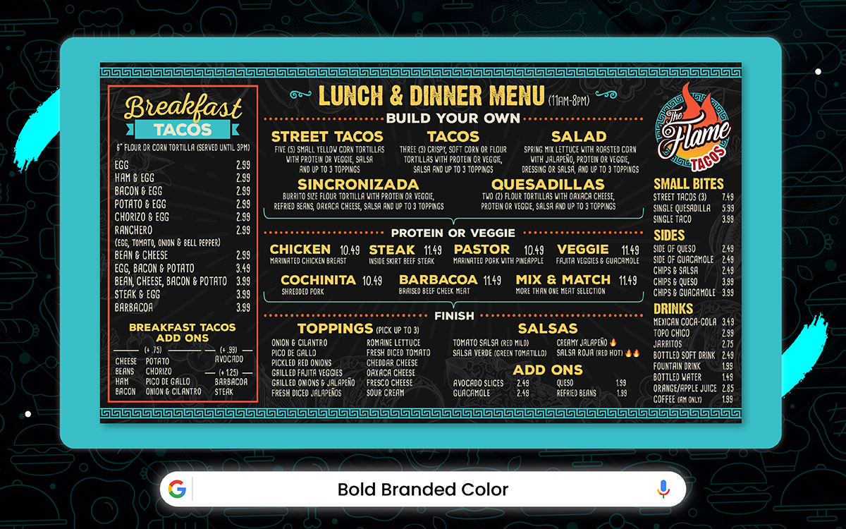
Restaurant: The Flame Tacos (Seabrook, Texas)
The menu comes alive with bold reds and oranges, matching the spicy kick in every dish. The dish names pop in big, chunky fonts, making the logo stand out. Ingredients are stacked neatly, easy to read, and clear.
The bright colors bring energy to the table, helping diners make fast choices. This bold style reflects the restaurant's lively vibe, promising flavors, zesty spices, and plenty of ways to customize.
Key Features:
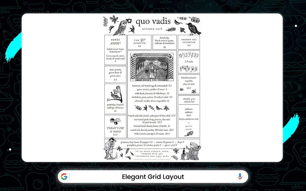
Restaurant: Quo Vadis – London, UK
Much like the city it calls home, the Quo Vadis menu is a work of art. Each dish and its price are neatly laid out in a grid, with thin lines to guide the eye and a balanced font that keeps things clear.
The layout is minimalist, vertically aligned, and organized in a single column. The typography is clean and refined, with dark ink that pops against the page for easy reading.
Generous spacing separates each section, and crisp horizontal lines provide a sense of order. There are no images or frills here, just text that lets the food do the talking.
This design is perfect for a chic café, an artisanal bakery, or a laid-back brunch spot where simplicity reigns.
Key Features:
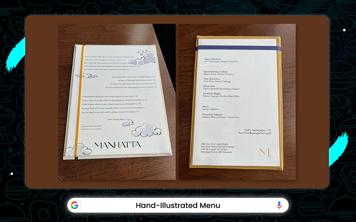
Restaurant: Manhatta – New York City
At Manhatta, the menus feel like lively sketchbooks, with each dish paired with hand-drawn illustrations. The fonts have that effortless vibe, like a casual signature, and the borders are sketched with a soft pencil touch.
It’s a reflection of the restaurant’s warm and personal atmosphere. Every page invites diners to feel valued, sparking curiosity and making them eager to dive into each story.
Key Features:
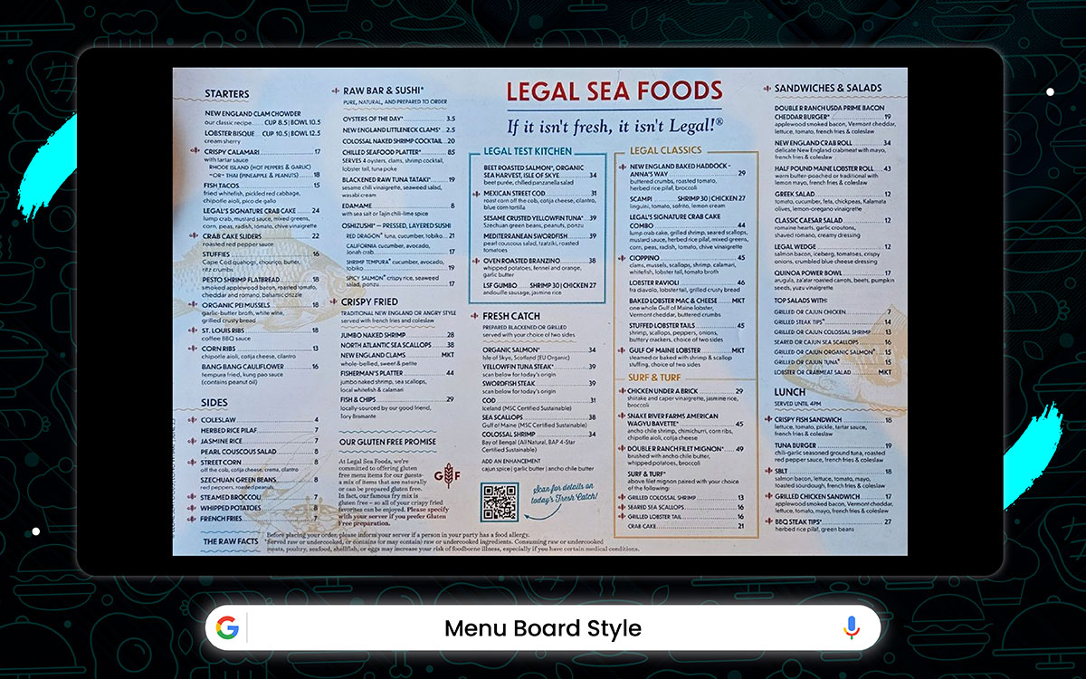
Restaurant: Legal Sea Foods – Boston Long Wharf
The menu at Legal Sea Foods has a classic, no-fuss vibe. It’s like a traditional wallboard menu with removable blocks. Each block lists the dish names and prices in clean type. The background is soft and faded, making everything easy to read.
Icons and simple graphics next to certain blocks tell you what’s what. It’s a style that gets straight to the point, perfect for a fast-service spot.
The layout is friendly, giving off an efficient, welcoming feel. It’s all about speed, service, and just enough flair to make it easy on the eyes.
Key Features:
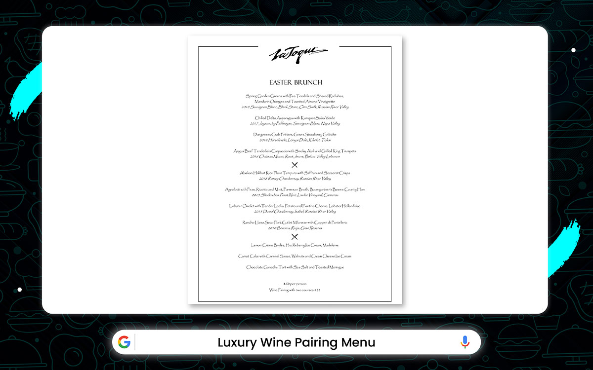
Restaurant: La Toque – Napa Valley, USA
At La Toque, dining is an experience, not just a meal. The moment you open the leather-bound menu, the deep, rich tones of its pages, paired with handpicked wine suggestions, pull you right in.
Each header invites you to explore, while subtle details add an air of exclusivity. Wine notes and dish descriptions seem to whisper secrets, creating an intimate atmosphere. The design, focused on perfect wine pairings, along with the sommelier’s expert touch, turns every moment, from ordering to savoring, into something extraordinary.
It's a place adored by both connoisseurs and romantics, where food, ambiance, and perfect pairings come together seamlessly. A true feast for the senses.
Key Features:
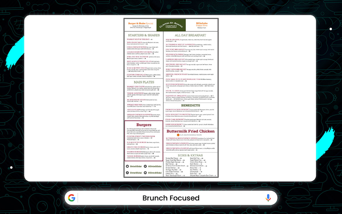
Restaurant: Clinton Street Baking Company & Restaurant – New York City
This brunch menu strikes the perfect balance between modern and relaxed. The clean layout and soft fonts make it easy on the eyes. The background is neutral with just a hint of texture.
Dish names pop in bold, so they're easy to spot, while the descriptions are smaller and neatly lined up below. Little icons and subtle dividers effortlessly organize everything.
The whole design feels cozy, fresh, and functional, just what you want for a laid-back weekend brunch. Perfect for casual diners and café lovers alike.
Key Features:
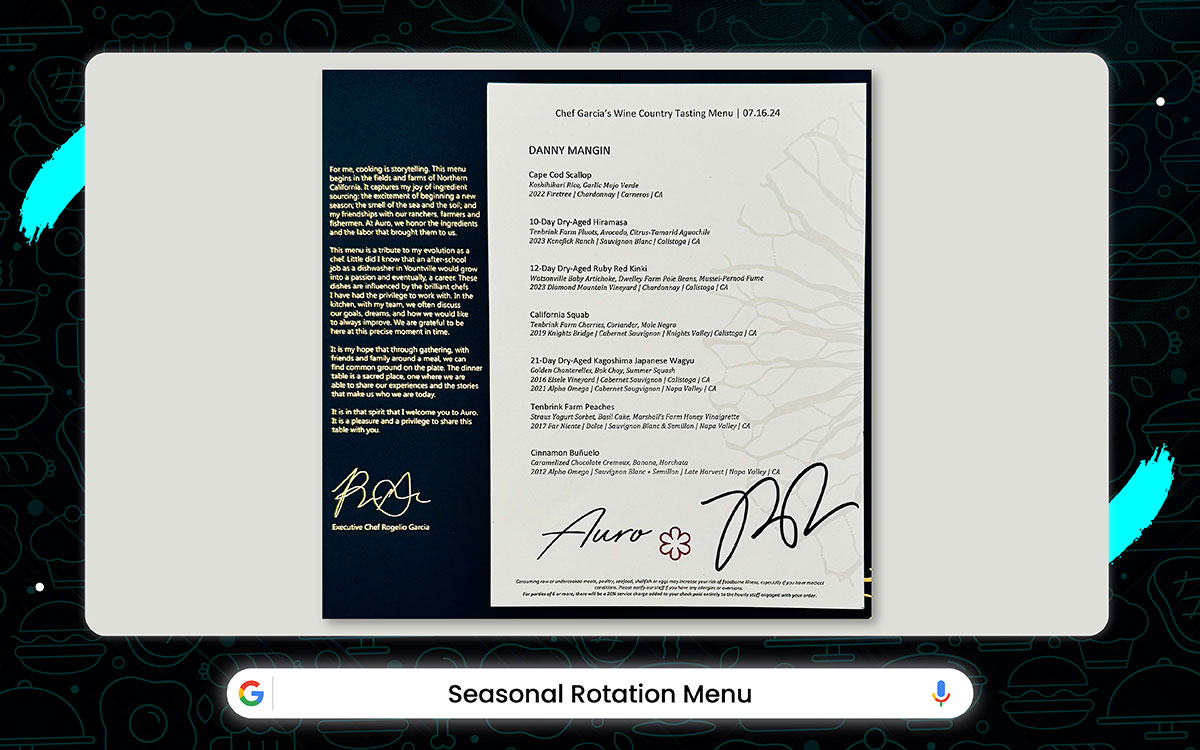
Restaurant: Auro, Four Seasons Napa Valley – Calistoga, USA
At Auro, the seasons shape the menu. Located in the beautiful Four Seasons Napa Valley, Auro changes with nature’s rhythm. The tasting menu follows the pulse of each season, with every detail reflecting that shift.
As the seasons change, so does the food. Autumn brings rich golden tones. Winter feels crisp with clean whites. Spring softens with fresh greens. Summer shines with warm blush hues.
The design stays classic with a serif font, but the seasons sneak in. In spring, hand-drawn citrus blossoms decorate the edges. Fall frames the menu with delicate leaves. Every change celebrates the beauty of the seasons, reflected in the food and design.
Key Features:
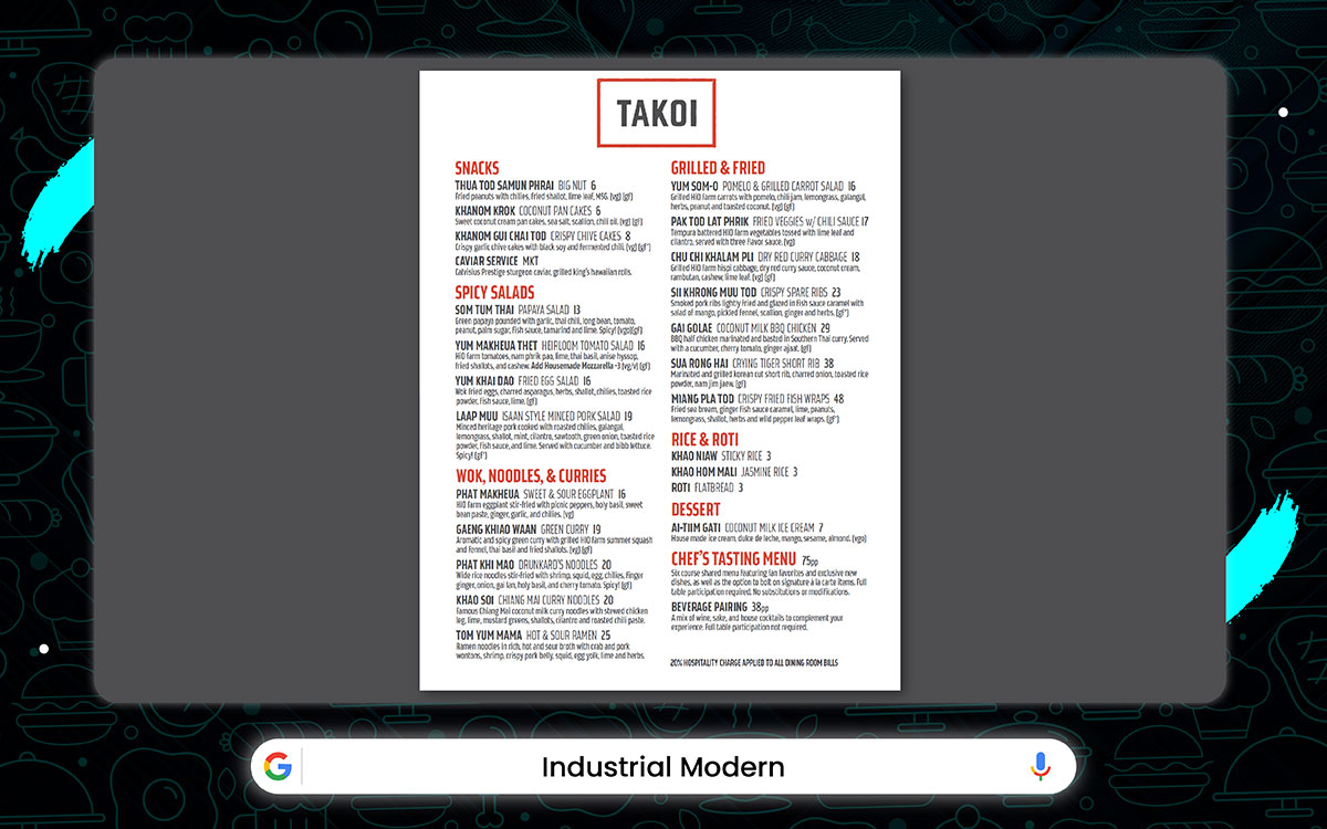
Restaurant: Takoi – Detroit, USA
Takoi’s vibe is all about urban grit. From the rough floors to the steel walls and the moody neon glow, it screams industrial style. Even the menu reflects this dark gray metal, matte-finished, with sharp angles and sleek geometric fonts.
Opening it feels like cracking open a blueprint. A blueprint of bold, engineered flavors. It’s modern and edgy, with a hint of Detroit’s industrial spirit.
Key Features:
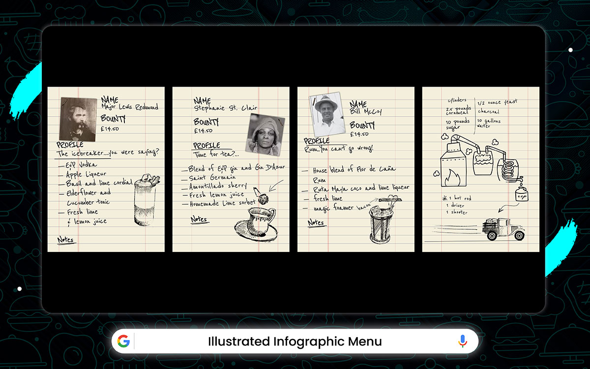
Restaurant: Evans & Peel Detective Agency – London, UK
Their cocktail menus look like case files, complete with hand-drawn charts. Each one highlights the ingredients, where they come from, and how to make the drink. It's a work of art, blending beauty with clarity. You can’t help but feel curious about each drink.
It’s the perfect fit for the "Eat Graph" theme, as it makes ordering into a fun puzzle to solve.
Key Features:
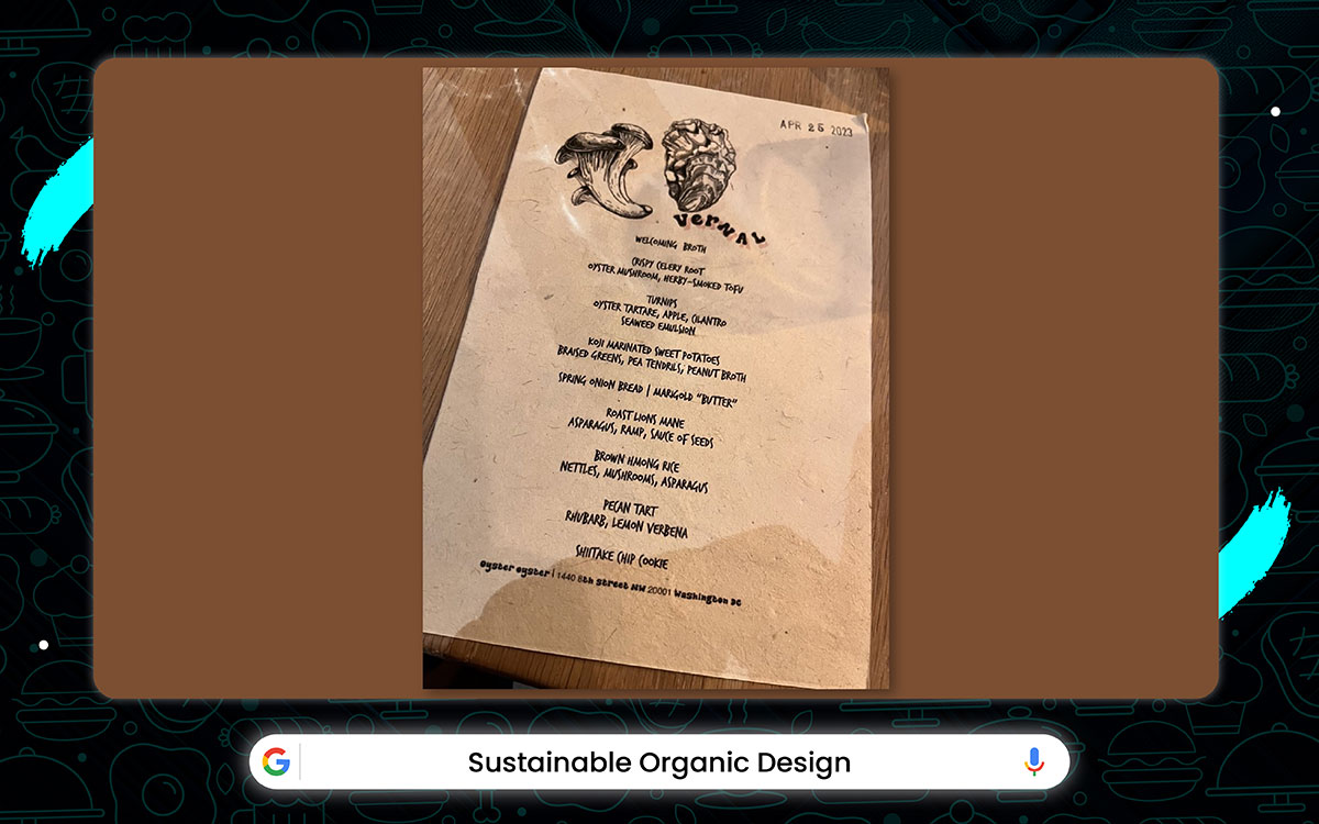
Restaurant: Oyster Oyster – Washington, D.C
This menu feels like a breath of fresh country air. The Kraft paper background gives it that earthy, homemade touch, while the clean layout keeps things simple and neat. The serif font on the headers adds a little old-world charm, and the easy-to-read body text brings it all back to basics.
Each dish has its own space, breathing easily in a layout that’s minimal and effective. The soft monochrome colors let the food take center stage, without any distractions.
It’s the perfect fit for eco-friendly and countryside spots where sustainability and authenticity are the stars.
Key Features:
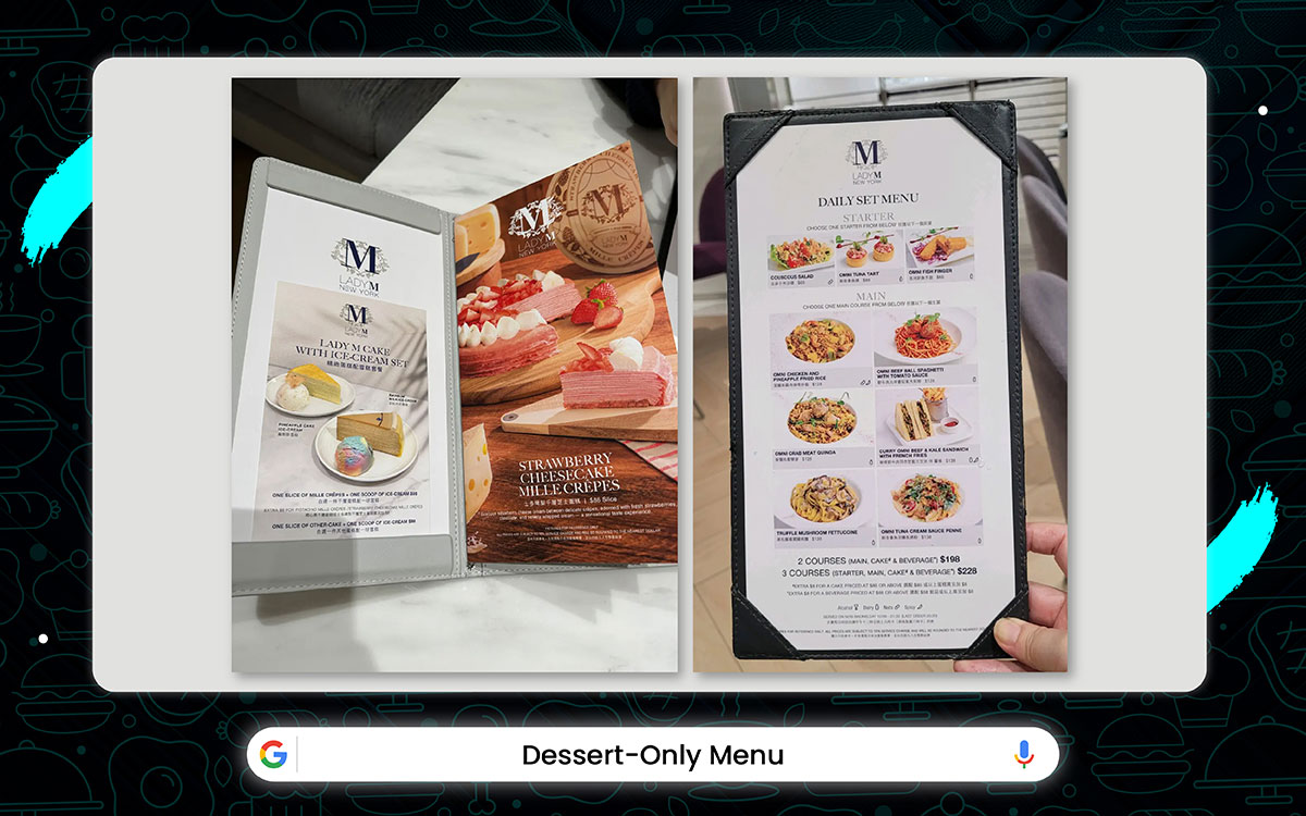
Restaurant: Lady M – New York City, USA
For dessert lovers, Lady M's pastel menu is a treat for the eyes. The playful serif fonts dance across the page, surrounded by bright, mouthwatering cake photos. Soft gradients and watercolor swirls give it a dreamy, indulgent vibe. It’s the kind of beauty that’ll have you snapping a pic for the 'gram before you even take a bite.
Key Features:
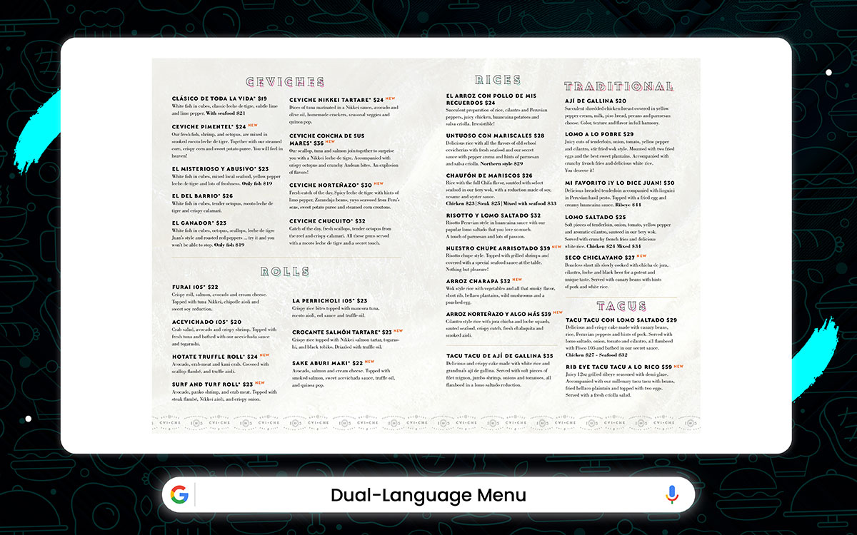
Restaurant: CVI.CHE 105 – Miami, USA
CVI.CHE 105 blends Latin charm with a dash of Colombian flair. Their menu, in both Spanish and English, pops with bold colors and Peruvian-inspired restaurant menu design ideas.
The fonts are easy to read yet eye-catching, while the borders reflect rich cultural patterns. It’s a place where everyone feels at home, no matter what language they speak.
Key Features:
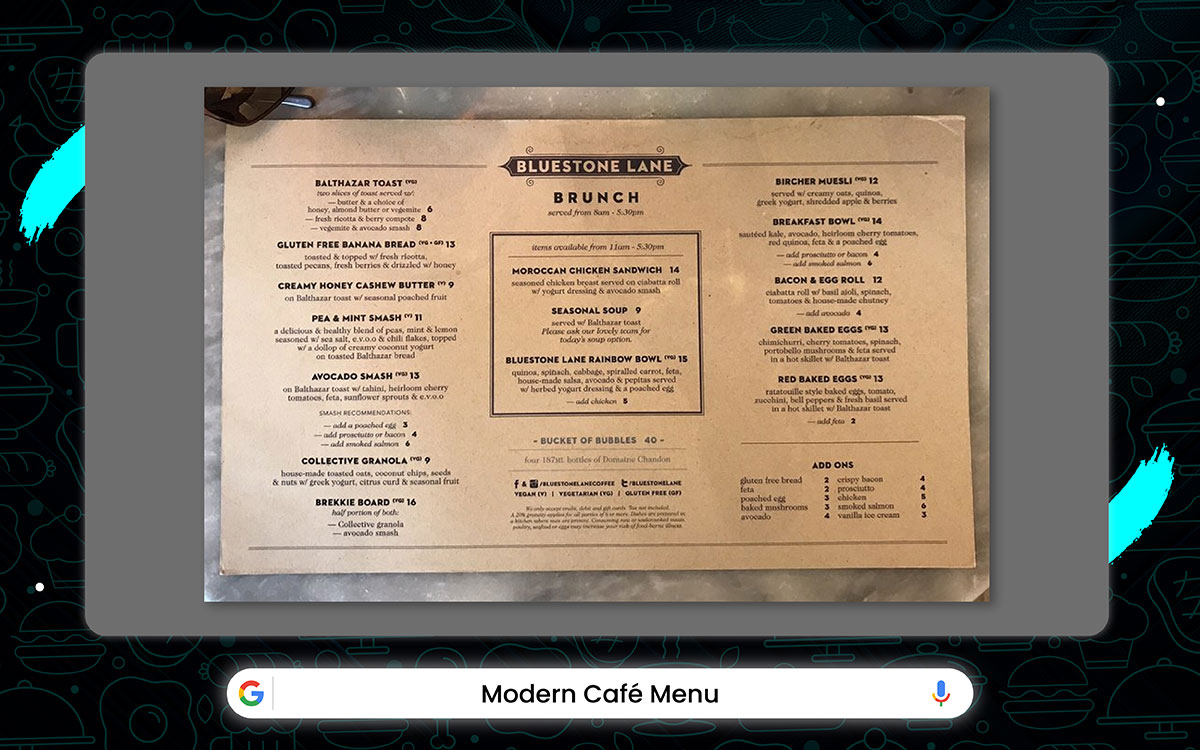
Restaurant: Bluestone Lane – New York, USA
Bluestone Lane perfectly blends the best of American coffee culture with a touch of Aussie flair. Whether you're in the mood for a light snack or a hearty meal, there's something for everyone at brunch. Their menu is a feast for the eyes, too.
The brunch menu is organized by mood, so you can pick exactly what you're craving without the stress. The text is sharp, and each item has plenty of space to breathe. It’s all about a laid-back, urban feel, matched by simple, beautiful food that shines through the understated fonts.
Key Features:
And that brings us to the end. We've just served up a mouthwatering selection of restaurant menu design ideas to spark your creativity.
Every menu tells a story long before the food hits the table. It’s not just about what’s on the plate; it's how it’s presented.
Now, what would you think would suit your restaurant? Have you selected one or gotten some restaurant menu ideas?
Don’t keep quiet, at Graphic Design Eye, we know how to bring your vision to life. Our menu design services are as tasty as they look, and are designed to make customers crave more.
Let’s make sure that first glance speaks volumes and leaves them hungry for more. If you have any questions, we’re open for a free consultation.
Until then, wishing you a flavorful journey ahead!