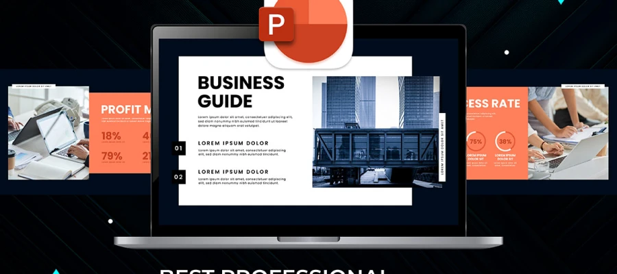
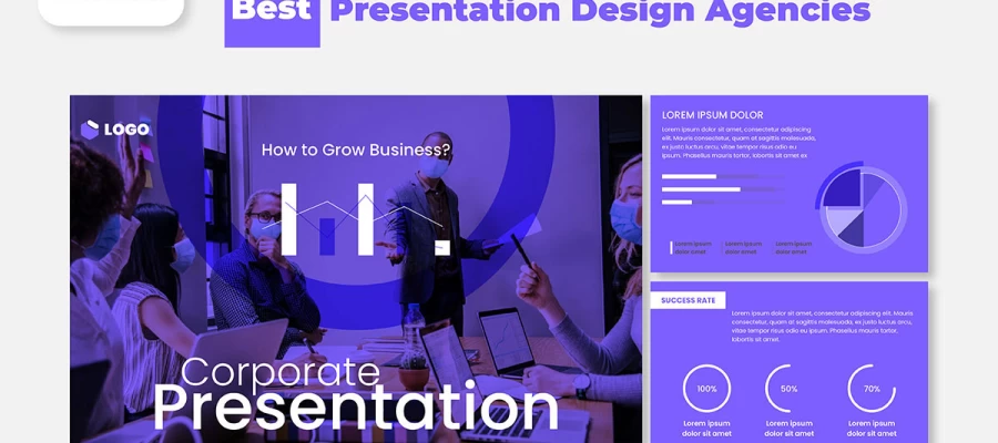
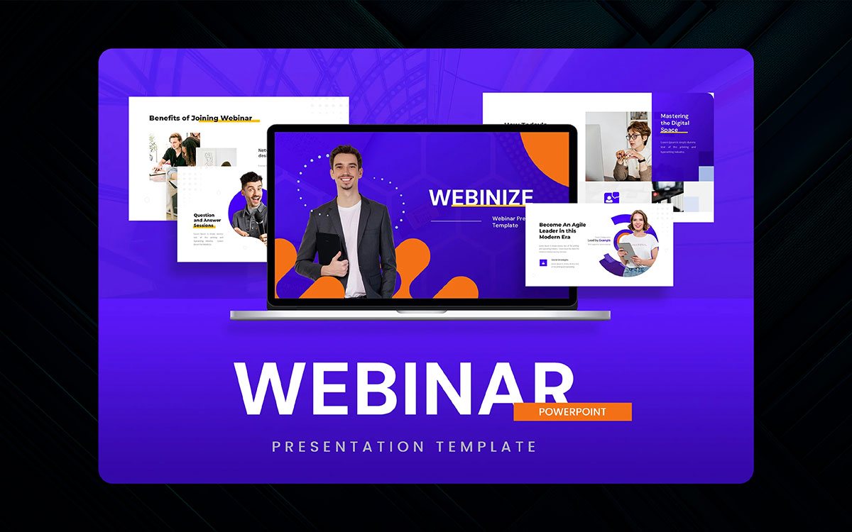
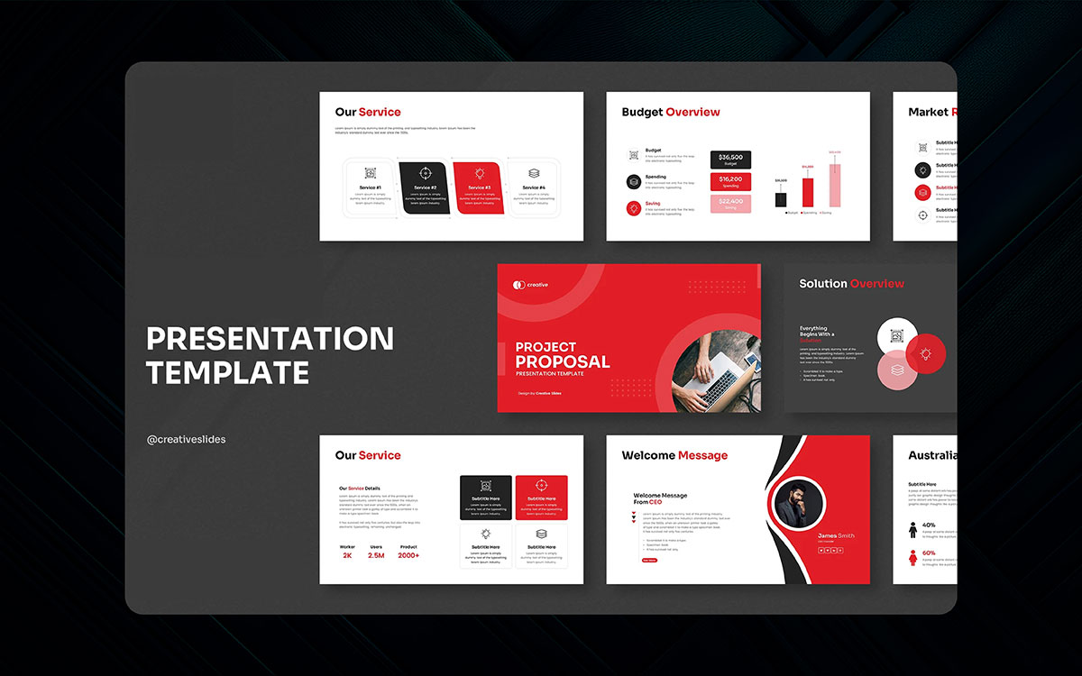
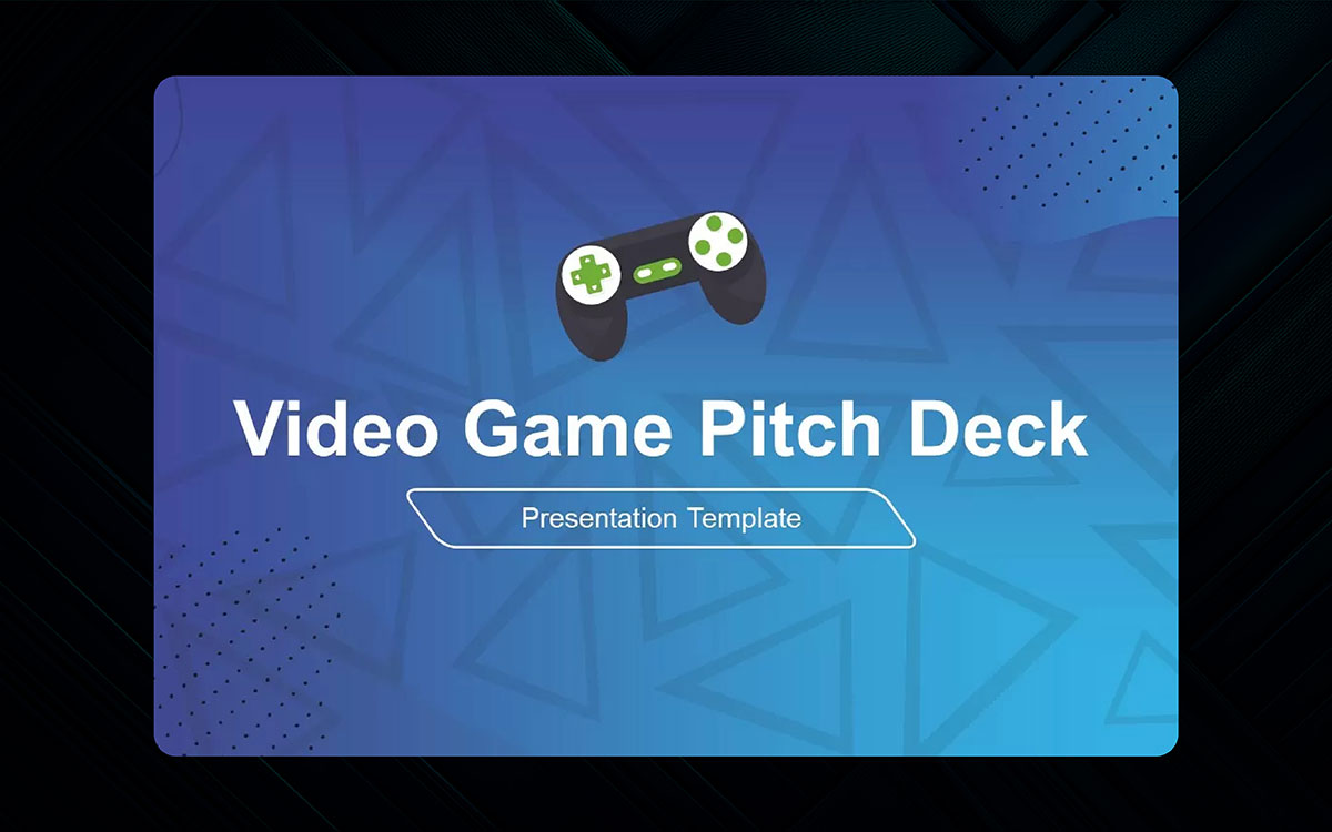
If you are diving into top presentation design trends to bring your startup or pitch decks, this blog can help you. Coping with presentation trends helps you convey your brand message in a significant way to your target audiences.
So, knowing the top trends in presentation design is a must to deliver the right messages. A good presentation acts like a first impression. The face of your business.
Everyone expects something fresh, new, and creative blend of presentation that makes a difference. As a business, educator, or trainer, you don’t want to see your audience scroll their mobile phones while your presentation is going on.
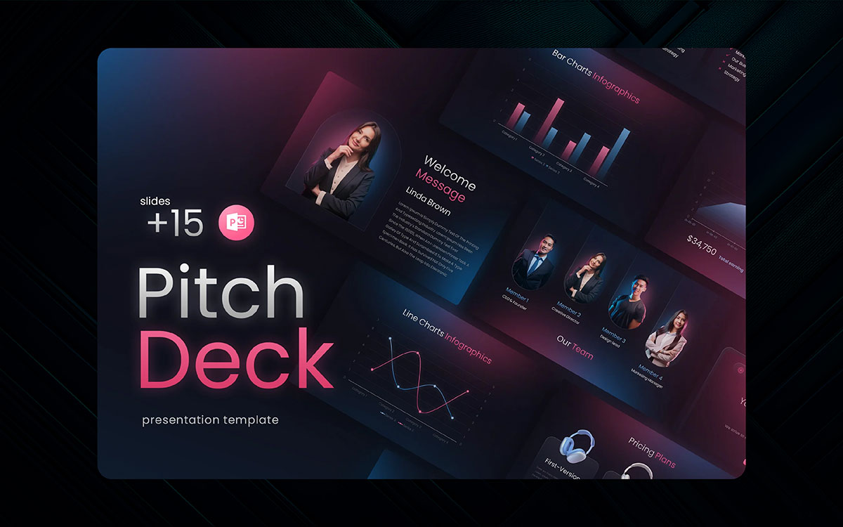
Some presentation design makes you delighted. Or some other makes you bored. We want you own your target audience for your business! That’s why our team has run a long race online and picked the top 17 presentation trends to add fresh and current air to your presentation design!
Ready to explore them? Let’s dive in.
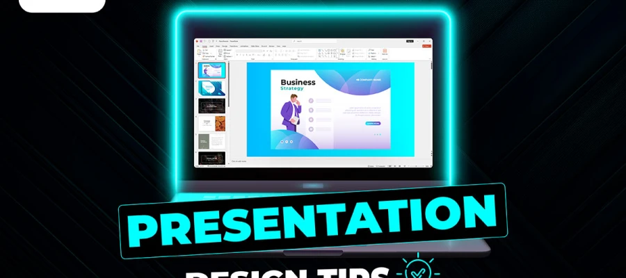
Slides are more than just bullet points and charts- they're a performance put on a stage. In 2026, the focus will be on delivering timeless messages that give clarity and the familiarity of connection. And the most exciting part? You don't have to be a designer to use them. Here we've curated the trends that are enjoyable to implement:
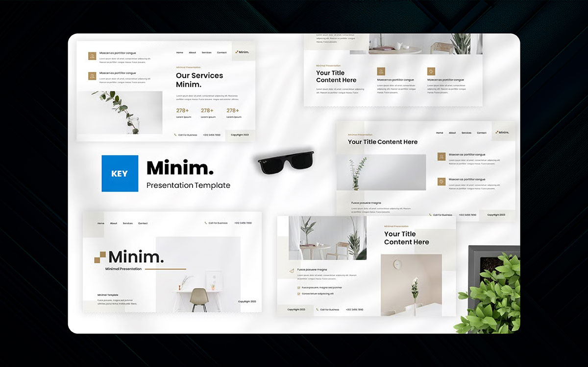
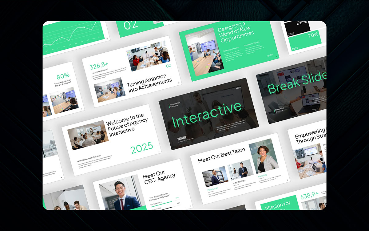
Aesthetic, minimalistic slide design isn’t about taking away everything. It’s about keeping the most crucial elements. The 2026 trends suggest simple slides integrated with loud colors or fonts to capture the audience's attention.
Imagine clear backgrounds with headings and one strong image per slide in professional presentation styles. Or, take a step further and imagine a room that’s been tidied up, and your favorite object is placed to stand out.
Simple layouts provide space to aid focus, allowing the audience to absorb the information being shared. This aesthetic is best suited for professional talks, pitches, or any topic that demands a calm, modern feel.
Tip: Embrace one color and use two fonts at most. Clean is not boring in slide design trends - it’s strategic.
Bold typography effectively captures a viewer’s attention in professional presentation styles. The clear, legible typography trend uses bigger, bolder fonts over smaller ones. Bold text captures attention and aids in memorization.
Large letters are great for setting the tone at the start of a slide. They also save space because fewer words can be used. Balance the text with visuals by using soft images. And don’t forget: Every font has a feeling, so choose one that is appropriate to your topic.
Note: Use all-caps or chunky serif typeface for the header to grab attention faster.
In color theory, colors have more applications beyond visuals. In 2026, designers do not use color for decoration. Warm tones and cool blues evoke emotions. They set a mood. Gradient backgrounds are back in style, especially warm ones.
You can use them to highlight key areas or as backgrounds, but do not mix too many. Color helps relieve the eye's tension and gives your slides a feeling. Use color combinations that suit your audience and topic.
Note: Blue equals trust. Red is for energy. Orange gives warmth. Use these wisely.
Symmetrical rows are too last season. Asymmetry breathes movement into designs. This trend gets rid of tidy columns and introduces visual tension. One side might be text-heavy while the other is just an image. Or titles might shift off-centre.
It is more interesting than it sounds. This calm imbalance gives attention. It’s like jazz, but visually. It works best for storytelling topics where you want to feel the slides, but not in a forced way.
Fact: Asymmetry does not mean chaos. It is the art of movement.
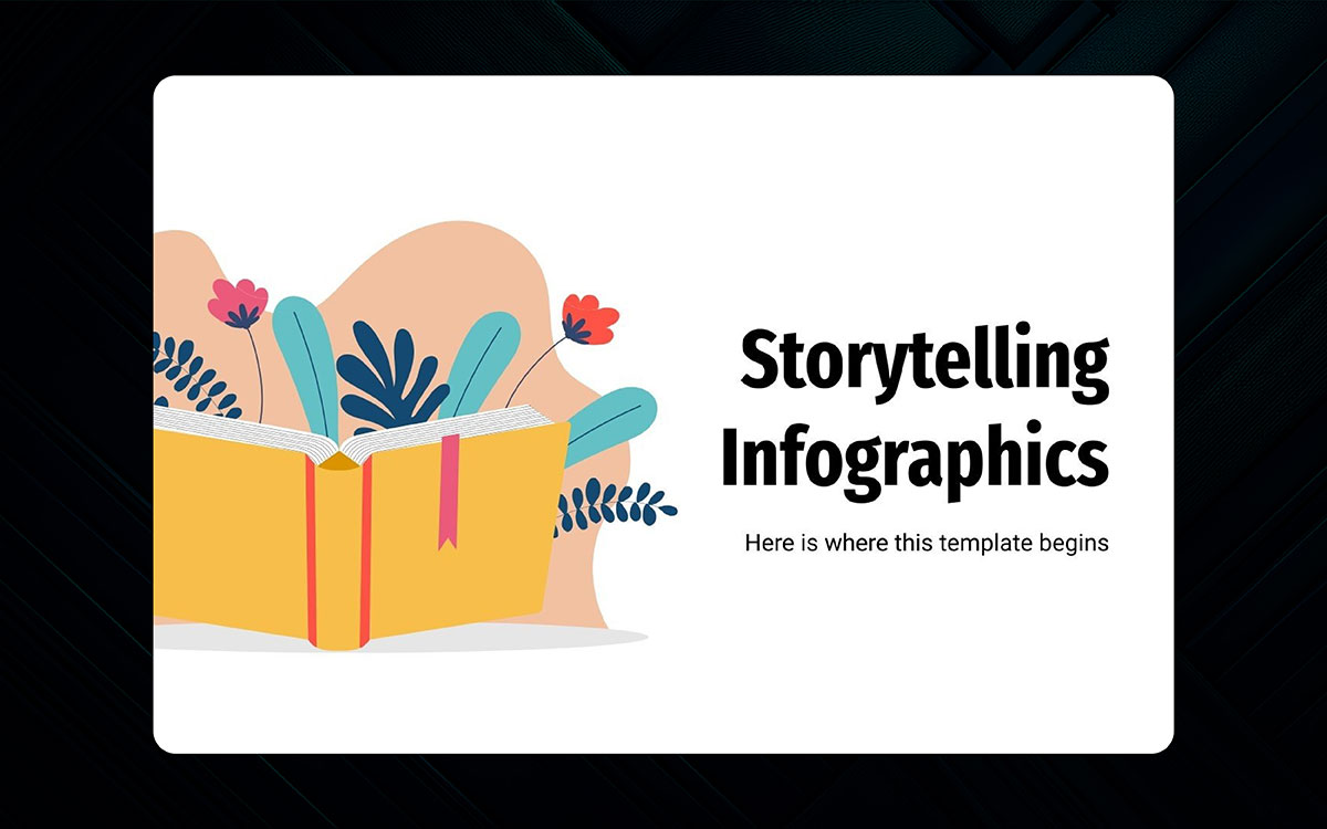
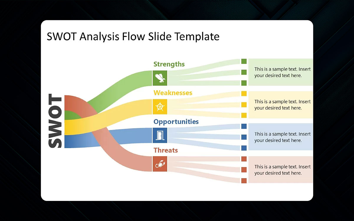
Data can often be boring, but adding context transforms it completely. Telling a story with data sets is becoming a trend. Instead of using basic charts, try adding infographics that literally guide the viewer. Consider adding icons, illustrations, or even doodles to spruce it up.
Think of data as a journey: there is an introduction, a middle, and an end. Visuals should depict progress, results, or cause and effect.
These story-based slides make sense quickly and make stats feel more human. They're ideal for reports, fundraising decks, or even explaining complex systems.
Tip: Use timeline infographics to show steps. Make it light and visual.
Static charts are out. Animated charts with micro animations and graphs will overtake the trending slide designs. A story tells the numbers, not just shows them. A pie that builds piece by piece or a bar that rises is more alive and falls into innovative presentation ideas.
These small movements guide the viewer’s attention and pique interest. Use them for crucial data such as results, changes, or comparisons. Animations shouldn't be distracting. Ensure smooth transitions do not eclipse the message framing.
Note: Test with subtle fades or slides. Avoid spinning and bouncing.
Data is more appealing when it’s live for interactive presentations. This buzz is all about showing current data rather than outdated snapshots. You can use tools to pull results from surveys, website visits, or live polls into your slides.
It adds credibility and keeps your information evergreen. This is particularly useful for webinars, reports, or any live event. Just make sure the tech is working seamlessly. No one wants to see a slide stuck on loading indefinitely. Real-time data makes your slides feel like actions as they are happening.
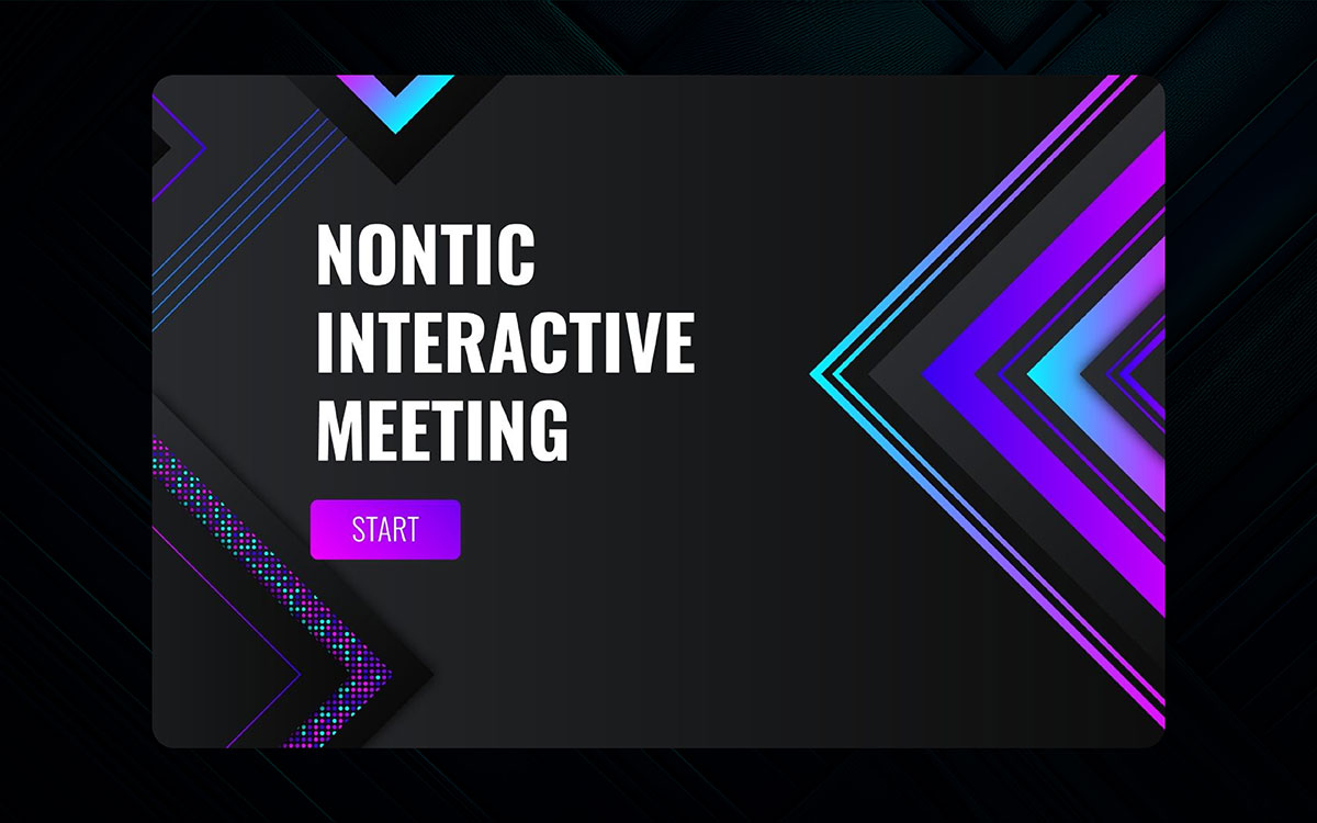
Slides continue evolving, now appearing as websites. This buzz adds buttons, links, and tabs to the slides, allowing your audience to navigate different presentation sections or interact with the content on their terms.
Consider clickable menus or slide links where the user can dictate the flow of the story. This comes in handy for pitch decks, tutorials, or product demos. Additionally, it gives the viewers some degree of power, which can be entertaining.
Just ensure that the design remains organized and that order isn’t compromised. When appropriately executed, hyperlinked presentations are much brighter and smoother.
Why only let your audience watch when they can actively participate? Polls and quizzes in trending slide designs transform static slides into engaging, interactive elements. Tools like Slido or Mentimeter allow you to seamlessly incorporate live feedback mechanisms, quizzes, or questions directly within your presentation.
It’s perfect for training sessions, workshops, and large gatherings. You can gauge participants' knowledge or inquire about their feelings regarding an issue, all of which are answered in real time.
This helps promote connection, ensure sustained attention, and, more importantly, enhance knowledge retention. People are far more likely to remember information they had a chance to interact with.
Gamification has an element of fun. To increase attention and interest, add points, badges, levels, or apply any number of quizzes to the slides. This works best in training sessions, team meetings, and even classrooms.
People become active instead of passive participants. Following the 2026 presentation design trends, include leaderboards for friendly competition or offer small prizes. It doesn’t have to be a fully-fledged game; just a sprinkle of fun to liven up the session will make it more enjoyable.
Ensure that your game is relevant to the topic, though. It has to aid the narrative, not detract from it.
Tip: Add levels or checkpoints for long decks. Feedback can be via sounds or visuals.
Using video as the background of your slides will improve your slides according to the 2026 presentation design trends, emotionally and visually. Nature scenery or a product demo can bring your slide to life while simultaneously being unobtrusive.
Look for light background videos that ease the viewer into the content instead of taking attention away. This trend is a game changer in narrative-driven slides. Ensure that the text on such slides is loud enough to be read easily. Don’t forget to check that the video works on all devices you plan to use.
Tip: Blur shapes or amplify softened motion and loop silent videos.
A voice-over might be much more effective for some presentations than on-screen text in the latest presentation styles. In such cases, audio narration comes in handy. Adding a voiceover that narrates each slide while the viewer watches is possible.
This is helpful for self-paced decks, online courses, or explainer presentations. The voice should be warm, clear, and moderately paced.
Improve the narration with light background music; however, the music should never drown out the voiceover. Maintain a visual approach with the slides and let your voiceover explain.
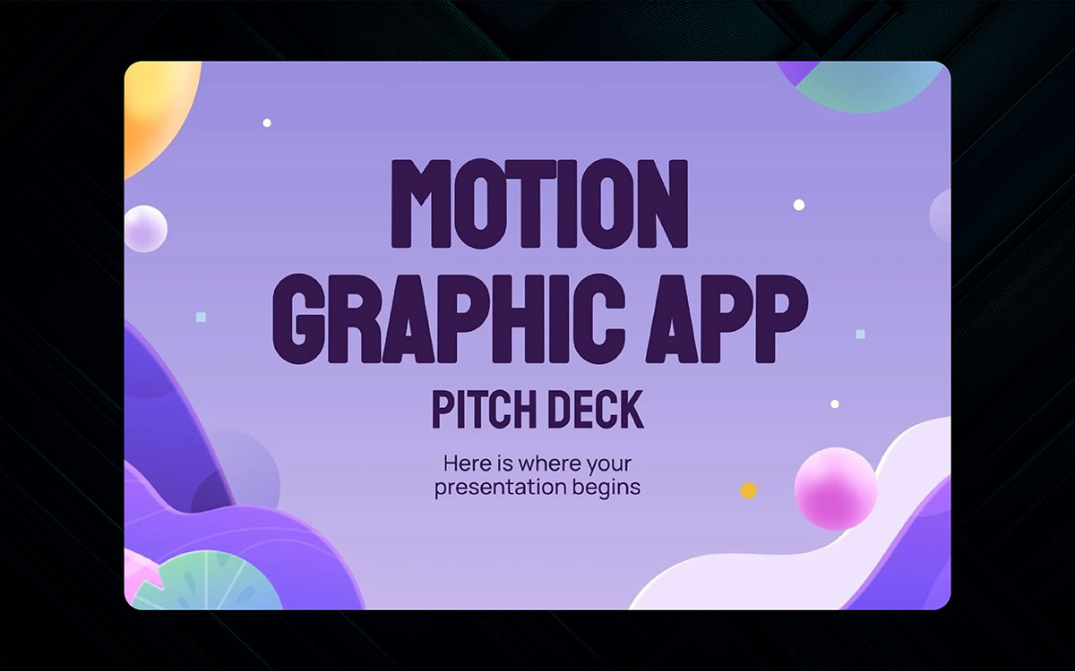
Slides aren't just about the content; the aesthetics matter in the latest presentation styles, too! Starting in 2026, motion graphics and 3D models will allow presenters to add much-needed flair to their slides.
These graphics ensure that the visuals are exciting and contemporary without being distracting. Use them to showcase products, explain processes, or even set the tone of the presentation. Motion can enhance attention capture and help the content feel alive.
But keep it subtle, smooth transitions and soft movements work best. This technique is especially powerful in design pitches, product demos, and tech reveals.
Tip: Use PowerPoint design trends, built-in 3D features, or animated icons from design libraries.
Remove sharp boxes and replace them with softer, more flowing shapes. These graphics have a calming and dynamic effect on your slides. Instead of rigid grids, shapes now float and flex around images and text. It feels smooth, natural, and modern.
Light gradients and pastel colors often accompany this trend. It’s ideal for topics like wellness, education, or branding presentations for brand consistency. It’s also easy on the eyes, perfect for long decks where attention is crucial.
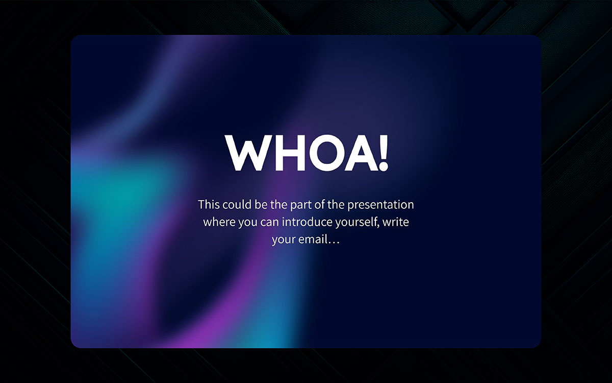
Sometimes, not including certain elements can be more important. Negative space, or “white” space in dark mode presentations, allows the rest of the content to be framed beautifully without competing with it for attention. It emphasizes what is essential.
This trend avoids cluttered slides and allows the design to rest. When used balanced, it feels modern and calm. It is great for making a strong point or providing your audience an important moment of reflection.
Opt for smaller, larger margins, and more simplistic layouts. Aim to convey a singular idea on each slide and give it ample space to shine.
Tip: Space is not empty; it has a purpose and power. Make sure to use it intentionally.
Bright neon slides have returned – but this time they mean business. Luminous colors like bold purple or electric blue not only serve to add vibrancy to your presentation but also prepare your audience for what is about to come.
With the right application, neon themes instantly direct attention to the relevant areas. They are perfect for topics involving gaming, technology, or youth culture. However, too many bold colors can be overwhelming, so maintain a balance.
Clean fonts paired with dark backgrounds help strike the right balance. Remember, this style is all about contrast and energy.
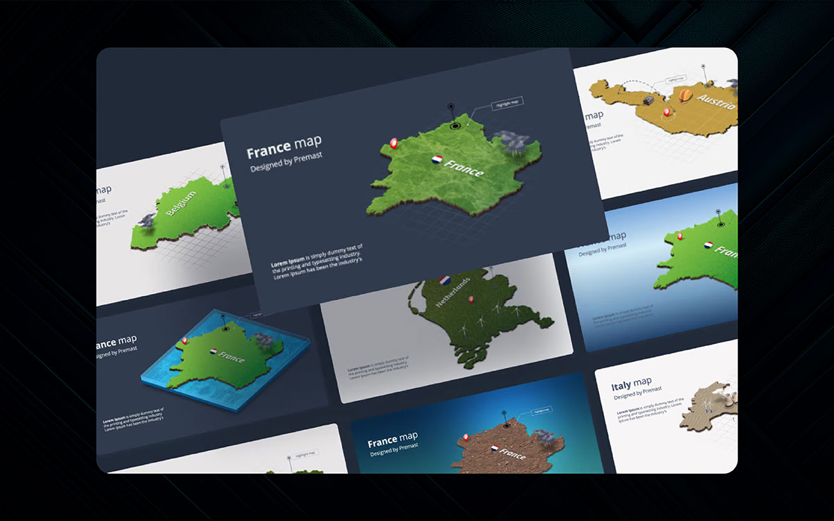
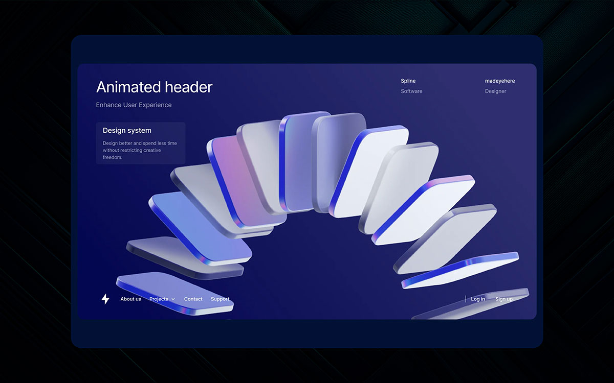
Isometric design is all about evoking the feeling of 3D while being simple. These angled custom illustrations have maintained their modern and clean looks over time.
Isometric designs of PowerPoint design trends are perfect for showing layered data systems or workflows, as they help the audience visualize how the underlying mechanisms work.
Though this design style is standard in technology, business, or digital products, its futuristic yet easy-to-digest feel is associated with its popularity. Use isometric icons, mockups, or scenes to add clarity and creativity to your message.
Let’s put the chips on the table. We've all experienced the strange boredom as people go through slides. You know the type: unreasonable bulleted lists, off-putting clipart, and charts that worsen things. Well, on the bright side, things are better now. That is where design trends come in. These are not abstract concepts; they help shape stories, helping them become more memorable. Let’s now know why they matter more than ever!
You literally have only a few seconds. Research argues that people only need around 50 milliseconds to judge visuals, which is faster than blinking.
Therefore, if your slide is outdated and disorganized, chances are your audience will lose focus and attention even before you have the opportunity to start speaking.
You care about your audience's attention; modern presentation trends with good design will demonstrate that. When the design appears to be contemporary, everything feels contemporary, too.
Your brain is capable of remembering images over text at a faster rate. For that reason, photographs and icons add vivid design to your ideas. Therefore, the ideas will stay with the audience. This is very powerful when you aim to present the steps, a big idea, or even data.
Design is not only art; it reflects what is currently relevant to human beings. In the year 2026, slides will be cleaner, more interactive, and less clutter-filled.
If your presentation is designed with the aesthetics of 2010, the audience will likely feel that your ideas are outdated. If one applies modern concepts, they show that the world is current and valuable, hence the message will be more relevant.
Your slides tell something about you. They capture your flair, your thoughts, your energy. For companies, a deck’s accessible design often embodies the business itself. For people, it signals how serious the individual is towards work.
A stylish, uncluttered presentation tells the audience, “I value your time. I have made an effort. I respect you." That feeling builds trust and makes the message more powerful.
Have you ever tried explaining an idea with only text? One word: difficult. But design can help. Trends such as visual data-driven storytelling, infographics, and minimalist layouts all help make difficult concepts easier to understand.
When you follow contemporary design norms, you do not have to explain everything beyond reason: your visuals can do the storytelling for you.
With powerful modern tools like Google Slides, PowerPoint, and Canva, designing aesthetically pleasing presentations is simpler than ever. These tools come with contemporary hooks such as animations, themed layouts, and image effects with immersive visuals.
However, your design will still look outdated if you don’t know how to use your tools properly. Understanding what is in style lets you make the most of your tools.
Truthfully, if a slide is boring, no one will pay attention. Phones are brought out, and people start blanking out. Designing handouts, banners, or even slides should be visually interesting by modern presentation trends but not overly stimulating.
Your design should invoke just the right amount of attention. Everything from motion, color, spacing, elements, and boldness is essential in getting your message noticed.
At the eleventh hour!
Found new and creative presentation design trends? Most probably, your answer is yes. Indeed, design trends are constantly covering new concepts and landscapes every day. But, we've done mega research on the trends in the presentation design world and picked the above 17 presentation trends as the core to add more fuel to your brand.
Great design comes across as simplicity. It just needs to be deliberate. Thoughtful use of color, layout, and flow can elevate a presentation from mildly interesting to memorable, which will stick with people’s minds long after they’ve walked away from it.
Anyway, do you think you need a reliable hand to make things easier for you? Or want to bring your ideas to life? If so, contact us right now with what type of presentation design services you’re looking for. You’ll never regret it.
Book a consultancy with Graphic Design Eye to explore more.
Good day! 🙂