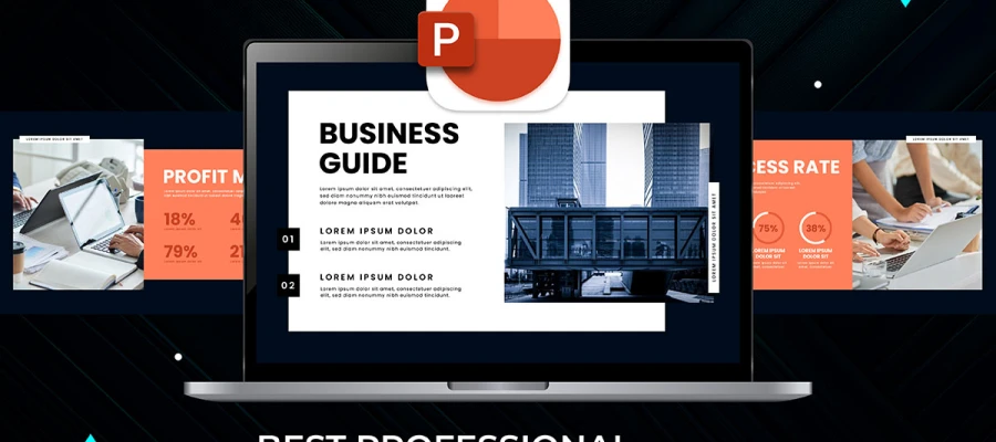
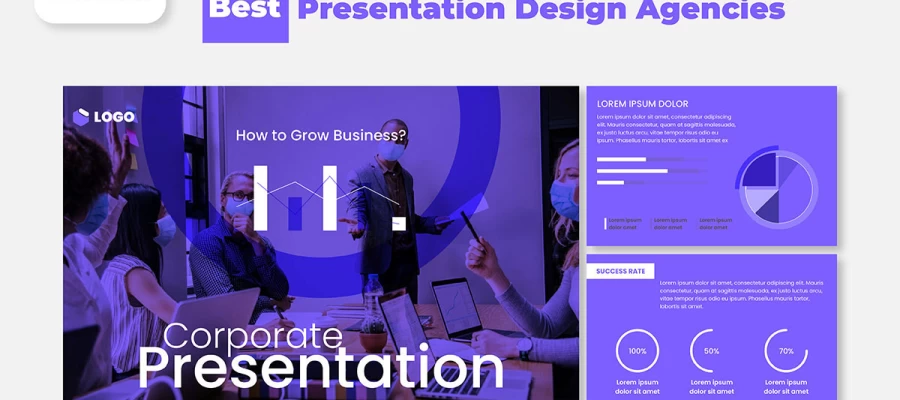
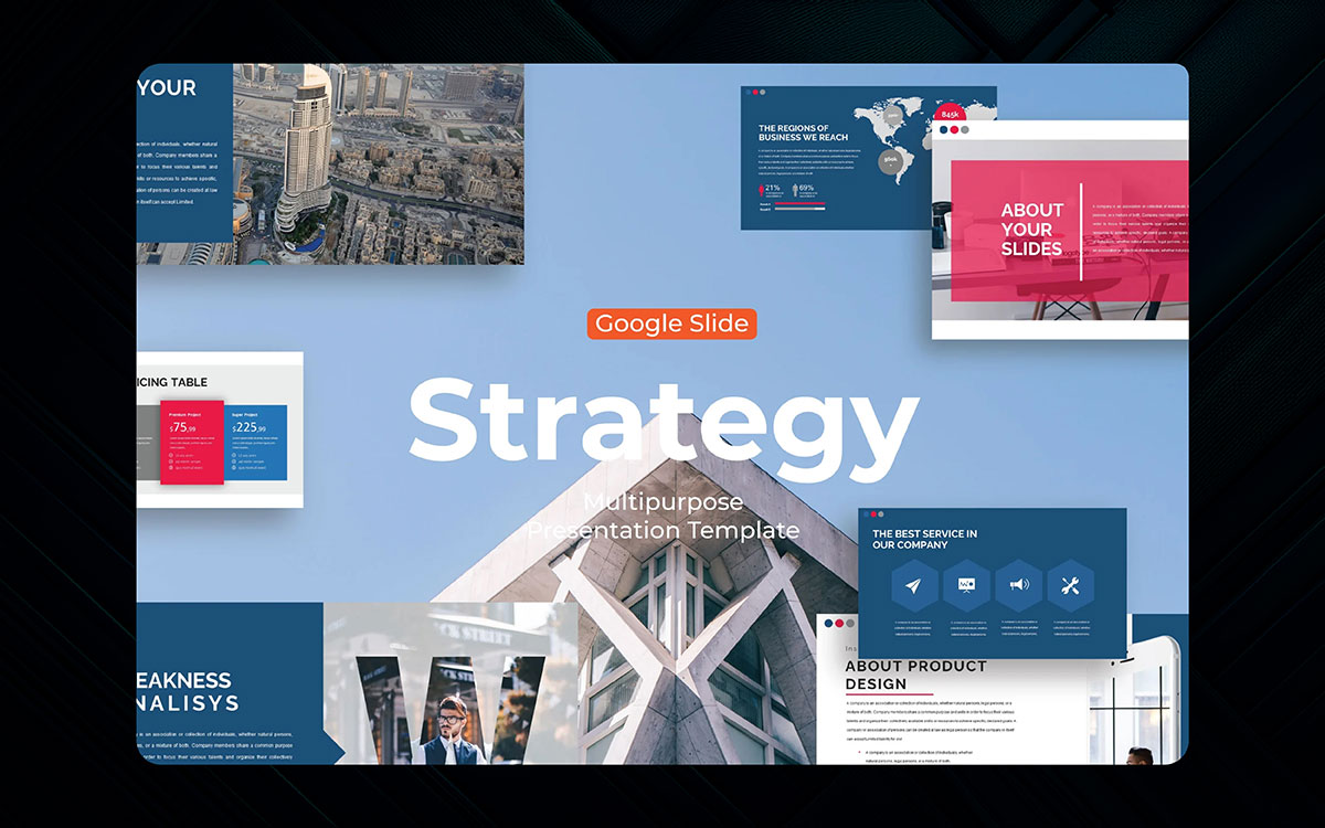
You are looking to find the best Google slides templates to create a highly captivating presentation that makes a difference. Indeed, Google Slides Template has been covering the presentation design world in full swing for a long time.
The top-notch Google Slides act like a true game-changer for everyone's presentation, whether you’re a business owner, teacher, trainer, or store owner.
Presentation is an art. It makes people remember you. Wherever you go in the presentation world, you will need the best Google Slides to make your presentation stand out from the crowd.
If the slides are mind-triggering, they'll engage your customers. That's why you will need the best presentation templates to make your presentation memorable and remarkable to your audience.
Today’s blog comes with the top 25 Google Slides templates for your captivating presentation design. It's time to go inside those slides that can trigger your audience's mind. Let's get started now!
That said, the types of Google Slides templates people use – especially the free ones versus paid ones – have changed. It’s nothing new to say the basic free templates have a harder time impressing bosses now, since, well, those fancy animated paid Google Slides themes are hogging all the attention. And client meetings.
Some still try using old boring slides. But when your coworker shows up with a premium template that moves and shines? Your presentation suddenly looks like a school project from 2010.
The free stuff works okay for class. But the best Google Slides templates? They make even your boring data look like some big-shot CEO made it. Big difference.
So yeah, free templates exist. But in 2026? If you wanna look pro, you gotta upgrade. Just don’t blame us when your boss expects all your slides to look this good now. Oops.
So when it comes to the best templates for business, we like to show off all kinds of designs, not just because we, the team, use different styles for different stuff, but also because we know you, the working professionals, need variety too.
For every super serious corporate slide deck that makes boardrooms happy, there's a fun, creative template that turns boring meetings into something almost exciting. For every minimalist business presentation template that looks slick and professional, there's a colorful modern one that makes data interesting to look at.
Some people think work slides gotta be boring. But why? A good Google Slides business template can make your quarterly report feel less like torture and more like... well, maybe not fun, but not nap time.
The free ones work okay. But the best-paid corporate templates? They make you look like some fancy consultant who charges $500 an hour. Worth it? Your boss will think so when clients stop checking their phones during your presentation.
So yeah – business slides don't have to suck. The right template can make even budget meetings look... Well, not terrible. That's a win in our book.
Of course, there are those minimal pitch deck templates that almost made our top picks but got cut last minute. That includes those super clean business Google Slides designs where less is more - just enough fancy to impress investors but not so much that it looks like a kindergarten art project. Even as you try to make your startup idea sound smart, these Google Slides templates do the heavy lifting so you don't look like another clueless founder.
Key Features:
Some think simple means boring. But a good minimal pitch template is like a tailored suit - it makes you look put together without trying too hard. Your slides stay quiet while your big ideas get loud.
The flashy templates grab eyes first. But these are minimal business slides? They're the ones that close deals, while others just get "we'll circle back" emails.
So yeah - sometimes the best pitch decks don't scream for attention. They whisper, "This person knows what they're doing," while investors reach for their checkbooks. Classy.
Also making our honorable mentions is the Blue Minimal Business template, a surprisingly fresh take on professional slides after all those overdone corporate designs. With this template, you get everything good about clean presentations - smart layouts, nice colors that aren't boring, and none of that ugly clipart nonsense that makes slides look cheap.
Some blue slides are for boring office stuff. But this minimal blue template? It's like the little black dress of Google Slides -it works for serious meetings but doesn't put people to sleep. Your pie charts suddenly look fancy. Your bullet points feel important.
Key Features:
The flashy rainbow templates get attention first. But these blue business slides? They're the ones clients remember when it's decision time. Simple but not lazy. Professional but not stiff.
So yeah - while everyone else uses those same old white slides, you'll be over here looking polished with zero effort. That's what we call a presentation power move.
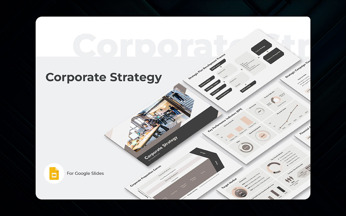
And then there are those serious corporate strategy templates like the Executive Vision deck, a boardroom-ready beast with more charts than a Fortune 500 annual report, and the sleek M&A Playbook slides. This Google Slides template would've ranked higher on our list if more teams knew how to use them right instead of just copying and pasting old bullet points into the fancy new layouts.
Some think strategy slides gotta be boring. But this corporate strategy template pack? It turns dry business jargon into something almost exciting (or at least not sleep-inducing). Your growth metrics suddenly look important. Your SWOT analysis doesn't make people groan.
Key Features:
The basic free Google Slides templates work okay. But these premium strategy slides? They're what separates the "we'll consider it" meetings from the "shut up and take our money" deals.
So yeah - while your coworkers still use that ancient presentation from 2012, you'll be over here looking like McKinsey consultants. Worth every penny when the promotion comes around. Just sayin'.
Gradient corporate continues the trend with smooth color blends that make boring slides look expensive. These best Google Slides templates take basic business presentations (you know, the kind that usually put people to sleep) and turn them into something almost cool, like your quarterly report got a fancy makeover.
Key Features:
Some think gradients are just for Instagram posts. But this gradient corporate pack? It makes pie charts look artsy and bar graphs feel stylish. Your revenue projections suddenly have mood lighting. Your team org chart doesn't look like a sad family tree.
The basic office templates work okay. But these premium gradient slides? They're what turns "just another Zoom presentation" into "wait, how'd you make our sales data look this good?" moments.
As one designer put it: "These templates serve up boring business info like it's fancy cocktail party food - same ingredients, way better presentation." Because let's be real - in 2026, if your slides don't look good, nobody thinks your ideas are good either. Harsh but true.
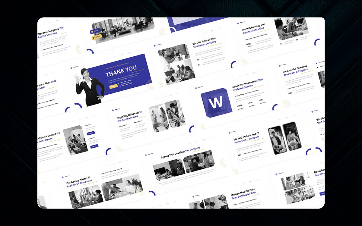
Business overview deck is the kind of template that grabs your boring presentation by its collar (you do wear collars to meetings, right?) and shakes it screaming LOOK HOW PROFESSIONAL WE CAN MAKE THIS! ISN’T IT BORING BUT ALSO KIND OF IMPRESSIVE!? And weirdly enough, it is. Corporate but cool, that is.
Key Features:
Your tired old slides start as "GenericBiz Inc..", a struggling company presentation fired from investor meetings for being dull, like all bad slides tend to be. Enter the overview deck template, which, when applied to your content, creates a slick, boardroom-ready version of your pitch (because obviously, professional). The new slides slowly take over while your old design goes dormant in the presentation graveyard.
As the template battles your bad formatting, the real corporate magic happens - pie charts become readable, timelines stop being tragic, and suddenly your growth projections don’t look like wishful thinking. You gotta see the before/after to realize maybe your old slides were the problem all along.
As one designer put it: "This template exposes bad presentation habits in a brutal, beautiful slide intervention." Because nothing hurts more than seeing how good your ideas could’ve looked all along. Ouch.
Educational Google Slides templates, with their colorful yet clean designs perfect for classrooms and lectures, scored highest with teachers. The "Science Explorer" template stars as a former boring class that got a total makeover into an engaging lesson plan.
Some teachers still use those ancient slides from 2010. But when they try these education templates, suddenly their lectures don't put students to sleep. The timeline slides make histology look exciting. The math templates turn equations into something almost fun (well, as fun as algebra can get).
Chen designs her templates to work across all grades, jumping from elementary ABCs to university lectures as smoothly as a teacher changing subjects. The layouts are as impressive as the color schemes (and those smart "click here" animations that keep kids paying attention!), all building to that "wait, did my students enjoy this lesson?" moment.
As one teacher raved, "These best Google Slides templates that build engagement in ways I've never seen. Between the bright visuals and smart layouts, the result is some of the most effective teaching slides I've used in 15 years of classroom work." Because when education looks this good, even homework seems slightly less terrible. Almost.
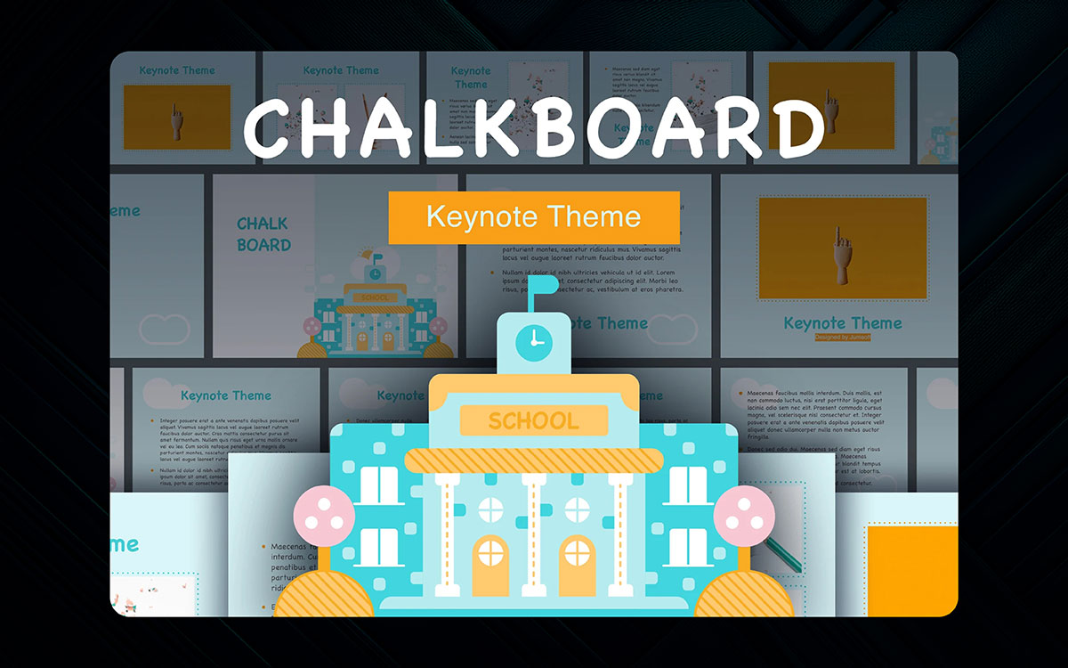
Take the boring old chalkboard classroom idea and turn it into a Slides presentation that teachers love. Nay, not just a template, this is now a whole education trend, with matching worksheets and lesson plans popping up everywhere.
Certainly, using that perfect chalky font and just-right smudge effects was key to making this template work. But the real skill is taking something as simple as a blackboard and making it feel fresh again - not too messy like real chalk, but not too clean like boring digital slides either. It's like she climbed up that dusty old teaching tool and made it cool again.
Key Features:
The template even improves on the original chalkboard by adding secret spots for videos and quizzes that real blackboards could never do. Like one teacher said in her review: "Featuring perfect chalk textures, this classroom chalkboard template is a game-changing tool for making lessons feel warm and personal while still being digital-ready."
Because sometimes the best way forward is to look backward, just with less chalk dust in your hair.
There was a lot to think about when picking the best lesson plan templates. We always got some that almost made it but just missed out, like the science lab template and history timeline slides this year. Both were good, but got beaten by others that were just slightly better. So let's see which ones won, and why teachers love them so much.
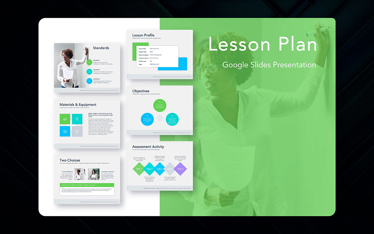
The lesson plan slides template came out on top because it makes planning easy peasy. You got spots for objectives, activities, and homework - all laid out neatly and clearly.
No more scribbling notes on scrap paper! Other templates try too hard with fancy stuff, but this one keeps it simple so you can focus on teaching, not decorating slides.
Key Features:
Some teachers still use boring old Word docs for plans. But once they try this Google Slides template, they wonder how they ever lived without it. Everything in one place, looking pro but not stuffy. Even the principal will be impressed when they see your plans now!
So while other templates come close, this one's the champ for making lesson planning kinda fun. Well, as fun as planning can be anyway! Teachers gotta take their wins where they can get them.
Before we show the best science fair templates that won this year, let's talk about ones that almost made it. The robot project slides, volcano experiment design, solar system theme, and chemistry lab template all got votes but just missed the top spots. Each one is cool in its way - like how the robot slides make tech projects look futuristic, or how the volcano template looks like it's about to erupt (but won't make a mess on your laptop).
The science fair template that won is the one teachers and kids love most. It's got perfect spots for your hypothesis, materials list, results - everything laid out so even parents can understand it. No more tri-fold boards with glue stains! Many templates try too hard with crazy animations, but this one keeps it clean so your actual experiment gets all the attention.
Key Features:
Some kids still use poster boards with marker scribbles. But once they see this template, they realize science fairs can look pro without being boring. Even the judges will nod their heads when your presentation pops up on the screen.
So while those other templates are fun, this one's the real winner for making science look as awesome as it is. Now, if only it could do your experiment for you, too!
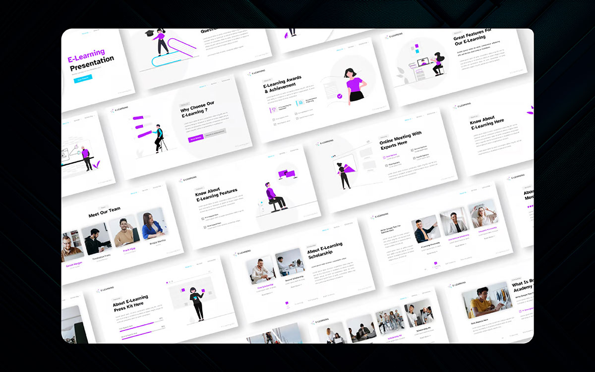
The e-learning theme template barely made our runner-up list after getting way better from its first version. While the design isn't perfect, the battle between boring online lessons and fun slides got way more intense this year.
With students zoning out left and right, the stakes grew even as designer Amy Chen found ways to put learning and cool graphics on the same screen again. Formerly dull education turned into flashy digital lessons, so it seems impossible for regular slides to compete at this point.
Key Features:
Though the e-learning template could sometimes frustrate with too many animation options, it remains a visually slick set of slides that delivers the "whoa" factor that students stuck at home have come to need. The quiz slides pop, the video frames look pro, and the lesson layouts make sense - something rare in education templates.
Some teachers complain it's "too much" for simple lessons. But when your students pay attention instead of playing games on their phones? Maybe being "too much" is just enough. After all, in the war against distractions, boring slides were lost years ago. This template? It's got dragons. Well, not really. But it might as well - it's that much cooler than what you're using now.
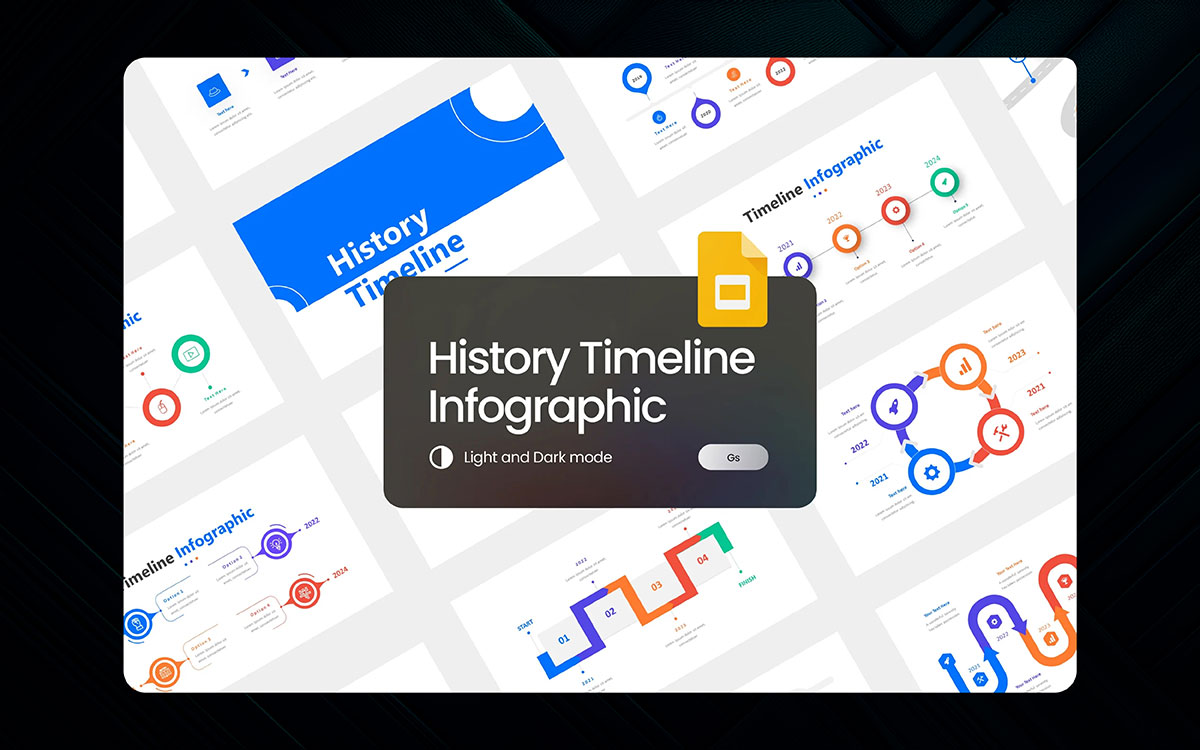
The history timeline template, featuring cool designs of pyramids, knights, and space rockets, continues the story of making boring history lessons fun, showing the battle between dull textbooks and engaging slides.
From the start, this template has been a visual feast, probably using more colors than your average history book by a mile. While the newest version still has the awesome timeline graphics the template is known for, some teachers felt the ancient history section was rushed compared to the modern era stuff.
Had the designers added more details about cavemen and dinosaurs, it probably could've won the best template ever.
Key Features:
Some parts feel squished together, like the Industrial Revolution happened fast. But when you see students paying attention to the French Revolution instead of passing notes? That's some educational magic right there. The template makes centuries fly by in minutes, but in a good way - like a time machine with better fonts.
Sure, it's not perfect (what template is?), but when your class cheers for a pop quiz about ancient Egypt? That's when you know you're using the history timeline template right. Just don't blame us when kids start demanding gladiator battles in the school gym.
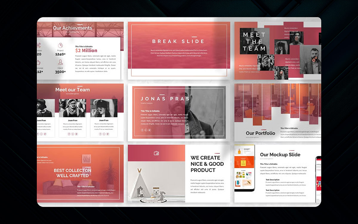
There's no one style to this year's best creative portfolio Google Slides templates. Sure, you've got your clean professional ones that always do good in this crowded category. But two wild new designs blew us away by making boring resumes look like art. These winners are the slides that stick in clients' brains long after your pitch, and they belong in your template folder too.
Some think portfolio slides gotta be serious and plain. But the creative & portfolio templates that won? They prove your work can pop without looking silly. One makes your photos float around like a gallery, another turns projects into a cool story. Not too flashy, not too boring - just right to make people go "whoa" in that good way.
The safe corporate Google Slides templates work fine. But these? They're what gets you hired over someone with the same skills. Because in 2026, if your portfolio doesn't grab your attention in 3 seconds, it's already lost.
So yeah - while others use those same old black-and-white slides, you'll be over here getting job offers. Worth the upgrade when your dream client slides into your DMs saying, "We need to talk." Just saying.
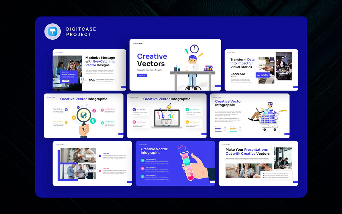
It was super hard to pick just a few presentation templates this year, but there are two that didn't win and still deserve shoutouts. One is Minimalix, a crazy clean template that makes boring stuff look fancy without trying too hard. Some slideshows are impossible to fix, but with the right design? Even your grandma's cookie recipe looks pro. The other is DataBeam - in a year full of boring charts, this one makes numbers fun to look at (well, as fun as numbers can get).
Key Features:
The creative Google Slides template that won? It's like the superhero of slides - takes whatever junk you throw in and makes it look awesome. Not too simple, not too messy, just right to make people go "whoa" without hurting their eyes.
Alternative best Google Slides templates work okay. But this one? It's what gets your work remembered when others get forgotten. Because in 2026, if your slides don't pop in the first 3 seconds, you've already lost.
So yeah - while others use those same old presentations, you'll be over here looking like a design genius. Worth every penny when clients start copying YOUR style. Just saying.
There's a cool story behind this minimal portfolio template from DesignHaus. It's based on this old-school art portfolio style from the 1920s that got forgotten when everything went digital. The original designer, Max Fleischer, never got to see his clean layout ideas become popular before computers changed everything, which makes this remake by modern designers.
Key Features:
Most portfolio templates try too hard with fancy stuff. But this one? It keeps things simple like the old masters wanted - just your work, looking perfect, no distractions. Not flashy, not boring, just right to let your art speak for itself.
Alternative templates add too much junk. This minimal design? It's what gets you hired when others get ignored. Because sometimes the best way to stand out is to... well, not stand out too much. Just show your work clean and let it shine.

The design pitch template tells the story of boring presentations stuck in endless corporate meetings. Frustrated, good design goes on strike, meaning no slides look nice anymore. That leaves creative Ideas with no choice but to inspire designers to make pretty slides again.
Key Features:
This template saves your work from Death-by-Bullet-Points. When ugly presentations attack, it fights back with clean layouts and nice colors. Your ideas finally get to shine without getting buried in junk.
Alternative templates try too hard. This one? It's like a superhero for your presentations - not flashy, just gets the job done right. Because in 2026, if your slides don't look good, nobody thinks your ideas are good either.
So let the boring slides die. Your next pitch? It's gonna live forever in clients' memories. Or at least until lunchtime.
Whatever you think about paying for a fancy Google Slides template, nobody can deny that this UX/UI slides pack has the best designs out there. Where else can you get slides made by top designers who understand how people look at screens?
Key Features:
Some say, "Just use a free Google Slides template." But this one? It's like having a design team on your laptop. Your wireframes won't look like scribbles anymore. Your user flows make actual sense now. Even your color palettes stop hurting people's eyes.
Alternative templates try to do everything. This UX/UI template just does the important stuff right - clean layouts, smart grids, places to show your process without putting everyone to sleep.
So yeah, maybe spend money on good slides. Because in 2026, if your portfolio looks bad, everyone assumes your designs are bad too. Harsh but true. Your dream job deserves better than some janky free template. Just saying.
The agency portfolio template will instantly grab designers who love clean layouts, mixing bold visuals with smart organization and real-world usability. It follows a creative agency struggling to stand out in a sea of boring pitches until it discovers this game-changing slide design.
Key Features:
Some slide templates try too hard to be different. But this one? It's like your best work finally found its perfect frame, showing off your projects without distracting junk. Your case studies look expensive. Your team page doesn't make people cringe. Even your contact slide stops getting ignored.
Alternative portfolios scream, "Look at me!" This agency template whispers, "Hire us" in that cool, confident way that works. Because in 2026, if your deck doesn't impress in the first 5 slides, you've already lost the client.
Your next pitch? It's gonna haunt clients' memories (in that good way) long after the meeting ends. The right template won't just show your work - it'll make people feel something. And feeling gets contracts signed.
If we gave an award for most eye-catching marketing templates, this sales slide pack would crush the competition. The designs mix bold colors and clean layouts perfectly, showing the difference between boring old pitches and slides that close deals. No wonder it won "Best Sales Template of 2026" from Design Weekly.
Some decks try too hard with crazy effects. But this marketing template? It's like your best ad campaign came to life in slide form, making numbers exciting and products irresistible. Your KPIs look sexy (weird to say, but true). Your testimonials pop. Even your pricing page stops scaring clients away.
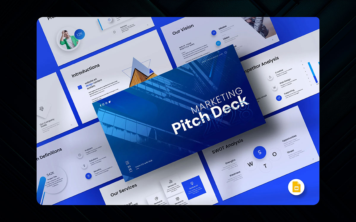
Looked down as the most boring of all marketing Google Slides templates, the corporate blue 2015 suffered from a design clash, as the business-y vibe never meshed with actually exciting pitches. And the layout's story of bullet points trying to hide bad ideas behind clipart never really worked. Still, there are some okay parts - the title slide font isn't terrible, and the chart colors don't completely hurt your eyes, even if the animations feel as fake as Loki's death. Oh, and we'll never forgive those unreadable 8pt footers.
Key Features:
But this marketing pitch deck template? It's what happens when the Avengers assemble. Your value prop pops like Thor's hammer. Your competitor's slides burn worse than Surtur's sword. Even your pricing page doesn't make clients run for the Bifrost.
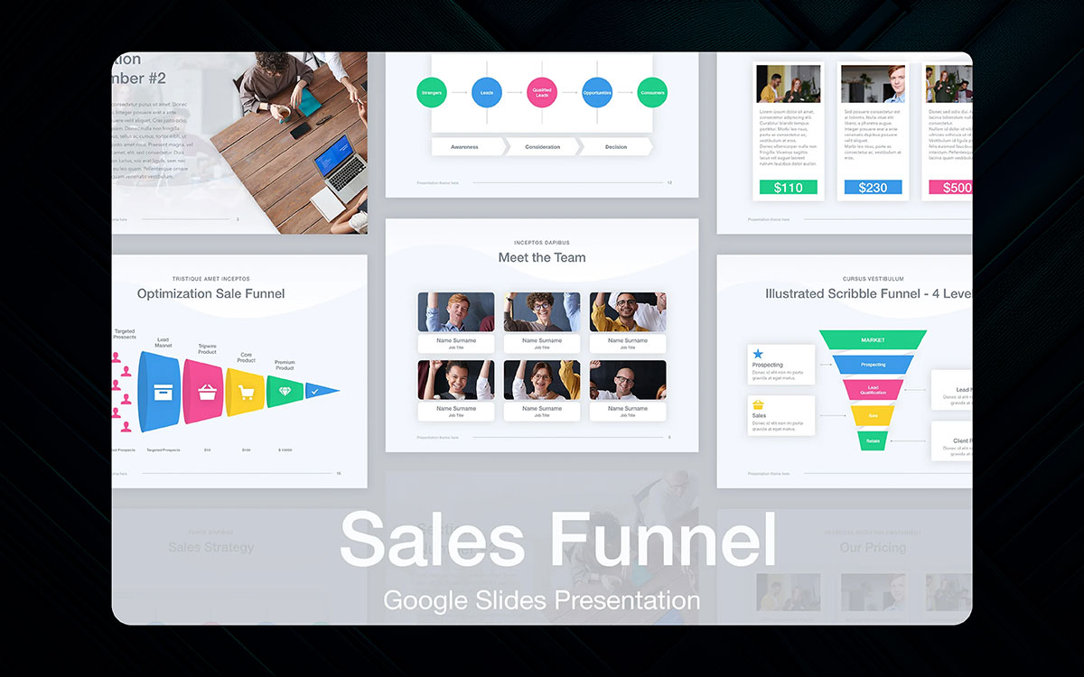
The sales funnel template has always been a pretty basic business tool, going back to those ugly presentation versions from the 2000s. But nothing could have prepared us for how awesome this new Google Slides funnel template would be.
Key Features:
Some think sales slides gotta be boring. But this one? It transforms your leads-to-clients journey like Optimus Prime - taking dull data and making it exciting (well, as exciting as conversion rates can get). Your awareness stage shines bright like a Bumblebee. Your decision stage hits harder than Megatron. Even your retention slides don't look like afterthoughts.
This product launch kit template reboots boring presentations as part of the new Design Universe, combining slides, graphics, and data viz into one powerful deck. But it does it in a way that feels classic yet fresh, like your favorite startup pitch but with way better design.
Key Features:
It's got that perfect balance - enough wow factor to excite stakeholders, enough substance to explain your product. Your features section transforms from boring specs to must-have benefits. Your roadmap slides make sense. Even your pricing page stops scaring people away.
The rest of the templates either go too retro or too futuristic. This launch kit? It's what happens when good design meets smart strategy - familiar enough to feel comfortable, innovative enough to get noticed. Because in 2026, if your product launch doesn't both reassure AND excite, you're just another forgettable Zoom call.
That said, no template has done more to unleash the full power of email marketing than this Email Strategy slides pack. In these slides, the clock is ticking down until your next big campaign launch. With limited time to impress clients, a smart layout and killer data viz team up to create slides capable of crushing boring reports and freeing marketers from terrible slides forever.
Key Features:
It's assembling all the best weapons - open rate heatmaps that make sense, A/B test showdowns more exciting than hero battles, and conversion funnels that don't put people to sleep. Your subject line testing slides hit harder than Thor's hammer. Your segmentation strategy shines brighter than Iron Man's repulsors.
This email strategy deck? It's what happens when good design fights the evil forces of marketing Blandness. Because in 2026, if your email presentation doesn't both inform AND excite, you're just another unread message in the client's inbox.
While others are stuck with last year's boring reports, you'll be over here saving the day (and probably getting promoted). The right template doesn't just share data - it makes people care about click-through rates. And that? That's a real marketing superpower.
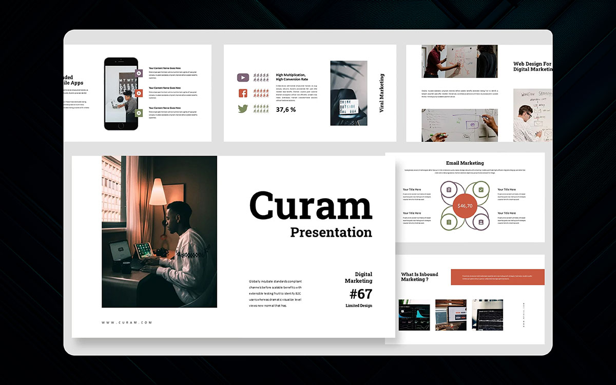
No current social media template captures the chaos of online marketing in 2024 quite like this social media overview deck. It's a survival guide for brands drowning in algorithm changes and viral presentation trends. It reinvents boring reports with bold visuals and useful data. Month after month, it's the template that keeps your strategy from looking outdated.
Key Features:
It organizes the internet madness like a superhero team - your engagement metrics finally make sense, your content calendar stops being embarrassing, even your hashtag research looks strategic. Your TikTok stats hit harder than viral challenges. Your Instagram growth shines brighter than influencer drama.
It's what happens when good design battles the evil forces of marketing confusion. Because in 2026, if your social report doesn't both show results AND tell a story, you're just another forgotten post in the feed.
So while others are stuck explaining yet another "viral moment," you'll be over here proving ROI with slides that impress. The right template doesn't just track likes - it makes bosses care about comments. And that? That's a real social media superpower.
It's not crazy to say we're seeing the best tech startup templates since the early presentation days. The past few years brought fresh designs, mixing nostalgia for simple slides with new tricks that make pitches exciting. The result? Super clean Google Slides templates, retro-modern looks, and fresh layouts that find smart ways to make investors pay attention.
They're like your favorite apps - simple to use but packed with smart features. Your funding task doesn't scare people away. Your product roadmap makes actual sense. Even your team page stops looking like a bad yearbook photo.
These happen when good design meets big ideas - familiar enough to feel comfortable, innovative enough to get that "whoa" reaction. Because in 2026, if your pitch deck doesn't both explain AND excite, you're just another forgettable Zoom call.
So forget those ancient slides from 2010. This tech Google Slides template is like software updates for your pitch - everything works better, looks sharper, and helps you close the deal. The right deck doesn't just share your idea - it makes people believe in it. And belief? That's what turns "maybe next year" into funding today.
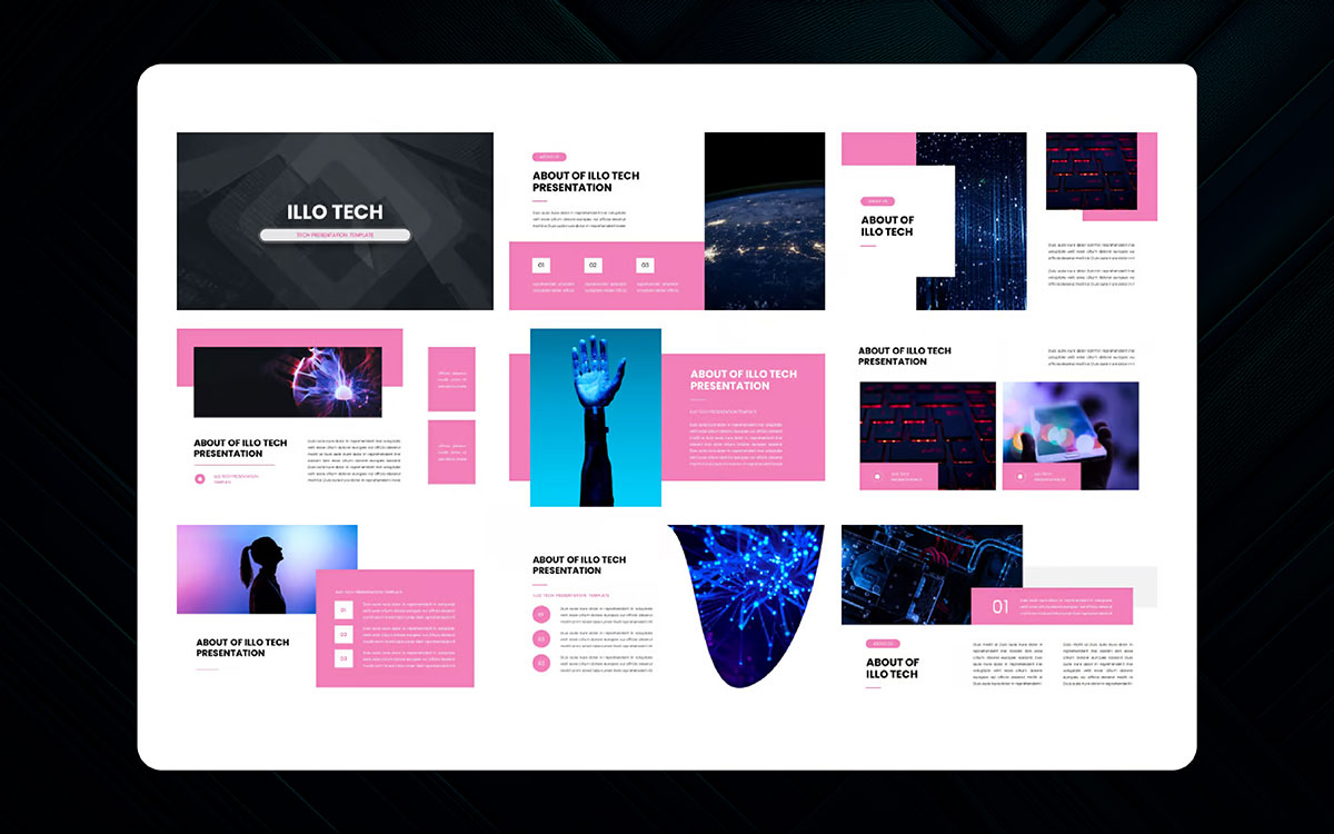
Things in the tech template space are so good that last year, we created a best gradient design category for our template awards. And it was crazy easy to bring it back this year because the tech gradient slides just keep getting better. We got treated to the smooth color blends of the Neon Code pack, the futuristic vibes of Cyber Fade, the retro-cool Ombre 3000, and the mind-bending Hologram slides that make data look like magic.
Key Features:
These techs are giving your boring charts a sci-fi makeover. Your KPIs don't just sit there - they glow. Your team photos don't look awkward - they look like a cyberpunk movie poster. Even your quarterly numbers stop putting people to sleep.
They're what happens when tech meets art - professional enough for boardrooms but cool enough for TED Talks. Because in 2026, if your slides don't grab attention in 3 seconds, your big ideas get lost in the noise.
These gradient designs are like visual espresso shots - they wake people up and make them care about your SaaS metrics. The right colors don't just decorate your slides... they make your whole company look smarter. And that? That's how you turn "let's circle back" into "let's sign today.
The Dark Mod Tech template from designer PixelForge is a slick presentation beast set in a digital world where bright slides burn your eyes. It's enjoyably futuristic, painted in the cool blues and purples of midnight screens and powered by the secret weapon of tired audiences everywhere - no more blinding white backgrounds.
Key Features:
It's way more exciting than basic slides would suggest, with glowing data visualizations that pop like neon signs and text that stays readable in conference rooms with bad lighting. Your code snippets look dangerous. Your tech specs feel mysterious. Even your boring meeting agenda seems kinda cool now.
Other best Google Slides templates try too hard with light colors. This one? It's what happens when good design understands developers work at 2 AM. Because in 2026, if your presentation doesn't respect people's eyeballs, you're just another reason someone needs aspirin.
So let the other teams keep burning retinas with white slides. Your next pitch? It'll be the one everyone remembers when the lights go down. The right dark mode doesn't just look good - it makes people pay attention to your API documentation. And that? That's real dark magic.
We also gotta give props to the geometric innovation template. While some designers might not vibe with its unusual angles at first, our team loved its weird-cool approach to slide design. The latest template from former Apple designer Marco Li certainly has its quirks - shapes colliding in ways conventional slides would never allow - but there's something genius about how it makes boring data feel fresh.
Key Features:
Using triangle graphs that transform into 3D pyramids, or pie charts that explode into hexagons? That's wilder than most templates dare to be. In a world of safe corporate slides, this one wears its weirdness like a badge of honor. Your revenue charts become art. Your team org chart looks like an avant-garde sculpture. Even your Q3 projections feel... dangerous.
For those tired of the same old rectangles? This template's like mainlining creativity straight to the brain. Because in 2026, if your slides don't make people do a double-take, you're just wallpaper.
Let the other teams keep using their basic boxes. Your next presentation? It'll be the one that haunts the client's memory (in that good way). The right geometry doesn't just organize info - it makes people see your ideas completely differently. And that? That's how you turn "interesting concept" into "shut up and take our money."
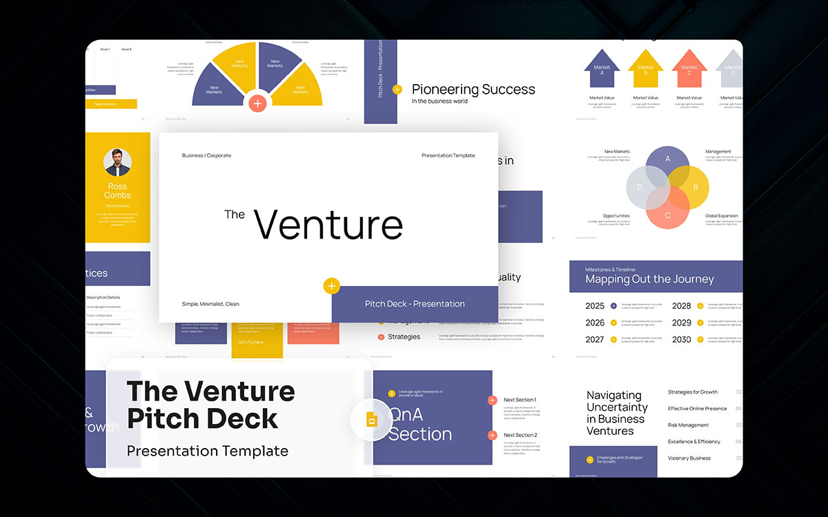
The magic of the best venture pitch deck is in its killer simplicity: a presentation where every slide has to earn its place. A cluttered chart or rambling bullet point could sink your whole pitch. On paper, that's not just good advice - it's the secret sauce behind fundraising success. And so, totally predictably, we've landed on a truly killer template in venture pitch deck: The Road to Funding.
Key Features:
It's all about ruthless focus - your problem statement hits like a gunshot, your solution shines like a beacon, even your finances tell a story worth hearing. Your traction slides don't just sit there - they scream "money waiting to happen." Your team page? More like an all-star lineup.
Other decks babble through 50 slides. This one? It's what happens when good ideas meet military-grade editing. Because in 2026, if your pitch doesn't grab attention by slide 3, you're just VC background noise.
It'll be the one that leaves investors holding their breath (in that good way). The right template doesn't just share your vision - it makes wallets open automatically. And that? That's the sound of term sheets printing.
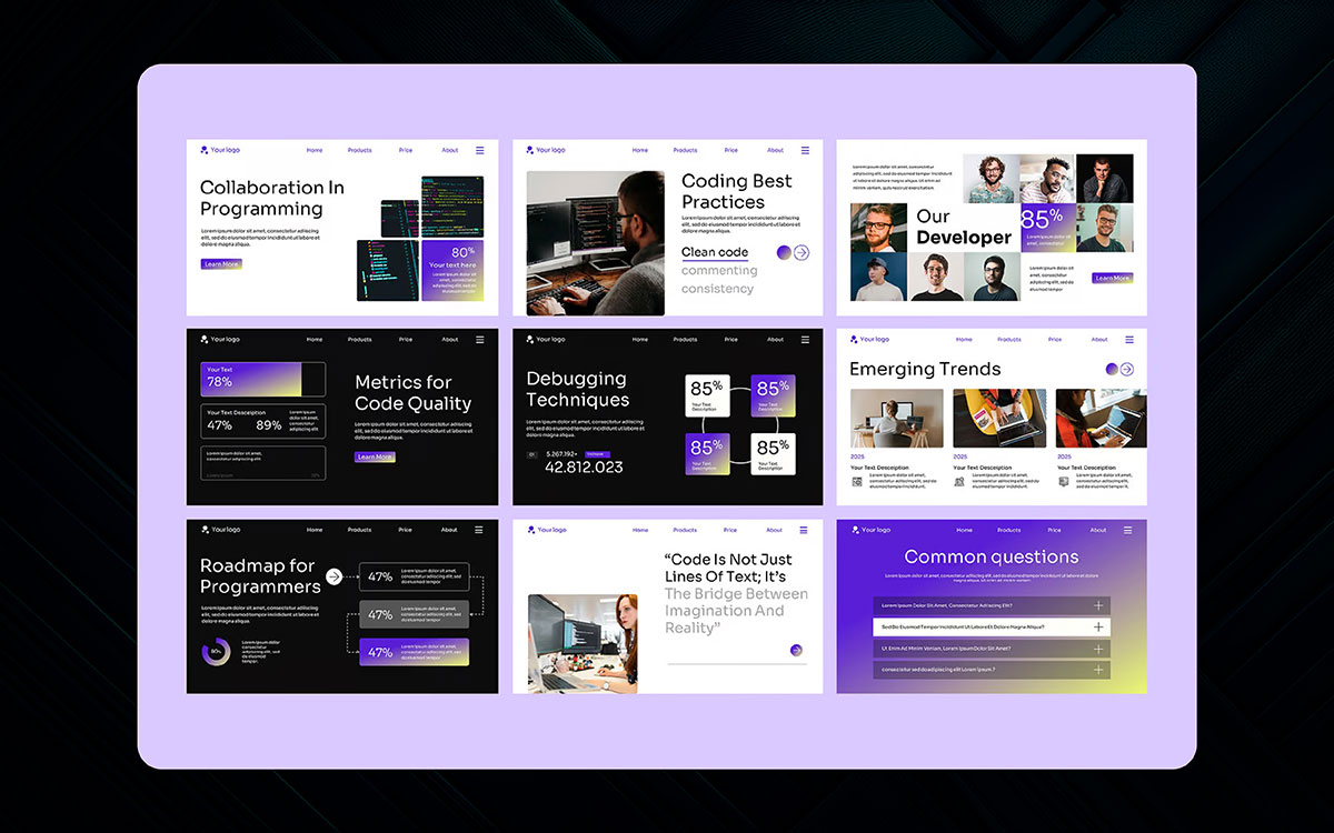
As you'd guess, this is a high-stakes dev presentation built on clean code principles. Hunted by the same bugs seen in bad repos, you must carefully navigate through slides packed with messy syntax. Every animated transition is a risk - will it lag?
Every custom font could crash older machines. Adding stress? Your audience is engineers who spot bad indentation from 20 feet away. One sloppy code snippet and their inner linter will scream errors.
Key Features:
It's survival mode for devs - your architecture diagrams stay crisp, your code samples stay readable (with perfect highlighting), even your API docs don't induce panic attacks. Your error handling slides don't just explain - they demonstrate grace under pressure.
Many other templates bloat with useless widgets. This one? It's what happens when OCD meets a presentation - every bracket aligned, every color accessible, every slide compiling on the first try. Because in 2026, if your tech talk doesn't respect the fundamentals, you're just another "npm install" away from disaster.
Your next talk? It'll be the one where engineers nod approvingly instead of fixing your slides in their heads. The right template doesn't just share code - it proves you write good code. And that? That's how you turn "interesting project" into "when can you start?"
We gotta explain why picking a good template is so important for your presentation, so here's the deal. On top of that, Google has many best Google Slides templates where you just click and add your words. There is not much fancy stuff - you won't find crazy animations, perfect color matches, or designer fonts here. But as you start working, you fall into a deep hole of making it perfect. What happens when boring slides make people fall asleep? Attention has become a rare, precious thing.
Always go for:
A good template is like a spaceship - it helps you go far without getting lost. Pick one with the right colors for your topic (serious = blue, fun = bright). Make sure the text is easy to read from the back of the room. And don't use too many pictures that fight with your words!
When selecting a Google Slides presentation template, focus on these key factors:
Templates are your friend, not your enemy. It is there to help, not make more work. Choose smart, and your audience stays awake like watching a good movie!
Finally, we're done! Do you like seeing the 25 best Google Slides templates? Now, maybe it's time to make your presentation slides prettier, yes?
Good slide, it's like nice clothes - make people look at you! If you are a teacher, boss, or store owner, nice slides help say, "I know stuff!" Our team looked at 1000s of themes for 3 whole days to pick the best ones.
It's not an easy choice! We pick ones with bright colors, fun pictures, and cool words that make people go "Ooooh!"
Now the world is all about technology. Old boring slides go to sleep, new exciting slides wake up! These Google Slides templates have all the new tricks to make you look smart.
But if you don't wanna pick them yourself? You can pay a design guy to make slides just for you! That works too.
Ready to make slides that make people listen? Starting today!
Good luck, have fun!
Boring slides killing your vibe? Contact us today to design your custom presentation slides!