We are discussing this article dedicated to the in-depth exploration of each of the top 10 book cover design trends in the year, complete with insights, examples, and practical tips on how best to craft covers that speak to your audience.
These book cover trends are not just skin deep or visual, but they are total emotion, able to elicit a reaction even from the cover. The list of book cover trends includes everything – from minimalistic designs that need no elaborate logos as they hint at a lot with gentle lines to abstract styles that make people want to know more about the artwork, which have no clear image in the foreground. Well, are you all prepped for a brand boost for your book this year?
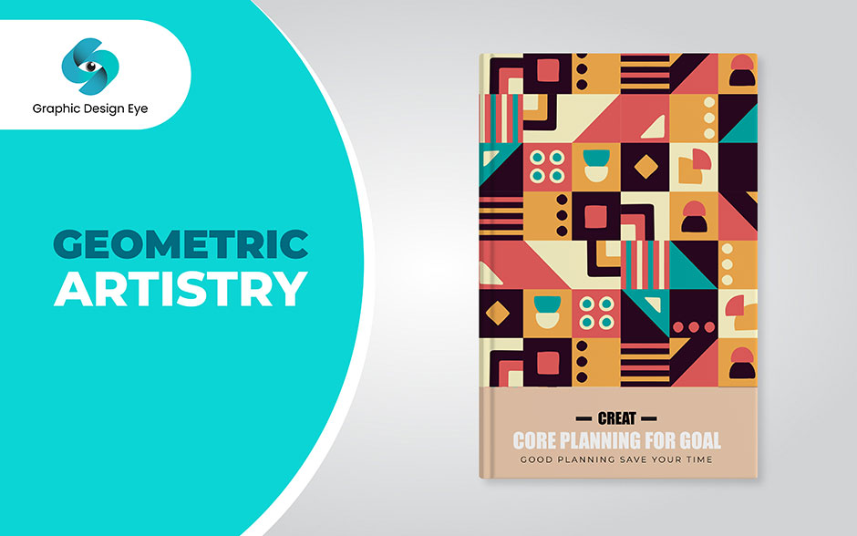
Now, I'd like to share some information about the remarkable book cover. It has straight parallel lines and shapes clear models with a clean aesthetic maturity look. The theme is highly balanced with an emphasis on geometrical proportions, and this is a factor that I believe you will find quite endearing.
In terms of design, it's close to the Nordic concept of simplicity – it has a clear and plain form and structure that does not overload the eye, giving the overall image a clear and elegant look. In general, if one looks at this cover, one gets a feeling that everything is fine in the world.
There is also a geometric patterned background that gives you the feeling of focus and the ability to concentrate on the video. Every time you flip a page, you are moving to a new realm, one that is conveniently packaged in neat sections. The shape of the individual letters in larger font also makes it look more contemporary. The clean lines also give the book a stylish and timeless feel.
The fact that it has been designed in a simple fashion without much color work makes it appropriate for simplicity lovers. This cover looks classy, and I'm excited to share that I believe you will enjoy this book as it has been well-designed and given much consideration.
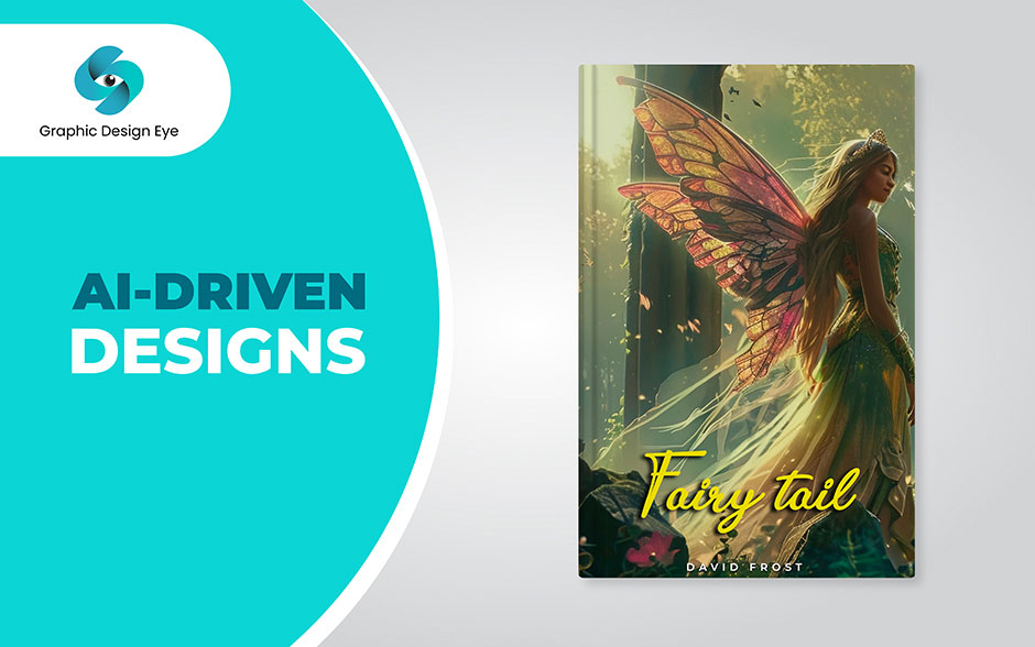
Well, this one I find particularly interesting. The cover is made using artificial intelligence, and it comes with a neat and noble outlook. There is a sense of novelty that engulfs its design and, arguably, a frontier of design prophecy that is being witnessed. Furthermore, the idea of setting and presenting the contents in a smart and crisp manner makes it more appealing and inspiring for anyone who has an interest in the mixture of technology and art.
This kind of work made me realize that I now even got an outlook on what the future of creativity by AI could look like when I stumbled across this cover. The measured detail and overall sense of futurism are just compelling.
That is why it is a beautiful message that art and technology can be a perfect symbiosis, where art can show a new angle and expand the boundaries. And quite truthfully, to hold this cover is to hold the future of design in your hands.
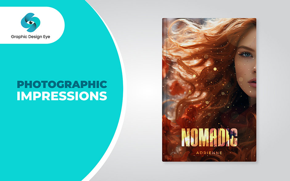
The picture on this particular cover is remarkable. The focus is clear, the colors are intense, and it depicts a specific situation, which makes it look fresh and very artistic. The type of design that invites the viewer to become a part of the given storyline.
First of all, what you receive with this cover is bright and intensely colored, which also contributes to the emotional experience. The photograph that we find at the start of the book creates a good feeling, and it seems like you can observe a specific moment in people's lives. The concept is executed in such a manner that turning the page becomes much more engaging each time.
Let me assure you the photograph used is of very high quality, and this aspect gives the book a beautiful color appeal. It is the modern design that gives the readers a fresh look and feel, making them interested in the works with a certain level of concern for visual text appeals. This cover gives the signal that the book is interesting and full of action.
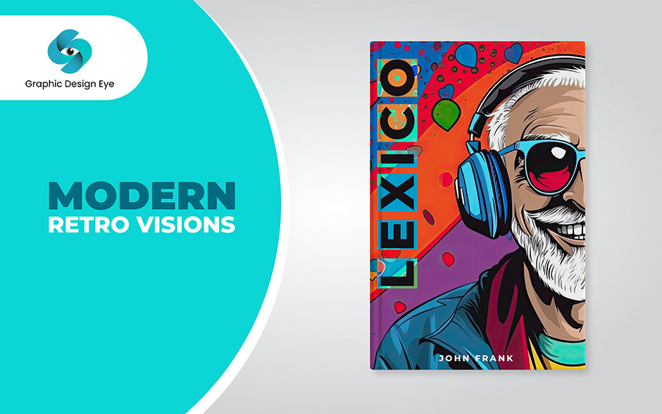
This collection called "Modern Retro Visions" entrancingly combines both aspects. The cover design is like 'retro pop art' with a clean type and powerful graphic elements to convey the taste of modern pop culture. It is inviting and catchy- the first thing you notice when you scroll or zoom in.
For cover number five, you will be provided with a blend of the past and present. It also serves to make the design look somewhat nostalgic but not in a boring and old-school way; instead, it borrows the charm of old-school themes and makes it new, fresh, and exciting.
There is a distinct assurance that every page contains both traditional and contemporary stories to make you interested. It makes the book even look more inviting or eye-catching or something like that. This particular design incorporates the use of geometric shapes, and they make use of these shapes in a very artistic way, something that will appeal to anyone who is on the lookout for the latest and trendiest designs. This cover claims to be that kind of reading that you can look forward to, one that will be dynamic and full of creativity.
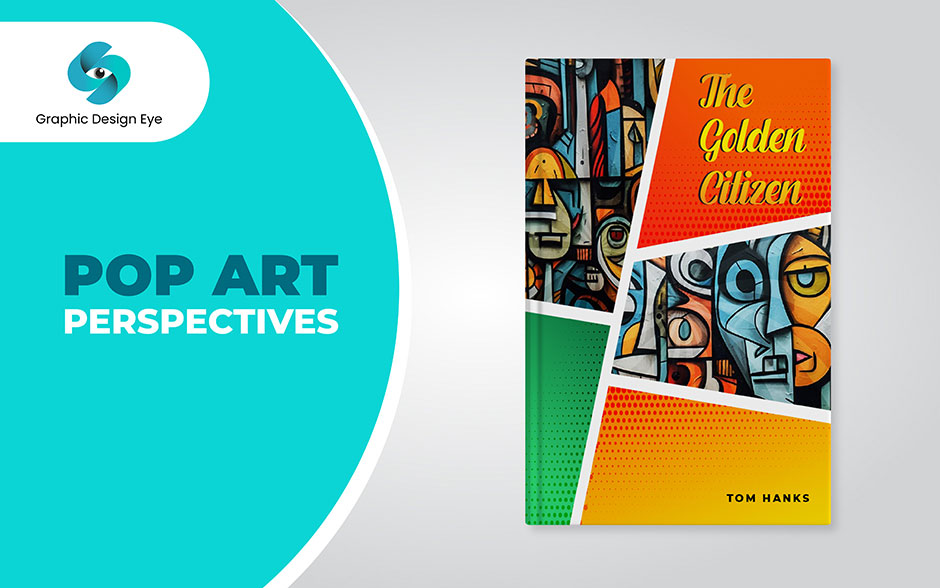
This bright cover is full of energy and vibrant colors! This one is even influenced by pop art and is hallmarked by its loud images and tastes that seem to jump right out at you. In a way, it is like arriving at a movie set of a comic book with its constant interaction and movement.
The concept is cheerful and light, which has something to do with pop Nostalgia and Pop Art at the same time. When I saw this cover, I was invited to a wonderful party-happy, pop-art party.
The garish narratives and the almost comical graphics gave me an immediate uplift. It's as if everyone is out there dancing, singing, painting, and drawing, which makes it almost impossible to overlook all this commotion. Moreover, it is not only an attractive and creative design, but it also gives a feeling that makes people want to keep going because there is hope.
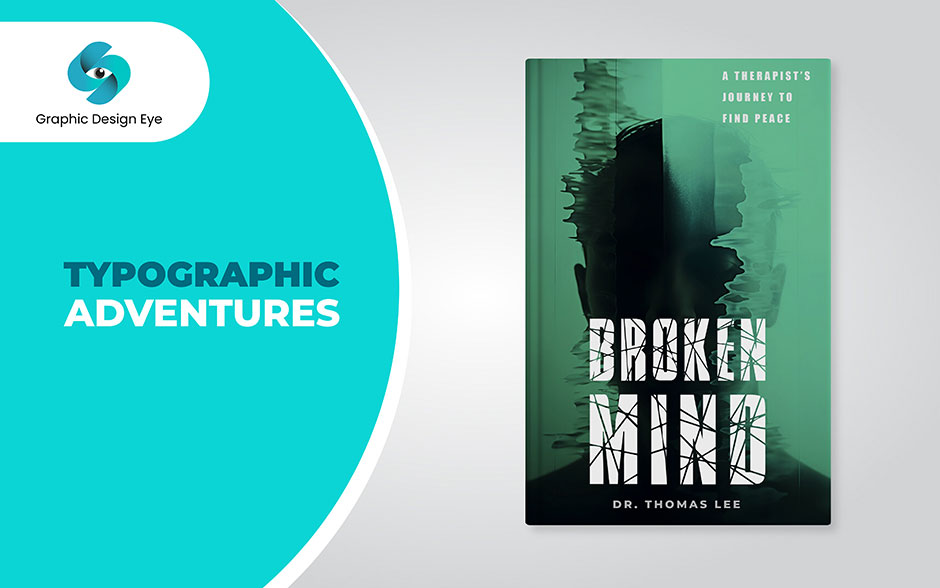
Guess what I have discovered?
Now, this cover is something that is an adventure for me! That's what makes it very colorful; all the fonts and styles used are entirely different things, and they all have different tales to tell. The layout of the letters is mentally entertaining, and they give the audience a ride through the realm of typography. The plugin suits everyone who is enthusiastic about what the letters in words look like.
The first time I looked at this cover, it was like looking at a map of a treasure with a goldmine of imagination. The use of so many fonts and the rather juvenile style delighted my senses the moment I set my eyes on it. The individual letters felt very playful, and they opened the door to a typed tale of adventure. Moreover, it can be said that it is stimulating as well as visually appealing, which makes this book a gem for any bookshelf.
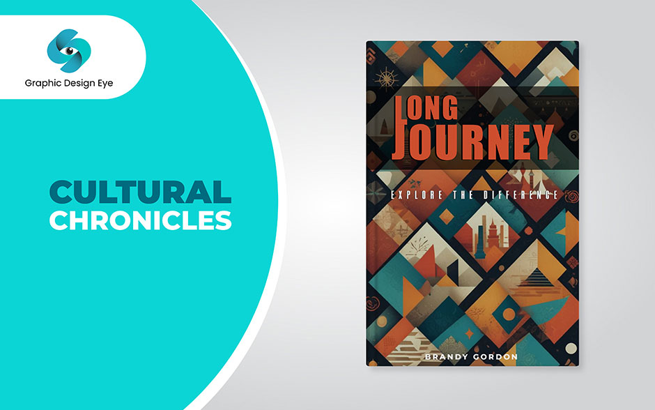
Let me share with you how I have experienced making the cover of the 'Cultural Chronicles,' which is quite a masterpiece! This design appears to be like a colorful trip from one culture to another and through various eras in history. You will immediately see that it has a kind of complex geometric design and many bright colors referring to different cultural motives, so it looks like a mosaic.
If I look at the cover, one can easily notice how features of the two cultures have been incorporated into one blend. The introduction of headline styles that are modern but culturally sensitive to the particular demographic audience gives the title a new twist that is also classy to make it stand out.
In general, the architectural appearance lets the viewers guess and encourages them to get acquainted with numerous aspects of people's history inside. For all the history lovers, anthropology enthusiasts, or all those who appreciate cultural differences, this cover will help bring the topic of ethnic and cultural tourism to the fore.
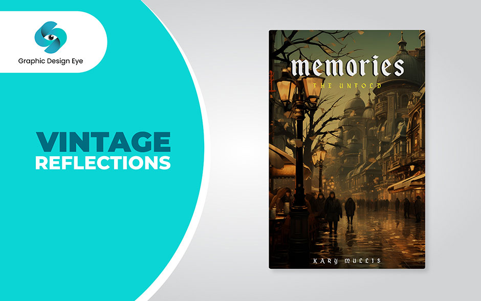
The layout of Vintage Reflections is reminiscent of an antique aesthetic. The cover of the first set has nineteen sepia pictures, and the lettering is in a conservative style. What is more, this outlook evokes memories of those epochs. The style is formal and traditional; it bears the impression of elevated literature from the first period.
By selecting this cover provides a throwback to the old days. It has an aura of narrating that makes history come alive in a certain kind of household way. This makes you feel as though you have to 'nest' and start contemplating. It enriches and gives the reading process motives associated with emotions and sentiments. Surprisingly, the dots produce sepia shades, which lend the book a classy appearance.
The simplest shapes of the letters convey a marvelous vintage-like aura. This cover is particularly relevant to people who are interested in the past and/or have nostalgic tendencies. As it stands, it delivers on its word within the meaning of being a contemplative and sentimental time-traveling experience.
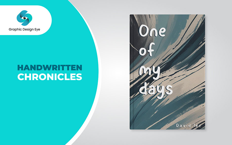
Here is the beauty of a cover that seems as though it's pulling back the curtain on someone's diary. As much as a book of poetry, it is written with effort; the text is handwritten, which makes it seem personal.
It makes you feel that you have secretly met the writer and are able to witness what they are experiencing at that particular time. The importance of writing by hand will always remain in the ability to appreciate the purest human interaction – the warmth of writing notes to friends.
Picture yourself having a cup of coffee and gossiping with a sister – a circle of trust. Just like that of a bewildered deer, I felt when I came across this cover. Reading in the handwritten style abruptly reminded me of past calligraphy letters, diaries, and other personalized scripts. It's, perhaps, as if someone whispered a soft note on the beauty of hope and humanity, which never fails to move a heart and a soul.
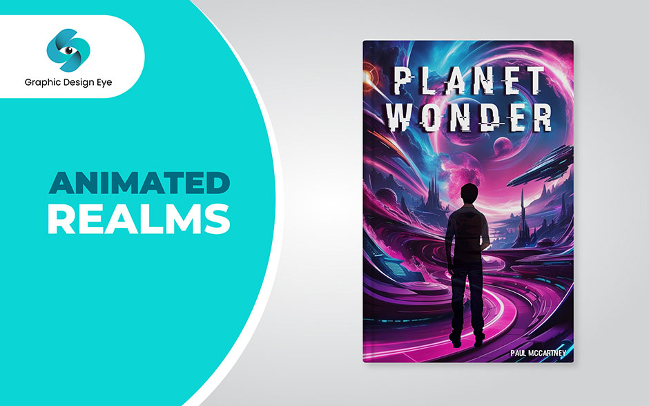
I've seen "Animated Realms"! It's actually quite impressive. Think of a book cover that is full of colors and amazingly designed with much detail displayed on the outer casing. At first sight, you are filled with enthusiasm and a special feeling, as if you have entered a new world where everybody draws and paints. Indeed, the artwork done on "Animated Realms" is worth a second look.
For one, you'll inevitably get pulled into the specifics; each line and coloring has its own narrative to offer. Not only is it a cover, but it also is a door to a world where fiction and reality interconnect. You should notice how such characteristics as characters' eyes and positions are highlighted and outlined as if the characters were ready to leap out of the book.
And the adjectives that evoke ideas are fantastic. Again, I am referring to this mentioned sense of wonder, this sense of reminded curiosity and remembering wonder all at the same time. When you grab a piece of art, more specifically when you have the opportunity to hold the material in your hands that created art, you will feel the music inside.
You will be inside an environment where everything is possible. I remember the title 'Animated Realms' as the cover is much more than just an illustration of the graphical design of the book. It illustrates and acts as a picture that stirs your emotions and fuels your creativity.
There you have it! I hope you had a good time when reading this top 10 book cover design trends for 2026. From the geometric arts to encouraging animated looks, these book cover trends not only give beauty to the products but also peep into a glance of the story behind them.
From your perspective, whether you are a writer trying to make your book look more attractive to readers or a reader elated at the prospect of a new exciting blog accommodating the concepts and styles, these book cover trends are expected to add value to your reading process. This book explores the dynamic visual culture of covers as well as each creation’s capacity to convey the spirit of the narrative and entice readers at first sight.
If you have a book and wish to offer life to the cover part, try contacting Graphic Design Eye. They offer a wide range of print and ebook book cover design services, including minimalism, bold typography, 3D book covers, real photos, retro styles, clever typography, double exposure, handwriting, and natural elements. So, design your book cover into a piece that will not blend in on the store shelves.
Get in touch with Graphic Design Eye today for your custom book cover design!
Happy designing and reading! 🎁