Looking to get the best presentation design tips to gear up your business to the next level? Surely, presentation design creates a lasting impression, increases audience engagement, and conveys better communication!
Also, the presentation design hacks make your branding messages easy to understand and retain information. At the same time, a nicely designed presentation offers professionalism and credibility and makes your brand instantly memorable.
This design plays a big role in triggering your audience's mind. True-to-life presentation design creative ideas, along with the top-notch presentation templates that transform your brand into a visible and memorable one!
In this blog, we're going to cover influential presentation design secrets to bring your brand to your target audience's mouth. Get started now!
Effective design in presentations is important because it affects the way the audience comprehends and recalls the information. Sharp graphics, orderly arrangement, and effective use of blank areas enhance concentration and retention.
Well-designed slides not only aid in presentations but also direct the audience’s focus, clarify complicated concepts, and assist the presenter without being a distraction.
Poorly designed slides, on the other hand, can incur a mixture of confusion, irritation, and boredom. Effective design displays quality and attention to detail. It also improves reliability and trust.
Strong minimalistic design transforms a routine speech into a powerful experience people will want to keep remembering.
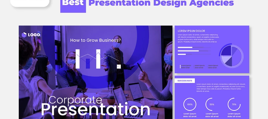
That’s why, even when you can’t make your presentation design stand out on your own, you need to consult experts like Graphic Design Eye for creative presentation design suggestions. In the end, your presentation’s looks and messages should always leave a lasting impression.
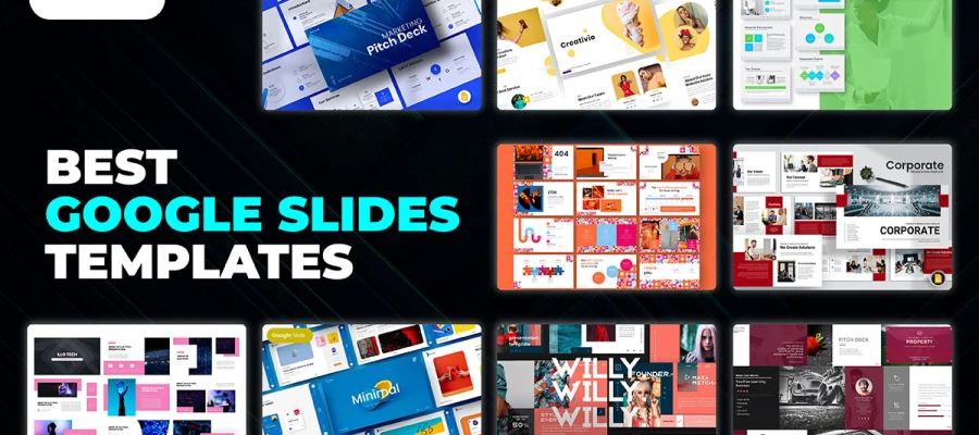
Let’s face it, presentations these days hardly leave an impression. But when it comes to your presentation, not anymore! Here are 20 helpful presentation design tips to follow to get ideas to work on and achieve slides that pop and messages that resonate loudly.
Even for presentations, first impressions count. Your first slide sets the mood for the entire presentation. So, avoid the generic title screen. Instead, put something eye-catching.
You can put a bold question, a surprising fact, or an interesting picture. This lets your audience know that this presentation is not just another run-of-the-mill boring slideshow, it is something they should pay attention to.
Tips:
Let’s face it, people cannot focus on lengthy text on slides. Slides are not meant to be wordy, but rather a visual aid.
Visual aids are not there to be read off. If every word is written on a slide, the listener will read the slide rather than focus on the presentation. Keep all text to a bare minimum.
The minimal words you choose should be powerful. Say everything else out loud. This will keep people’s focus on you. Having less text frees up space on your slides.
Use a photo or an icon to illustrate your message visually. Every slide should be treated as a clue, and not a page out of a textbook.
Tips:
This approach is appealing until you attempt to squeeze three different points into one slide. That’s where things start to fall apart.
Your audience doesn’t know what to focus on. Simplicity is key. Ensure to have just one idea per slide. If you have multiple presentation design ideas, think of how to break them down; every design concept needs to feel like its own mini story.
It’s powerful and so much more effective, which makes it easier to understand. Remember, one idea on a slide.
Tips:

It is not essential to use sentences to explain every single detail clearly. Sometimes all you require is a picture, and everything is handled.
Sticking to good visuals increases retention when compared to text. Most importantly, the images are relevant to the information provided.
Do not select random pictures; using visuals that align with your message would be better. Rather, use them as your presentations.
Tips:
Because of visual importance, people only focus on what stands out. Ensure to guide the eyes by placing crucial things in highlighted areas and supporting text in subdued ones.
Prioritize color, size, and boldness as your main PowerPoint presentation tips. Think of a newspaper ad design where headlines dominate. Your slides should pose the same question.
Thus, your slides have a distinct order that helps readers project their ideas easily, quickly, and thoroughly.
Tips:
Sophisticated presentation fonts often come with a cost of being hard to read from the back row. Always go for clean and simple because it’s much easier to read.
Typefaces, such as Arial, Roboto, or Open Sans, work well. And remember, be consistent. Don’t switch fonts every slide.
Restrict yourself to two: one for the header and one for the body. Let the words work, but avoid allowing your audience to squint.
Tips:
Add white space to balance the content on your slides. White space is not empty. On a well-designed document, everything else is highlighted because no other text or object clutters the white space.
If you eliminate white space in a document full of text or images, none of the content will get noticed. Doing the opposite, white space makes everything feel more professional, gives a sense of order, and makes the content easier to read.
Tips:
Color scheme can help set the mood, but if overused, your slides may look like a chaotic party. Stick to 2-3 primary colors that will appear on every slide. Use 1 bold color and 2 softer colors to create balance.
If unsure what color combinations will work, try looking for a “color palette generator.” Smart colors are not loud.
Tips:
Yes, animation effects can be entertaining, but your audience will be distracted if they are overdone. Keep it lowkey- this is one of the most important presentation design tips for better designs. Fades and slides are welcome, but don’t animate the text to spin and the icons to bounce.
The intention is to ensure understanding, not a circus. The purpose of animation should be to uncover content, direct focus, or illustrate progress. It should not be the center of attention.
Tips:
Slide compositions that have elements that are out of alignment or scattered seem chaotic.
Your slide consistency will resemble a disorganized school project if your titles are ‘floating’ and images are placed randomly without direction.
Rather, use order. Position titles, text boxes, photos, and other visual elements in grid order for proper data visualization. This enhances the feeling of professionalism and organization.
Specified layout improves flow and eliminates distractions for your audience, allowing them to focus on the content purely.
Tips:
Have you ever found yourself trapped in a lengthy presentation, wondering, “How much longer is this going to last?”
Progress indicators are just for this situation. It helps the presenter visualize where the audience is in his visual storytelling, be it shown as a simple strip, step count, or titles of sections.
These indicators provide a framework, structure, and assist with paying attention.
Tips:
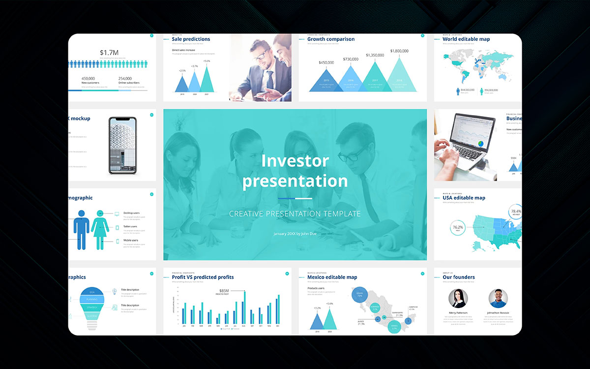
A table packed with numbers is dull, but numbers matter. Think about changing the way you display your data. Infographics, charts, and graphs can be more visually appealing for visual storytelling and easily understood. Information is processed a lot quicker through visuals, not text.
For example, a simple pie chart speaks of proportion more effectively than a paragraph that contains stats. Use guiding titles, labels, and colors to help your audience. Allow the numbers to speak on your behalf.
Tips:
Clearly identify new sections for easier audience tracking. Let your audience know when a new topic of discussion comes into play.
New slide titles, background change, or short divider slides accomplish this beautifully. These breaks enhance the rhythm and flow of the entire presentation, making it smooth and seamless.
Tips:
Want to engage your audience? Ask a question. This is one of the most important parts of the business presentation design tips.
Even if it’s a rhetorical question, it will get people thinking. You might not answer questions and allow them to reflect instead.
Use questions on opening and closing slides that align with your core message. It actively draws the audience in and shifts focus away from the idea that the talk is simply a presentation.
Tips:
Quotes do wonders! They add emotion, weight, and perspectives, and allow your audience a break.
Choose a quote that resonates strongly and deeply with your topic, enlarge it, mark it clearly, and center it on the slide where words will work.
Tips:
Use icons alongside bullet points, titles, and infographics for presentations to convey information faster and more easily.
Explain concepts quickly with the use of smaller, yet powerful icons, as they ease the scanning and viewing of the slide.
Tips:
Clutter refers to too much repeating text on any single piece of content. If your content looks packed, it most likely is- remember the saying ‘Less is more’, right?
The more you try to squeeze in, the weaker the content. Go through every piece as a part of effective presentation techniques and ask yourself, “How Many Problems do I need to overcome to simplify this?”. If the answer is anything besides zero, delete it. Simplicity wins every time.”
Tips:
Always support winning slides with great quotes and empower champions after the presentation.
Marking quotes alongside powerful takes enables memorable messages. Providing memorable captions is one strategy that draws the audience in.
Tips:
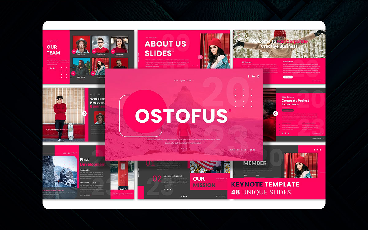
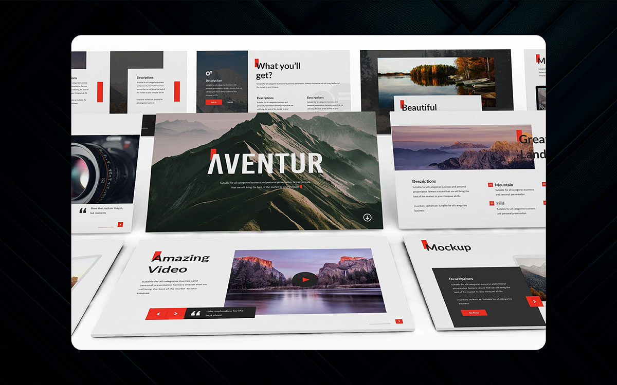
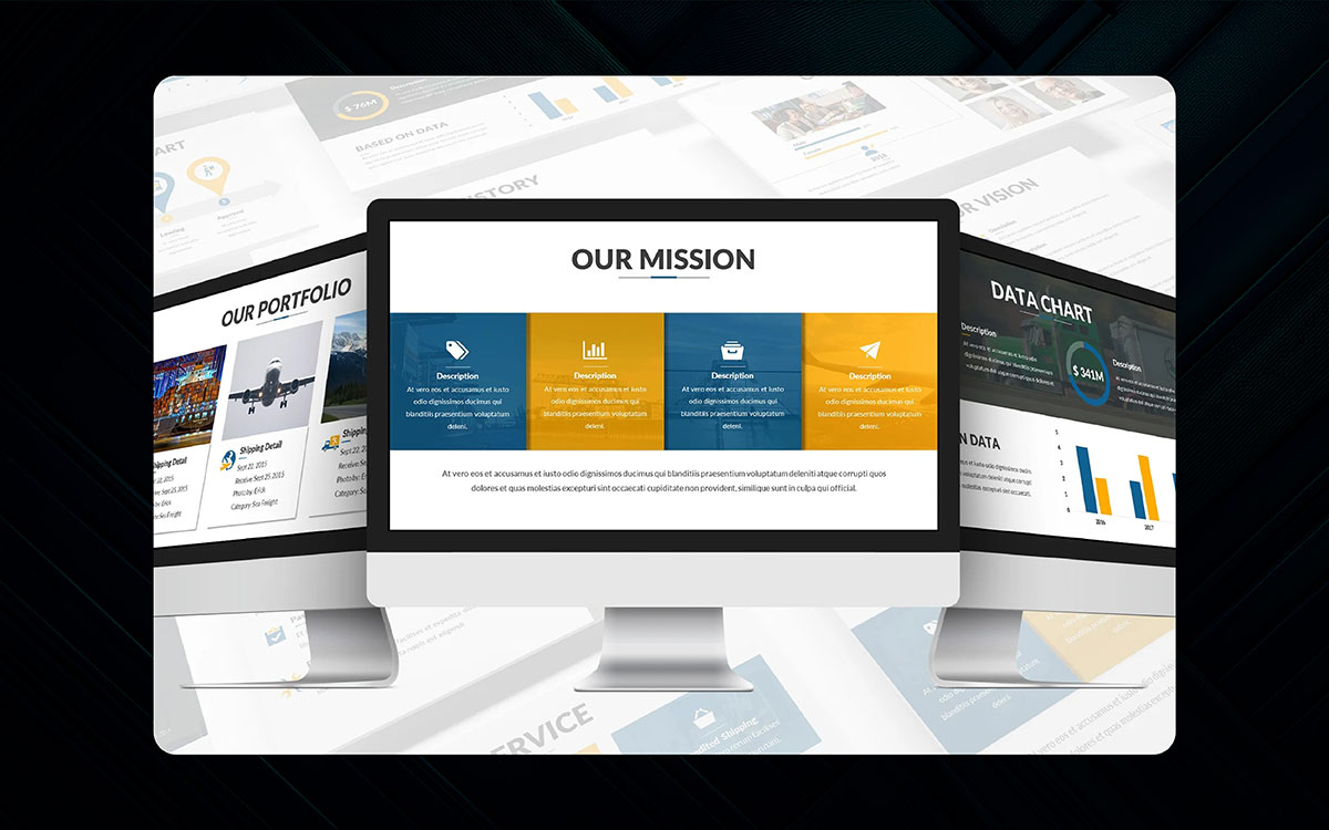
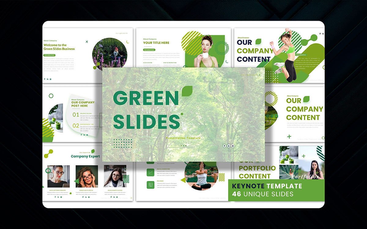
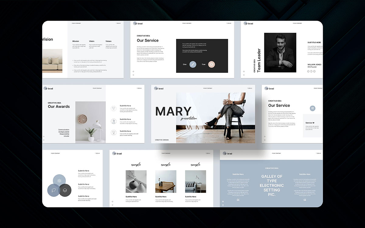
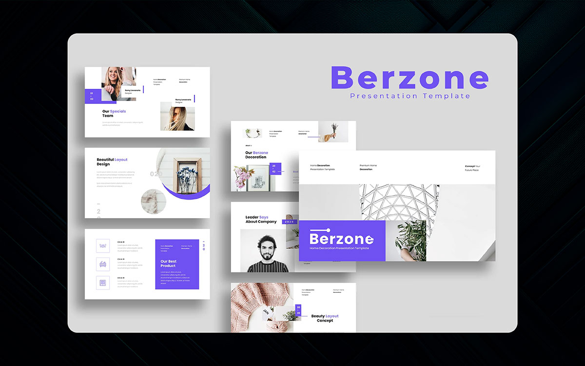
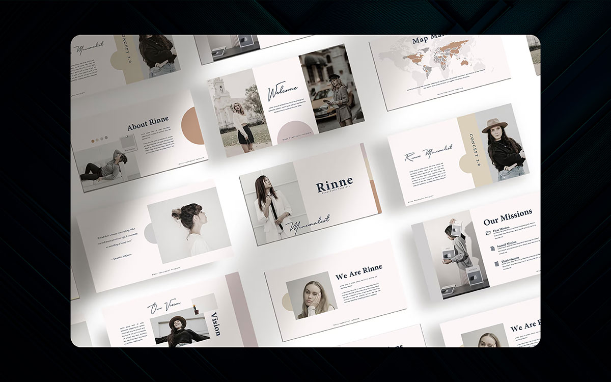
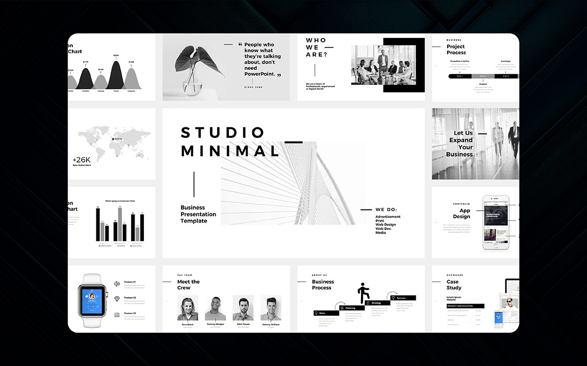
Constructing slides might take you eons, especially if done from scratch. The best approach? Taking advantage of a reliably good PowerPoint presentation template and professional presentation design. You save yourself the hassle of time, tedious structuring and designing, and an organized presentation.
Be sure to choose one that speaks to your argument; simple, clean ones usually work best. From there, you can edit your complete text, colors, and fonts to match your style.
Tips:
Even the best-looking slides are bound to fail without practice. Ensure that you go through the steps with your PowerPoint presentation. Have a run-through of every slide.
Adapting to the rhythm makes identifying errors and awkward transitions easier and becomes more instinctual when it’s finally performance time.
Tips:
First things come first.
Presentation design is the mirror of your brand. However, have you found the best presentation design tips from the above article? Probably, your answer is yes.
Great presentation design goes beyond looking nice, it’s about making your message land. The above 20 presentation tips can help you connect to your audience and make your brand memorable like ‘Apple.’
In your presentation design, simple layouts or stunning visuals can make your overall presentation stand out from the box. It meets the purpose of your brand.
The best presentation templates make the process easier when you think of a great presentation. If things are sloppy, contact Graphic Design Eye LLC to hire top-notch presentation design services.
Let’s create amazing presentation designs to surprise your audience! 🙂