Looking for creative and mind-triggering food packaging design ideas to elevate your food business to the next level? We understand that your delicious food gets ignored just because of your poor packaging design. It looks like it was designed during a power outage! Nothing to be worried about. Here we are. This blog will help you with eye-catching food packaging designs!
In the mundane world, people eat with their eyes before their mouths. Your food packaging needs to be pop, sizzle, and elicit those shoppers right off the shelf! No matter how mouthwatering your product is, if it’s wrapped in something that screams bland, customers are going to walk right past it like it’s last week’s leftovers.
Don't worry.
Here we are. This is your fun-sized flavor bomb of creativity, a spicy cheat sheet packed with 20 brilliant food packaging ideas that will surely convert your customers. Then your time will come to say “Limited edition!”
So, without further ado, let’s dive into the highly engaging and most creative 20 best food packaging design ideas right now!
CrunchyBites cereal box and YumYum juice carton both just missed being the best, but are very good for a shout-out. The eye-catching new look of CrunchyBites was the first-ever shiny design for the new shelf, and when it finally came out this year, it can be said that it thing: prettiest food box ever made!
BrightColors Studio’s super bright ink and fancy paper adventure is a big deal, an explosion of colors that uses all the best printers in the factory. It’s a bit plain in the shape part – more like a boring rectangle than a cool fun shape – but it is still very nice to look at and makes you wanna grab it.
Indeed, it’s very much worth stopping to see this box in the store.
Suppose a customer strolls by, eyes scanning shelves like a hawk looking for BOOM, and your packaging hits their eyeballs like a confetti cannon. That first glance is your only shot to make them fall in love.
Bold colors, cheeky fonts, and irresistible visuals can create a difference!
That’s not just packaging’s your silent salesperson working overtime. If your design doesn’t turn heads in three seconds, it's game over. So make it count, make it crave-worthy, and let your product scream “TAKE ME HOME” before the customer even reads the label.
Who knew cardboard and ink could throw a fashion show? Welcome to the world of creative food packaging concepts!
First things first.
Your packaging is your product’s Tinder profile. Swipe-worthy or swiped away? It’s not just a wrapper; it’s your brand’s first impression, personality, and elevator pitch, all rolled into one crunchy, sassy, or elegant exterior.
Whether you’re going for sleek or minimal or loud and quirky, your design tells the world who you are before they even taste what you’ve got. So ditch the generic and dress your brand like it’s going on a date with destiny because customers do judge a snack by its cover.
Food packaging design is more than just pretty colors and shapes. It’s about making buyers feel safe and smart when they pick your product. Good design tells a story, like how fresh the food is or why it’s healthy, without saying too much. Just like how a bright red tomato on a label makes you think ‘Juicy,’ even before you taste it. But great packaging doesn’t just stop at looking nice.
It answers questions before buyers even ask. Like if the food is organic, or if the box is recyclable. In a world where shelves are full of options, the right design can make your product the one that stands out.
After all, people eat with their eyes first. And when they trust what they see, they’re more likely to take it home.
Good food packaging doesn’t just look nice, it gotta keep stuff fresh too! Smart designs skip the fancy stuff and focus on what matters: no leaks, no spills, no crushed chips. Like how a juice box has that little straw hole so it doesn't spill, or how a yogurt lid peels off smoothly without making a mess.
Some packs even have special layers that block air and light, so the food stays good for longer.
But the best part?
It still gotta look yummy. Bright colors, big pictures of the food, and words that say ‘Crunchy’ or ‘Creamy so people wanna grab it fast. If the box does its job right, the food tastes as good as the package promises. And that’s how you make buyers happy and come back.
Your lunch just checked into a five-star suite. Surely, you say thanks to wild and innovative food box designs!
Meanwhile, the top food packaging ideas is a cool concept – a bunch of colorful boxes and wrappers turn into a fun way to make food look yummy and exciting on the shelves, change into a super fun mix of art and useful stuff. Its bright and happy colors only make the whole thing better.
This was as usual idea at a time when we usually say food packages are just boring! But this year’s fun trip to the store to see all the pretty designs and talk about which one is best with friends proved to be just the kind of shopping we needed.
However, now let’s dive into the top-tier 20 food packaging design ideas to elevate your business to the next level.
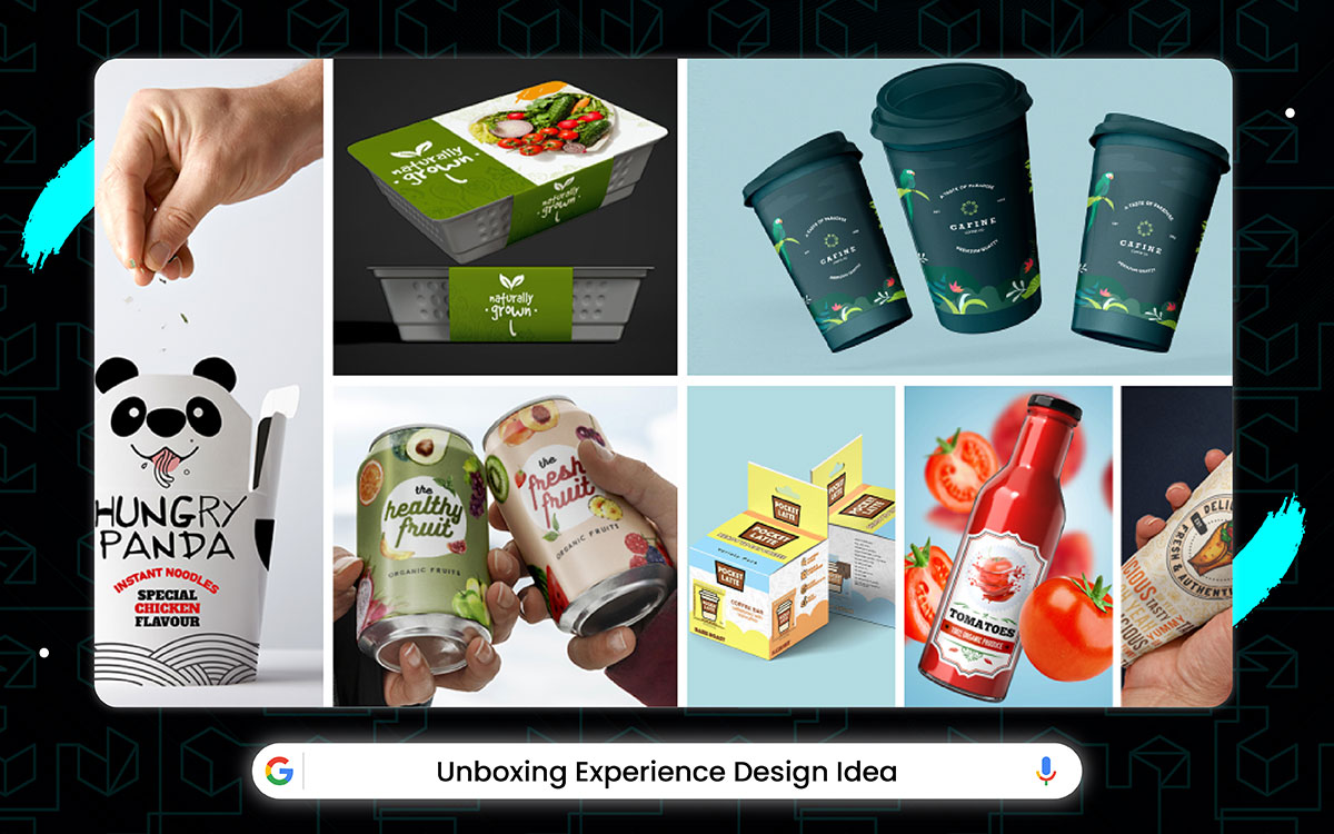
Some shoppers were doubtful when they first heard about fancy unboxing designs for regular products. But when people started opening them, the designers knew they were right.
These new packages make you feel special from the first crinkle of the tissue paper to the way everything fits together perfectly inside, not forgetting the super cool reveal when you lift the lid that tricks your eyes into thinking you got something way more expensive than you bought.
The packaging artists even made the little pull-tabs and ribbons feel so nice that your hands and brain get tricked into thinking you're opening a birthday present instead of just some new shampoo.
Yes, food packaging design ideas hit a whole new level with unboxing experience design packaging. It's like throwing a surprise party for your taste buds, where the real fun starts the moment you rip that box open!
All the time, outside of an awesome 2021 that saw the release of the crinkly cookie wrap and the slide-out candy tray along with the tear-happy noodle box, the rip-strip coffee bag, and the pop-top chip tube, snackers wait for boxes that make opening fun.
The new magnetic tea tin getting pushed to next birthday and the cool confetti pouch slipping out of 2025. But the fun-box makers did their work right before holiday gifts. They made the crinkle-foil chocolate bar, the new ribbon-pull biscuit tin, and the puzzle-lock cookie jar all land right when parties started. All three made you go "Whoa!" when opening!
Now let's talk about the almost fun ones and the Best Unbox Thrill of 2025. Boring bags make you sad. Fun boxes make eating feel like a birthday. Rip the strip, hear the sound, see the shiny inside. Makes your hands happy before your mouth even tastes! However, let’s take a look why this design comes out as top-notch:
The fancy wrap has layers, sure, but these layers are just for making the real magic safe: the surprise. Your fingers can be used to rip plain bags or maybe twist dumb lids. But crinkly foils and ribbons mostly for building big feels while you fight to get to the cookie.
The giggly feeling when you peel back velvety paper to see shiny gold inside makes snack time extra big, just like unwrapping presents on Christmas morning.
Pop-top things might look simple, but they snap loudly using all the springy power they can muster. It’s a bit scary the first time, more like pulling a tooth than opening lunch.
But it is nevertheless super exciting and makes your ears happy. It’s very much worth trying this for your next soda can. Old seals need teeth or scissors. Pop tops just need a thumb push.
Press down, click, lid flies off!
Fizz sprays your nose! Fun before the first sip. Your boring juice becomes a party drink!
Having packages for that party is key. No more sad brown boxes. Just ribbon pulls, foil crinkles, confetti bursts. They make Tuesday feel like a birthday. They win against boredom.
They make kids dance while opening. Good for grumpy moods and happy hands!
Unwrapping ain’t a chore anymore! You don’t just tear mindlessly. You hunt clues. You peel layers slowly. You save ribbons for hair. Indeed, it takes extra seconds, but then it is an adventure! Just twist, peel, search, gasp! Easy peasy. Feels good to beat the box game. Hunger can wait!
Old boxes sat silent like rocks. New ones sing, crinkle, snap, jump! They got special paper that changes color when touched. They got lids that hiss like snakes when open. They got glitter that exploded gently! No more sad "just food". Just grab, fight the wrapper, and find treasure inside. Your kitchen table becomes a stage!
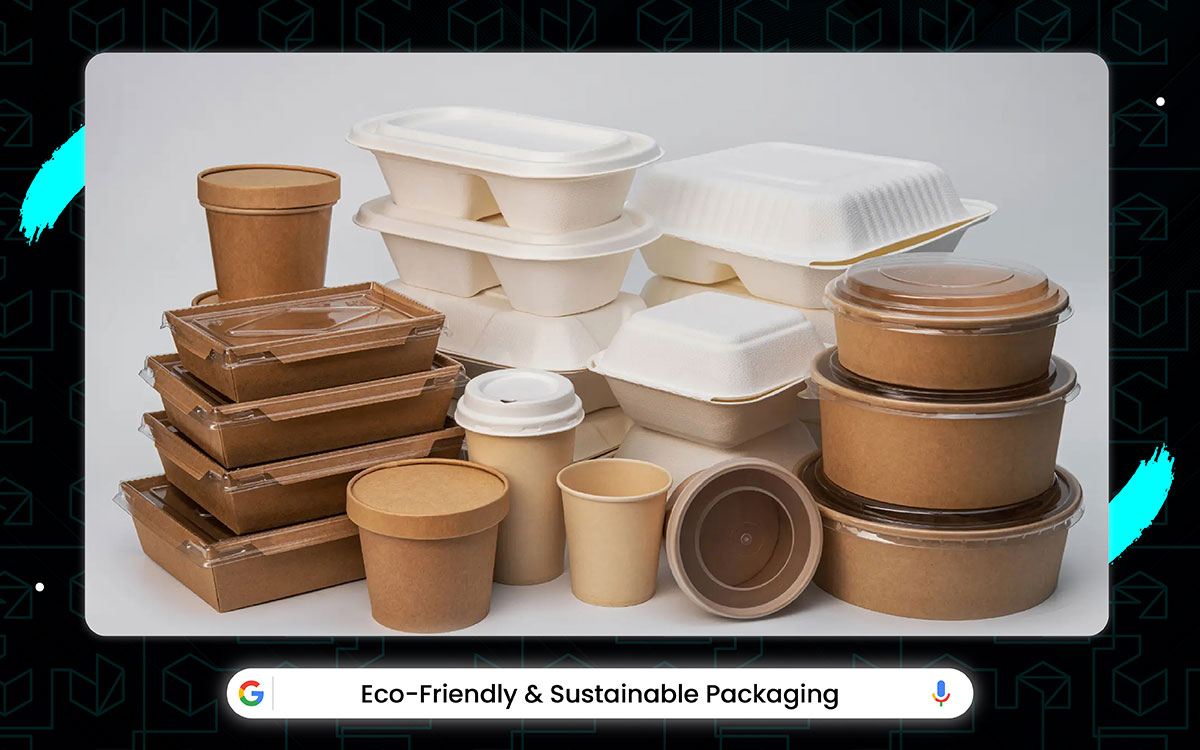
Eco-friendly designs are always appreciated from all walks of people!
It’s been a weird time for eco-friendly packaging so far. It started when people got mad about too much plastic and then companies had big problems finding good materials that don’t hurt the planet, the most important new bio-plastic (made from plants) got delayed because it acutally wasn’t strong enough but they fixed it after a year, some big brands tried to switch to 100% recycled stuff.
But governments said “No way” at first before finally saying “Okay!” one company made a super cool compostable wrapper that won awards but also started selling their stuff in regular plastic again because it was cheaper, and the boss of a packaging company even said they’re working on edible packaging. But, in the meantime, we probably will be able to see it in stores for a long time.
Save the planet one wrapper at a time; sustainable packaging materials are the real snack.
Look, the food wrappers ghost the earth gracefully; biodegradable and eco-ninjas.
It works good as people now care a lot more about the planet and stuff. Eco-friendly packaging is made from stuff that comes from plants or recycled things. They do not come with nasty plastic that hurt animals.
Companies use it because customers like it, and they feel happy buying things that don't hurt the Earth. It works because it makes less trash in the big holes in the ground called landfills. Also, it looks nice often, simple and clean, not messy with too many colors.
Now let’s have a look at why this Eco-friendly and Sustainable Packaging design works:
Using green packaging makes you feel like a superhero saving the world, even if you are just sitting at home opening a box. When you pick the product with leaves on the box, you know you did a good thing.
Opening a package feels fun now, not sad like before. Old packages had foam peanuts and plastic wrap that you know just gonna choke a bird. Now, you get soft paper fluff or air pillows made from plants that melt in water. You rip the box open and smile, no yucky feeling in your tummy!
It's just paper and cards that you can squish up and put in the blue bin easily. No tiny plastic bits falling everywhere, making a mess.
Companies sell more things when they use planet-happy boxes and wrappers. People like buying them because it feels right. Shops want it on their shelves because shoppers look for the green leaf sign. Less stuff gets thrown away because the packaging breaks down quickly or gets made into new things again.
Using recycled cardboard means fewer trees get chopped down. Everyone wins like shops sell more, people buy happiness, earth gets less sick. Trash trucks don't need to drive so much picking up rubbish.
Green packaging is not just a fad like silly bands; it stays forever. People want it now, not just pretending. Laws are coming saying you gotta use less plastic anyway. So companies are jumping on the bandwagon for real. It's not gonna disappear tomorrow like some TikTok dance. More and more shops only want stuff packed this way!
Earth feels a bit better because of these nice packages. Less oil is sucked up to make plastic and less smoke is produced from burning trash. Indeed, animals in the sea have less of a chance of eating a plastic bag, thinking it's a jellyfish. Trees get a break because paper gets used again and again. The air smells cleaner near the dump.
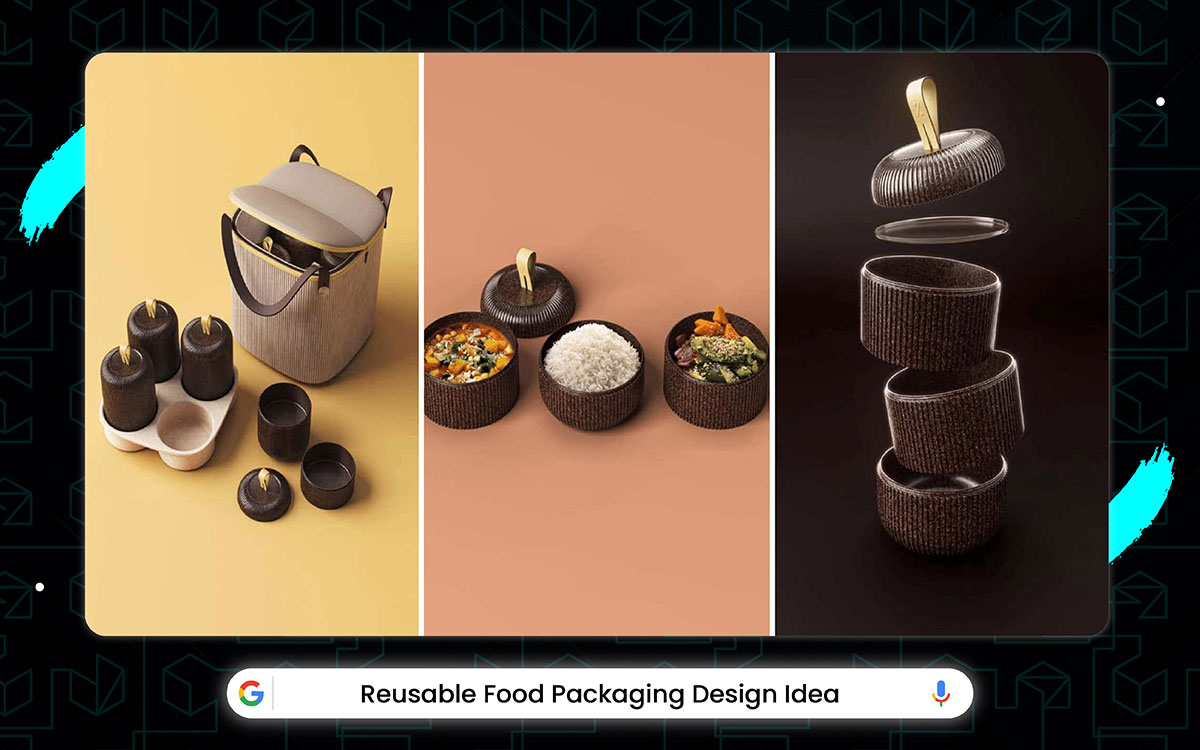
More importantly, the big packaging companies and all graphic design agencies work hard on boxes and jars every day finally made the coolest reusable package idea in forever.
People don’t talk about them much but they know that the secret to a great package is making it fun to use again, and in these new designs, you get to do all kinds of smart stuff.
Like turning a cereal box into a toy car or making a juice bottle into a bird feeder or even using a snack bag as a wallet (weird but cool!). The look of it ain’t as crazy-shocking as that one time a company made a bottle out of seaweed.
It’s still pretty awesome and makes throwing stuff away feel fun for once! Slap on a label so stylish, your ketchup bottle might start influencing on Instagram; hello, custom food label design ideas.
It's been a weird time for food packages lately. It all started when people got worried about too much trash. This made finding good boxes hard for months. The super cool new compostable bag had a big problem and needed to wait a whole year before coming out.
A big company tried to buy a plastic maker for huge money. But, this goes wrong. Lots of government people said no way before it finally happened. They made one good lunchbox (the blue one with dinosaurs) and also started selling their special boxes in normal stores.
All the time, except for that awesome year when the dinosaur lunchbox and the compostable bag came out. Actually, the good beeswax wraps and the metal straws, people were waiting (and waiting) for snacks without so much plastic.
And this year looked kinda sad again. Like always, with the new fruit pouch getting pushed to next spring and the cool see-thru cookie bag not coming in 2025.
The metal box has a lid, sure, but the lid is just for keeping the real star safe: yesterday's dinner. Your fork can be used to poke the food or maybe stir it up good. But it’s mostly for eating the yummy pasta or stew or pizza you saved from last night.
And the happy feeling when you find good food you forgot about makes lunchtime extra fun, just like finding money in your pocket. The taste is also still good. With maybe some cheese making it better and keeping it tasty without ever getting too boring or gross.
Glass jars and paper bags both almost made the top of our list, but are super good and deserve a high five. The see-through glass jar was the first thing people thought of for no-plastic, and when we used it this year, it can say one thing: the best way to see your cereal or beans ever made.
Putting stuff in glass looks nice and keeps food fresh and good, using all the cleanliness glass can do.
Some people were unsure when they heard last winter that making lunches ahead would be done mostly on Sunday. Once everyone tried it, planning food got popular fast.
Prepping meals helps you save time, from the big stack of containers you fill to the yummy food you pack to the fridge shelf that gets full. Like not to mention the A+ feeling of not making lunch when you tired in the morning, which makes you feel like a superhero somehow even if you just chopped veggies.
Meanwhile, the bamboo lunchbox’s neat idea – a box made from grass that you can use every day and wash easily after munching your sandwich and Apple turns into a really fun mix of looking cool and working well.
Its natural wood-look style only made the whole thing prettier. This was a nice new thing in a time when we usually moan about boring old plastic boxes.
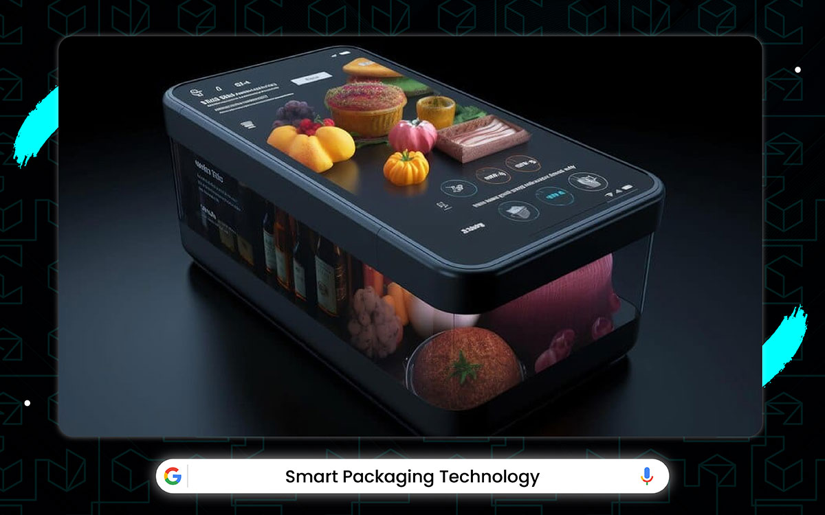
Yes, some people thought it was weird when companies first said food packages could talk to your phone. But once they tried it, the smart packaging idea made sense.
The SmartPack tech makes you feel like the food is alive, from the little light that blinks when it's fresh to the QR code that tells jokes when you scan it to the package that changes color if the food goes bad.
In the meantime, the super cool voice that sounds just like a real chef telling you how to cook it (even though it's just a computer talking). It's like magic food that knows what you're thinking!
Food packaging design ideas just got a glow-up with Smart packaging technology. Basically, it's like giving your snacks a VIP pass to freshness, while making them look so cool even your fridge will be jealous Smart packages and talking labels both almost didn’t make our top picks, but they are really good and deserve a shout-out.
The techy sticker that talks was the first thing anyone thought of for smart food packs, and when stores finally used it this year, they can brag about one thing: the best way to know your milk is fresh ever made. Putting little computers on boxes looks fancy and keeps food safe, good, using all the smart bits chips can do!
Now let’s dive into the inside of the design why it matter:
It's been a weird time for food boxes lately. It all started when people got scared of food poisoning. This made finding boxes that talk hard for months. The super cool new freshness sensor had a big oopsie and needed to wait a whole year before coming out.
A huge company tried to buy a chip maker, but lots of suits people said nope before it finally happened. They made one really good soup can that glows when warm (the red one with the smiley face), and also it has started putting talky labels on normal cereal boxes, too!
All the time, except for that awesome year when the glow-soup-can and the talking yogurt came out. At the same time, the good meat sensors and the apple stickers that change color, people have been waiting (and waiting) for packages that show when food has gone bad.
And this year looked kinda boring again with the new bread bag sensor getting pushed to next fall and the cool milk cap that flashes not coming in 2025. But the box makers did their work right before the store closed.
Meanwhile, the fridge magnet scanner’s neat idea – a little gadget you stick on your fridge and wave food at to see if it's okay to eat after a long day of school and soccer that turns into a real fun mix of playing scientist and keeping lunch safe. It's little blinky lights only made the whole thing cooler.
This was a nice new toy in a time when we usually moan about sniffing milk like a dog. But this year’s cool magnet thingy to check your sandwich and not get sick while showing your mom how smart it is proved to be just the kind of kitchen helper we needed.
Some people were giggling when they heard last winter that snack bags could know if you wanted salty or sweet. But once everyone tried it, mood chips got popular fast. Smart snack packs completely help you pick treats, from the little camera that sees your face to the happy music.
It plays to the shelf that lights up when you walk by – not to mention the A+ feeling of getting the perfect crunch when you sad, which makes you feel like a king somehow even if you just opened chips.
A bumpy start made shoppers grumpy, but things quickly got better as the box makers flew high with the latest version of their super safety wrap. The team somehow made food packs even safer, wrapping an even cleaner and germ-free sandwich than the one from 2021.
They also added a lot more blocks, from icky stuff shields to unbelievably covering the whole package with teeny tiny germ fighters. Yeah, seals were improved, as were lots of other hidden bits inside.
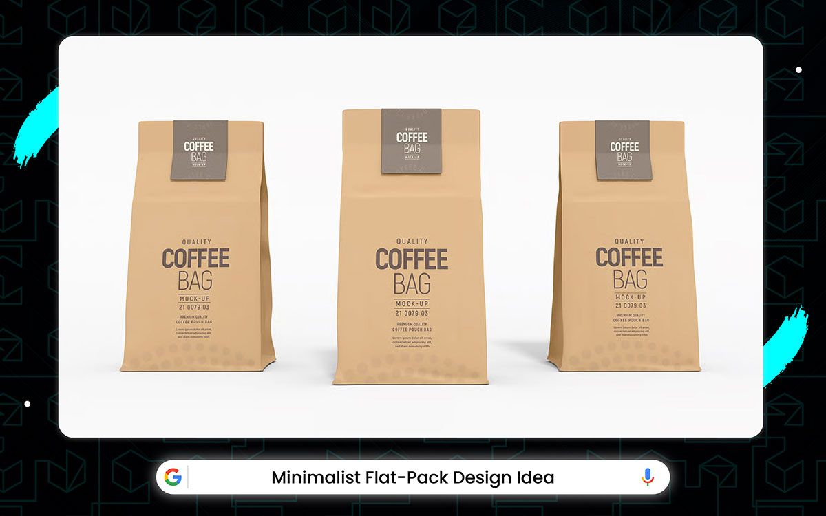
The Minimalist Flat-Packs got style, yeah, but that style works with the real point of it: simplicity. Your boxes can hold stuff well, or fold down small. But they’re mostly used for easy carrying when you move houses, go shopping, or mail things to friends. The clean lines make the designs look extra neat, just like those fancy magazines show.
The colors are also right, with white and gray being used to keep things looking fresh, so it never gets too messy or loud. Oh, and you’ll be saving space too. So, so much space everywhere, big and small. And they’re all easy to use and stack. Not all heroes wear capes; some zip up tight and keep your snacks fresh; a salute to food pouch packaging inspiration!
All the time, outside of an awesome 2021 that saw the release of the super thin phone box and the super flat shoe box along with the no-lid cereal pack, the crushable water bottle, and the foldy pizza box, peoples been waiting (and waiting) for boxes that don't take up the whole room. And it was looking kinda sad.
The new flat TV box getting pushed to March 2025 and the cool origami cereal bag slipping out of 2024. But the box makers turned in all their homework right as the truck came to load it, with the super flat book mailer, the pancake-thin toy box, and the fold-like-paper clothes pack all landing in the final six weeks of the year and all three getting gold stars from the recycle man.
The flat box has corners, sure, but these corners are just for keeping the real magic safe: saving room. Your hands can be used to rip it open – or maybe crush it flat – but it is mostly for fitting more stuff in the closet or under the bed. And the happy feeling when you stack ten boxes in the space of one makes cleanup extra fun, just like winning a game.
The design is also really smart, with clever folds being used to make it strong without ever getting too thick or heavy.
Fancy plastic shells and puffy foam peanuts both almost didn’t make our top picks. They are okay and deserve a nod. The simple brown cardboard box was the first thing anyone used for mailing stuff and when stores shipped it this year, it can be said that it thing:
‘Best space-saving way to send your stuff ever made.’
Plain cardboard might look boring, but it works well using all the flatness it can muster.
Most importantly, the designers, engineers, and the many factory workers who worked hard on boxes every day came together to make the best flat pack mailer in years.
The smart paper people knew that the key to a great box is stacking good, and in the new flat packs, you get all kinds of useful things, from fitting them under your bed to stacking them like books on a shelf to sliding them behind the couch and so much more.
Some people were laughing when they heard last spring that mailboxes would fold up like paper airplanes. But once everyone tried it, the foldy boxes got popular fast. Flat packs completely help you store things, from the tiny creases you bend to the smooth sides you stack to the closet shelf that holds a hundred now – not to mention the A+ feeling of folding one down super small with one hand, which makes you feel like a ninja master somehow even if you just smashed a box.
It's been a weird time for packages lately. It all started when trucks got too full. This made finding skinny boxes hard for months. The super cool new flat fridge pack had a big problem and needed to wait a whole year before coming out.
A big store tried to buy a cardboard factory for SO MUCH MONEY, but lots of truck drivers said no way before it finally happened. They made one good flat screen TV box (the grey one with no tape) and also started shipping all their toys in skinny flat packs, too.
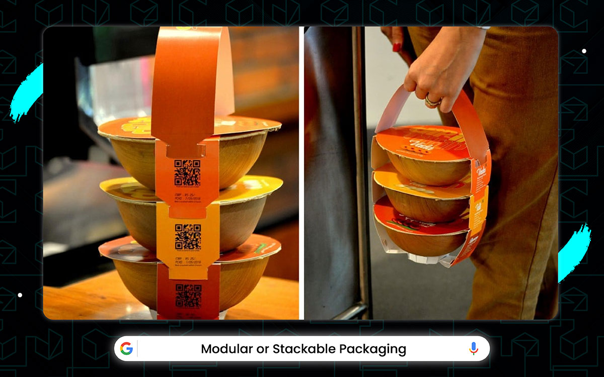
Modular or Stackable Packaging just missed being the top idea on our list, but it’s still super good for a shoutout. The space-saving design for food boxes was one of the first-ever smart packaging design trends. If companies used it this year, they can brag about one thing: the most clever way to store stuff ever made.
Modular packages are a smart solution, a powerhouse of practicality that uses every bit of room that your shelf or fridge has. It’s a bit plain to look at more like simple blocks than fancy decorated boxes. But it is super handy and crazy useful.
No doubt, it’s truly worth trying out this kind of packing for your snacks and groceries.
Look, the stackable box has handles, sure, but these handles are just for keeping the real magic safe. It’s saving space. You can use your hands to carry it. Maybe hook others under it – but it is mostly for fitting more stuff in the pantry or on the fridge shelf.
The happy feeling when you stack five boxes tall without falling makes organizing extra fun, just like winning at blocks. The design is also really clever, with clicky bits being used to lock them together without ever getting too wobbly or loose. Oh, and you gotta stack it too.
So, many ways to stack both high and wide. And they’re all pretty fun to try until you find the best way. Stacking boxes saves cupboards. So, big messy piles are annoying like mosquitoes.
Modular boxes click together neatly. Plastic ones snap loudly. Glass ones stack carefully. Metal ones are heavy but strong. Just click it and stick it. Saves your time and kitchen space. Easy win!
Now let’s dig into the inside of this design idea:
Some moms were doubtful when they heard last winter that cereal boxes would snap together like Legos. But once everyone tried it, the clicky corners got popular fast. Modular packs completely help you build stuff, from the little nubs you push in to the smooth sides you slide to the pantry shelf that holds twice as much now.
It’s a feeling of pulling one box out without the whole tower crashing, which makes you feel like a stacking wizard somehow even if you just grabbed breakfast.
This lunchbox system mixes tough food holders with bendy dividers in a simple plastic box to create a lunch setup that feels boringly normal yet excitingly customizable all at the same time. Though its first try had lids that popped off easily, its new clips came fast that it’s impossible to hold the old one against it!
The inventors, mold makers, and the many factory workers who worked super hard on containers every week came together to make the best stackable set in years.
The smart plastic people knew that the key to great storage is shapes that fit, and in the new modular packs, you get all kinds of useful boxes, from tiny cubes for nuts to long rectangles for pasta to square ones for cookies and much more.
Meanwhile, the modular bin’s neat idea a kitchen shelf becomes a tidy spot for containers to live and click together. After a long day of holding these spaghetti and meatballs that turns into a real fun mix of playing architect and keeping things neat.
Its satisfying clicky sound only made the whole thing better. This was a happy new thing in a season where we usually cry about the ‘Tupperware’ avalanche.
Clear plastic bins and colored stackable tubs both almost didn’t make our top pick. But they are nice and deserve a thumbs-up. In the meantime, the see-thru modular set was the first thing anyone wanted for pantry stuff, and when stores finally sold it this year, they can brag about one thing. What’s that. The best-looking way to store your cereal ever made!
It’s been a weird time for food packaging lately.
First, there was all that fuss about plastic being bad, then companies had to figure out new ways to make stuff without hurting turtles, the big idea of squeeze pouches almost got ruined when some dumb exploded In kids lunchboxes.
The smart people at PackGenius tried to make a super eco-pouch that cost like $5 before everyone said no way, they did make one cool thing that won awards (those juice boxes you peel open like a banana). It started putting ketchup in those little dip cups like McDonald's uses.
And the boss of SnackCo even said they’re working on packaging you can eat, even if we probably won’t see it until like next year or something.
It has become a bit of weird time for snack packs lately. It all started when people got tired of spilling stuff. This made finding easy-open things hard for months. The super cool new juice pouch had a big oopsie and needed to wait a whole year before coming out.
They made one rood yogurt tube (the purple one with no mess) and also started selling their easy-sip drinks in normal stores, too. The packaging boss even said they are making a box that opens itself, even if we don't see it till maybe the next picnic.
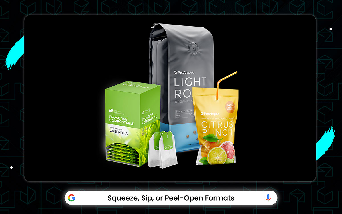
People have been using hard packages for too long. Squeeze-sip-peel things just make sense because they are easy to use. It doesn't need scissors or grown-ups. This saves time and stops big spills. It may cost a dime more, but then you don't wear your lunch. My sister uses a squeeze applesauce, and she never gets sticky. It's just smarter for the car and kids, too, even if squeezing too hard makes a fountain sometimes.
All the time, outside of an awesome 2021 that saw the release of the no-spill juice box and the good peel-top pudding along with the zip-fruit cup, the twisty yogurt, and the push-pull cheese stick, snackers have been waiting (and waiting) for drinks that don't explode.
And it was looking not good with the new no-drip sports bottle getting pushed to next summer and the cool self-sealing milk carton slipping out of 2024. But the sip-pack makers did their work right before lunchtime!
Fancy resealable bags and twist-off caps both almost didn’t make our top picks, but they are really handy and deserve a wave. The simple peel-back lid was the first thing anyone wanted for pudding cups, and when stores finally used it this year, they can brag about one thing: the best easy way to get your snack ever made.
Peel-top things might look plain. They work well using all the sticky glue they can get. No tools, no fuss. Just peel and eat. Your snacktime gets happier fast!
Meanwhile, the peel-pouch’s neat idea – a little bag becomes a fun thing for kids to rip open quickly after a long day of school and being hungry – turns into a real fun mix of playing treasure hunter and getting food fast. It's a satisfying rippy sound that only made the whole thing better. This was a happy new thing in a time when we usually cried about lost bottle caps.
Some moms were giggling when they heard last winter that ketchup would come in tubes you squeeze. But once everyone tried it, the squirty bottles got popular fast. Squeeze packs completely help you sauce things, from the soft plastic you squish to the pointy tip you aim to the hot dog that gets covered perfectly.
Yes, tops were improved, as were lots of other hidden sticky bits. No-mess packs are like magic. Old bags leaked in your backpack. Squeeze-sip-peel packs stay shut tight. They got special glue that sticks forever. They got valves that close when you stop sucking.
They have thick sides that don’t pop! No more finding yogurt all over your math book. Just sip, squeeze, peel, and eat clean. Your backpack remains happy!
All this time, except for that awesome time when we got those cool cereal boxes with big letters and the shiny soda cans everyone liked, plus those pizza boxes with jokes printed on them and the yogurt lids with puzzles, package designers have been waiting (and waiting) for people to notice their work.
And it not good feels with the new snack bag designs getting delayed to next summer and those fun fruit stickers with cartoon faces not coming out till after Christmas. But then the design guys did all their best work right before the big packaging show, with the new chip bags, soda bottles, and ice cream tubs all showing up in the last month, and all three getting gold stars from the judges.
When fonts flirt with flavors, magic happens; welcome to the spice of typography in food packaging.
Fancy curly letters and tiny word designs both almost didn’t make our top picks, but they are nice and deserve a thumbs-up. The big chunky letter style was the first thing stores used for cereal boxes, and when companies finally tried it this year, they can brag about the best-seen packaging from far away ever made.
Giant blocky words might look simple, but they shout using all the bigness they can muster. It’s a bit plain for art shows – more like a stop sign than a painting – but it is nevertheless super clear and makes you look. It’s very much worth putting these fat letters on your next chip bag. Small writing hides like a mouse.
Big words jump out and punch your eyes. You see "CHOCOLATE" in huge letters, and your hand grabs before your brain thinks. Sells stuff faster than anything. My dad bought cookies just because the "CRUNCH" word was big and red. Smart for busy shoppers!
Okay. Let’s take a look why this food packaging design matters:
People have been using tiny writing for too long. Big fat words just make sense cause they scream, "LOOK AT ME!". It doesn't whisper like a secret. This saves time and makes cash registers sing. It may cost pennies more, but then you sell faster. My mom bought chips because "SALTY" was written bigger than the bag.
It is just smarter for stores and for companies, too, even if it sometimes hurts your eyes.
The bold words have curves, sure, but these curves are just for making the real magic safe: being seen. Your eyes can be used to read small print – or maybe ignore it – but big. Fat letter is mostly for grabbing attention while you walk past shelves full of stuff.
And the happy feeling when you spot your favorite snack from across the store makes shopping extra fun, just like finding candy. The letter shapes are also really smart, with thick lines being used to stand out without ever getting too fancy or hard to read.
We saw the release of the mega-size "CRISP" letters and the giant "SWEET" words along with the thick "CRUNCH" font, the jumbo "TASTY" sign, and the super-fat "YUM" logo. Shoppers have been waiting (and waiting) for packages that don’t make you squint. But the word makers did their work right before holiday shopping.
They made the shaky "HOT" letters for sauce, the new wobbly "COLD" sign for ice cream, and the bouncy "FRESH" word for veggies all ready when Christmas came and all three worked super duper good.
Words that scream work magic. You don’t wander aisles forever cause they call you. You save time because you grab quickly. You feel smart because you won the shopping. It takes some getting used to, but then it is easy! Just look for the biggest words, follow them, and grab. Done! Easy peasy. Feels good to beat the crowd!
Its beauty doesn’t quite wow you like a rainbow, but it’s a damn useful trick. Anyway, that helps the whole "sell more stuff" thing work well. Having letters that yell is key. No more hunting for hidden words. Just spot the biggest shouty ones. They dominate shelves. They win against other brands. They make kids point and shoot, "MOM! THIS ONE!" Good for sales and hungry bellies!
The designers at ColorPop, SimplePack, and other packaging companies who work hard every year got together to make the coolest-looking snack boxes in forever.
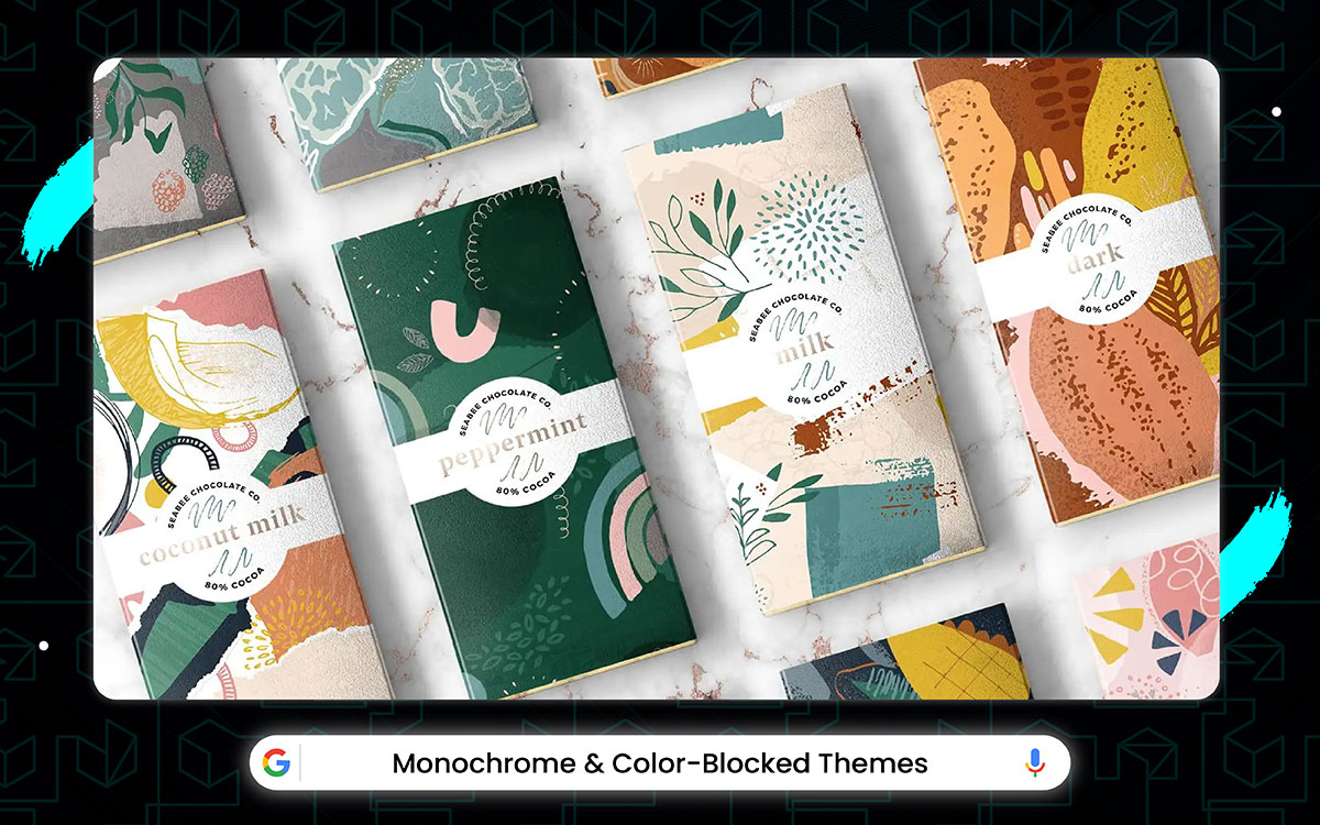
People don't always notice, but SimplePack knows that the secret to good packaging is making each thing look different, and with Monochrome and Color-Blocked, you get all kinds of awesome styles. From clean black and white cereal boxes to bright single color juice bottles brings fancy two tone candy wrappers and lots more.
The designs aren't a big surprise like when some packages change colors in sunlight, but they still look nice and make all the different foods stand out in the store.
Food packaging design ideas take a bold turn with Monochrome and Color-Blocked themes. They’re like the cool kids of the packaging world, turning your snacks into a must-have accessory, all while making your shelves look like a modern art gallery!
With the release of the all blue cereal box and the black-white soup can along with the grey pasta pack, the beige cookie tin, and the red-only soda bottle, shoppers have been waiting (and waiting) for packages that don’t hurt your eyes.
The new milk carton stripes getting pushed to next summer and the cool spot-color bag. But the color-block makers did their work right before Christmas shopping.
They made the all-green tea box, the new black-and-yellow cracker pack, and the just-white chocolate bar all land right when holidays came, and all three looked super duper slick.
Crazy rainbow boxes are a headache. Too many colors screaming "LOOK!". One-color packs chill like a nap. Just pick one shade. Maybe two. Make big blocks. No mess. Looks fancy like an art show.
Better, we dive into how this food packaging design idea come out on the spotlight:
The artists, printers, and the many paint mixers who worked really hard on labels every day came together to make the best simple color boxes in years. The smart color people know that the key to great packaging is fewer colors. In new monochrome packs, you get all kinds of cool looks, from baby-blue-only cereal to fire-red-only chips to forest-green-only tea bags and more.
Meanwhile, the color-block bag’s neat idea is a boring chip bag becomes a cool thing for people to admire after a long day of ugly ads and messy shelves. It turns into a real fun mix of playing artist and feeling fancy. It's big, clean color squares only made the whole thing cooler. This was a happy new thing in a time when we usually moan about clown packaging.
Enjoy looking at yourself with these clean boxes, as their designers did when dreaming them up. Simple doesn't mean boring. It means smart. Old boxes yelled with pictures and words. New ones whisper with class. One color. One block. Maybe two. Clean like a new room. No noise. Just yummy food in a calm jacket. Feels grown up but still fun!
The monochrome box has details. These details are just for helping the real star safe: the color. Your eyes can be used to see tiny pictures or maybe ignore them. But big color blocks are mostly for making you feel happy while you walk past boring beige walls. The happy feeling comes when you spot that bright red tea box in a grey kitchen makes cooking extra fun, just like finding candy!
Labels were improved, as were lots of other hidden pretty bits. Simple packs are like quiet heroes. Old boxes screamed like babies. Monochrome boxes sit quietly but strongly. They got special paper that feels nice. They have colors that glow softly. They got shapes that look sculpted! No more hiding your cereal in the cupboard. Put it out proud! Your kitchen counter says "Just Wow!"
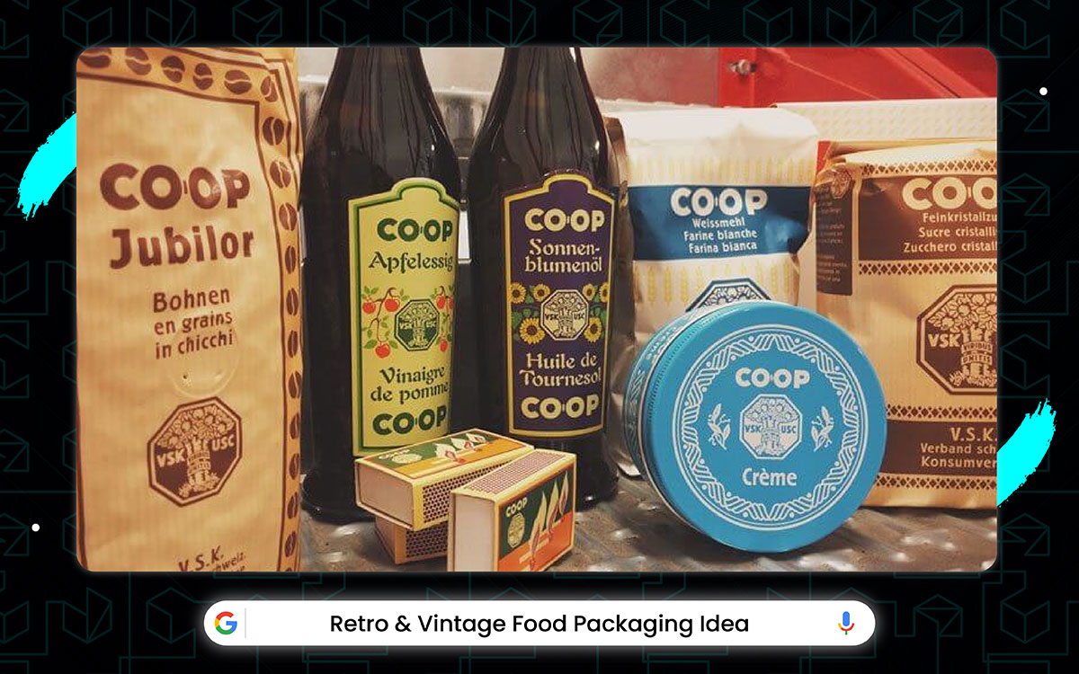
Some people weren't sure when they first heard that new snack packages would look like old-timey designs from grandma's days. But when everyone saw them, the designers knew what they were doing.
Retro and Vintage Packaging makes you feel like you time traveled, from the old-school paper wrappers that crinkle in your hands to the faded colors that look like they have been in the sun too long. It does not even count the super cool old logo designs they copied perfectly that tricks your eyes into thinking you found some treasure in your parent's attic!
The package designers even got the weird spelling and funny sayings from back then just right. Making your brain think you somehow bought these straight from a 1950s grocery store. Because even your granola bar needs a personal brand stronger than your ex’s influencer phase like user-friendly branding for food packaging design ideas!
Old-timey cookie tins and groovy chip bags both almost didn’t make our top picks. They are really neat and deserve a high five. However, the classic red-and-white soup can be the first thing stores used way back, and when companies finally brought it back this year, they can brag about one thing: best-feeling packaging that makes you think of grandma ever made!
Think about vintage styles. It might look old, but they are charming, using all the nostalgia they can. It’s a bit dusty sometimes more like grandpa’s attic than a new phone. But it is nevertheless super cozy and makes you smile.
It’s very much worth picking these old-style boxes for your next snack. New packages feel cold like a robot. Retro ones hug your heart. You see "MOM'S PIE" in wobbly letters, and you buy it for the memories.
Sell stuff with feelings, NOT words!
It's been a weird time for food boxes lately. It all started when people got tired of boring plastic. This made finding old-style tins hard for months. The super neat new retro soda label had a big problem and needed to wait a whole year before coming out. A big company tried to buy a printing press for SO MUCH MONEY, but lots of historians said no way before it finally happened. They made one good candy jar (the glass one with flowers) and also started using swirl designs on normal cereal boxes, too.
Finding feel-good packages is hard, but getting better. Retro designs beat shiny new ones any day. Your heart remembers them first. Then your hand grabs. Then your mouth tastes like childhood. Simple like that!
Old packages are like time machines. They got pictures of old cars. They got fonts from black-white TVs. They got colors that ain’t bright. Makes cheap cookies taste fancy cause they look like love. Good for sad days and happy bites!
The smart vintage people knew that the key to great packaging is feeling familiar, and in new retro packs, you get all kinds of warm fuzzies, from polka-dot "BREAD" letters to stripey "MILK" words to flowery "TEA" signs and so much more. Its tech doesn't quite wow you like an iPad, but it’s a damn cozy trick anyway that helps the whole "Taste like childhood" thing work well.
Having packages that remember is key. No more cold plastic feel. Just a big warm nostalgia. They hug your eyes. They win against new brands! They make grandpas cry happy tears. Good for sales and hungry hearts.
Retro packs are like comfort food for the eyes, not bellies. New boxes feel like strangers. Vintage ones feel like home. They got special fonts that wobble. They got pictures that look hand-drawn. They got shapes that feel chunky! Put them out proud! Your kitchen shelf says, "Remember when"?
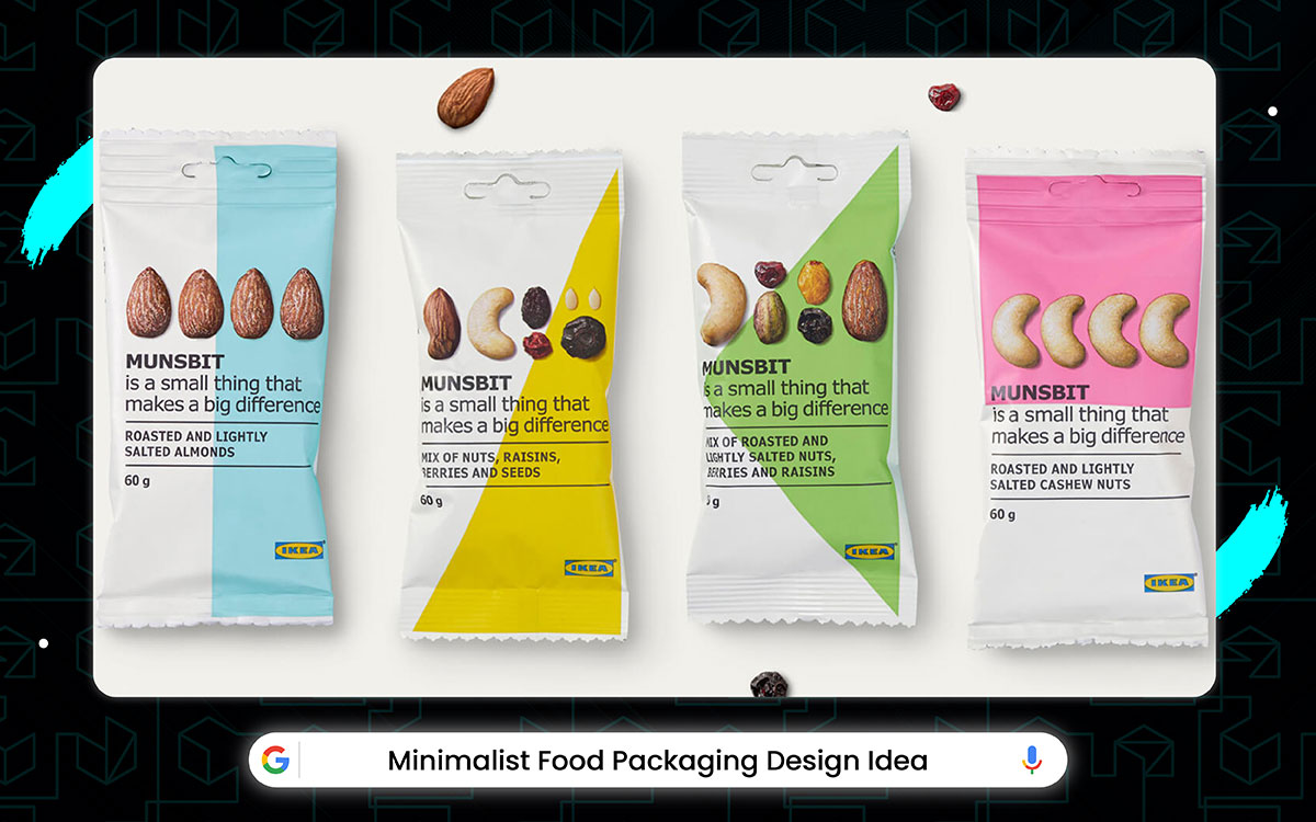
Simple food packaging designs win the race.
It all started when people got tired of too many colors and pictures on everything, then stores had trouble stocking all the fancy packages cause they cost too much to make, and the super popular plain white boxes (you know the ones) got delayed cause the glue wasn't sticky enough, some big company tried to spend like million dollars on just one plain cereal box design before everyone said that was dumb.
They did make one really good simple milk carton that won awards and also started using the same clean look on juice boxes and cookie bags. And the packaging boss lady even said they're working on see-through packages you can recycle super easy, even if we probably won't see them till next Christmas or something.
That’s why food packaging design ideas are so creative and bold. Your snacks might just strut off the shelf and ask for a modeling contract!
The plain box has pictures. These pictures are just for helping the real star safe: the food. Your eyes can be used to see fancy drawings or maybe ignore them. But clean boxes mostly for showing the yummy stuff inside without shouting too loud.
And the calm feeling when you see a simple white box with just "COOKIES" makes snack time extra nice, just like finding a quiet spot. The design is also really smart, with space being used to look fancy without ever getting too busy or noisy. Oh, and you gotta open it too. So, many boxes are both messy and clean.
But the simple ones always win the beauty contest. Less junk in the box means less trash later. No silly plastic windows. No extra stickers. Just the food name and maybe one color. Looks grown up good. My mom buys plain rice bags because they don’t hurt her eyes.
Smart choice for Earth and tired brains!
Time to check out why this packaging design stands out:
However, minimal packs completely help you see the food, from the smooth cardboard you touch to the tiny letters you read, to the kitchen shelf that looks tidy now. Simple packages don’t lie. You see what you get. No cartoon animals tricking you. No fake "HEALTHY!" shouts.
Just the food name is quiet. Saves your eyes from headaches. You need to make cheap noodles look fancy like a restaurant. Good for quick grabs and calm pantries!
This no-nonsense design mixes boring white backgrounds with one little logo in an empty box to create a look that feels boringly plain yet excitingly fancy all at the same time. Though its first try had glue that showed messy, its new sticky stuff came so fast that it’s impossible to hold the old mess against it.
The smart, simple people knew that the key to great packaging is saying less, and in new minimalist packs. You get all kinds of calm feels, from all-white cookie bags to grey-only tea boxes to beige rice sacks and so much more. Its excitement doesn't quite wow you like a circus.
But it’s a damn classy trick anyway that helps the whole "Look expensive" thing work well. Simple sells sneaky goods.
Sleek means smooth like a rock. No bumpy plastic. No glitter sparkles. Just soft paper or silky plastic. Feels nice in the hand. Makes eating feel special, like a present. Good for picnics and feeling fancy!
Fancy rainbow bags and shouty labels both almost didn’t make our top picks, but they are okay and deserve a nod. The clean brown paper bag was the first thing anyone used for lunches. It can brag about one thing: the best no-nonsense way to hold your sandwich ever made.
Just tear, eat, done!
No sticky glue on fingers. No loud colors shouting "BUY ME!".
Just food and peace. Maximum munching, minimum headache!
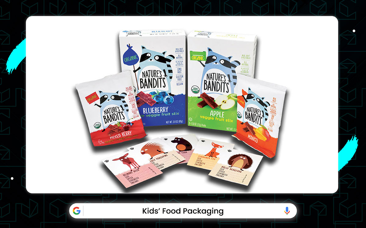
It's been a crazy time for kids' food packages lately.
It all started when parents got mad about too much sugar in everything, then stores had trouble making boxes cause of the cardboard shortage, the super cool lunchbox snacks (you know the ones with dinosaurs) got delayed cause the colors weren't right.
Big Food Company tried to spend like a billion dollars on new cartoon characters before moms said that was stupid. They did make one good juice box that won awards and also started putting the same fun designs on yogurt and applesauce, and the snack boss guy even said they're working on packages kids can play with after eating.
If we probably won't see them till next school year maybe. It’s not bragging if your packaging turns heads faster than a flash sale. Say hello to shelf appeal royalty!
Kid snacks and juice boxes both almost didn’t make our top picks, but they are fun and deserve a sticker. The super colorful cereal box was the first thing little kids saw at stores, and when companies finally made it this year, they can brag about one thing: the best way to make kids stop crying.
Bright, happy packages might look silly, but they smile good using all the rainbows they can make. It’s a bit loud for grown-ups more like a toy store than a kitchen. But it is nevertheless super exciting and makes kids point. It’s very much worth buying these for your next lunchbox.
Plain bags are boring like homework! Kid packs got cartoons and animals dancing. You see a dinosaur on yogurt and you gotta have it. Sells stuff faster than saying "Ice cream!”
Let’s know why this food packaging design stands out:
It all started when kids hated broccoli. This made finding fun boxes hard for months. The super cool new rainbow cookie bag had a big oopsie and needed to wait a whole year before coming out. A huge company tried to buy a cartoon company for SO MUCH MONEY, but lots of moms said no way before it finally happened.
The animal crackers have legs, sure, but these legs are just for making the real magic safe: being fun. Your hands can be used to grab circles or maybe boring squares. But star-shaped nuggets are mostly for playing before eating, while you sit at a yucky dinner table. The giggly feeling when you bite the head off a bear cookie makes eating extra fun, just like recess.
The fun-food makers did their work right before school started. They have made the dip-dots for veggies. The new smiley face pancake mold and the just like-lego cheese blocks all ready right when summer ended and all three played super duper good. Food shouldn’t just sit there! Let kids dunk. Let them build. Let them draw with icing. Turns "Eww" into "Wow!" in one bite!
Some dads were giggling when they heard last winter that spaghetti would have superhero faces. Once kids saw it, the character noodles got popular fast. Cartoons are the magic glue. You don’t say "no" to cereal with a space robot. You grab fast. You eat happily. It takes some drawing, but then kids love it! Just put a princess on peas. Put a dragon on milk. Put a racecar on apples. Kids will eat anything their friends eat. Even yucky spinach!
Its size doesn't quite wow you like a big cake. But it’s a damn useful trick anyway that helps the whole "No spilled milk" thing work well. Having stuff that fits kids ' Hands is key.’
No more dropping stuff. Just perfect little pouches. Easy squeeze. Easy tears. Easy carry. Makes snack time feel like big-kid power. Good for messy floors and proud smiles!
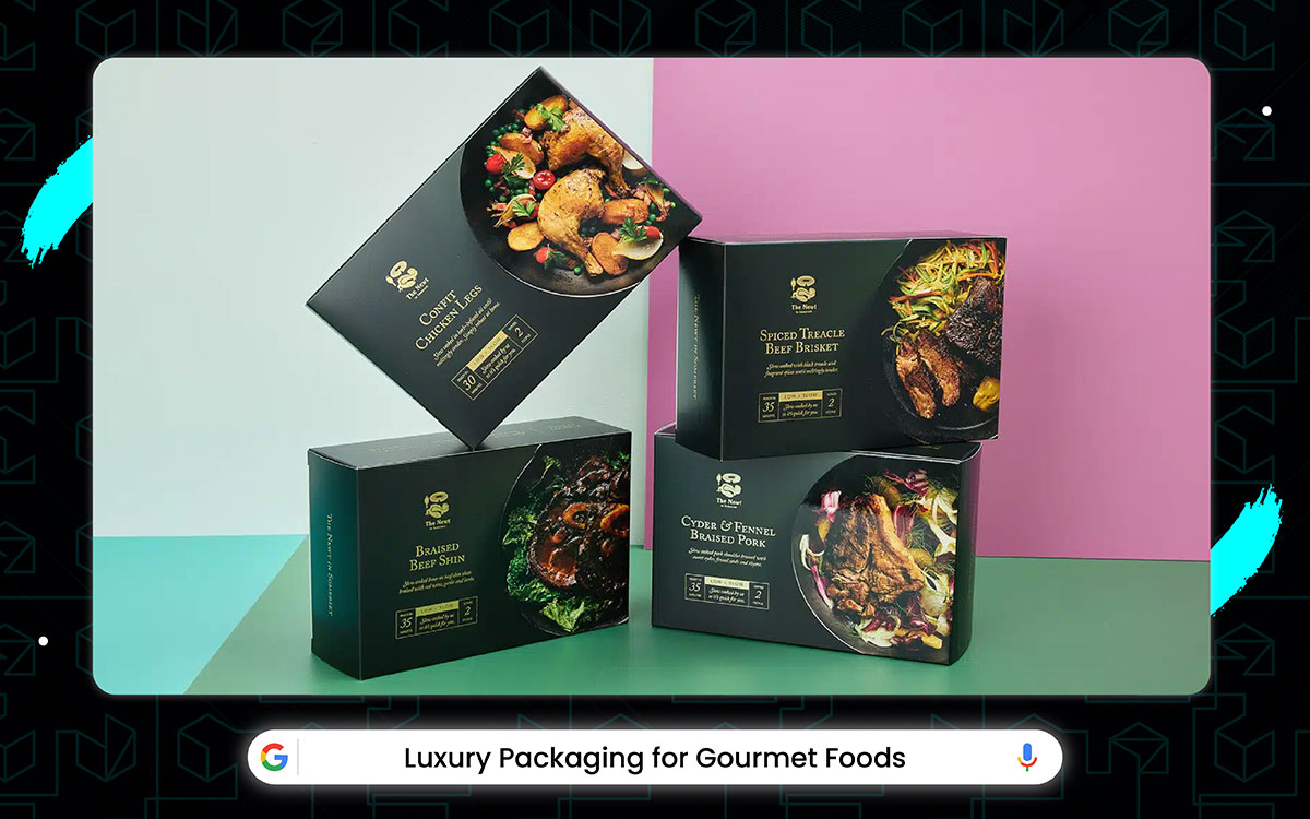
We got those gold-foil chocolate boxes and the truffle oils in glass bottles, plus those caviar tins with real wood lids. Fancy food lovers wait for more special packages. And it was looking for the new wine gift that sets getting pushed to next Christmas and those limited edition olive oils not coming till after harvest season.
But then the fancy package makers did all their best work right before the holiday rush, with the new cheese boards, smoked salmon boxes, and champagne carriers all showing up in the last month, and all three getting five-star reviews from the rich people magazines.
Rich people wanted nicer boxes. This made finding sparkly wraps hard for months. The shiny new chocolate cover had a big problem and needed to wait a whole year before coming out.
And the food boss even said they make boxes that sing when opened, even if we don't see it till maybe next Christmas. People have been using boring bags for too long. Luxury wraps just make sense because they feel special. It doesn't look cheap like plastic.
This makes food taste better and feel fancy. It may cost lots more, but then you feel like a king. My aunt got truffles in a silk box and she smiled big. It is just smarter for presents and rich tummies, even if the bow gets messy sometimes.
Take a look at how this food packaging design stands out:
Plain boxes are sad like old socks. Fancy wraps make oatmeal feel royal. Just add shiny paper. Maybe a real ribbon. Make it heavy. No plastic feeling. Looks expensive like a jewelry store. My neighbor bought salt because it came in a tiny glass container. Fancy sells goods!
The gold paper has wrinkles. These wrinkles are just for making the real magic safe: looking rich. Your fingers can be used to touch normal paper or maybe cheap foil but real gold wrapping is mostly for making you feel important while you are opening a birthday present.
Luxury packs might look extra, but they work well by using all the fancy features they can. It’s a bit heavy to carry more like a brick than a feather. But it is nevertheless super pretty and hardly ever looks cheap. It’s very much worth paying more for these boxes. You taste with your eyes first!
Fancy box makes the brain think "yum!" before the tongue knows. Shiny means tasty in the head. Heavy box means important food. Soft lining means special treat. Your mouth waters faster. Good for making broccoli taste fancy!
Luxury is like magic dust. Surely, you don’t care about price when the box sparkles. You grab your wallet fast. You eat slowly like a queen. You save the box forever. It takes some saving money, but then you feel big! Just unwrap slowly, admire the shine, then nibble. Easy peasy. Feels good to be a fancy eater.
Expensive packs talk loud. They whisper, "you're special". They shout, This costs a lot!". They make you sit straight. No more paper plates. Just a heavy silver fork. Real glass bowl. Velvet napkin ring. Makes TV dinner feel like a castle feast. Good for lonely nights and happy hearts!
We got those protein bars with cool packaging. The vitamin waters with fitness labels. Plus, those healthy snack packs and organic juice boxes. People trying to eat well have been waiting for more smart packaging!
The new gym supplements are getting delayed to next summer and those workout recovery drinks not coming out till after New Year. But then the packaging people did all their best work right before the big health food expo, with the new energy gels, protein powders, and fitness waters all showing up in the last month, and all three getting gold medals from the nutrition judges.
It looks handmade, feels heartfelt, priced like a Picasso; artisan and organic food packaging never misses.
Healthy snack packs have pictures of muscles. But these muscles are just for helping the real star, safe, good food. Yes, your eyes can be used to see nutrition facts or maybe ignore them. But green leaf designs mostly make you feel strong while you are choosing snacks. And the happy feeling when you see "PROTEIN!" In big letters makes chewing extra fun, just like winning a race. The colors are also really smart, with green and white being used to look clean without ever getting too boring or sad. Oh, and you gotta read it, too.
Many words like "Organic" and "Low-sugar". But the healthy ones always win the hungry contest. Plain bags make you feel lazy. Fitness packs comes in carrots exciting. You see athletes on a wrapper and think, "I run fast too!". Sells veggies better than cartoons!
Let’s understand why this food packaging design stands out:
Some gym people were laughing when they heard last winter that protein bars would come in recycled paper. But once everyone tried it. However, the earth-friendly wrappers got popular fast. You flex your muscles cleaner. It takes some finding, but then it is easy! Just rip, munch, plant. Done! Easy peasy. Feels good to be strong and green!
Enjoy chewing your gained fuel, as its makers did when mixing it up. Smart snacks have numbers on the front. 20g protein! 5g fiber! Big letters shout "STRONG!" No more sugar crash naps. Just open, bite, and lift heavy things. Makes gym time feel easy, like a playground. Good for sore muscles and happy mouths!
Its size doesn't quite fill you like pizza, but it's a damn tasty trick anyway that helps the whole "no belly ache" thing work well. Having snacks without guilt is key. No more hiding cookie wrappers. Just proud to chew. They fuel workouts. They win against hunger. They make jeans fit nicer. Good for scales and happy smiles!
This year’s cool neon shaker for your powder and not spilling while showing gym buddies how fast you shake proved to be just the kind of energy boost we needed. Pumped up packs got flexing arms pictures. Got "YOU CAN DO IT!" words.
It got colors that glow under gym lights. Makes drinking protein feel like winning a trophy. No more plain white tubs! Just grab, shake, and grow muscles. Good for weak arms and big dreams!
Fitness packs might look serious, but they shine strong using all the energy they can muster. It’s a bit plain for birthdays more like a doctor's office than a carnival. But it is nevertheless super helpful and hardly ever lies about calories. It’s very much worth choosing these for your six-pack goals. Healthy looks snap back fast!
Like rubber bands. You eat well, and your body bounces quickly. The package reminds you that every bite counts. A strong body starts with a strong wrapper choice!
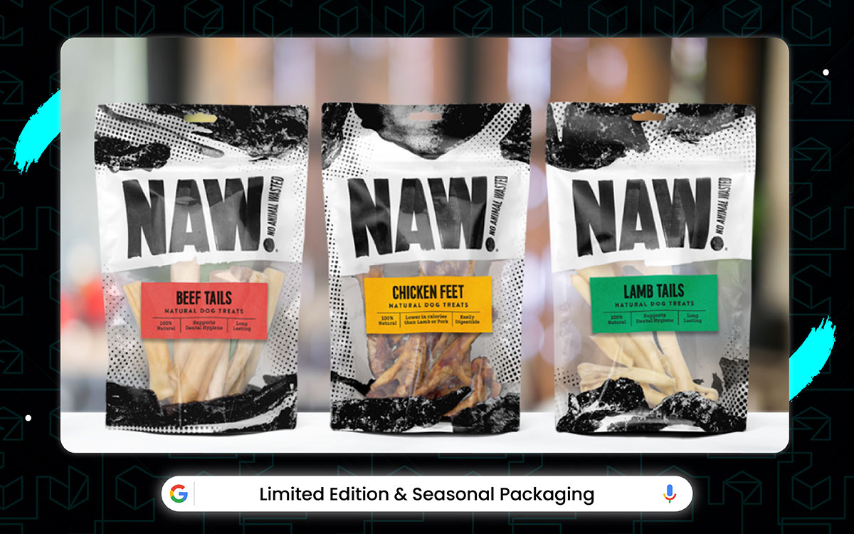
Limited Edition packaging has special designs. Yeah, but those designs work with the real point of it: making things feel exciting. Your holiday cookie tin can be used for storage or as a fancy gift box. But it's mostly about that Christmas feeling when you see the snowflake patterns and shiny red colors.
And the special seasonal artwork makes opening the package feel extra magical, just like when you unwrap presents. The colors are also perfect, with pumpkins for Halloween and hearts for Valentine's being used to make sure the packaging always feels festive without ever getting too plain or boring.
Oh, and you'll be collecting these packages too. So many different ones for every holiday and season. And they're all fun to look at and keep. Warning: These food packaging design ideas are so hot that even your chips will feel spicy sitting inside them.
People got bored with the same old boxes.
This made finding special holiday bags hard for months. The super cool new Halloween cookie bag had a big oopsie and needed to wait a whole year before coming out.
The snack boss even said they are making Easter egg cereal that glows, even if we don't see it till maybe next spring. People have been using plain bags for too long.
Holiday wraps just make sense cause they scream "PARTY!"
It doesn't look boring like Tuesday. This makes eating feel like a birthday every day. It may cost a dime more, but then you get happy feelings. My mom bought turkey gravy because the jar had pilgrim hats. It is just smarter for holidays and smiley faces. And, even if it doesn't match your kitchen.
Now let’s have a look at how this packaging design stands out:
The new Fourth of July star chips getting pushed to next summer and the cool green beer bottle slipping out of St. Patrick’s Day. The holiday makers did their work right before December. They made the snowman soup cans, the new love-heart chocolates, the ghostly white cookies, all landing right when holidays hit and all three made people go "OOH!" in stores.
Holiday packs might look silly, but they sparkle well when using all the glitter glue they can. It’s a bit much for April – more like a costume than clothes – but it is nevertheless super fun and makes you dance. It’s very much worth hunting these down fast.
Normal boxes whisper. Holiday boxes shout "CELEBRATE!" with bells and snowflakes. Turns boring oatmeal into Christmas morning. Makes you buy stuffing in July! Good for sad days and happy tummies.
The "LAST CHANCE!" Sticker’s neat idea – a boring shelf becomes a panic spot for moms to grab fast after seeing their neighbor's cool Halloween candy bowl that turns into a real fun mix of playing treasure hunt and feeling smart. Scary countdown timer only made the whole thing wilder. This was a happy new thing in a time when we usually ignored snacks.
Some grandmothers were giggling when they heard last fall that soup cans would have different snowflakes to collect. But, once everyone witnessed it, the collector madness got popular fast.
Collecting ain’t just stamps no more!
You gotta catch all the pumpkin designs. Trade with friends. Line them up on the windowsill. It takes allowance money, but then it is pride! Just spot, grab, save, brag! Easy peasy. Feels good to have all the Christmas cookie tins. Hunger optional!
Normal boxes sit quietly. Holiday ones sing carols, glow, and wink at you! They got special shapes like trees. They have colors that make your eyes happy. They got ribbons that curl alone! No more hiding your cereal.
Put it out on center stage! Your kitchen counter throws the party now.
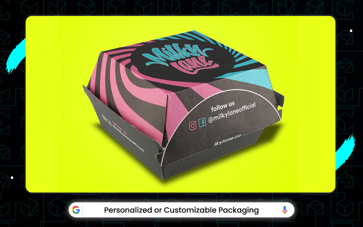
The designers at NameYourSnack and BoxItYourWay, plus all the other creative packaging companies who work super hard every day. Yes, we together make the coolest personalized packages ever.
People don't always notice but the smart folks at BoxItYourWay know that the secret to great custom packaging is letting people choose everything. With Personalized Packaging you get to pick all kinds of awesome options from writing your name in glitter letters to selecting.
Your favorite color combinations to adding silly pictures and lots more.
The final product might not shock you like when some packages change color when you touch them, but they still look amazing and make every gift or product feel extra special because you designed it yourself.
Special name bags and color-pick boxes both almost didn’t make the top list, but they are cool and deserve a star sticker. The first "write your name here" cookie pouch was the thing stores tried last year, and when people finally got it this year, it can say one thing: the best way to make a snack feel like yours ever made.
Putting your name on stuff might look simple.
But it is magic, good for using all the happy feelings it can bring. It’s a bit slow to make sometimes more like waiting for a birthday than grabbing candy.
But it is nevertheless super special and makes you grin big. It’s very much worth the extra day to wait for these packs.
Normal boxes feel like hand-me-downs.
Custom packs hug you like a sweater with your name. You see "TIMMY'S CHIPS" and you go "MINE!". Sell stuff by making you feel famous! Now, let’s dive into why this food packaging design stands out:
Custom ones just make sense cause they shout "THIS IS YOU!". It doesn't look like everybody else. This makes eating feel like a party just for one. It may cost a nickel more, but then you get a smile with lunch. My sister got pasta with her face on the bag, and she danced! It is just smarter for happy kids and special snacks, too, even if the ink smudges sometimes.
Therefore, the nickname noodle cups, the new favorite color chip bags, the just-like-your-dog biscuit tins, all ready right when backpacks got packed and all three made people feel super duper important. Finding food that you know i,s hard but getting better. Custom beats plain any day. Your eyes spot your name first. Your hands grab fast. Your mouth eats. Simple like that! No sharing needed!
The oven-bag’s neat idea a boring chicken becomes a juicy feast inside a shiny bag after a long day of work and no energy comes into a real fun mix of playing chef and not cleaning. Its puffy balloon shape only made the whole thing cooler.
This was a happy new thing in a time when we usually cried over baked-on cheese pans. Old cooking made sink mountains. Rip the bag open. Dump in the trash. Wipe the counter quickly. Done! No greasy pans soaking overnight. No scrubbing cheese cement.
Just eat, toss, relax. Your free time says thank you!
Having food that whispers your name is key. No more lost lunch boxes. Just big "SARAH" in sparkles. Yes, they hug your heart. They win against boring brands. Wow, they make birthdays feel like every Tuesday. Good for lonely lunches and happy bites!
Unique packs are like snowflakes. Normal boxes are all twins. Your box is yours! They got your weird favorite number printed. They got your cat’s paw print. They got inside jokes only you get! No more hiding in the cupboard. Put it out on the table proudly. Your snack screams, "I AM SPECIAL!" to the whole room.
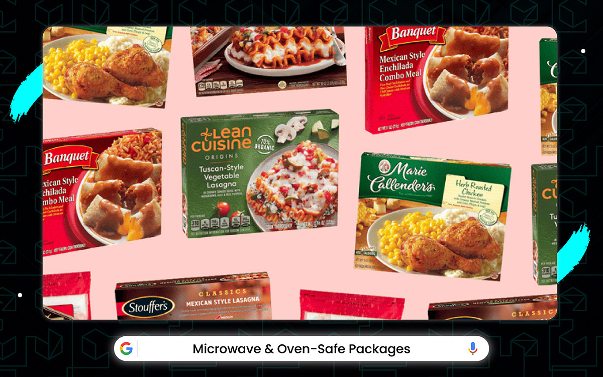
It's been a worse time for microwave packages lately. It all started when people got tired of switching food to bowls, then factories had trouble making boxes that wouldn't melt, the super handy pizza boxes (the ones you can just put straight in the oven) got delayed cause the glue kept burning.
In the meantime, Big Food Company tried to spend like ten million dollars on special microwave trays before everyone said that was crazy. Yeah, they have one good frozen dinner tray that won awards and also started using the same heat-proof material on soup cups and snack packs.
The packaging science guy even said they're working on packages you can cook and eat from. We probably won't see them till next Thanksgiving!
People have been using pots for too long. Cook-in packs just make sense cause you use them and then throw them. It doesn't make the sink full. This saves time and stops dish fights. It may cost pennies more, but then you skip scrubbing. Let’s take inside of this food packaging design:
With the arrival of the noodle-cook-cup and the lasagna tray, along with the bake-in-bag fish, the oven-safe pie tin, and the microwave popcorn bag, hungry people have been waiting for food that cooks in its clothes. Normal food needs pots. Heat-safe packs are like a magic oven. Rip top. Put it in the microwave. Beep beep!
Eat! Throw away! Easy like magic. Fewer dishes piling stinky in the sink!
The noodle cup has noodles. But these noodles are just for filling the real magic safe. The cooking box. Your hands can be used to stir pots or burn fingers. But microwave cups are mostly for making food fast while you are tired and grumpy.
No watching pots boil. Just hungry to fill in one commercial break. Good for growling stomachs!
No mess packs are like a gift. Old cooking made the mountain sink. New way? Rip the bag open. Dump in the trash. Wipe the counter quickly. Done! No greasy pans soaking overnight. No scrubbing cheese cement. Just eat, toss, relax. Your free time says thank you!
Hot packs wait patiently. You come home late? Food is still ready. Just zap 90 seconds. Bam! Steamy dinner. No thawing frozen bricks. No chopping sad veggies. Just hungry, be full. Feels good to beat dishes!
Heat packs are like superheroes. Old plastic bags melted, crying. New ones laugh at microwaves. They got special layers that block burn. They got glue that sticks even when boiling. They got shapes that puff steam safely! No more exploding soup! Just dump, heat, eat, smile. Your microwave doesn't even get dirty!
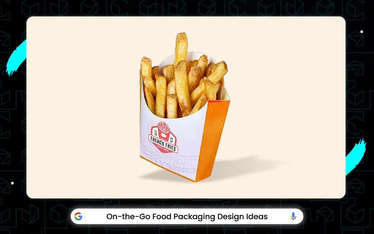
Some people weren't sure when they first saw those new food packages you can eat from while walking. But when everyone tried them, the designers knew they were right. On-the-Go Packaging makes eating easy anywhere from the no-spill coffee lids that don't drip to the one-hand snack.
It pouches that don't need opening to the built-in spoon on yogurt cups and not even counting the super smart sandwich boxes that fold into a plate, which tricks your hands into thinking you're at a table.
The package engineers even made the drink holders so good that they didn't spill in the car, making your brain think you magically got better at carrying stuff while moving.
Outside the awesome 2021 that saw the release of squeeze yogurts and one-hand chips along with car cup noodles, no-spill smoothies, and tear-top nuts. Busy people can’t wait for snacks that don't stop you from running.
A new bike bottle snack pouch getting pushed to next summer and a cool magnetic lunchbox slipping to 2025. But go-food makers work right before rush hour.
They made clip-on apple slices, new twisty energy gels, just-stick granola bars, all ready right when traffic jammed. All three worked super duper good. Now, talk about the winners of Best Go-Snack 2025. Normal foods need plates and a seat. Go-packs fit in pockets, open with teeth, and survive a backpack smash. Yogurt doesn't leak in the purse. Chips don't crush in bike bags. Just grab, rip, shove mouth, keep moving. Saves time and stops tummy growls in meetings!
Now let’s take an in-depth look at why this packaging design comes on spotlight:
The protein bar has a wrapper, sure, but the wrapper is just for helping real heroes eat safely: speedy eating. Your teeth can bite hard things or maybe sticky stuff. But tear-notches mostly for opening fast while you're running for the bus.
Happy feeling when the bar opens, brrip first try makes chewing extra fun, just like winning a race.
Glow up means look cool eating! Old sandwiches got squished and sad. Go-packs stay perfect like just been made. See-through windows show freshness. Shiny foil looks like space food. Neon colors shout "FAST!"
Makes boring carrots exciting in a race car pack. Good for selfies and hungry speed!
Smart package people know the key to great go-food is no-fuss, and in new speed packs, you get all kinds of energy bites, from caffeine peanut butter to vitamin gummy bears to salt lick nuggets and much more.
Its size doesn't quite feel like pizza, but a damn useful trick anyway that helps the whole "No crash" thing work well. Having pocket rockets is key.
No more stopping work. Just fist in pocket, grab rocket fuel, launch energy! They power workouts. Win against sleepies. Make overtime feel easy. Good for tired eyes and busy hands!
No-mess is a magic spell.
Don't need napkins or sinks. Just suck, chew, toss, wrap. Cheese dust stays in the bag. Smoothies stay in a straw. Ketchup stays in the ketchup pocket! Hands are clean like washed. Clothes are spotless, like new. Your mom stops yelling about stains!
Zippers have been improved! No crumbs escaped! Pocket packs are like ninjas. Old snacks bulged pants. New ones hide secrets. They got special shapes for back pockets. They got calorie bombs smaller than coins. They got silent open for a class sneak peek!
No more loud crinkles in quiet places. Just palm, sneak, munch, smile. Your energy goes zoom without stopping!
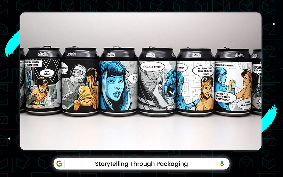
The Cereal Story boxes and Chocolate Tale wrappers both almost made our top picks, but deserve a shout-out. That cereal box with the little comic story on the back was the first ever to try telling a whole adventure while you eat, and when it finally hit stores this year, it can brag about one thing: the most creative breakfast ever made.
StoryPack's super fancy printing tech makes the package like a picture book, using every inch of the box to show colorful drawings that make your cereal taste better. It's not the most practical more like reading a book than just eating.
But the drawings are so pretty and the story so fun. It's worth reading all the way through while you munch your morning cereal.
When people got bored with plain wrappers. This made finding story bags hard for months. The super cool new cookie bag with a pirate story had a big problem and needed to wait the whole year before coming out.
Food experts even quoted them making chocolate bars that whisper tales when open, even if we don't hear till maybe next Halloween. People have been using quiet packages for too long.
Story packs make sense cause they talk to you. It doesn't sit silently like a rock. This makes snack time feel like a movie. It may cost pennies more, but then you get an adventure with chips. My sister reads a jam jar story every morning. Just smarter for hearts and hungry brains! Let’s find out why this packaging design is unique and most creative:
Normal foods just sit there. Story snacks take you places! See pictures of corn, imagine fields. Read pirates on fish sticks, feel the ocean wind. Makes broccoli taste exciting because it has a gnome tale. Sure, it’s really good for boring dinners!
The story box has colors, sure, but these colors are just for helping a real star's safety: the adventure. Your eyes can see pictures or maybe skip but crinkly map papers are mostly for guiding you through snack journeys while eating. Happy feeling when finding a secret message under a cookie makes chewing extra fun, just like a treasure hunt.
Drawings are also really pretty with little details that should be showed characters without ever getting too messy or confusing.
Story packs might look simple, but shout loud using all the words they can. It's a bit babyish for grown-up. More like cartoons than newspapers but super fun and makes you smile. Much worth buying for lunchboxes. Quiet packages feel lonely.
Story bags whisper jokes, share secrets, and sing farm songs. You hear Cookie's crinkly voice say, "Eat me!" Suppose, you see a chip bag with a pirate drawing. Snack time becomes chat time with food friends!
Personal stories stick best. Don’t just see random pictures. See your town on a milk carton. See your pet in a treat bag. See your hobby on the juice label. Feels like a package made just for you. Soul connects before the mouth opens!
Story packs ain’t just wrappers! They use time machines to go to farms. They boat to the oceans. They rocket to the stars. Look, food becomes a passport. Taste travels farther than the tongue. Your imagination chews longer than teeth! Good for boring days and big dreams!
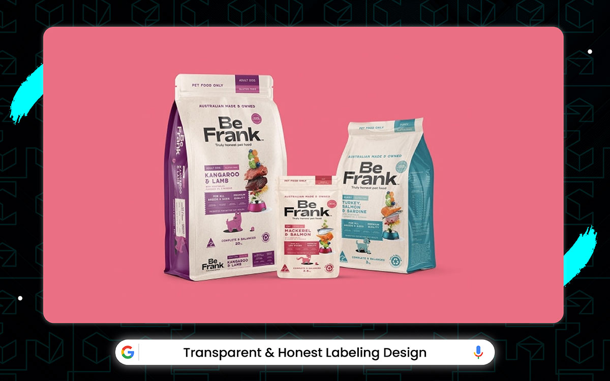
With those clear nutrition labels and honest ingredient lists, plus those "what's inside" windows on packages, shoppers waitfor food labels that don't lie. The new allergy warnings getting pushed to next season and those sugar content stickers not coming till after the holidays.
The label makers did all their best work right before the big food expo, with the new see-through packages, big-font ingredient lists, and color coded health info all showing up in the last month. Some of great food packaging design ideas like Peek-a-boo, we see you! Transparent packaging windows give snacks sneak peeks forever.
The see-thru bag has words, sure, but these words are just for helping the real star safe: the truth. Your eyes can be used to squint at tiny letters or maybe skip them. But it’s big, creative label designs are mostly for telling you what’s inside while you stand confused in the aisle.
The calm feeling when you see "ONLY 3 THINGS!" makes grabbing extra nice, just like finding easy homework. The words are also really simple, with no tricky names being used to trick you without ever getting too sciencey or scary.
Oh, and you gotta trust it too. So, many labels are both lying and true. But the honest ones always win the tummy contest. Yes, clear labels don’t hide nasty stuff.
No fake "HEALTHY!" shouts.
No mystery chemicals. Just real food names, you know. Ah, sugar is called sugar. Salt is called salt. Makes you feel smart picking food. My mom buys juice because it says "100% FRUIT" in big letters.
Smart packaging for health and happy brains! Let’s have look at why this design comes in front:
Some shoppers were giggling when they heard last winter that chip bags would have windows. Once everyone saw it, the peaky packs got popular fast.
New ones?
Look before you pay! See the cookie size. Count the raisins. Spot the weird brown thing. No more sad surprises when open. Look - like, approve, and then buy.
Your lunchbox stays happy!
Honesty packs might look boring.
But they work well using all the nothing-to-hide they can do. Bit plain for parties more like a glass jar than gift wrap. But super safe and hardly ever lies. Much worth picking for kids. Secrets make tummies nervous. What if nuts are inside? What if a fake strawberry?
Clear labels shout "LOOK!". Ingredients list in easy words. Allergy warnings big red letters. No more guessing games. Just read quickly, know safety, and eat happily. Good for itchy throats and calm moms!
This year’s cool "REAL CHEESE" promise on a macaroni box for your dinner, and not finding orange powder while showing kids how honest it is proves just the kind of trust win need. Truth tags taste better! Lie labels leave a bad feeling in the mouth. Like "juice drink," that’s just sugar water. Honest tags? Even if it's just beans and salt, you know.
The brain says "Okay" before the tongue tastes. Makes cheap noodles feel fancy because it's true. Good for happy bites and no lies!
Finding no-trick packs is hard.
But getting is better. Clear plastic beats fancy drawings. See the bread’s real raisins. Count the fish sticks. Know the cheese color ain’t fake. Eyes don’t lie like words sometimes do. Yay for trusty snacks!
Glue spots were improved! So, tags don’t fall off! True packs are like best friends. Old labels whispered lies in tiny letters. New ones hug you with honesty. They got special fonts for old eyes. They got colors for warnings. They got windows to see the truth! No more "May contain" hiding in the corner. Just look, read, know, and eat. Your taste buds do happy dances because your brain has already said yes!
Picking the right food package is like choosing armor for your product, it gotta protect but also show off what is inside. Some boxes scream "Buy me!" with bright colors and big words, while others whisper "fancy" with smooth papers and gold letters.
But the best food packaging design ideas?
They do both. Like how a cereal box got cartoons for kids, but also the healthy stuff moms look for. Who knew food packaging ideas could be this fun? One even made my grandma say, “I’d buy this just for the box!”
The tricky part is knowing what your buyers want before they do. If your cookies are organic, the package should say it out loud with leaf pictures. If your chips are extra crunchy, maybe put a sound wave graphic that makes people think "CRUNCH!" when they see it.
And don't forget the little things, like how easily the bag opens or if the lid snaps back on tight. Some companies try too hard, and their packages look like a clown threw up on them. Others are so plain nobody notices them on the shelf. The sweet spot is the middle packages that feel special but not confusing. Like that one juice brand that uses simple, clear bottles so you see the real fruit bits inside. Smart!
At the end of the day, your package is your product's first handshake. Make it strong, make it friendly, and make sure it doesn't let go till the customer is at checkout.
Knowing who is gonna buy your stuff is like knowing what your best friend wants for your birthday - you gotta pay attention. Some people want fancy packages with shiny colors, others just want simple boxes that tell them what is inside quickly.
Like how kids' cereal got cartoons, but coffee bags got fancy writing. If you aim at mamas, they look for words like "organic" or "no sugar." But teens? They want cool designs that make good pics for phones. Old people like big, easy-to-read words and simple open tabs.
You can't make one package make everybody happy - that is how you end up with a mess nobody likes. Because if we squint to read your label, your product’s already ghosted; label placement and readability matter!
The smartest companies watch how people pick stuff in stores. They see if their hands go for bright red or calm blue. If fingers poke at see through parts or like a matte touch. Some even ask kids to draw what they think "Yummy" looks like - and boom!
A big mistake is thinking what YOU like is what everybody likes. Maybe you love rainbow colors, but your buyers want clean white. Maybe you think cursive is fancy, but young people can't read it well. The best package doesn't shout "I'm pretty!" - it whispers "I'm exactly what you need" right to the right person.
Your food package must match what your brand is, like how superheroes wear the same colors all the time. If your company is all 'healthy and natural', then green leaves and brown papers are good. But if you are fun and crazy like candy brands, then neon colors and wacky shapes fit better.
The problem is that many companies try to copy what works for others. Like when a small juice company tries to look fancy like a big brand but ends up just looking fake. Or when organic chips use the same font as cheap ones, it makes people confused. Is this healthy or not?
Your package should scream 'THIS IS US!' before the customer even reads words. Some companies change too much and lose their look. Like when soda brands go from red to blue and nobody recognizes it anymore. Or when the bakery takes off the grandma's picture from the box and sales go down.
People like it when they know what they are getting - a package is like an old friend's face. The smartest thing is to keep the main thing the same but make little upgrades. Like how cola can keep its red but make the design shinier. Or how cereal boxes keep mascots but give them new clothes sometimes. That way, people still know it but also see it fresh and creative.
The hardest part is changing enough to stay cool but not so much that you lose who you are.
Money is boring but super important - like when mom says, "We can't get that toy" at the store. Some package ideas cost too much and eat up all your profit. Like gold foil stamping or fancy shapes that need special machines. But cheap-looking packages make products seem cheap too - nobody wants cereal from floppy bags that look like trash. The best trick is to find a middle way.
Like using one special color instead of five.
Or make the box a simple shape, but add cool stickers that pop out.
Some companies waste money on stuff nobody notices, like tiny writing on the bottom or inside pictures that get thrown away. Smart people spend on what customers actually see and touch first. A big mistake is to copy an expensive brand when you are small. That fancy tea company can do wood boxes with magnets - but you?
Maybe start with a nice paper first. Another mistake is to go too cheap, then have to change later, like juice brands that start with plain plastic, then try to switch to glass when they get popular.
But nobody recognizes it anymore.
Real smart designers know how to make a simple look special. Like using clever folding so the box feels thick without extra material, or printing patterns that hide fingerprints so they always look clean.
The best package is not the one that costs the most - it's the one that makes the customer think "This is worth it" when they see the price tag.
Ready to turn bland boxes and sleepy snack wraps into absolute shelf superstars? Buckle up, because these food packaging design ideas are not here to play it safe; they're here to flirt, wow, and sell!
Whether you’re wrapping cookies, chips, or grandma’s secret sauce, great packaging is your product’s first impression, best wingman, and personal hype squad all rolled into one. Let’s dive into the bold, the brilliant, and the downright delicious world of design that makes shoppers say, “I don’t know what this is, but I need it!”
Before you start slapping colors and fonts on a box like it’s arts and crafts day, pause who's buying this? Is it busy moms juggling a toddler and a shopping cart? Gym rats hunting for protein-packed snacks? Or midnight snackers looking for love in the chip aisle?
Knowing your target audience is like having a cheat code to their hearts (and wallets). Get inside their heads, speak their language, and design like you're their favorite mind-reading magician. Because if your packaging doesn’t vibe with them, it’s just pretty cardboard in a sea of “Meh.”
Sure, looking good is great, but if your packaging can’t keep the food fresh or makes people wrestle it open like a wild raccoon, we’ve got a problem. Prioritize functionality and shelf-life like your snack’s survival depends on it (because it does).
Think seals that seal, materials that fight off moisture like ninjas, and shapes that don’t play Tetris with store shelves. Let’s face it, no one’s impressed by soggy crackers in a stunning box.
If your packaging looks like a puzzle and people have to squint like they’re decoding an ancient scroll, stop right there! Keep typography legible and colors appetizing, because no one wants to guess what they’re eating or feel like they need a flashlight and a magnifying glass. Bold, clean fonts say, “Hey, I’m confident,” and mouthwatering colors whisper, “Eat me.” It’s a feast for the eyes before it’s a feast for the belly, so make every letter and hue count!
Launching without testing is like jumping into a pool without checking if there’s water, but probably a disaster.
Test prototypes before full production to catch those sneaky little issues that only show up when real people (with real opinions and butterfingers) interact with your packaging. Will it survive a toddler tantrum? Does it open without tools and a prayer? Does it still look fab after a week on the shelf?
Test it, tweak it, and only then unleash it like the packaging rockstar it was born to be!
Finally! We are at the end of exploring the best food packaging design ideas. Have you enjoyed and found something creative and fresh food packaging designs?
Most probably, your answer is yes!
Basically, packaging design is more than ‘design’ pieces! It’s the first face for your product! So, it matters most to pick captivating designs for your food packaging.
Yes, after reading the above blog, you're now officially a packaging genius! Congrats! You’ve devoured the top 20 above food packaging designs and are guessing which one will work best? Yes,your brain is now marinated in flavor-packed brilliance!
No more bland boxes. It's time to turn heads, drop jaws, and make your products fly off the shelves. In a world where customers judge a snack by its cover, your packaging is your first impression.
So go ahead, mix in a dash of creativity, sprinkle in some strategy, and serve up packaging that doesn’t just sit pretty but it brings crazy sales.
However, looking to get top-notch packaging design services to level up your business? Contact us right now to embrace your desired needs. We, Graphic Design Eye, are a team of world-class design experts to provide top-tier packaging design services all across the globe.
We are waiting for your ping! Let us know your thoughts about highly captivating food packaging design and our design experts are ready to dive into your draft!
So, why delay?
We can’t hold on a second to see you coming and winning your dream! 🎉